Guest Post By Victoria Maderna
Hello everyone! I’m Victoria and I’ll be your guest blogger today. My heartfelt thanks to Dan for the invitation to post here, I’m honoured and more than a little intimidated to be in the company of the immensely talented contributors of Muddy Colors.
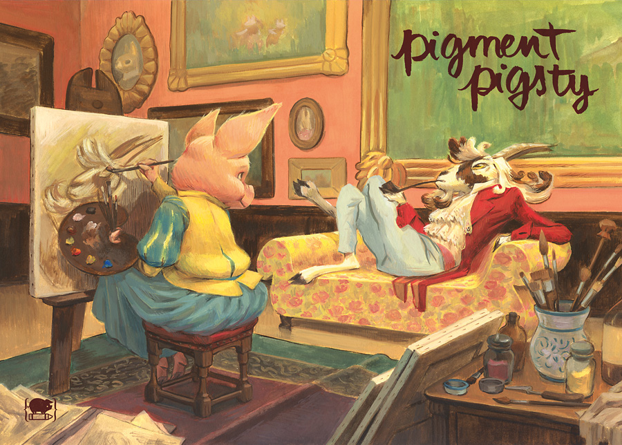
Last year I put together a small self published artbook and, instead of using an existing image, I decided to paint a cover for it. Recording my process while I paint is something I rarely do because it can feel disruptive (particularly during a tight deadline) but this one took a few sittings and I scanned the painting at different intervals, so I thought of using it to show how I work and talk a little about my medium of choice: gouache.
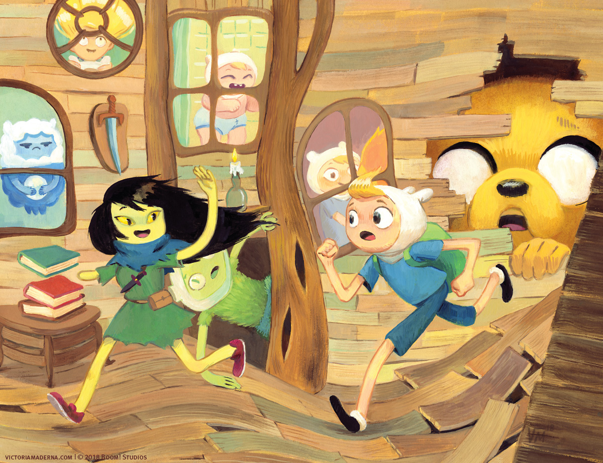
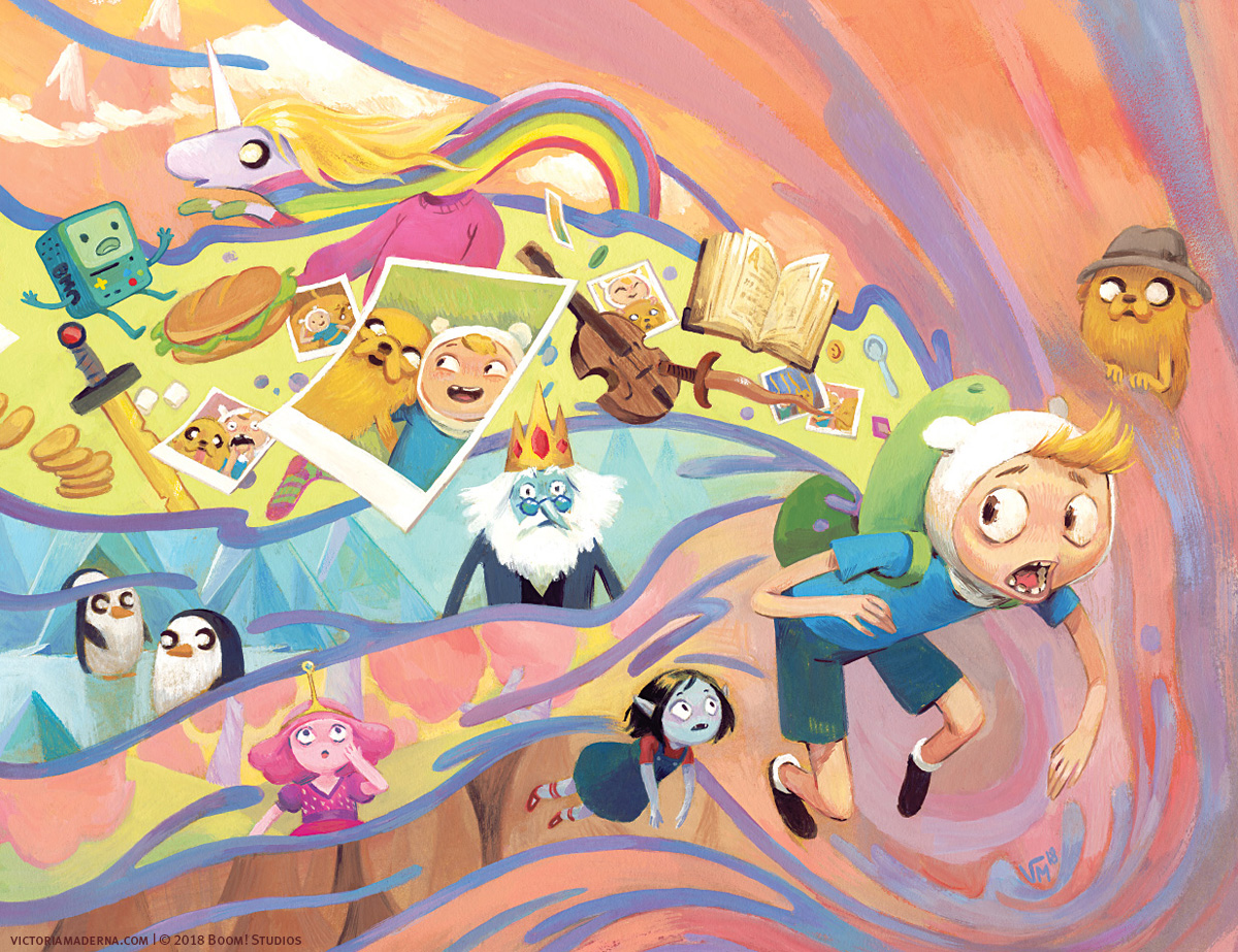
I knew I wanted a wraparound cover for my book as I love the challenge they pose: the front has to be able to hold on its own, the back should be interesting as well, and ideally it will make full sense when you see the whole picture. That cover served as a springboard for this series of wraparounds I recently created for Adventure Time: Beginning of the End, an upcoming limited comic book series from Boom! Studios.
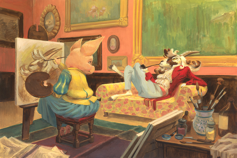
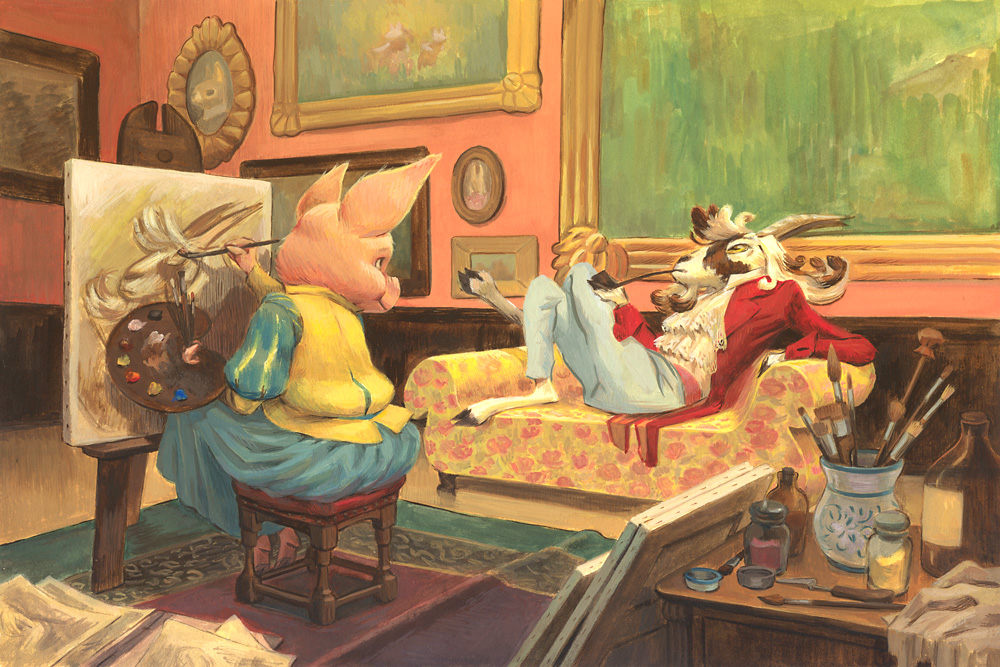
I went through a few ideas, but once I decided on a title for my book, Pigment Pigsty, the general theme for the cover pretty much chose itself. This “artist and model” scene idea with a female painter and a male model got stubbornly stuck in my head and I just had to paint it.
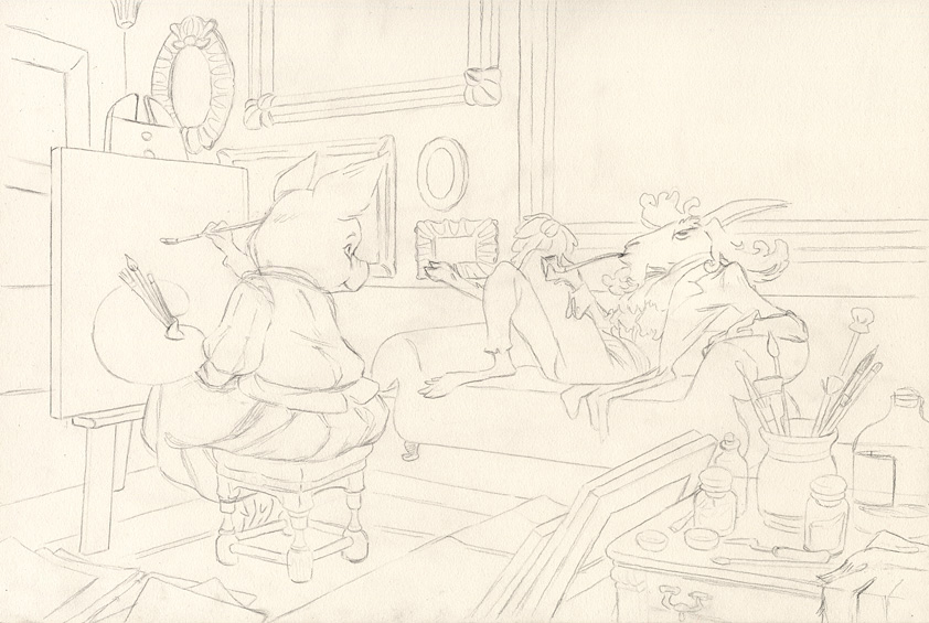
I made a few loose sketches and then did some research to get the details right. I don’t use direct reference in my work often, but I do gather and use a lot of documentation: photos, paintings, palettes or techniques that I can use as inspiration. I tightened my sketch and transferred it to illustration board with the classic method of rubbing graphite on the back of a printout and going over the lines.
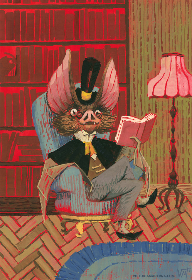
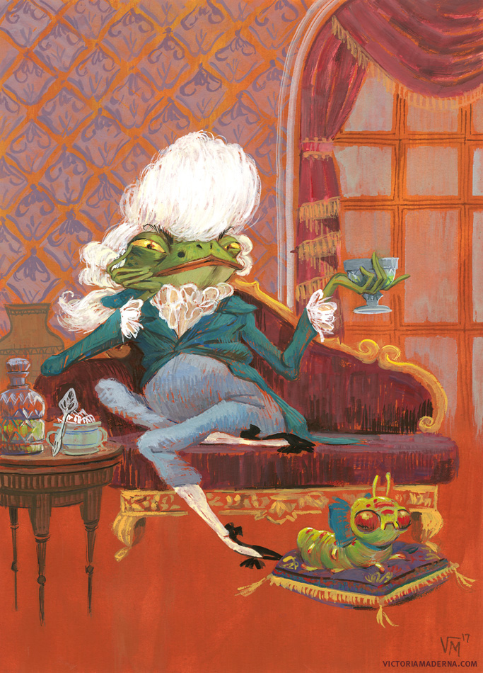
While I love trying out different media and experiment, most of my work is done with gouache. I will sometimes start with acrylic gouache (matte acrylics, essentially) if I want to have a more permanent base layer: in the two paintings shown below I started with a very saturated ground of acrylic gouache and painted with regular gouache on top, making for an interesting effect – although the process was a bit harsh on my eyes!
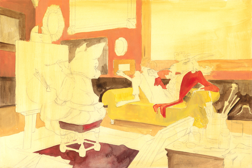
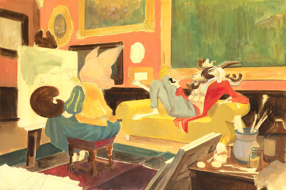
The cover for Pigment Pigsty is all gouache though. I started with a light wash of ocher over the whole thing: as moisture reactivates the paint, having an underlying color is a good way of harmonizing your palette; a sort of reverse glazing. In this piece I wanted that “old painting” feel so yellowing the ground helped achieve that mood. Then I started roughly filling in the big areas, still using a lot of water with my paint, adding general colors/values. I’m working in a pretty sloppy manner at this point.
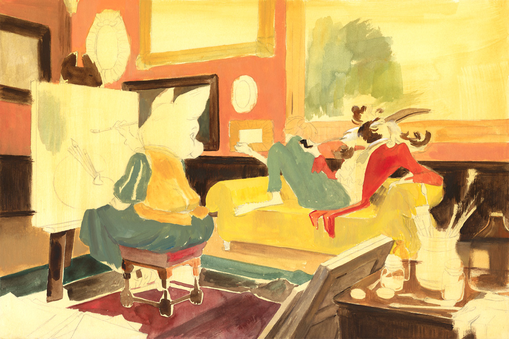
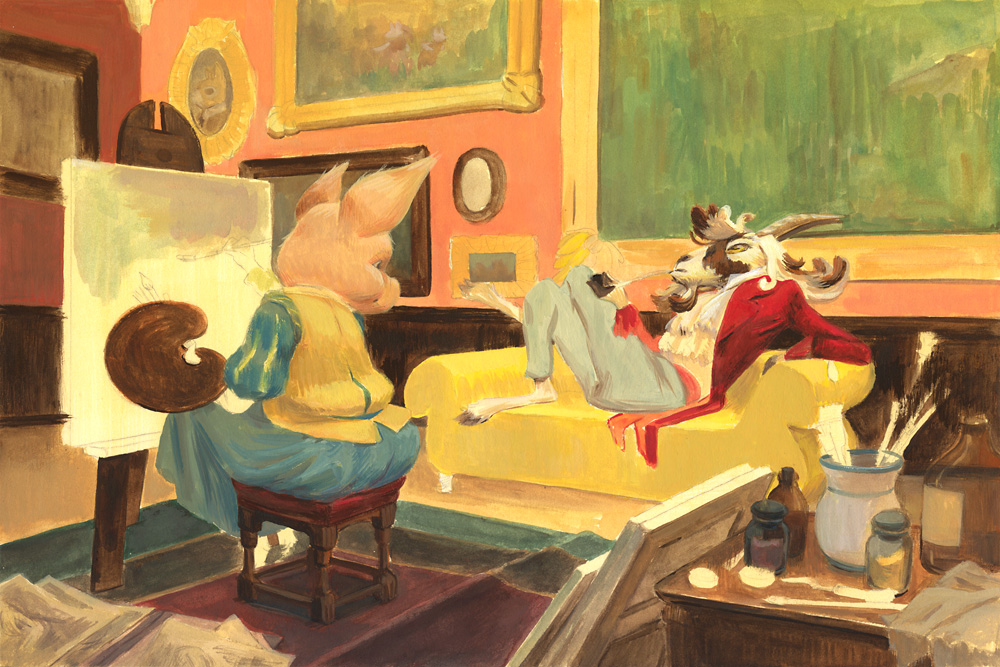
Gouache can be used very transparent like watercolor, thick from the tube, and every variation in between. I generally go from transparent to opaque as the painting progresses. I’m not terribly methodical about the way I paint; I try to lay down all of my general shapes before I get to the particulars… but I sometimes get bored with this “filling in” part and start detailing an area before I should.
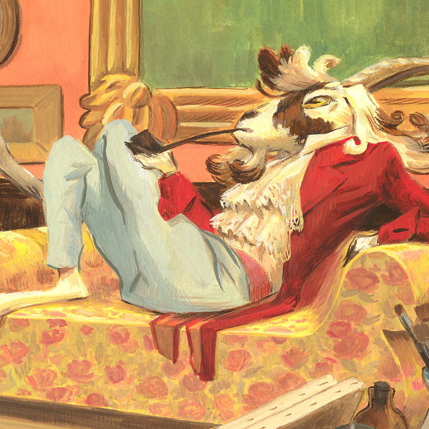
Here I started adding information to that goat’s face long before I even finished covering the board’s surface. But it was, after all, the focus of the painting, and in my view, the right method is the one that works for you: jumping around might not be super efficient but it helps keeping me interested and engaged in what I’m doing.
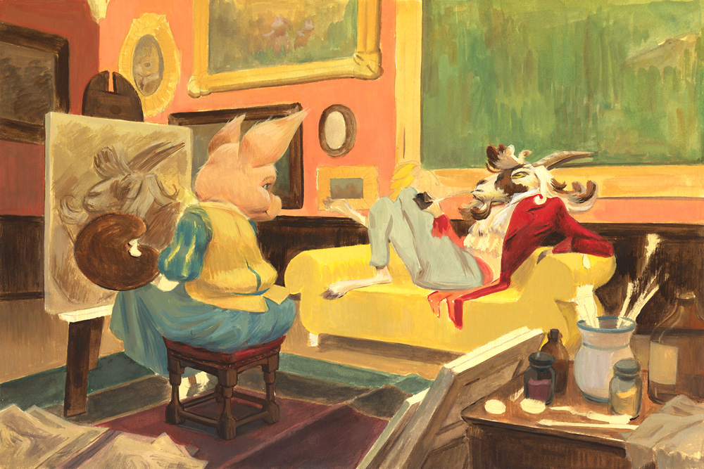
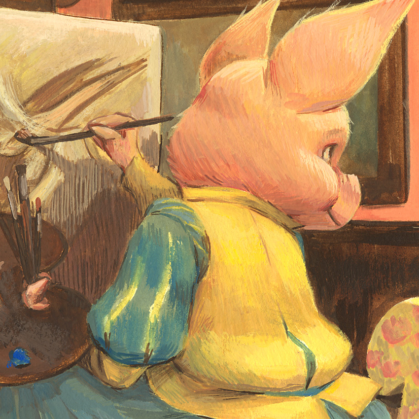
Once I have a base color, I can begin adding texture and interest to the surface. Although sable and squirrel brushes (or synthetic equivalents) are what’s used more often with gouache, I find adding a hog brush and other “oddballs” to the mix will bring interesting marks and textures as well. I also use a lot of hatching in certain areas to create visual mixes and transitions of color/value.
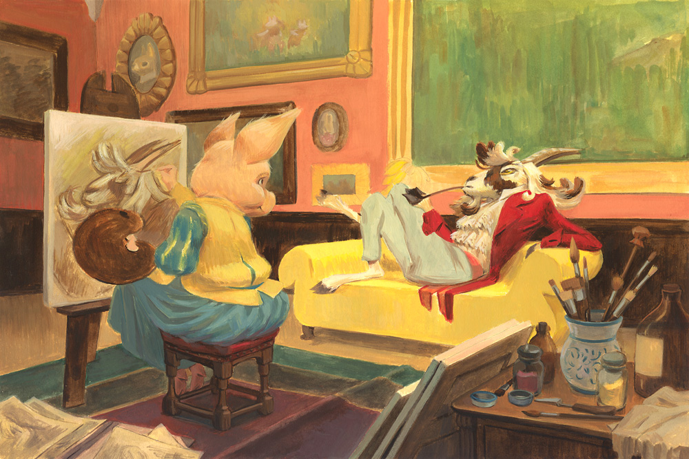
I pushed the contrast as the painting progressed – this can be difficult to do in gouache but I wanted to have that sort of heavy, almost baroque ambiance to the scene so I made sure not to shy away from dark values.
I know a lot of people find it frustrating that gouache reactivates with water – I did at first too! Now I consider it a plus and not a drawback, because there are ways of making it work in your favour, and of minimizing it when it doesn’t suit your needs. When I painted the flowers over the couch, the paint was semi-opaque – it still had a good amount of water – so the bright yellow tinted the flowers and they easily blended into the object. Thicker paint will be more covering, but it helps if the layer under it is not too thick and you’ve let it dry completely before applying more paint.
One of the advantages of this medium is that its matte finish makes it very easy to scan. And unlike paints with acrylic binder, it’s much kinder on brushes… and clothes! Very important if you, like me, are cursed with terrible clumsiness and getting paint everywhere is a daily occurrence. And unless you’re doing very watery/transparent washes, it also dries fast, so you can safely touch it soon after putting down a brushstroke (I did mention my clumsiness, right? Me+oils = smudgefest of epic proportions).
When scanning a traditional piece and getting it ready for print, I don’t let the scanner do any adjustments at all; I save those for Photoshop. My three go-to layers for adjusting are Levels (or Curves if I have subtle value shifts), Hue/Saturation, and Color Balance to make small hue tweaks. I also make liberal use of the Clone Stamp tool to get rid of any noticeable dust or hair on the painting’s surface. After these digital edits, the cover is finished! All that remains is cropping it to size and add the lettering for the print files.
Every time I finish a painting there’s one or two spots where things end up just right; these make me ridiculously happy and feel like a victory even if I don’t like much else about a piece. In this one the blue sleeve on the pig painter and the ruffles on the goat are my favorite parts: painterly and effortless.
This is my goal every time I add a brushstroke, but my brain can be a jerk sometimes and convinces me that maybe I need to tighten things juuuust a little more. The more I paint, the more I learn not to listen to it.
Having scans of a piece at different points means that you can make a GIF out of them and feel like one of the cool kids:
I hope you’ve enjoyed this window into my process and that maybe it will encourage some of you to give gouache a try. Whenever you pick up a new medium I think the trick is not to try and force it into the behaviours you are already familiar or comfortable with, but to be willing and open to learn its own set of particularities and let them work for you.
Post written by Victoria Maderna
Victoria is a freelance illustrator from Argentina living in Spain who enjoys painting animals in period outfits. She has worked as an artist in children’s publishing, comics, magazines and tabletop games. Her natural habitat is her studio, where she’ll often be found with a brush in hand and hot tea nearby. You can view more of her work at: http://victoriamaderna.com






“but I sometimes get bored with this “filling in” part and start detailing an area before I should.” – The same here… I thought that it was only me.
Thanks for sharing.
Thanks! I doubt it’s just us, Marco 🙂 At first I worried more about doing things in the “right” order but now I’ve come to believe we all should find what works for us – even if it doesn’t for others!
I am glad you shared your proces, and I hope you will do so again. A very enjoyable post, I like your work too.
Thanks for the kind words Ronnie, I’m glad you enjoyed the post!
Amazing job, Victoria! I adore your work.
Thanks a ton Dan!! That’s going straight to my head 🙂 The feeling’s mutual, I’m a big fan of what you and the rest of the Muddy Colors contributors have built here.
Thank you Victoria, this is one of the best tutorials I’ve seen on working with gouache. Well done!
Thanks Erich!! As I’m not a native English speaker, I always worry about making sense and being clear in my explanations, so I’m very happy to hear it!
Very nice work. I like to work with gouache and it’s a pleasure to discover artists using this medium.
Thanks for the kind words Li-An!!! 🙂 I’m familiar with your lovely work (I’ll have to dig for your gouache stuff though, as I’ve only seen inks I think), and I *adore* your blog – I’m a huge fan of Georges Beuville and I’ve found so many of his images there as well as discovering new (to me) artists, so thank you for sharing them!
I hesitated to speak to you about Beuville’s work when I wrote my comment 🙂 His work in gouache is so intense. Well I don’t have time to paint (I’m kind of lazy guy). You can see some examples here https://www.li-an.fr/blog/mon-travail/mes-zimages/concours-ex-libris/, https://www.li-an.fr/blog/mon-travail/mes-zimages/je-dirai-meme-plus-bonne-annee-2013/ or https://www.li-an.fr/blog/mon-travail/mes-zimages/ex-libris-pour-les-10-ans-de-bederama/. But I’m just an amateur in painting.
Beuville is just amazing – the more I look at his work, the more it impresses me. And your paintings are great, I’m particularly drawn to the left image of the first link with the red forest – wonderful palette! Thanks for the links 🙂