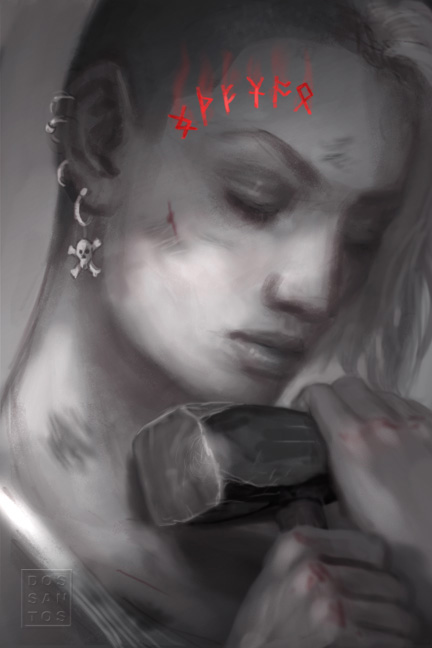
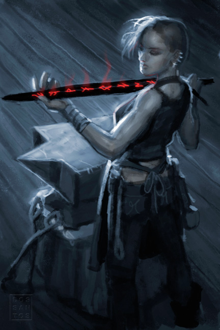
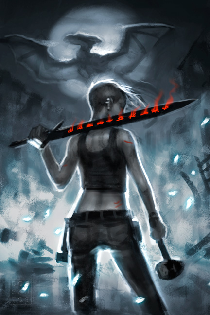
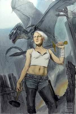
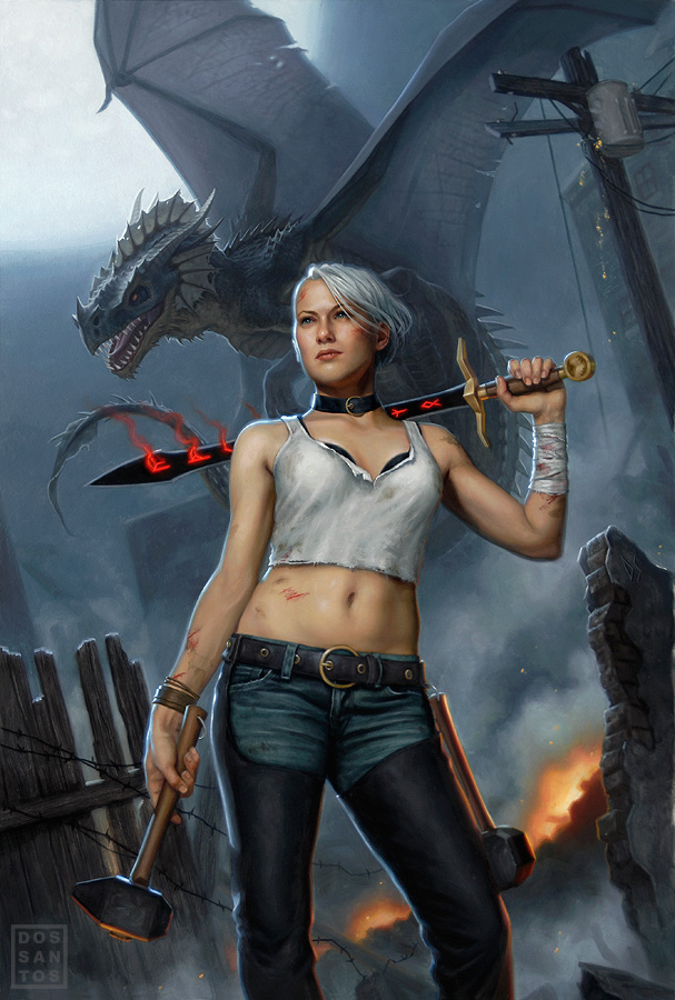
About a year ago, I was asked to do the cover for a novel called ‘Black Blade Blues’. As usual, I asked the Art Director to send me the manuscript so that I can get some insight as to what the book is about. Upon reading it, I was really excited to discover that not only was the story well written, but that the subject matter could not be cooler. Here was a story about a rugged, female Blacksmith, with a white mohawk, who dons a black sword as she slays dragons in modern day Seattle! Very cool. Pleased as could be, I went about doing sketches.
As usual, I did my sketches in Photoshop. At this point, I do not use any reference. I am merely trying to convey a concept, and am not overly concerned about anatomical accuracy or realism. If the AD can tell what’s going on, it’ll suffice. Of course, it doesn’t hurt to polish up those sketches that you really want them to pick.
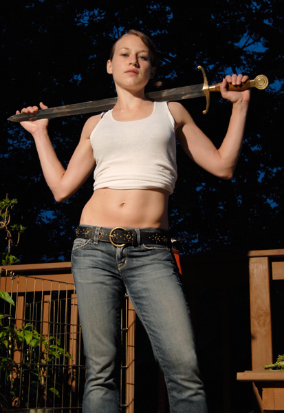
Once I have all my reference, I recompose my sketch in Photoshop and begin to draw in all the elements that are missing or no longer work because of a perspective or lighting shift. When I am happy with the results, I print out my new comp and begin graphing out the final painting.
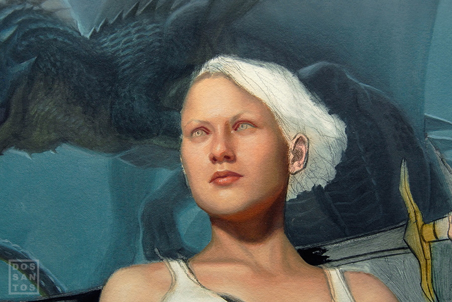
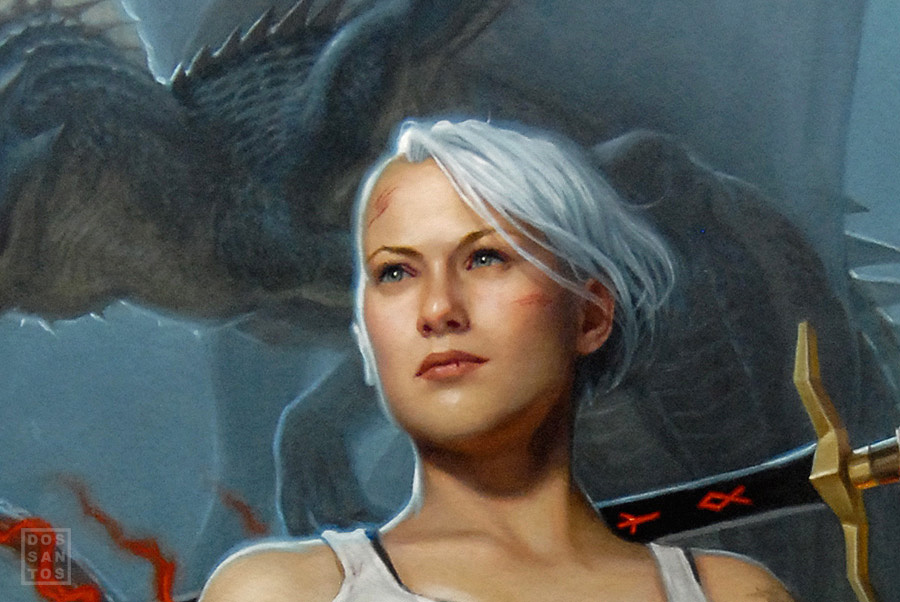
I use Strathmore 500 Series Illustration Board, which I lightly gesso 3 times on each side. I do my final drawing directly on this board. Unfortunately, this process means that I have no original drawing left preserved. On the upside, I can get a very fine level of detail that will help me immensely when I paint the image. By doing a rather refined drawing, I can apply the oil paint very thinly, permitting the pencil to show through and do a lot of the work for me. This is particularly helpful when painting things like wood grain and denim jeans. Just a little glaze of color, and it looks completely done. Things like the face also start out very thin, as to preserve the drawing for as long as possible, but eventually become opaque as I grow confident in it’s accuracy.
Once completed, about ten days later, I had the painting scanned and submitted it to the client. In this case, the AD didn’t feel the dragon looked mean enough, so I had to alter it’s head a little in Photoshop. I gave it horns, added some decay, and altered it’s facial structure a bit to make it look less dinosaur-like. I later decided I liked it better that way too, and decided to revise the original painting to match.
For more information on my oil painting process, as well as a hi-resolution wallpaper featuring this art, check out my website HERE.




This is awesome, Dan. I never get tired of seeing your process. I am very excited about this new blog!
In your process shots you left out the “ugly” stage! I thought every painting went through one.
great stuff 🙂
amazing. Thanks for posting all this cool info!
Dan, I've been a fan of your stuff for several years now. I've always been more of a draftsman than a painter so I've always found it beneficial to start with a detailed drawing and build up paint layers slowly. I find myself pushing around piles of mud (the bad kind) if I go alla prima style.
Once your final drawing is completed how many hours do you think you spend on painting until completion?