Welcome to day two of the ‘Muddy Colors’ blog!
I still don’t know quite how I managed to do it, but I somehow convinced what I consider some of the best Artists in the industry to join me in creating this blog. A blog which guarantees to take their already packed work days and stuff them even fuller with deadlines, tech-savvy shortcomings, and even a little self-doubt. And in return for all their hard work… the risk of public humiliation. Yet despite all of that, everyone still generously said ‘Yes.’ Proving they are not just some of the most talented people I know, but some of the nicest as well. For this, I am truly grateful, and extremely proud to call them my friends. I don’t know how long it will be until this experiment blows up in our faces, but until then, we promise to have something new for you guys every single weekday. So please, check back in regularly!
For what is technically my inaugural post, I’d like to briefly show off a new painting I just finished, and talk a little about what is quickly becoming one of coolest series I get to work on.
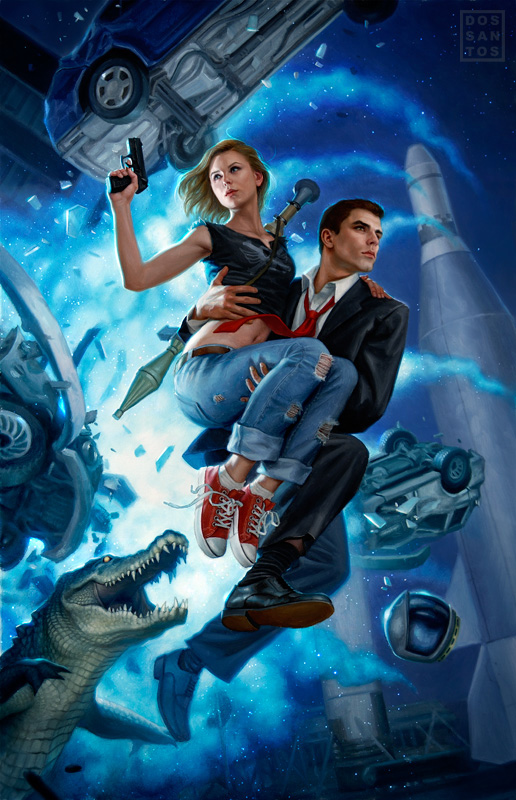
Daw books contacted me a little over a year ago to do the cover for a book called ‘Touched by an Alien”, by Gini Koch. The story revolves around a woman named Katherine (Kitty) Katt, who fights along side Armani-clad (and drop dead gorgeous) Alpha Centurions to defend the Earth from hostile alien invasion. The story is packed full of sex, violence, and surprisingly… humor.


This series of covers quickly became proverbial kitchen sinks; chock full of monsters, aliens, guns, exploding cars, clones, and even crocodiles?! I distinctly remember sitting at my easel in the early morning hours, really tired, painting this crocodile and asking myself “What the HELL am I doing right now?” Yet in retrospect, I wouldn’t like the painting half as much if it weren’t for that cute little guy. It seems the more I stuff in there, the better they get. Not only does this make the images more exciting to look at, but it makes for a really fun painting experience. The other nice thing is that it allows me to add a slew of narrative elements from the book. Elements, which I hope readers will pick up on as they come across them in the story.
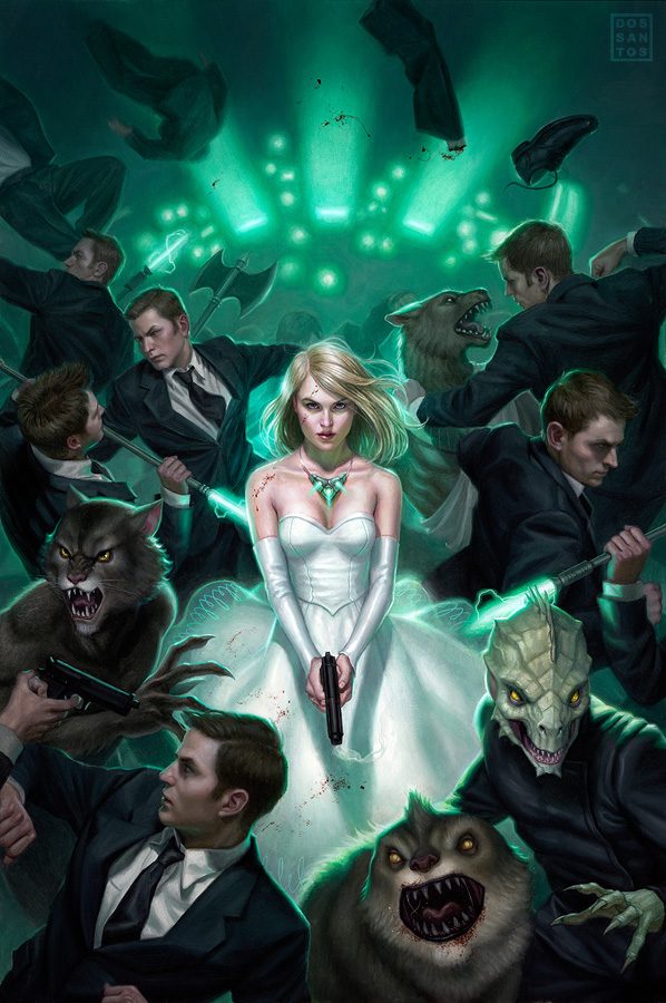
The most recent addition to the series is “Alien in the Family”. The book won’t be out for sometime yet, so I can’t mention the epic intergalactic bloodbath… But suffice it to say, it was super fun to paint, and promises to bring me yet another really cool painting to work on in 2011.
 |
| Oils on board, 20×30 inches. |


Looking at that list of artists on the side there, I see some of my absolute favorites. And not favorites just for the fantastic art you all create, but for your continued generosity in sharing your excitement, passion and knowledge about making art with everyone.
Thanks for making this blog, Dan. Definitely added to my daily rounds! And of course, super fantastic paintings! (asspat! :D)
Wow! Thank you all for this Blog. I can't wait to see more.
As the author who scored these awesome covers, I can honestly say that you captured the essence of each book in one painting. And yes, I find that totally amazing.
Authors live in fear of what their covers will end up looking like — me, I now eagerly await what you'll come up with, because I KNOW it's going to rock beyond belief! (BTW, the SKETCH for Alien in the Family was amazing, let alone how gorgeous the final cover ended up being.)
I get asked all the time how I lucked into getting you as my cover artist. To which my only reply is: DAW likes me, they really, really like me!
Thanks for creating the best covers in the world (yeah, I'm biased, sue me ;-D) and for all you do to support aspiring artists. You truly epitomize the word “great”.
Awesome post, Dan! Sounds like that series is right up your alley. The Alien in the Family piece is beautiful and epic. Two things I fully support 😉 I can't wait to see what gets shown up on this blog you guys have all put together here.
As a fan of the Gini Koch books I have to say you totally capture everything in the books. I STILL look back at the cover of the first book and find something new every time. That-is awesome.
I love the Matrix-esque look of the newest cover. 😀 That really grabbed me the first time I saw it… all these men in suits fighting, agaisnt a green background.
I loved the other covers as well, of course – the cover for 'Touched by an Alien' was what first made me pick the book up, because I was intrigued by the overblown drama of the scene, with the fire and planes and this armed couple kissing in the foreground, lol.
Great concept here, thanks for taking the time to help those of us still learning! I'm trying to teach myself how to paint with oils and this blog looks to be a great resource.
I was looking through the learning materials you had on your website and had a question for you. You mentioned that you use oil on illustration board, I was curious why. I've seen other artists say that they also do oil on illustration board. What does that surface give that canvas or canvas boards don't? I just thought that was very interesting and wanted to know more.
Thanks,
-Justin
@Justin,
Sometimes the details I paint are smaller than the weave of the canvas permits. Having to fight little bumps and crevices really inhibit what you can paint. I also don't like the bounce of a stretched canvas.
For both these reasons, a lot of artists choose to paint on gessoed wood panels. Conversely, I find wood to be too smooth, and it shows every little stroke you make.
Gessoed illustration board seems to strike the right balance for me… smooth, with a little tooth, and slightly absorbent.
Thanks for this new great blog it's great !
wow what an awesome blog!thanks a lot!
haha that crocodile vs. the guys and the girls deadserious face expressions just made my day 😀
These covers are awesome! I also really loved your cover for the book Warbreaker by Brandon Sanderson. I think it feels very different to these, rather more simplistic. Really nice!
That crocodile really does steal the show! He got a good giggle out of me just now. 🙂
In all seriousness, though, that's an excellent point about one of the core distinctions between a serious/realistic story and one that has a bit more fun with itself. Great insight!
I have to say that I have been a fan of yours for a while… I've loved your covers for the Mercy Thompson series and these for Gini's books just make ypou my favorite cover artist EVER! Im not even exaggerating!
you rock!
So happy I found this blog! cant wait to see what you come up with next =D