-By Dan dos Santos
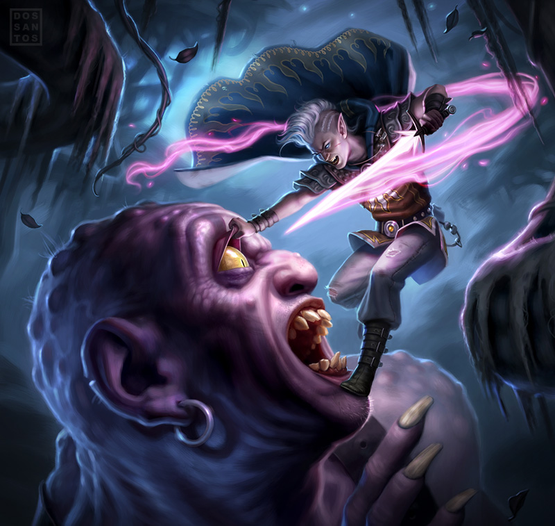
This cover just went public a few days ago on the Dungeons & Dragons site, so I figured it would be a good time to share it.
I believe I have only done about 3 or 4 professional digitally… this being one of them. For a long while, I was on the fence about whether or not to start working digitally. I was under the impression that it is much faster and much easier to achieve professional results. And though this may be the case for some… it is not for me.
I found myself repeatedly drawing the same stroke, over and over, trying to capture something that I could have done so easily in real paint. Conversely, there are things that take mere seconds in Photoshop (like dodging) that would take hours to do properly in oils. Ultimately, it seems that a blending of the two mediums reaps the best results.

I am also including the original concept sketch which was rejected. It was rejected because the AD felt that it was too violent, and exceeded the magazine’s PG-13 limitation for a cover. Personally, I find the original concept more comical than violent, and would actually go so far as to say that the accepted concept is more violent than this one. Though, the deciding factor seemed to be that it was simply implied violence in the new image, since nothing had actually taken place yet.
What do you think?


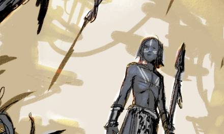
Big fan of the first image, the light flow from the sword and the composition of the severed head as he rides it to the ground are a lot of fun. Though the final is pretty sick too. It makes me rub my eyes reflexively…
Great images. I think your analysis wrt choice is on the spot. The chosen one definitely carries more violent intention than your draft, but the post itself might only be threatening.
I agree that the final is more violent by implication. I think the first one is more humorous, and lopping the head off of monsters in kinda the standard for heroes anyway, while holding his eyelid and stabbing his eye seems more cruel. But what I find really interesting is how I can't tell the difference between your digital and traditional pieces, at least when looking at low-res versions of them on the screen. You get the same colours, the same mark making and the same textures when you work digitally.
I the final is solidly more violent in my opinion. You can feel the fear in the giant as he is about to die, unlike the first image where the violence seems cleaner and more impersonal.
yup, it's the fear in the giant's face that makes the second more disturbing. Hard to take it too seriously with the neon sword tho – I think it's still safely in the world of fantasy.
re: digital painting – I think it's all what you know man! not trying to convert you – but I feel the same/inverted – when working traditionally I find myself painting over trying to get things I could easily do digitally, and I get a sore shoulder from working up to a standing easel 🙂
I think your digital stuff has perhaps too many soft edges right now as compared to your sharper oils. Your probably right – mixing tech is probably the way to go.
I prefer your rejected sketch than the one they accepted for the magazine.
The composition has more dynamism overall for me, and a great flow. I felt that the flow of the final piece was more forced than anything.
Either way they are both great pieces 🙂
I agree with Noel and a few others – the final seems more disturbing to me because of the fear you can see on the giant's face, whereas in the rough piece his face looks more shocked/blank.
It's the anticipation of that sword penetrating the giant eyeball that's much more violent to me. I started squinting the moment I saw it because of the way he has the eyelid pulled out and away. Yikes! I agree that the study is more comical in nature. The fact that there's a glow at the severed neck and not blood helps too.
Perhaps they went with the final because it implies injury and blindness whereas there's no question that the giant's dead in the study?
The implication of the sharp object entering the eyeball is far more psychologically disturbing and I know a part of you must've thought about implied violence being more compelling. Though the censorship is reminiscent of church ladies in public school libraries with sharpies blacking out any naughty language. My middle school experience included a copy of Of Mice and Men which at some point had to have been soaked in black ink.
Great piece!
– Joey
Not related to this post in particular… I'm really enjoying this blog, so I have syndicated it to Livejournal as “muddycolors.” Just thought to know your posts are snaking out into other venues, and hopefully reaching a different audience. 🙂
In the first sketch, the violence is right there, right in your face. In the second sketch it's more implied. Although I love the colours in the second sketch, I don't like either image.
How many manhours have you spent learning Photoshop? I have the feeling that the answer is not many. Just like learning to paint, learning to use a software program like Photoshop (or Corel Painter which you didn't mention), takes time. You only get out of learning what you put in. My impression is that you are just making up an excuse to continue painting traditionally. Why not just admit to yourself that you like it, and not digital?
I agree with the majority, the implied violence in the first image is far more threatening, even the way he pulls up the giant's eyelid. Whereas the second image doesn't deal with the violence itself at all, just the aftermath which isn't too gory. No blood after all, just a stunned look on the chopped off head, which is in fact quite funny.
As for Photoshop, ces has a point: to master it to the point where you don't even notice what tools you are using takes as much as mastering traditional painting itself. I'm in that difficult transitional state as well where I often think that with paints I would've finished this hours ago but the ability to change things, to try out different outcomes, the ease of some of the effects easily make up for it. It's a long process so maybe don't give up quite yet. Based on your traditional work, I'd love to see what else you would do in digital!
I like the use of purple and yellow, especially the bright purple sword in contrast to the yellow eye.
At least you have a firm grip on color. I'm still struggling with it myself.
Decapitation is a big no-no though for PG13, right? I've run up against that before.
Which is a shame, as a giant decapitated head with glowing pink blood being ridden to the dungeon floor is made of win.