Every so often I get asked why I became an illustrator (or, more accurately these days, work in the arts and with artists). My answer is almost always the same: as a kid I was excited by—inspired by—other visual artists and somehow, some way I wanted to do what they were doing. Never mind that I never came remotely close to creating anything as arresting as the works by my heroes, they still inspire me. Their art—and the art by many, many others that have come along (or whom I’ve stumbled across) in the years since I stopped wearing short pants—still flips that switch in my head and electrifies my imagination. I am absolutely certain every other artist feels the same way and has their own heroes. As for some of the people that grabbed my adolescent attention and have never let go in the decades since? Well…
First there was Russ Heath and his war stories (including “the war that time forgot” that pitted WWII soldiers against dinosaurs) for DC Comics. Heath (who is now 84, I believe) had a meticulous style that I think was unmatched in comics (at least in the 1960s). I always appreciated the stories drawn by Joe Kubert and John Severin (and naturally loved the energy of Jack Kirby and Steve Ditko), but Russ’ work was always something that I avidly looked for.
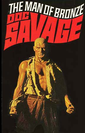
Next was James Bama and his astonishing run of covers for the Doc Savage paperback series—60+ paintings. I always felt like Jimmy was showing me something real and that his characters could literally step off the book rack and beat my butt. Bama also painted the box art for a series of model kits based on the old Universal movie monsters that were also affecting (and which always looked much better than the actual models).
The third was the tag-team of Frank McCarthy and Robert McGinnis, who collaborated on the posters for Thunderball and You Only Live Twice. McCarthy (who also painted posters for The Dirty Dozen and The Train before moving on to become a Western artist—just as Bama did) handled the action scenes while McGinnis painted the vignettes featuring Bond surrounded by a bevy of beauties. I was a little young to understand why, exactly (was it the gadgets or the girls?), but looking at those movie posters made me want to be James Bond. Or, failing that, McCarthy or McGinnis.



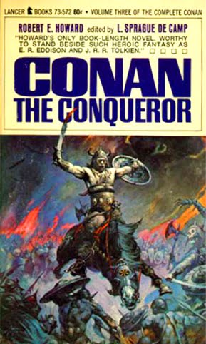

I can actually sift it down to one image… Frazetta's Dark Kingdom.
While I was certainly influenced by many of the same artists others here probably were, It was this one image that lead me to pursue illustration further. Id love to know how many times as a kid I sat down and tried to copy the cover art from my older brothers Molly Hatchet Album. I still have the album displayed in my studio today.
Interesting post on influences Arnie. Thanks!
May the Great Frazetta rest in piece.
Arnie, I always find it interesting to learn about influences. I know those of us interested in this genre probably have certain crossovers but the interesting part for me comes when we branch out a little. I did the comic thing too but at some point got into music and was pulled by the dark side artists like Roger Dean, Ian Miller, Patrick Woodruff, etc. Being in California guys like Robert Williams and Ed “Big Daddy” Roth creeped in to my consciousness. So my pure sci/fi/fantasy blood was tainted with the evil music world. And when I discovered Bosch, then the underground world of Crumb and Zap I was corrupted forever. Maybe that's why I find it so hard to stay with the beautiful narrative world and keep messing with inexplicable imagery, humor, and mystery. Oh well I could never compete with artists like on this site anyway so best I carve my own niche. I hope this post isn't too long.
Arnie, You and Cathy have been able to clarify, while not define, this genre that we all love so well. On second thought I think you have expanded our conception of the field and given us more to look to for inspiration. Great to get a glimpse into your noggin. Looking forward to your next post.
Jon
Back in the late '70s I was fascinated by James Burke's series that ran on PBS, Connections. In each episode he'd connect the dots, explaining that advancement wasn't linear, but rather that the essence of the modern world is the result of a convoluted web of interconnected events—without the actual participants ever realizing what the long-term benefits or repercussions of their discoveries or actions might be. Here's the description for episode 8:
“”Eat, Drink and Be Merry” begins with plastic, the plastic credit card and the concept of credit, then leaps back to the time of the Dukes of Burgundy, the first state to use credit. The dukes used credit for many luxuries, and to buy more armor for a stronger army. The Swiss opposed the army of Burgundy and invented a new military formation (with soldiers using pikes) called the Pike Square. The Pike Square, along with events following the French Revolution, set in motion the growth in the size of armies and in the use of ill-trained peasant soldiers. Feeding these large armies became a problem for Napoleon, which caused the innovation of bottled food. The bottled food was first put in champagne bottles then in tin cans. Canned food was used for armies and for navies. In one of the bottles the canned food went bad, and people blamed the spoiled food on “Bad Air”, also known as swamp air. Investigations around “bad air” and malaria led to the innovation of air conditioning and refrigeration. In 1892 Sir James Dewar invented a container that could keep liquids hot or cold (the thermos) which led three men — Tsiolkovsky, Robert Goddard, and Hermann Oberth) — to construct a large thermal flask for either liquid hydrogen and oxygen or for solid fuel combustion for use in rocket propulsion, applying the thermal flask principle to keep rocket fuel cold and successfully using it for the V2 rocket and the Saturn V rocket that put man on the moon.”
Who woulda thunk it?
Influences are a cacophony; the successful artist is able to blend them into a singular unique voice all their own, creating their own “songs” and in turn influencing others. That's why it's fun for me at least try to connect the dotes. Frazetta's a good example: his Hal Foster and Al Capp influences are readily apparent, but I never would've guessed early on how much he was inspired by Milton Caniff and E. C. Segar. To find out that Frazetta in turn influenced artists as different as John Currin and Peter de Sève is another eye-opener.
My guess is that there are a lot of artists that have made names for themselves (or who will in the future) that could trace their lightbulb moment to watching Star Wars or playing D&D or seeing, say, a Wyeth exhibit. Or maybe they watched Donato do a painting demo at Comic-Con…
So, Bill, while I can squint and see Patrick Woodruff and Bosch as ingredients in your recipe, Big Daddy Roth and Crumb causes me to grin and say, “No kiddin'?” Learning that will definitely make me go back and look at your paintings from a slightly different angle.
And Jon…I knew you were on fire the first time I saw your work. I knew it 20 years ago; I know it today.
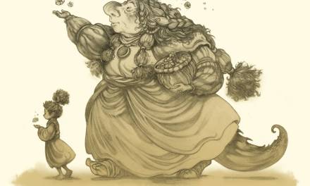
I remember my mom reading Dinotopia for me and that was the first time I looked at the pictures as not just pictures, but realized they were actual paintings made by a person. Another moment was a compilation book of Tolkien art called Tolkien's World where especially the works of John Howe made me realize that there are people who do this stuff and they are awesome. Howe's painting of Sam and Frodo in Mordor, with an orc cracking his whip at them, is also the first time I realized that plate armour is the way to go… 😉
Amen on James Gurney. That guy is a mad man! Tolkien's original images always peaked my imagination. Very few writers are so charged by their own stories that they attempt artwork. While it will never be nearly as technically good as John Howe's library of LOTR material, there's something about seeing the author's original vision that intrigues me.
Newspaper comic strips are what inspired me to go into making my own comics. Of course, if it's more recent influences, I've been drawn to the work of the children's author Richard Scarry. Do you notice his compositions in the Busytown books? He fills up the pages, yet at the same time, it doesn't look cluttered.
Thanks for sharing some of those covers. I always did like the older comic book covers, especially some of the ones from the 1980s. A personal favorite of mine has to be the Amazing Spiderman #247 from 1984.
Can I say something here too? I'm trying to work in visual arts only because I'm no good at anything else. Plus those closest to me (who are supposed to help me the most) are the ones feeding me the majority of their bullshit, while not lifting a finger at all.
No, I'm not the type that thinks that art is easy. It's been 4 years of work, quitting my stable job to get some extra time to draw.
And hell, I've only recently realized how much talent you need to have to survive in this field. Not giving up though, this is all I have now.
Gods, the amount of talent in this field makes me extremely disgruntled.