Hi, everyone! It’s a real honor to be here!
A little about myself: My name is Jason Chan and I’m a freelance illustrator dealing mostly in fantasy and young adult book covers and trading card games. I am also a full time video game/ movie concept artist working with Massive Black in San Francisco.
I’ve always been a huge fan of movies, comics, video games, fantasy novels and card games ever since I was a kid and I would spend hours drawing my own “contributions” to my favorites. Little did I know that I would grow up to do it for a living!
So today I thought I’d share with you what a typical illustration job is like for me.
 |
| Among Ghosts, ©2010 Jason Chan |
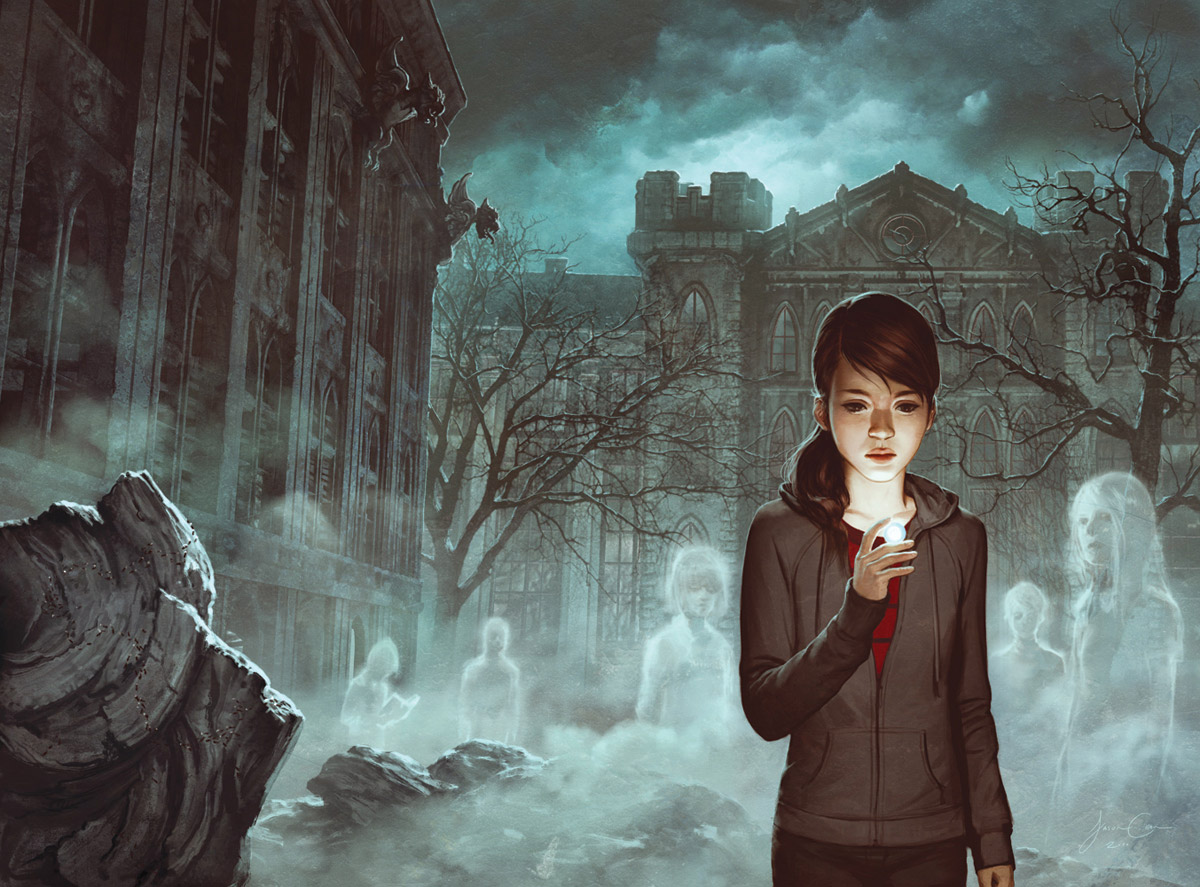
This image is for the book Among Ghosts, by Amber Benson. I was asked to do an image of the main character, Noh, standing in front of her new school, which is scary and haunted. She is to be holding an Evil Eye, from which a magical fog is escaping and ghosts can be seen. It’s a wrap around cover and they specifically asked for a burnt dormitory to be on the back cover with ants crawling into it.
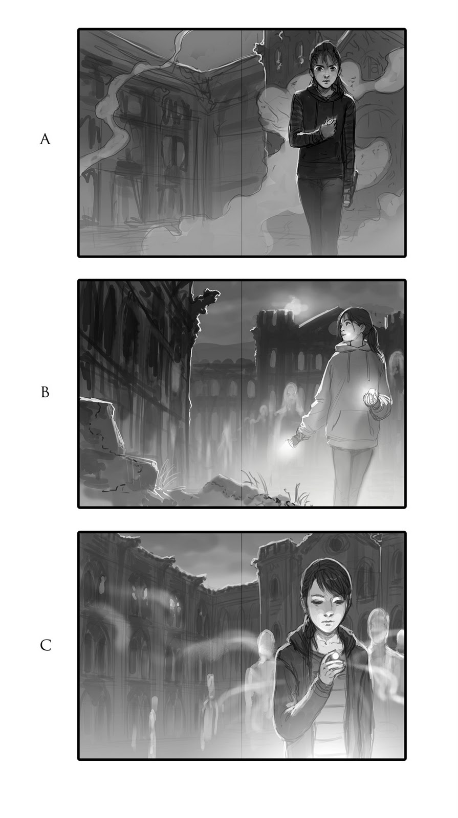
Next I prepare some sketches to show the client. I normally do my sketches in grayscale, but if something relies heavily on color, I will do color sketches. This is not one of those times. Since this brief was pretty specific, I only do 3 sketches, but make sure that each one is unique and has it’s own special “something” that makes it an interesting
cover. A lot of times it’s easy to have an idea for a cover you really like and then be lazy and do some throw away compositions just to fill space. I don’t recommend this, because more often than not, they WON’T pick your favorite! It’s best to make sure there is something in each sketch that you like so that you don’t end up working tens of hours on something you don’t like.
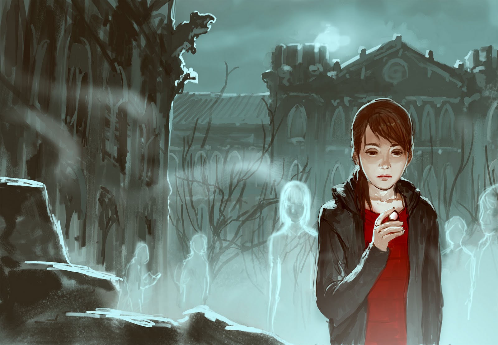
Finally I put the rough draft in the oven and cook on high for 20 – 60 hours depending on the complexity of the image. And we have a final image! I made a few adjustments here and there (made the foreground shape on the left more interesting and adjusted the hoodie on the girl), but the client liked them so I was safe.
That’s the basic way most of my illustrations go when things go smoothly. When things are not so smooth, there are a lot more revisions. In concept art, it seems like all you do are revisions!
So if you are still reading, thank you! I hope that this was informative (probably not) or at least entertaining. Thank you so much for your attention and thanks to Dan and the crew for having me!
-Jason Chan



Great post! 😀 Thanks for sharing your process, Jason!
Also, chan is a badass that does much more than you can possibly imagine. Also, his taste in jackets is immaculate. Which means his taste in art is also immaculate. If you think i'm joking then try and buy a jacket see how it's not as cool and fantasy as Chan could make it. Also, Chan paint good.
Cool. Thanks for sharing your process, interesting read.
I'm still learning color myself and I'm curious, Jason. I noticed that girl is wearing gray, yet there's a lot of grays in the midground and background. How do you make her not get lost in all that other gray?
Great cover and great post!
I'm curious as to how much photo you use… did you actually paint the clouds, are they photo or do you have a home made cloud brush?
Thank you
Emil
This is one of my favorite pieces of yours… I really like the mood it conveys.
Quick question: when doing images with teens in them, especially if they are part of a series… so consistency is needed, where do you go for models for reference shoots? or do you just fabricate the figure from images you find?
Great to see the steps Jason! Im a long time fan and I like how simple you spell out your process.
Jason,
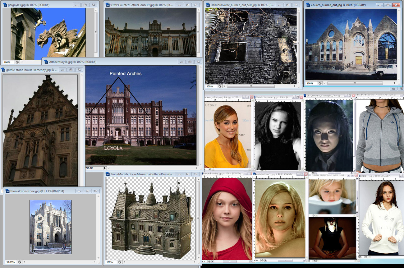
I know a lot of illustrators still book figure models and will take photographs of them before they complete a final piece and there's something to be said about the realism you can achieve in taking original source images.
But I'm in the same camp with you when it comes to basic google image research.
One way or another it's very revealing to see your reference images here. Thanks!
Joey
Thanks for sharing Jason! Great addition to the blog, I hope we'll be hearing more from you in the future 🙂
Thanks for the insight into your process.
Thanks Jason, I've been following your work since before you joined MB. Your ideas and execution are equally outstanding. Thanks for sharing.
Thanks for this. This was a great read because this is one of the jobs that I would like to do. I am going to TAD right now and I don't know which path I will go down, but regardless I would love to do fantasy book covers. Thanks again
-Evan Norman
Thank you for this post – I really loved reading about your process. The cover is really gorgeous.
Really great post. I'm working on a project now (yet here I am procrastinating), and I needed the extra inspiration to keep me focused 😀 Thank you for the information and insight.
Nice, interesting read. I really love the final, the mood is perfect. Man, I would be temped to start painting the final from that sketch though… and I'd probably pay for it later.
And that's my favorite artist 🙂
This was/is my absolute favourite piece from you. It was great to see your references and your different concepts, Just adore this and all your work! Thanks for sharing 🙂
I've been a fan of yours for quite a while, and I always love seeing your process. Thank you for sharing! 🙂
Thank you for sharing it! Ur works are always awesome 🙂
Very interesting and very informative! It's always fantastic to able to see the whole process from someone of your calibre. Thanks for sharing.
@Max West: Sometimes it's not so much about color IMO. In this picture, the main girl is in the foreground (more visual, contrasts in her) while the background withe buildings and ghost tend to have a unified feel, color intensity to it (less contrasty). Great job Chanman!
@Max West: Just read your comment. If you notice, the background has a blue tint, but the girl overall has a lively tint of reds, including her red shirt underneath, which helps your eye focus on her first, and also with the hoodie against the background you can also see what I meant about blue tint vs. the red tint 🙂 I think he was going for a supernatural/night pallet with this painting (my fav from him!) to keep with the haunted ghost appeal, and to make the girl too bright would make her not fit into the background anymore. 🙂 So, I guess you can say that this piece is slightly muted and a bit monochromatic for the over all feel.
Great article, Jason!
Excellent.
I just discovered the articles.
Jason is awesome.