Spectrum 17 is out and it is my good fortune to have the cover image. Especially on a nice white background. (Thanks, Arnie! ) I’m a fan of white backgrounds. Probably an influence from the Saturday Evening Post and a decade of the best paperback covers in the world.
I love that crisp edge against white, and usually with a perspective that keeps the ground at level view, looking at the toes of shoes and upward towards the head. We hardly ever observe this point of view in life, but we feel it. We feel like we take in the entire figure when we see someone coming toward us, but we are really only focused on a very small part. The rest is impression.
I’ve been a fan of the Wizard of Oz story since my whole family sat around a b/w tv set while I was a kid, watching Hallmark Cards sponsor the rerun of the 1939 movie every spring. Every year, my parents would argue about what scenes had been cut from the original. I was alway curious about those left out scenes. I thought my folks were mistaken, until I watched the LaserDisc version that had background material…and deleted scenes. After all, my parents had seen it in a real theater, when it came out. It’s very likely the first version included those scenes in the initial release.
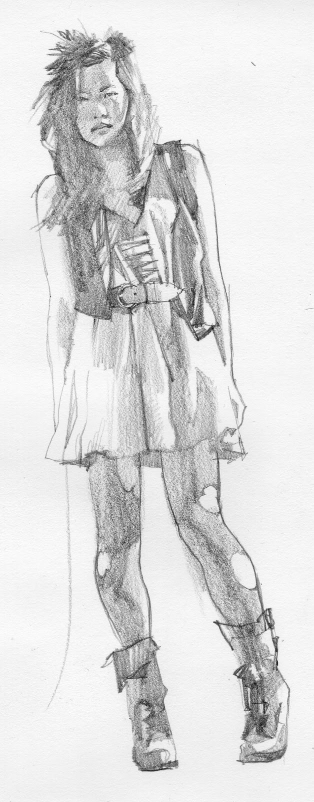
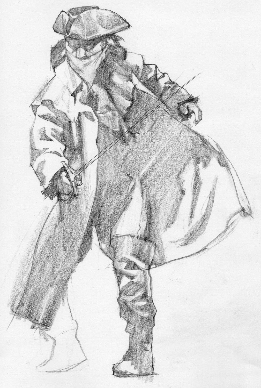
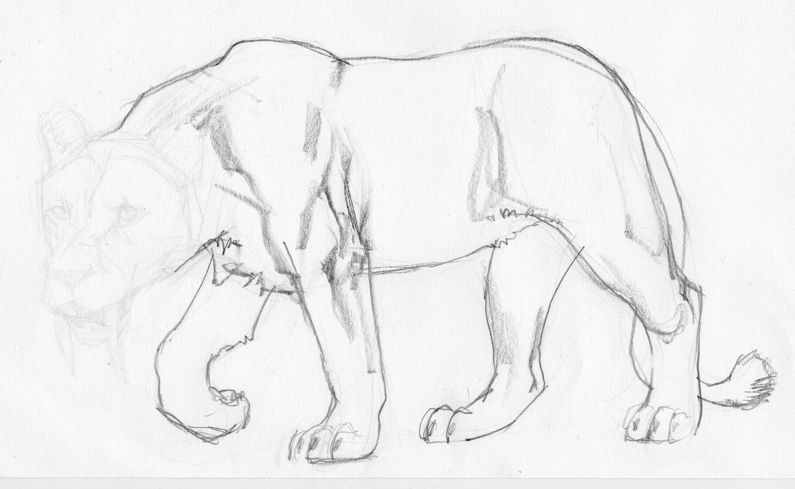
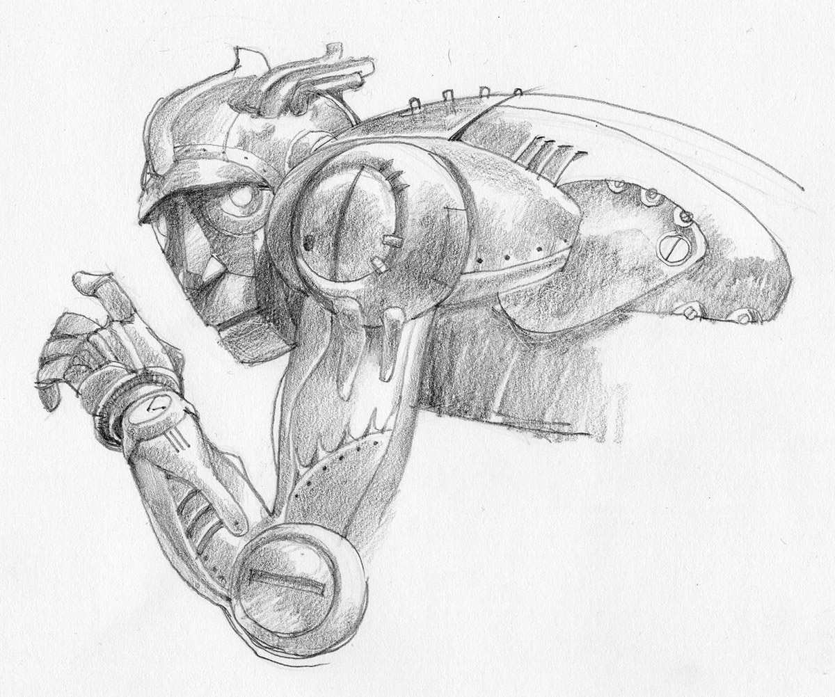
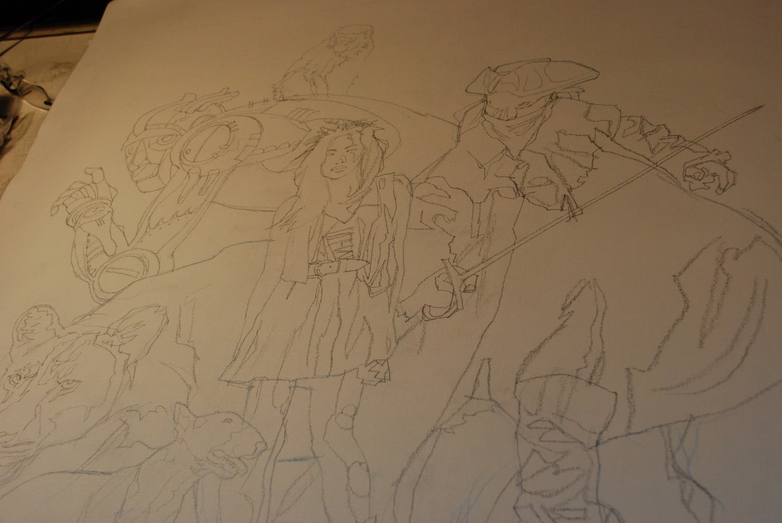
This painting was going to be different though. I wanted to take the basic story premise and change it up. Dorothy became a goth Asian chick, the Scarecrow became a highwayman, the Lion got some cahones and became a saber tooth, and the Tin Man became a robot. Little Toto had to man-up and became a bull terrier. I was not a fan of Toto as a kid. I had a real dog.
I started with Dorothy, moved to the Scarecrow, then the Tin Man, the Lion, and finally Toto. I drew them all separately and projected the individual sketches onto my canvas. I designed it on the wall, building the composition I had in my head as I completed the pencil drawing.
Here’s a shot under the projector.
I brought the prepared canvas to the Illustration Master Class that 9 of us teach every June in Amherst, MA. It was one of two demo paintings I did during the week. We used the W of Oz story for a book cover assignment for the class, but with a slant toward steampunk. What a treat to work with all of the painters and their ideas! One of my favorites (everyone’s really) was our own Justin Gerard. A killer piece.
To start, I sealed the drawing with acrylics, and began painting the Scarecrow. I finished most of it that week, but it sat for about 6 months before I decided to finish it. It was just a fun project for me. I’ve since written two chapters of my reworking of the story. Maybe I’ll get to illustrate my version someday….maybe test out a chapter on you guys here at Muddy Colors!


congratullations for the work!!
I like more the composition and the colors.
The monkey is awesone!! jjaja I love this monkey.
great concept man, and I gotta say Dorothy is looking pretty damn fine there.
Wow… I remember LaserDisc.
Great piece Greg!… love the simplicity. There's enough details to engage the viewer without a background.
The Tin man is my favorite but Harry is right, I think your Dorothy is too superfine to go back to Lamesville, Kansas. She should stay in Oz for a while.
This makes for a stunning cover with the ragged script. I really enjoy your love affair with paint.
Oh, my! This is amazing.
This is fantastic. I like your version of the characters better. I watched this way too much as a kid, and I think with each sitting I despised the characters more and more. I was to see THIS film. Thanks for sharing your beautiful sketches too. Really inspiring work. 🙂
Greg, thank you for posting this exquisite piece of art. I'd like to see it up close to enjoy the brushwork, particularly cool/warm passages on lion's face. It would be great if you could re-do it for some future DVD.
That spectrum cover is really fantastic! It's probably one of the 5 book covers I feel where the added typography really added the finishing touch, instead of being a nuisance!
I've seen the original Wizard in a movie theatre, and it's definitely a different movie than on laser disc, vhf, tv, dvd, etc, and it's not just all of the scenes being in it either.
Congrats to you & Spectrum!
Hey Greg!
Thank you very much for this post. I just want to say that I bought 2 years ago your conceptart.org-tutorial where you painted “Above the Timberline”. When I saw this painting it was crytsal clear to me that “this is it” – I want to learn to paint and I want “to leave details behind” in my paintings, too.
Your painting is my wallpaper on my desktop and I see it everday as a friendly reminder where I want to go with my art and it inspires me every day – I always want to paint when I see it. A real masterwork.
Thank you for that so much. I just wanted to get that off of my chest.
cheers Sascha
Greg! This painting makes me so happy. I was elated when I saw the Spectrum Cover. So well deserved! I've told you so many times how much I love your sense of shape, big confident brush stokes, and your negative shapes. As the comment mentioned above, seeing your work just makes me want to paint. Also, your sketches are almost as much fun as your finished piece.
The flying monkey is just perfect.
He kills me every time I see him. I mean, he really looks like he is about to leap howling off of the Tin Man, and attack someone.
And this is such an elegant and strong design for the Tin Man.
The world needs more of this.
Great. Freakin. Painting.
Thanks, y'all!
When I hear that my work gives someone the itch to paint, I realize that's EXACTLY how I felt when I started out and looked at my hero painters. Inspiration oozed off the canvases like radioactive slime.
I had to get it on me! It is extremely joyful to know that I can pass that feeling on, handing it off.
It's infectious, isn't it? Pass it on…..
Just wanted to say I love this painting! Just found out about the master class and will be attending in 2012. Looking forward to it and thanks for creating Toto as A Bullie!!!