Lord of Chaos
Wednesday, December 15th, 2010
Gregory Manchess
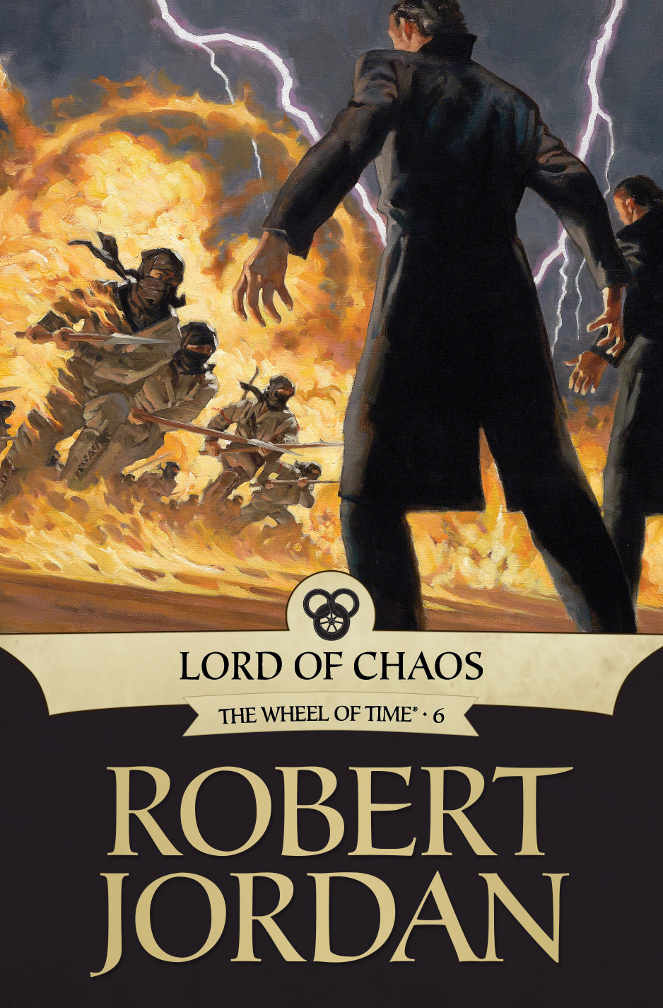
Sometimes, you just have to take the risk, no matter what the client is asking or paying.
Irene Gallo asked me to do the cover for Tor.com’s ebook of Lord of Chaos. A huge battle scene was needed. Gigantic: 400,000 warriors on one field. All of it had to fall within a square format, too.
There was no way. Unless I painted lots of tiny little figures with no scale and no drama, this was sure to fail. So I took a risk. I asked Irene if I could stretch the layout to one side or another so that we could see the entire battle scene. Much like a wrap cover. We agreed I would pick the sweet spot for the cover square, and the rest of the scene we could include in a post for Tor.com where we talked about the painting process for fans of the series.
She was delighted and thought I was taking on too much. I was, but with thirty-three years in the business behind me, and tons of study of action paintings, I decided to go all out. Sometimes, ya just gotta get crazy.
Hold on though. This was no ordinary battle scene. It’s broad daylight, lightning cracking out of a clear blue sky, and two hundred thousand semi-ninja warriors getting barbecued by explosive magic. As I broadened my painting horizon, so did the editors involved and requested more characters be included. Even attacking wolves. What the heck, let’s just throw in the Space Shuttle.
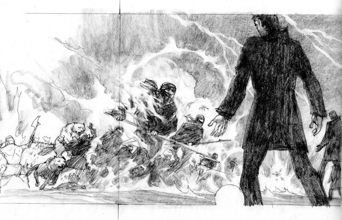
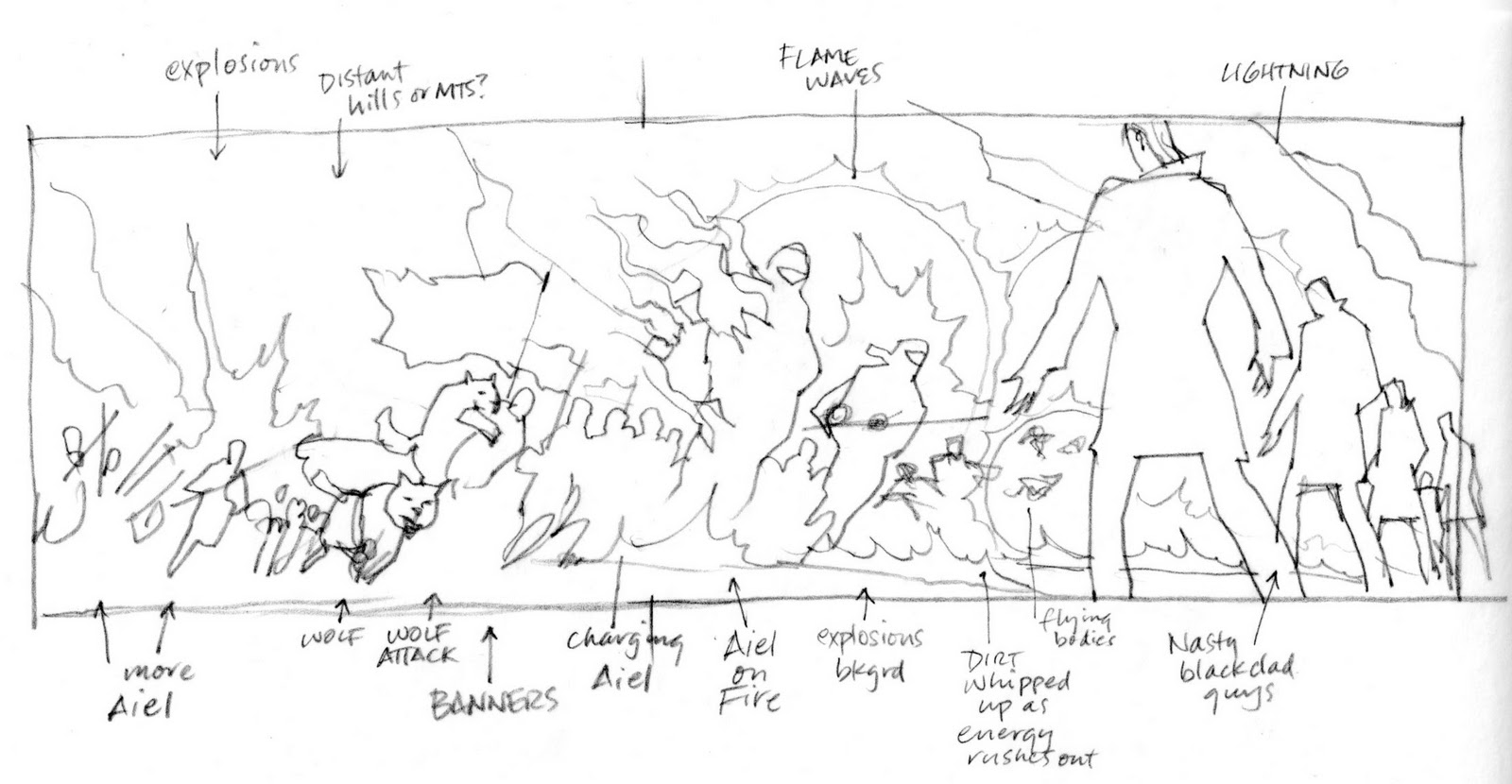
There was so much to organize. I started, as always, with thumbnails to try to work out the point of view. The composition would have to develop from there. I wanted the viewer to be right in there with the main action. Priorities: point of view, sweet spot, then composition. But composition can always trump the other two.
I have my own particular methods when it comes to action scenes. I choose the right perspective, then decide on foreground, middle ground, and background design. Like layers of action within the action. Light plays a major role in illuminating the layers and what I want the observer to look at and where. I control how they will absorb the piece. This is critical.
The black-clad guys have so much power, they stand in a broad semi-circle and blast people into piles of meat. I chose the moment before. Can you blame me?
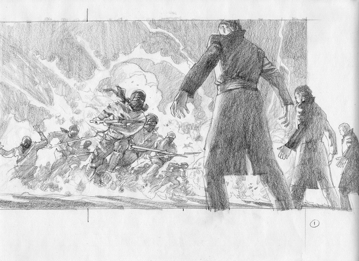
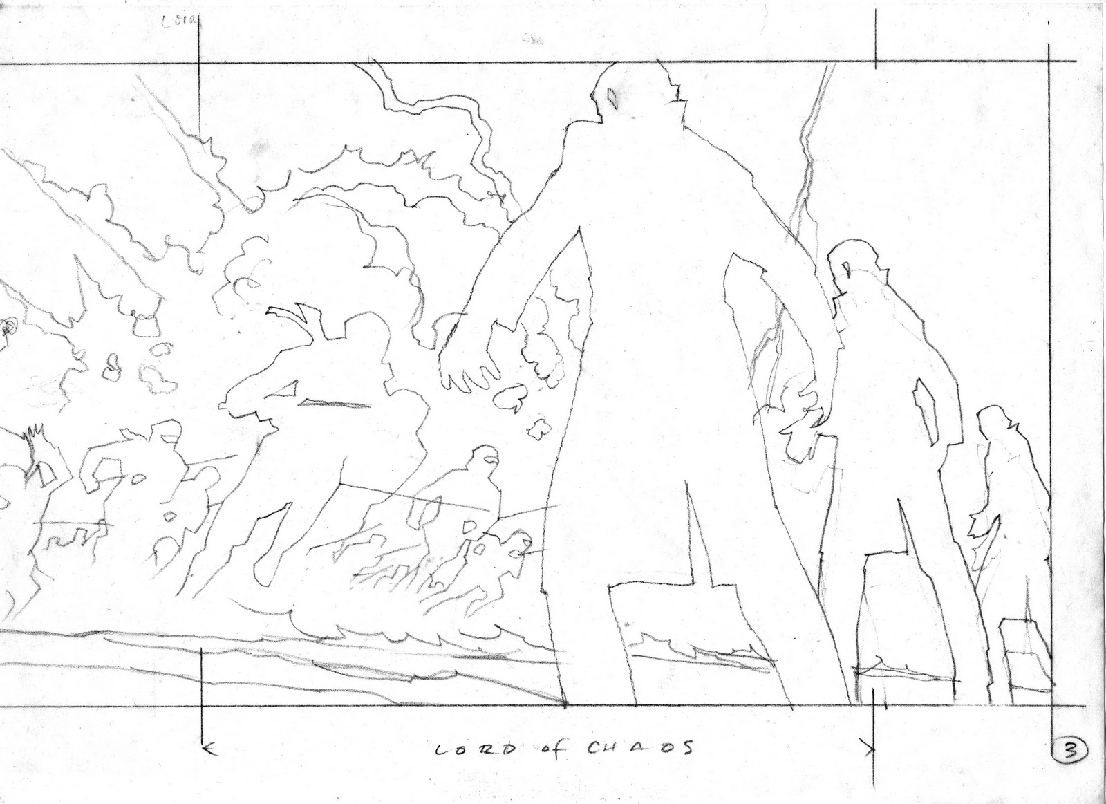
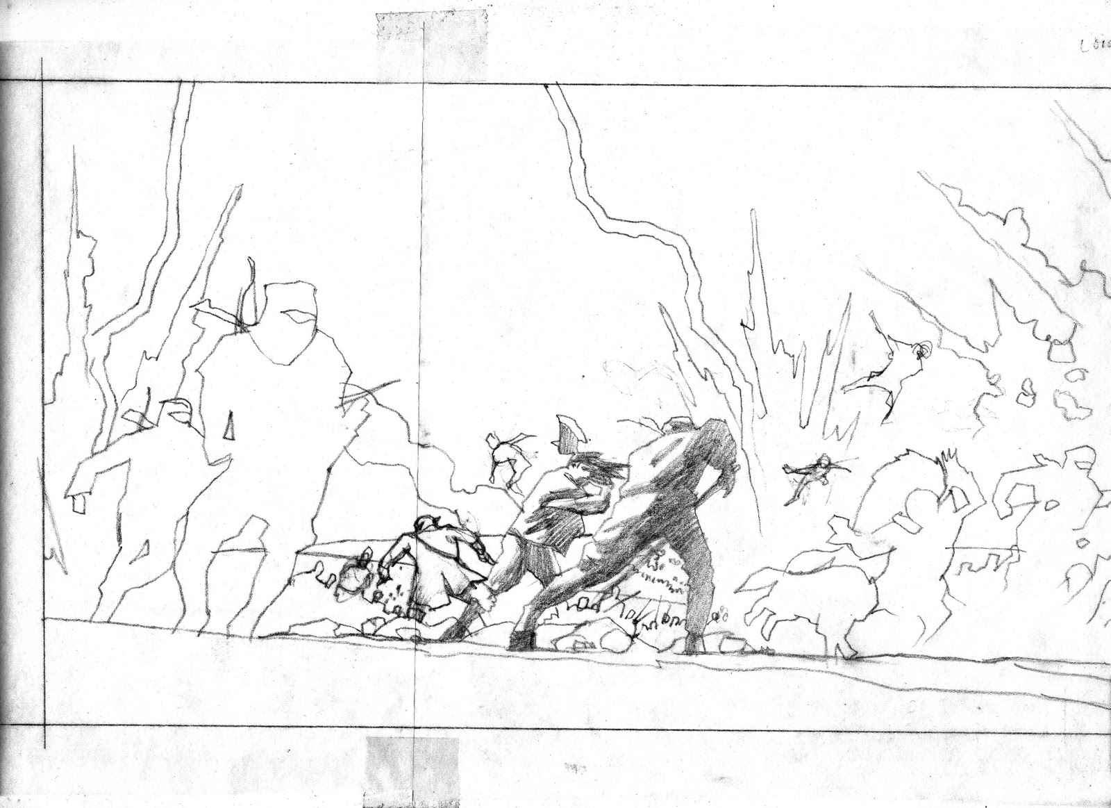
Here’s the cover more rendered as I visualized it out of my head, and another sketch for keeping details straight and explaining what I had in mind to Irene.
I also compose smaller areas within the composition. I call it ‘clumping’ as I group figures within a mass of figures. It is not random, it is planned, but it must look as if it’s random in order to achieve a pleasing design within the mayhem. Otherwise, you get mayhem. Snore.
The finished sketch in two sections.
But it wasn’t right, so I spent over five hours just rearranging figures in the layout. Plus adding some characters. I drew open-line silhouettes of the main figures on separate tissues and moved them around. I suppose I could’ve done this on the computer easily.
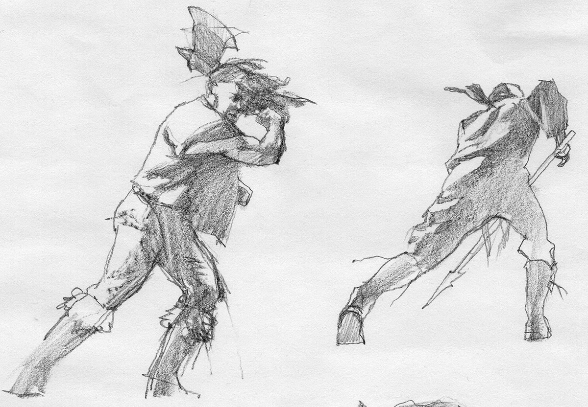
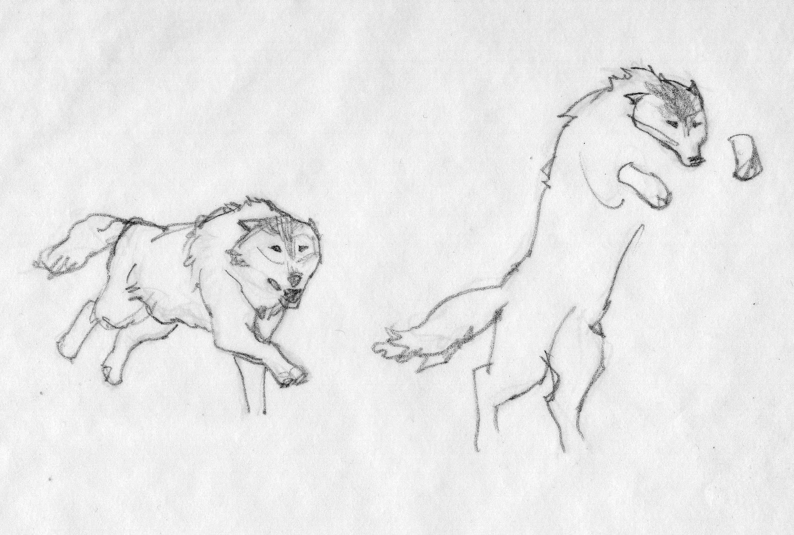
And a couple of studies. I couldn’t find the wolves I needed so I had to freehand them. I shot lots of figure reference: me dressed up and running at my camera. I’d have worked from nature, but I didn’t have the room to set fire to fifty guys in my studio.
I also wanted to test some painting skills by making the painting large. That added even more time, but valuable training. It started as a five foot painting, but ended up being over six feet wide. It took the better part of four days to paint, but not full days. I had other work to do, too. I worked on it mostly at night so I could control the lighting under the camera. Part of the slow down was because I recorded the piece in time-lapse, and I had to fuss with the program that drove my SLR.
Once it was finished I showed it to some illustrator friends. Bruce Jensen did a quick render of the piece in a wide angle view, moving from left to right, like a cinematic pan-shot. Irene saw it and thought it a great way to showcase the full image as a flat scan, ending on the sweet spot for the cover image.
There are more details and explanations at Tor.com’s post about Lord of Chaos. You can watch me paint the dang thing, too, in time-lapse. (Watch closely and you’ll see my animation of one of the lightning strikes on the far left.)
I could be mistaken, but technically, it could be the very first animated book cover. Well, it’s at least the first pan & scan cover.





Amazing!!! Thanks for showing the entire process. A true eye opener!
I watched the time lapse video, which was very interesting. I was wondering, why, on the right hand side of the painting, did you start with the foreground characters and then paint the background, but on the left hand side you did the background and then the characters?
Over six feet wide and less than four days to paint… and you think that seems slow?
Thinking of the troubles I have with mixing the right colour even when I'm working from life makes it so insane that you just start somewhere with a colour, and it's completely right. I can only hope that is something that comes from years of experience, and not some kind of magical gift only bestowed upon the worthy… I think I will stick to doing colour studies for the time being…
Phew….I think I'm going to sit down now and let the awesomeness sink in.
That's odd….I didn't think about where I started on parts of this, Mjade!
Thanks for pointing that out. But I know why. There's no formula here. I start with the main point that makes sense. I wanted to paint the extreme darkest dark in the beginning so I could calibrate how to mix the values for the subtle colors against the insane bright fireball values.
On the left side, I had to establish how light the background colors would be so that I could figure out the right values of the foreground figures running.
That probably sounds complicated. It's not. Most times, it's just how I see it in me wee head, and I have to start with something that establishes the value range. So most times I start with what I know for certain.
Which leads me to David's comment. Just ask me what I think about talent sometime, D. You'd get an earful. It does come from experience and focused practice…all of your life. It is not some kind of gift, and it is not some kind of magical gene responding to stimuli, or some DNA coding.
Whatever little 'talent' spark we believe is inherent in certain children is basically drained of energy by the time we reach adolescence. Whatever happens to continue that 'gift' is entirely up to that person. This is based on some very hard evidence which is coming into the light of day (thankfully) by study after study by neurologists.
There is no guarantee that the talented child will continue to innovate creatively into adulthood. In fact, most children stall out and put their 'gifts' to rest.
There is much to be said for the determined mind that is attracted to skill and training. I continue my training every dang day. Every time my pencil hits the paper, or my brush hits the canvas.
There is a ton of research out there on this very stuff. We all want to believe in the magic. I do not. And neither does a whole slew of scientists working on this. Magic comes from practicing so much you are just. that. good.
I may write a post on this subject sometime soon. A LOT of artists are counting on the idea that they are gifted, touched, enlightened. When in fact they are just trained, and would rather have you believe they are something so very special. There's a lot of ego involved.
Don't fall for it.
Greg,
Excellent post as usual and happy to see you on the cover of Spectrum every day when I pick it up to browse. In regards to your comment thank you for bringing the concept of talent into light again. Whenever I hear someone say that someone I admire is talented I feel like it is a dismissal of many years of training and practice. I couldn't agree with you more on this point.
Not much of an artist myself, but fan of the series I have to say: This picture is very near perfect with regard to the book(s). It has the dynamic of fierce battle and the gruesome onslaught of the Asha'man in it. Very good work, thank you.
I wonder where the Aiel on the “good side” are, though.
As both an artist and as a fan of the series, I am amazed to see all of the work that went into this piece…wonderfully rendered, and I like the wrap-around concept which is being used already for the hardcover issues. I wonder though when you say the finished piece was 6' long….typically how large is a standard dust jacket piece? I had no idea that these were done on such a large scale!
To the blog owner,
It would be nice if you could use your graphic knowledge and change the contrast between the background and the text so that the content is easier to read of these blogs.
Hmm. Acrylics, it looks like?
Raphael…I've not read the series. I read a bunch about the Aiel and was intrigued. I got the impression they were all “good,” just at different times?
Shawna…in my studio days, we used to do everything twice-up of what it would be as print size. Sometimes that just seemed too large to me. But when I started more painterly work, I found that the larger size was quite freeing. Then again, sometimes I'll work closer to the print size so that the brushwork stands out even more. It's really based on how you want the finished printed piece to look.
As far as this painting was concerned, I wanted to test my skills and heap challenges on myself to hold it together. It also gave me a chance to get some information into the smaller elements, like some of the background warriors and the landscape.
I admit, I took on too much. But in the end, it worked. I'm stronger for the experience now and know that I can take on other unique projects because of it. It's how I keep training.
All oil paint….on pre-primed linen.
Greg,
A couple of months ago James Gurney mentioned your lecture on the “talent gene” on his blog. I'd love to read more if you'd like to elaborate further. Great post.
Thanks a lot for sharing!
Really love your work and style!
Congratulations for this piece!
Impressive, Gregory!
About the oils: so, did you use any medium to fasten its drying time, or just “alla prima”?
I love the painting, it would make a really nice poster.
My grandkids will know about you sir!
Greg,
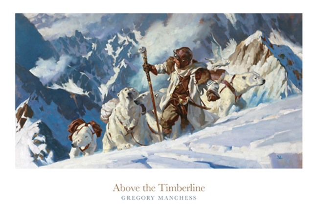
You painted this one on Pre-primed linen but was this stretched on a frame? On your “Above the Timberline” tutorial it looks like you're working at drafting table rather than an easel and it looks like stonehenge or some other heavy paper. Is that right?
Warning, WoT spoilers aheader!
Really!
Greg, the main bulk of Aiel is “good” in the sense that they follow Rand. The Shaido and some others break apart and defy him. In the scene you have drawn Shaido attack a track of enemies of Rand (actually they hold him captive) in order to kill him. Those Shaido are in turn attacked by forces loyal to Rand that want to free him (You painted Loial, Perrin and wolves and I thought there were Aiel with them, too, but I may be wrong). The Asha'man appear literally out of nowhere in the last moment and safe Rand from the Shaido Aiel. You see, it is a multi-layered battle.
I have to ask this then, when you paint these as larger images, what do you end up doing with the originals? Are they yours and you just have them in storage or, as in this case, does the final image belong to Tor Books and they keep it? Just curious….I used to want to be a dust jacket illustrator when I was young and have always been fascinated with how it all “comes together”.
Thanks for the marvelous post!
Shawna–
Greg will have to answer regarding what he does with his originals, but to answer your question about ownership these days: the artists, maybe 90% of the time, retain their original art as well as their copyrights and are selling only first reproduction rights (or reproduction rights for a particular project with multiple format options) to publishers. It wasn't always that way: book, comics, and magazine publishers would routinely keep the originals (and do whatever they chose with them: store, sell, give away, or destroy) and copyright the art in their name as part of the package. That started to change in the late 1960s…slowly, but change it eventually did. The comics field still practices work-for-hire and retains all rights to the art featuring characters they own, but they return the originals now. Film and advertising clients still tend to keep originals AND copyright, but there are exceptions—and those clients usually have to pay significantly more than the average fee to retain either or both. Unless you're on staff for, say, ILM or Disney etc., in which case the company owns everything.
Joey: watch the video again and you'll see where I explain that I'm working on pre-primed canvas. Comes in a roll. I use acrylic double primed because it's flexible. I lay that down on my drawing table and paint from there. It's like painting on panel. Only, after it's dry, I can roll it into a tube for shipping. I'm not a fan of stretched canvas for painting on. I don't tickle paintings. The brush responds better when it bends and drags. I stretch the canvas afterwards.
Shawna, I have stacks of canvases laying in flat files. Hundreds. It's great for storage as I can get about 40-50 paintings in a drawer because there're no stretcher bars.
And….what Arnie said! Right on.
Greg,
Oh I see it now. It makes a ton of sense keeping paintings flat in files. Looking at the usual stack of stretched canvases in my own studio makes me feel rather wasteful with space.
Looking forward to the next post!