I used to work at a studio of illustrators. One of our catch phrases at the time was, “generally, your first impression for an illustration idea is the right one.” Logic follows that if I just put down one sketch, it would likely be better than any that followed. And of course, this isn’t real.
The impression of the idea may be correct, but the solution is rarely so. It takes exploration, and as soon as I find a great solution, five more pop into my head. Each one leads to another. They start slow, then cascade. Solutions evolve.
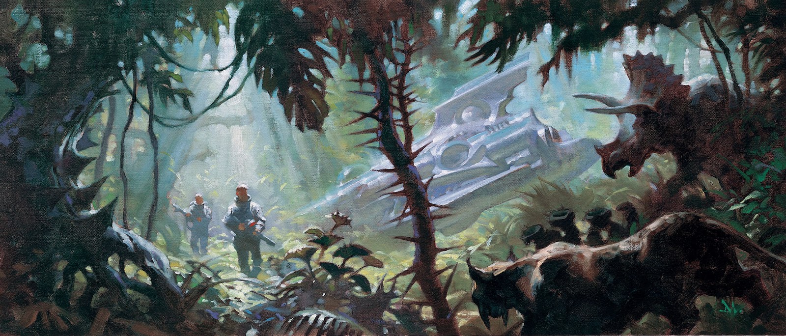
“The Sky People” was done for Irene at Tor Books. The story, by S.M. Stirling, sounded lush, fun, and a bit nostalgic. Here’s the mysterious planet Venus of long ago, full of steaming jungles, dinosaurs, mammoths, crashed spaceships, and lost airmen. I wanted to get this one right.
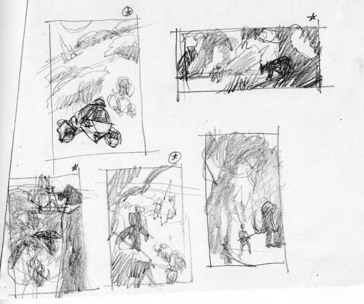
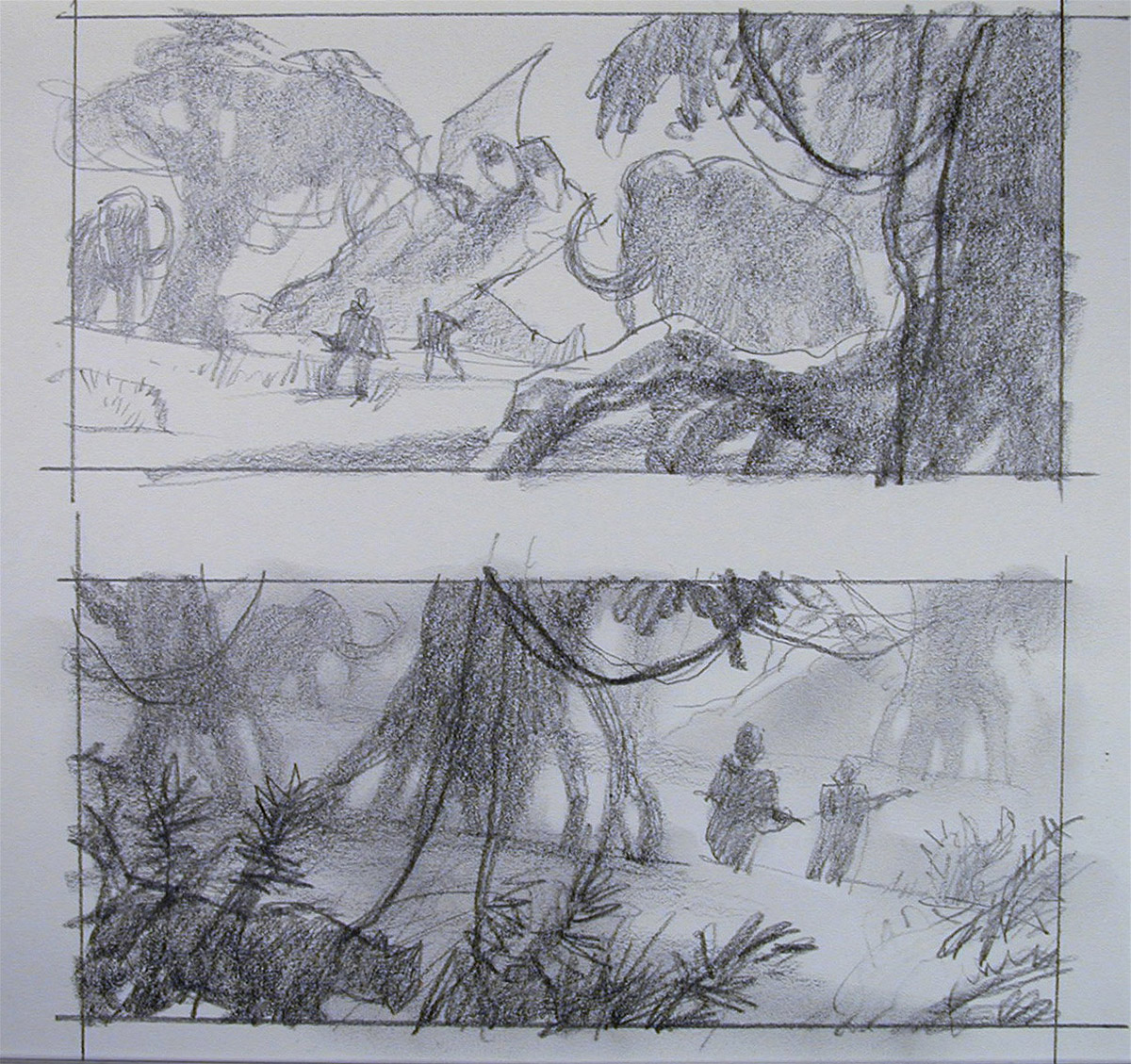
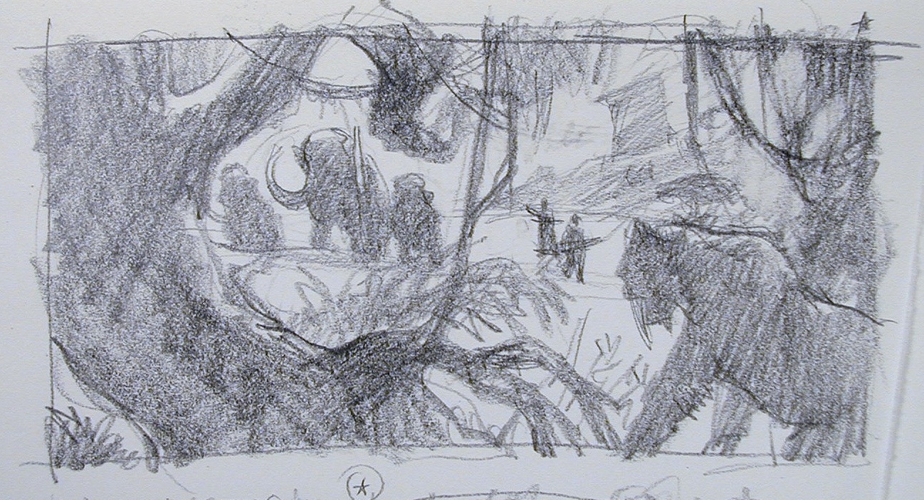
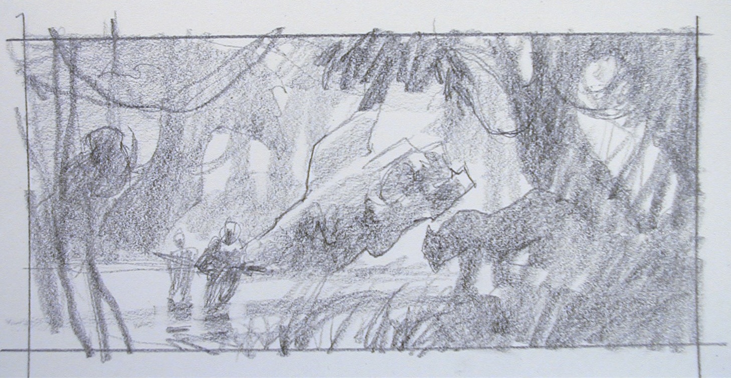
Below are the beginning thumbs, with a star over one of the sketches, upper right on the first page. I came back to that one. I didn’t know it at the time, but the idea developed toward that one. One of the first.
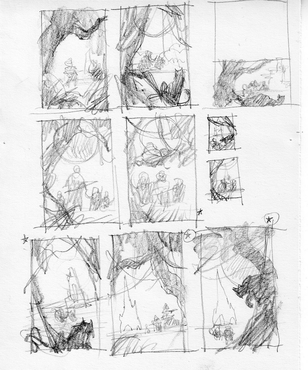
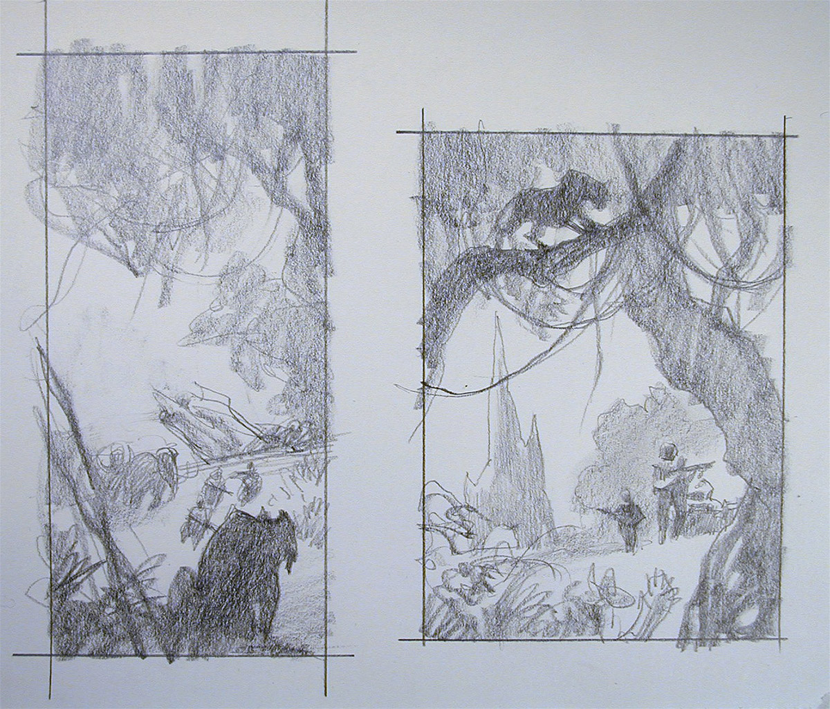
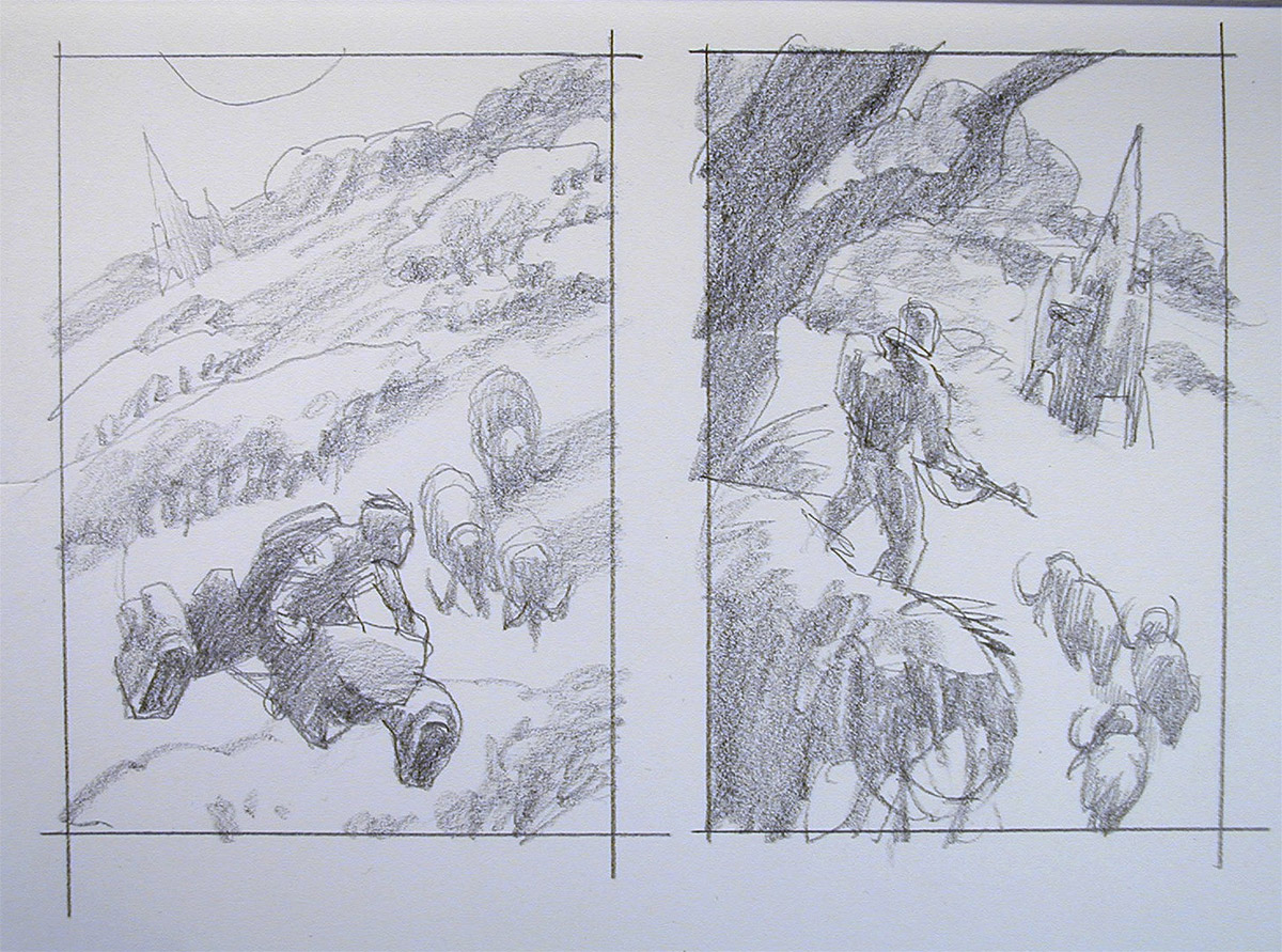
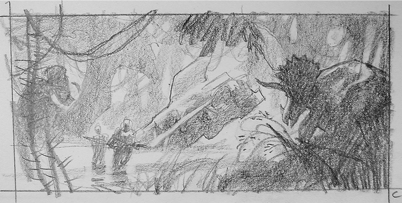
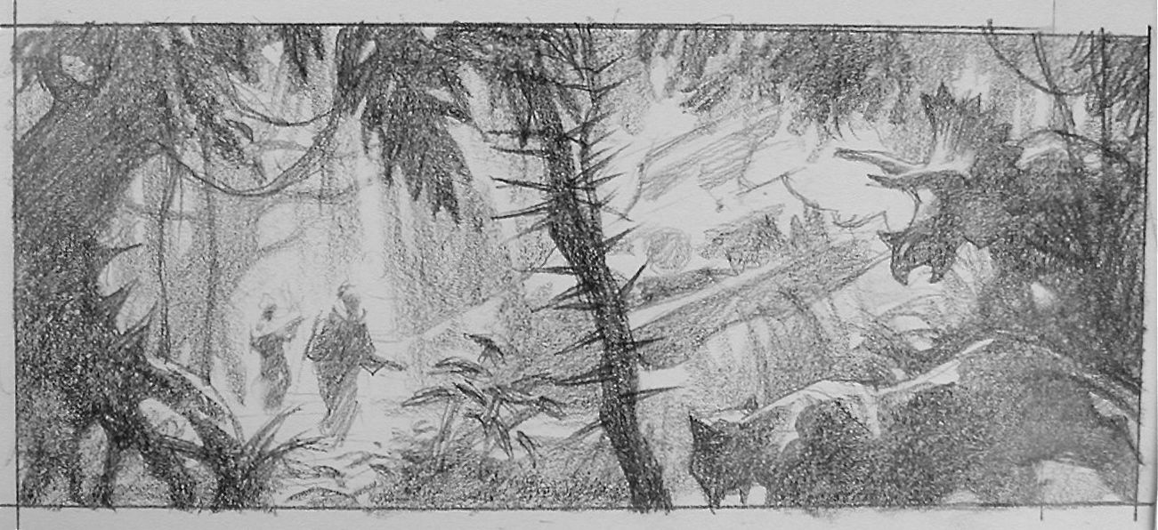
These are the sketches as they evolved, freely drawing from my wee brain, searching for the right composition, the right balance of elements, the right atmosphere. It’s work to find the right balance. As soon as I had one down, I had two more in mind, waiting to get sketched. I explored horizontal formats first as I like the cinematic feeling. Verticals may have solved the problem just as easily.
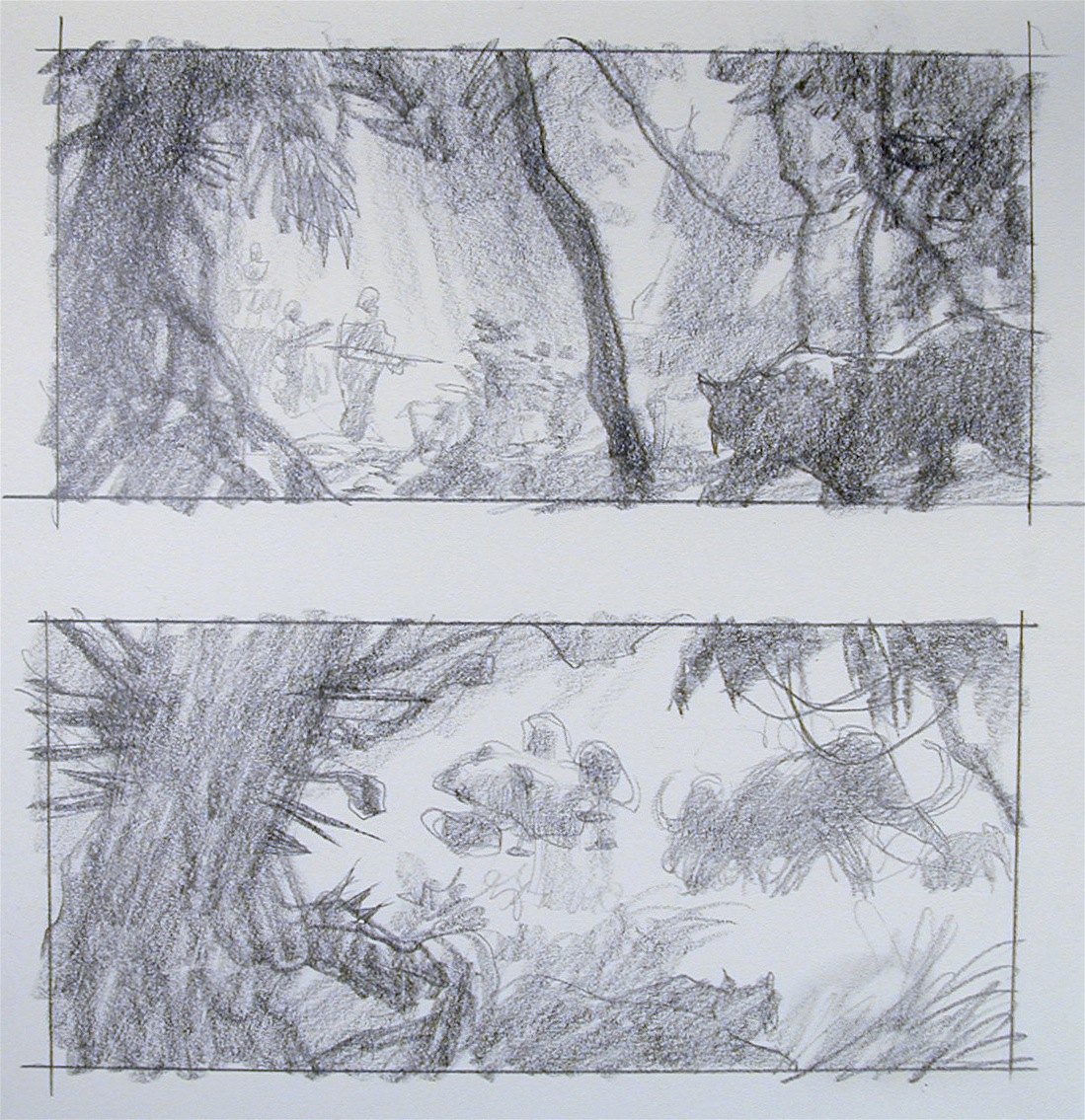
I finally narrowed it down to two sketches that got combined with the first sketch above. I still wasn’t quite sure, but I had to make a decision, trusting that I’d done enough to really know what I wanted to see. I had it in the beginning after all, but I still needed to explore.
I shot some quick reference of me under lights to get the right effect for the figures, and projected this loose sketch onto the canvas.
One key factor that solves any problem of ‘illustrator’s block’…just start drawing. Ideas come from action, not drumming fingers. Most times, one needs to draw more. It starts with thumbnails. Same for writing. Don’t know what to write? Start typing.
Ideas are cheap. Solutions, divine.




Great post, Greg. I love seeing artists advocating a focus on exploring every aspect of an image and concept with a pencil before jumping into a final piece.
What a relief to so so many thumbs for one illustration. And I thought I was the only one putting pressure on the environment by wasting paper.
I really like the idea of “When in doubt, just draw” I usually do that with colororughs: make to many and then: “arhh shit, I´ll go with this one”, grabbing one from the pile.
Nice reading Greg.
I'm curious if you ever do colour sketches, or if you always just see what you need to paint in your head? I remember in the video of you painting above the timberline you just sort of started with one colour and went on from there.
Wow Greg, what an illuminating post! I love seeing the roughness of your thumbnailing; I often have sketch envy from other illustrators since I spend more time building things than keeping agile on my draftmanship. Seeing someone who produces finishes to your level create thumbs that are a study in composition above all else is very eye-opening.
Thumbnails are not only handy for getting ideas down, but it helps you to be sure. I understand that the great Howard Pyle was said to do 50 thumbnail sketches for just one idea. He said that even if the first one was right, he wanted to do 49 more just to be sure.
I've been thinking about a t-shirt design that says, “Draw First. Think Next.” Most conceptualists and fine artists will argue tooth and nail that it's the other way around. And they would be mistaken.
No, David, I usually don't do any color studies. I'm hoping to use digital for that, but I just can't seem to put the time into that as much as improving painting skills! More important. Yes, I get a clear picture in my head before I do any final work. And I won't pick up the brush until I know exactly what that has to look like. So my color studies are all mental.
Cool point about Pyle, Max! There are always so many ways to go. I encourage students to fall in love with thumbnails as soon as possible. I had to consciously do that in my career. I purposely set out to make thumbnails that I liked to look at. This only ramped up the energy to do the final piece. I'm still working very focused on thumbs.
And why don't we teach these things in art school? Huh? HUH?
Lame.
Priceless.
But the problem is when it's not you who picks out the right solution for composition but some ego-driven AD and makes you paint stuff that you KNOW is wrong, right? At least, that's what happens to me often.
Beautiful! Thank you for sharing your process 🙂
Well Kan, ideally you show the AD the options you would be fine with, after choosing from many thumbs. Ideally, hehe…
Thanks once again fro showing us your process Greg! The final image is yummy! Great colors!
I think you had some balls to put that crossing line dividing your composition in two.
I remember seeing this piece for the first time and wondering that it had all the energy of a cool thumbnail in a finished painting. Maybe that's why you love thumbs so much. Your paintings are big beautiful thumbnails.
Man, Ive always loved this piece Greg. Such a great homage to classic Sci-Fi and planetary romance. Carlos beat me to it but like he said, it sure does take some balls to split that comp like that. Ive always been curious about this choice. Your thoughts on doing this?
These are such great examples of thumbnail evolution too. It drives me nuts when I tell students 5 thumbnails are due and they moan and groan about the work load. I might have to direct them to this post and have them read up. Great post Greg, thanks for sharing!
Great post! I echo the comments from some of the others above. I have always loved this piece of yours as well. It is nice to see the thumbs and learn how it evolved into the finished painting.
Awesome piece. I picked it as my paleoart of the week in this post…
http://chasmosaurs.blogspot.com/2010/12/mesozoic-miscellany-9.html
Beautiful stuff, and I'm really enjoying this blog.
Thank you so much Greg! I find this process the most interesting in looking at other artists. This is really the essence of the painting, I think the importance of this stage really can't be stressed enough.