Gregory Manchess

In The Courts Of The Crimson Kings, by S. M. Stirling
Wednesday, March 9th, 2011
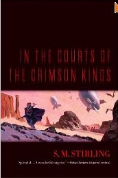
This is the companion book to The Sky People that I showed earlier on Muddy Colors. Irene Gallo at Tor Books art directed. We had established a format with the first book, so we kept to the same banding across the bottom of the hardback cover.
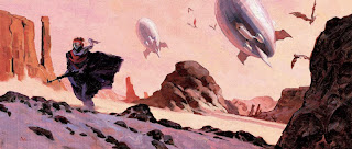
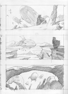
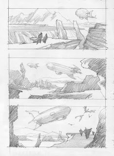
Both books offered a chance to paint nostalgic realism. Counter to a very steamy, pulp-like image of Venus for the other book, In The Courts Of The Crimson Kings takes place on Mars. After discussing what was needed, with Irene, I started as always, with a load of thumbnails, freely sketching from my head.
Thumbnails seem to be the bane of many artist’s process, mine included. Early on in my career, I hated the way mine looked so I focused on becoming better at it. I spent many years working on them for each job.
A better thumbnail can drive a much clearer painting to finish. I discovered that the answers are always in the prep time, and the thumbnails are key. Once I know where the image is going, the painting becomes just a necessary step to complete.
I was torn between the very first sketch above and this last one. The last one seemed lonely and desperate, and just right for a shadowed foreground with a hot background.
The landscape was made up from a bunch of rock reference and shots I’ve taken over the years. I followed the thumbnail to the letter on this one. In fact, I projected the drawing directly to my canvas and went from there.







Greg,
Thanks for sharing your thumbnails. Before seeing yours, mine tended to be very sketchy with basic shapes representing the picture's elements. Now they emulate yours, with the elements going from darker to lighter as you progress from foreground to background. This mini-tonal study really helps to establish depth early on and gives me instant organization of the elements.
DAMN Greg, there's some thing so nice and therapeutic about looking at your thumbnails. I can almost imagine elements like the airships and clouds drifting across the picture planes
Wow, I actually with above comment. Pretty, pretty thumbnails!
Just wanted to let you know how much we value you sharing your process and time with us on the site. It always helps other artists a great deal to see just how an artist they're a fan of goes about putting together a great painting. I was wondering when you take your drawing and project it on the canvas are you using an overhead projector or an opaque projector. I ask this because your thumbnails from what I can tell seem to be on regular printer paper or sometimes tracing paper.
Thanks, all. It's nice to hear these comments because they not only tell me I'm on a good track, but they inspire as well!
I must admit, the thumbnails shown here are a bit farther than I go sometimes. But I had the rough series for Sky People to prime me for getting right to some more rendered ones on this book.
If I can get in the right zone, where the pencil feels comfortable and the page feels right, I can pump out thumb after thumb and it's just flat out exciting. Later it becomes confusing because there are so many solutions to use. Ideas are a dime a dozen. More on that in another post.
Rebel Man: I constantly study other artists' methods…ancient, near past, contemporary, and young artists. One thing I study is their quick studies with regular pencil. Stunning abilities lie in the simplest designs.
I was never taught to thumbnail, but I remember a pro telling me at one point that planning is important. It took me years to understand and use it to full affect. Not because I didn't agree or comprehend it, but because I couldn't face it. It was one of those learning curves that seems daunting at first because it challenges your skills immediately.
Once I made the decision to do the work, it got better quicker than I expected. But I'm still practicing….
If I were an art director I would love to have you as a client, these thumbnails give such a concise and varied range of possibilties. I guess that's why you've been so successful 🙂
I love these thumbnails!
For some reason I always find the pencil work more fascinating in some ways than the painting. Drawings seem to lay bare the thoughts and intent of the artist more clearly to me.
I've had an image of this painting saved to my computer for a while now, and I kept trying to remember who did it since I forgot to put your name in the file name.
For some reason I was always thinking it had to be from the 60's or 70's because of the handling and retro feel. The handling should have clued me in.
Great work!
At a glance, I thought the thumbs were a comic in progress. They all read amazingly well! I would buy a book of these in a heartbeat. If you published a book of sketches and thumbs, you'd get my money.
Those thumbs are great – so clean!
Hmmm….a book of my sketches, or a comic of drawings…..
Gotta think about that!
Thanks, all.