Firstly, let me say… ‘Wow’.
There have been some amazing submissions to the Art Order Challenge. We will be critiquing some of these submissions both today and Monday. There are nearly a hundred submissions at this point, and we obviously can’t address them all, but we will try our best to get to as many as we can over the next 2 days.
The Muddy Colors members were asked to simply pick whatever pieces caught their interest. As such, there will be some pieces which receive multiple comments, and some which may receive none. This should not be taken as a comment on the quality of your work. It may simply be that we didn’t see any major issues with the piece and feel you should continue as you were. Further more, because there are multiple people critiquing, you may find that a lot of the comments reinforce one another… or contradict. Please keep in mind that every critique is essentially an opinion, and as such, we are all entitled to our own. You are free to accept, or ignore, any suggestion we might have. I also implore our readers to chime in on any pieces they’d like to address in our comments section. No need to worry about hurt feelings, just keep your comments constructive and sincere.
To start us off, our local LoTR expert Donato Giancola, would like to address a few issues in general.
Donato writes:
Wonderful sketches by so many artists! I am truly impressed and inspired.
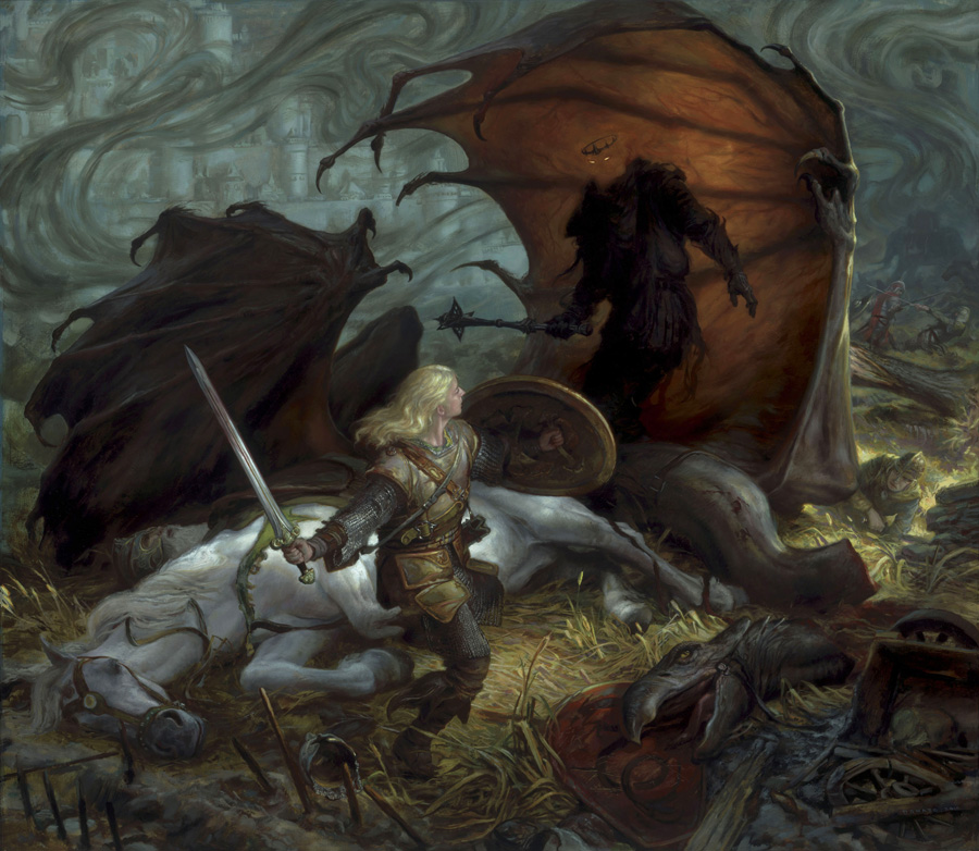
To lead off, this should not be an illustration based upon what we all saw in the movies. This should be from your own heart and the writings of J.R.R. Tolkien. While we cannot help but be influenced (I certainly was!) by the beauty on screen, the interpretations of those artists and Peter Jackson the director are just one way to look at how Tolkien wrote about these characters. Please look at my comments as from an art director and hard core fan, there are specific conditions to consider when working from the narrative of the Lord of the Rings. You can of course interpret the scene any way you truly wish, but as a commercial illustrator, you also need to hit certain chords so that your clients (and fans) know that the content is illuminating the story and not just a fanciful creation broadly interpretating the story.
To start with, please do not McDonald’s Super-Size the winged Beast (or any other creature) as if out of the movie. I know it is a personal nit pick, but I have to raise the issue.
This recent aesthetic development in fantasy and science fiction art to supersize objects and people makes my stomach turn. Far too often I see size as a poor substitute to generate fear, threat and mass. The real challenge as an artist is to some how make a normal person look massive, or the winged beast appear threatening through staging, composition, lighting, shadow play, camera angle, foreshortening, etc. Challenge yourself and your viewers.
This size issue was one of the biggest downers for me in the movie. The winged nazgul, the balrog, Sauron, and the oliphants looked like they were under the influence of American Steroid Consumption. As if size was the only reason and way for these creatures/people to generate fear. Use size in an intelligent fashion, and it will become your compositional friend! Anyone who has been attacked by a dog, knows that it is not the size of the creature that puts terror into your heart, it is the ferocity, speed and knowledge of the threat which does so. Think about these issues when you are composing the scene.
So…
Tolkien writes that the Nazgul were men. That means likely they are ~ 6’ tall.
The winged creature was small enough to:
‘settle upon the body of Snowmane, digging in its claws, stooping its long naked neck.’
You can of course interpret it openly, but the movie creatures size would make it hard pressed to settle upon a horses body without totally crushing and covering it.
Another detail regarding the beast is mentioned by Tolkien:
‘…striking with beak and claw.’
As much as we all love dragons as lizards with teeth, it appears Tolkien imagined this beast as beaked. That does not exclude teeth, but certainly seems to suggest otherwise.
Another movie issue was the helmeted Nazgul. Tolkien clearly describes him as thus:
‘A crown of steel he bore, but between rim and robe naught was there to see, save only a deadly gleam of eyes: the Lord of the Nazgul.’
Lose the helmet if you have one.
The battle took place on the Pelennor Fields, south of the road leading to Osgiliath from Minas Tirith, with the sun rising from the East. It is Spring time.
Again, there are truths to the writings that you need to consider as a professional and work with as constraints when considering composition and detail. Many of the artists have consider most and all of these details. If you have not, then it is time to revisit your sketches and art.
Lastly, after all these considerations, you need to make it look ‘Cool!’, ‘Inspired!’ ‘Compelling!’
And you wonder why I go gray considering illustrating Tolkien? 🙂
Best of Luck,
Donato
*******************************************************************************************************************************
Now onto the Crits!
Greg Manchess writes:
There are many designs here that are working very well, and of course, many that are still struggling to get the visual to be dynamic. I’ll say right up front: forget about trying to be so clever. This is a specific scene, with specific elements that are doing specific things according to the author’s vision. It also happens to be familiar to many viewers.
Stop trying to pull something so clever that no one’s ever seen. This is not the time for that. You have to show certain elements to get the scene across, so it already limits your range of ideas. What you want to work for is trying to capture that moment, no matter how many times it’s been portrayed, in exactly the way you would like to see it.
Ask yourself: is this how I’d really want to see this scene? Or am I trying to impress people to say, ‘wow, that’s so original’, or ‘wow, that’s so clever’, etc? Give that up and show us how you see this scene, no matter if you think it looks like something you’ve seen before. It has been done a LOT, so don’t worry about it. Give us your gut feelings, and it will take the piece farther, make us intensely curious about it. That’s creative. That’s original.
With that in mind, I’ve chosen a bunch of the ones that are definitely working well. Hopefully the comments about these pieces will help the other ideas take on better life.
First realize, the brain looks at something and generalizes the situation: “what is that?” then it gets specific: “oh, it’s that.” This happens very fast. In that split second, you must capture interest. The best way to get there is through composition. It immediately sets up the brain to WANT to ask more questions next. In other words, it becomes curious. THAT’s when you start telling the story more specifically, and NOT before.
Last comment. I’m not an expert on this scene of Tolkien’s, but it occurs to me that the Nazgul doesn’t realize that she is a SHE. By showing her revealed, fighting the battle exposed as a beautiful blonde, you ‘give away’ the crux of the scene. Consider showing her as more masculine, but with small touches to allow us to know it’s a woman.
**************************************************************************************************************************
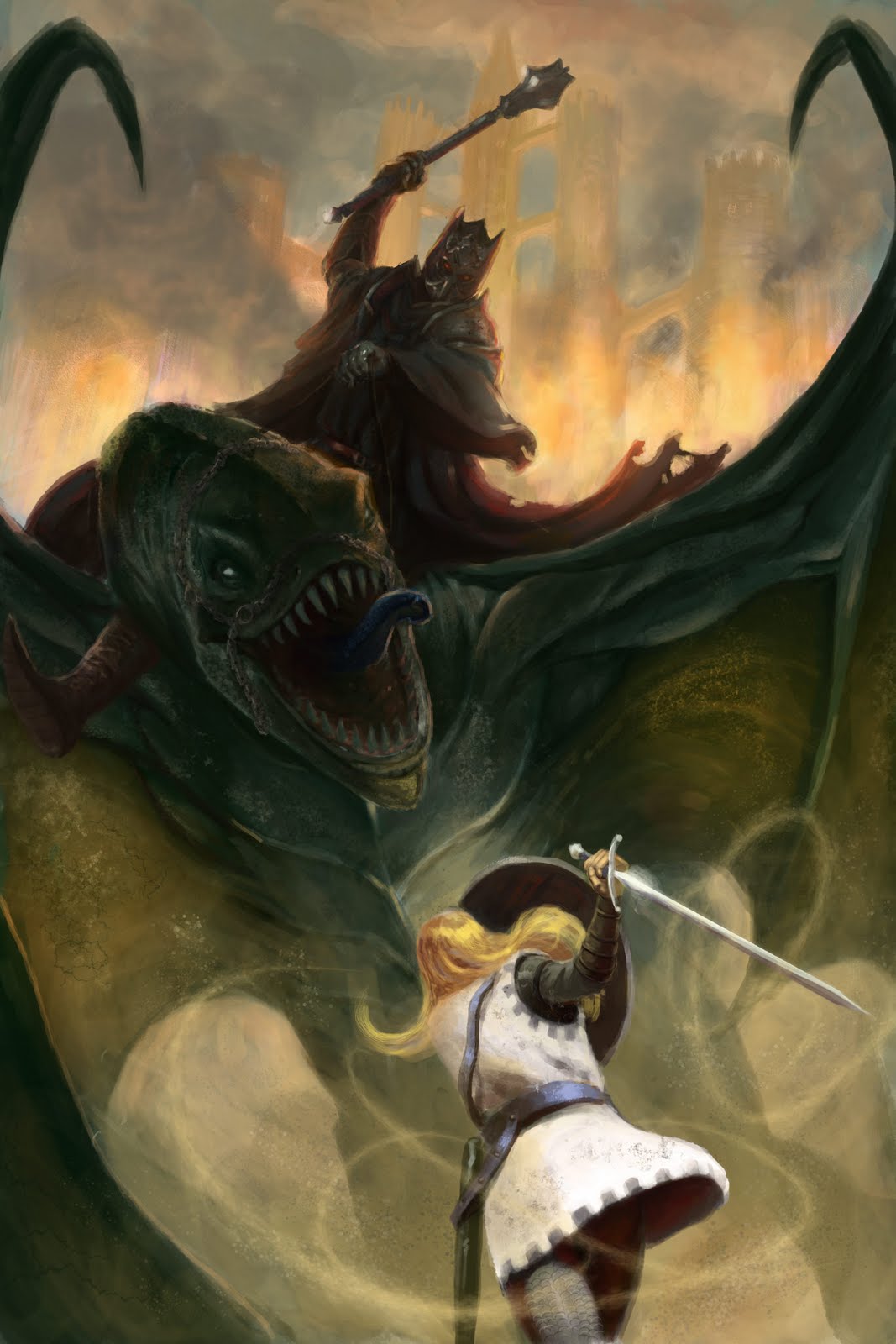
GM: This composition is great. You’ve adjusted it to get right in there, to show us that we are part of the action. Eowyn is close enough to see necessary costume detail; we look over part of the dead horse without having to see the whole thing; cropping the dragon enough to get the impression of it’s fierceness is key; and lastly our eyes sweep upward and downward from Eowyn to Nazgul, Nasgul to Eowyn. Everything is dynamic, in motion, even the dragon’s foot. Keep refining it.
DDS: I really like this composition. The strong angle add a great sense of drama. Though, like any compositional element, even angles need to be balanced. Right now, the Fell Beast’s back wing is what is saving this piece from sliding right off the page. That opposing angle helps ‘anchor’ everything. Try adding a few more opposing angles… perhaps the clouds, or something on the horse.
**************************************************************************************************************************
GM: This composition is powerful, and even though we have to work harder to understand it, we’re already interested enough to do so. I would adjust Eowyn so that her pose is seen a bit more, and definitely leave that one legged pose out. She needs to be in motion more. I would lift the Nazgul’s head to face her.
DDS: I know it’s still early, but just be certain to make Eowyn beautiful. Despite her guise, she should not read as a man AFTER looking carefully at the image. I think you can also increase her head size a bit in order to make he body look more slight and feminine.
**************************************************************************************************************************
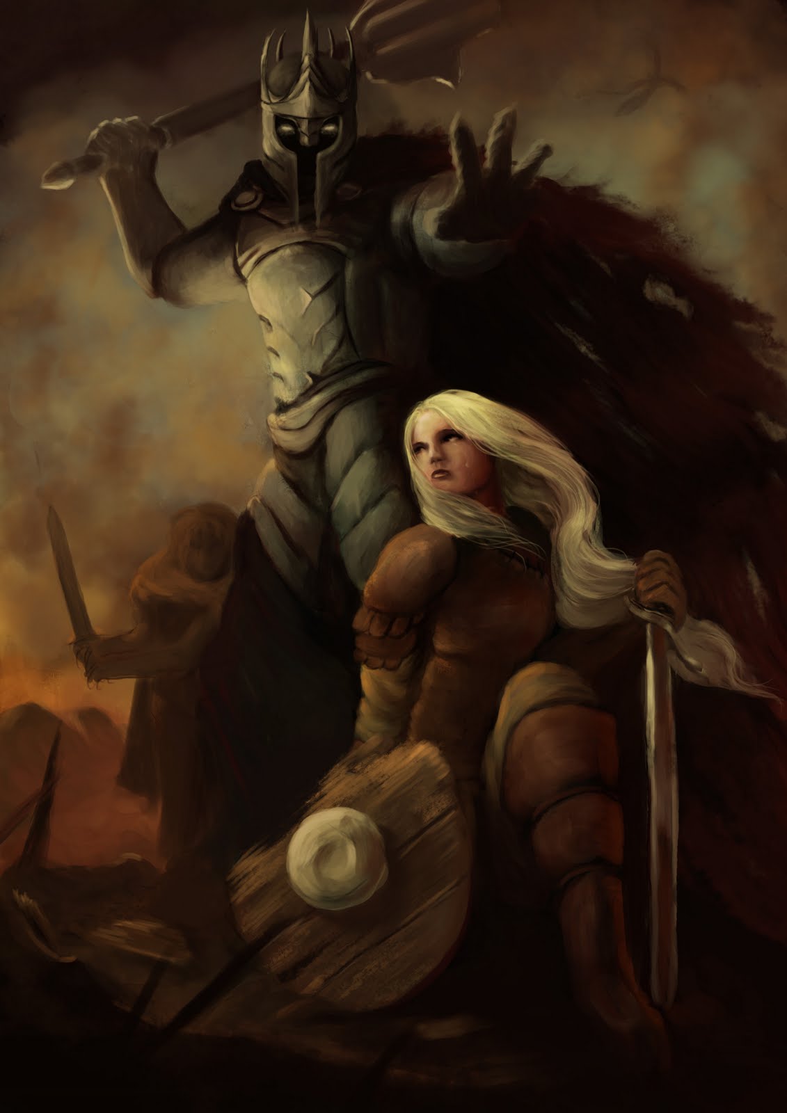
GM: Once again, the upsweep from Eowyn to Nazgul is just right, following a line that pushes our eye into the scene. Excellent. The angle on the dragon makes it huge and menacing. The figure of Eowyn, however needs to come much, much closer to the viewer. We should be standing behind her, or as a fallen comrade looking up at her challenge. I would rock the Nazgul’s mace to angle more backward behind his head. This will give it weight and become scary.
DDS: My only comment would be the Fell Beast’s wing. They don’t look anatomically sound. Even though your canvas may end, you still need to KNOW what lies beyond it’s edges.
**************************************************************************************************************************
GM: This was one of the first sketches, and I think nailed the general idea early on. Our eye runs from Eowyn to Nazgul and back, as the others. The major problem here though is that Eowyn has absolutely no interesting angle or gesture and so becomes dull immediately. Find a better angle to show her strength. I would suggest slightly below and behind, as some of the others.
DDS: Like Greg suggested, refine Eowyn’s pose. Not only does it lack drama, but what she is doing doesn’t make sense. She is 2 seconds away from getting her arm bit off. Make us feel like she is about to f*ck that that beast up!
**************************************************************************************************************************
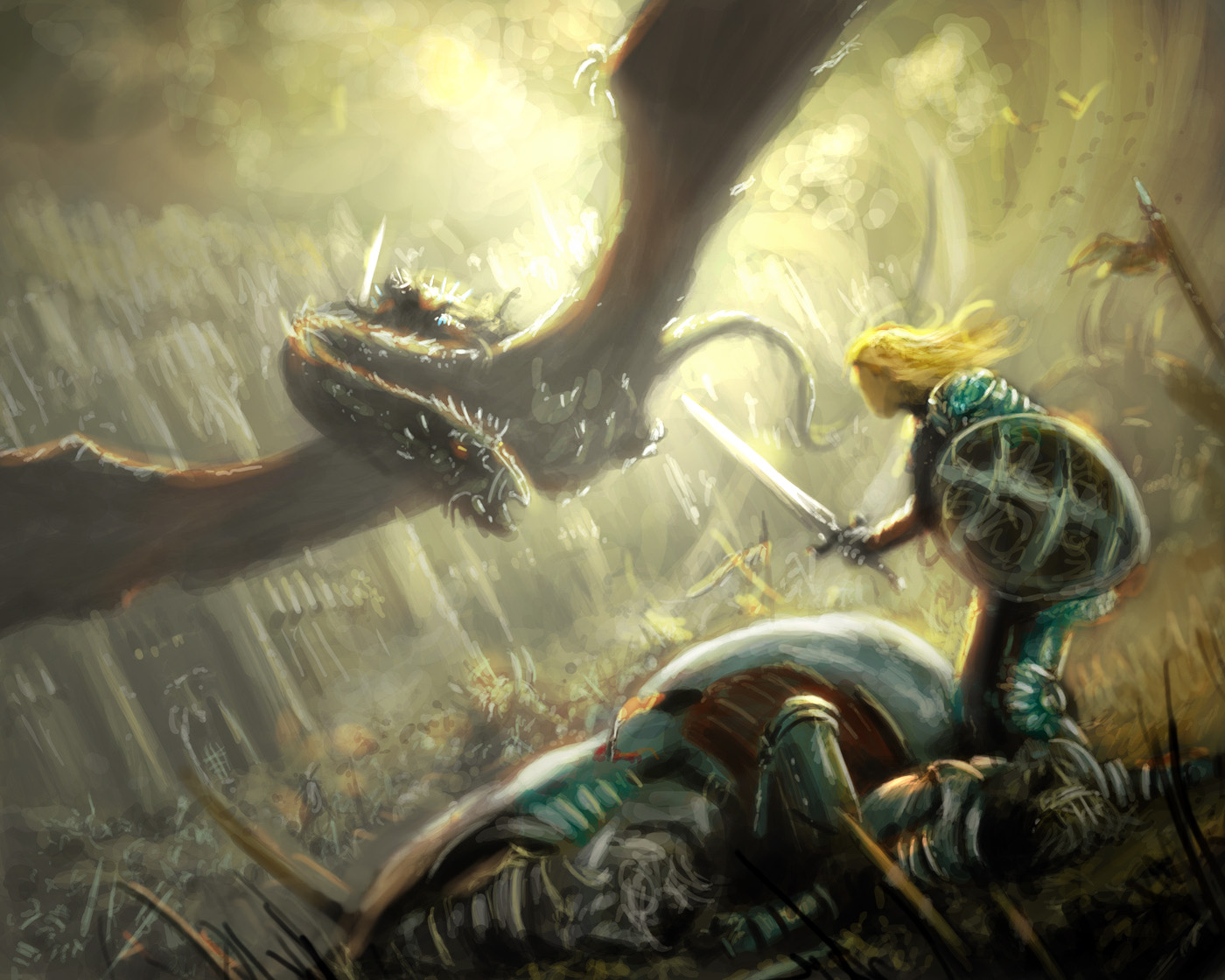
GM: Another strong compositional start, but we need to come into the scene: a simple zoom would work well here. Zoom in to your main character, Eowyn, without losing whatzizname on the ground. If we can’t get something close to us, the whole scene becomes average, and tells nothing. Get in there!
DDS: Great start, but your value structure is really killing it’s potential. Consider what a simple restructuring of your values can do for it’s impact and drama. Paint-over below:
 |
| Increase contrast at your focal point, and diminish contrast to create depth. |
**************************************************************************************************************************
GM: Excellent design. We’re pushed in for complete character studies, while at the same moment experiencing the action and fright and struggle. The composition line drives our eye right into the painting. There’s no looking away. Only thing to work on here is getting the subtle actions to be not so expected. See if you can get Eowyn more off balance to add power and fear. Don’t forget to put the same love into those background figures. Right now, they are sleepwalking in battle. Make them dynamic. Find your poses.
DDS: I know you’ve revised Eowyn’s pose a few times, but it’s still off. She needs to be focusing on the Nazgul. As is, something off to the right just caught her attention and now she is going to eat that mace.
**************************************************************************************************************************
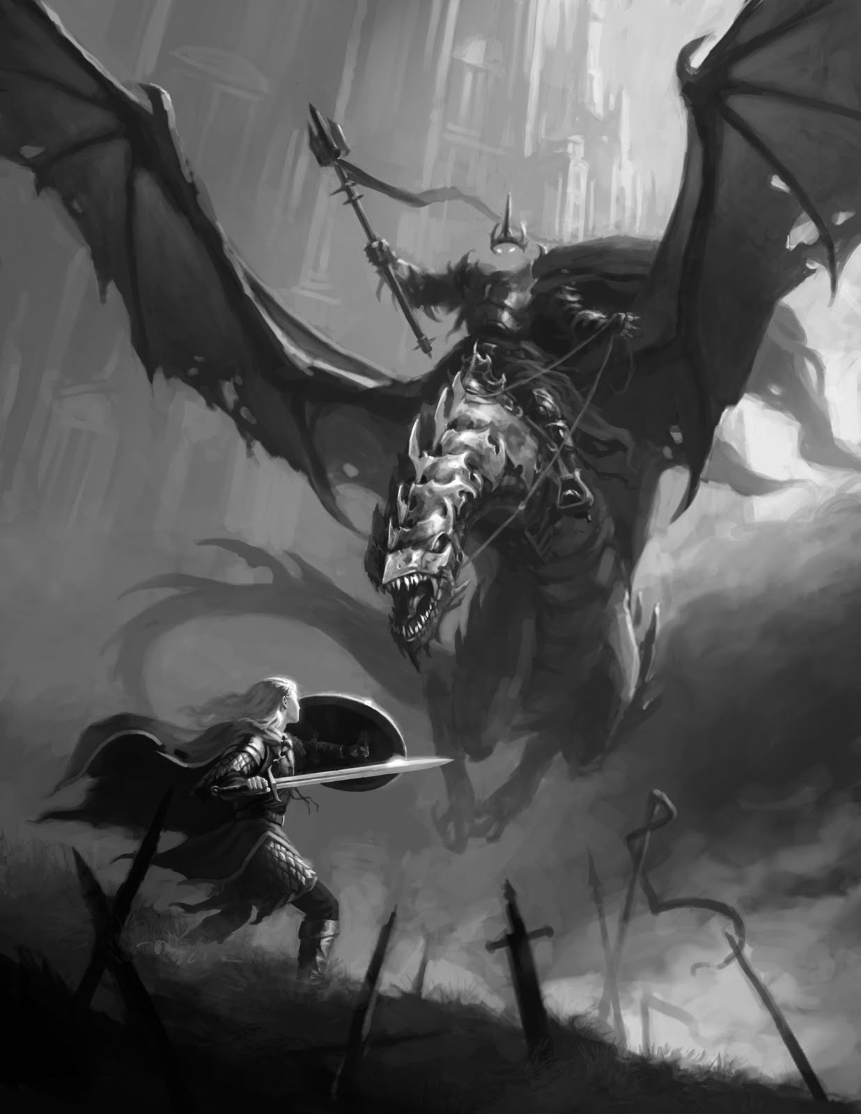
GM: Really strong piece. I feel the dragon hovering. Great. Now….get your (our) ass in there! Let’s look past some of the sword hilts while we look just beyond and up to the Nazgul….and later, the castle thingy.
DDS: Uh… yeah. That’s pretty good… I guess.
Seriously though, just add something more interesting to the ground, be it wounded soldiers or whatever. A sword stuck in the ground with no body next to it seems a bit cliche and way too convenient. Your obviously better than that. Give us something that adds to the story, not just meet compositional requirements.
**************************************************************************************************************************
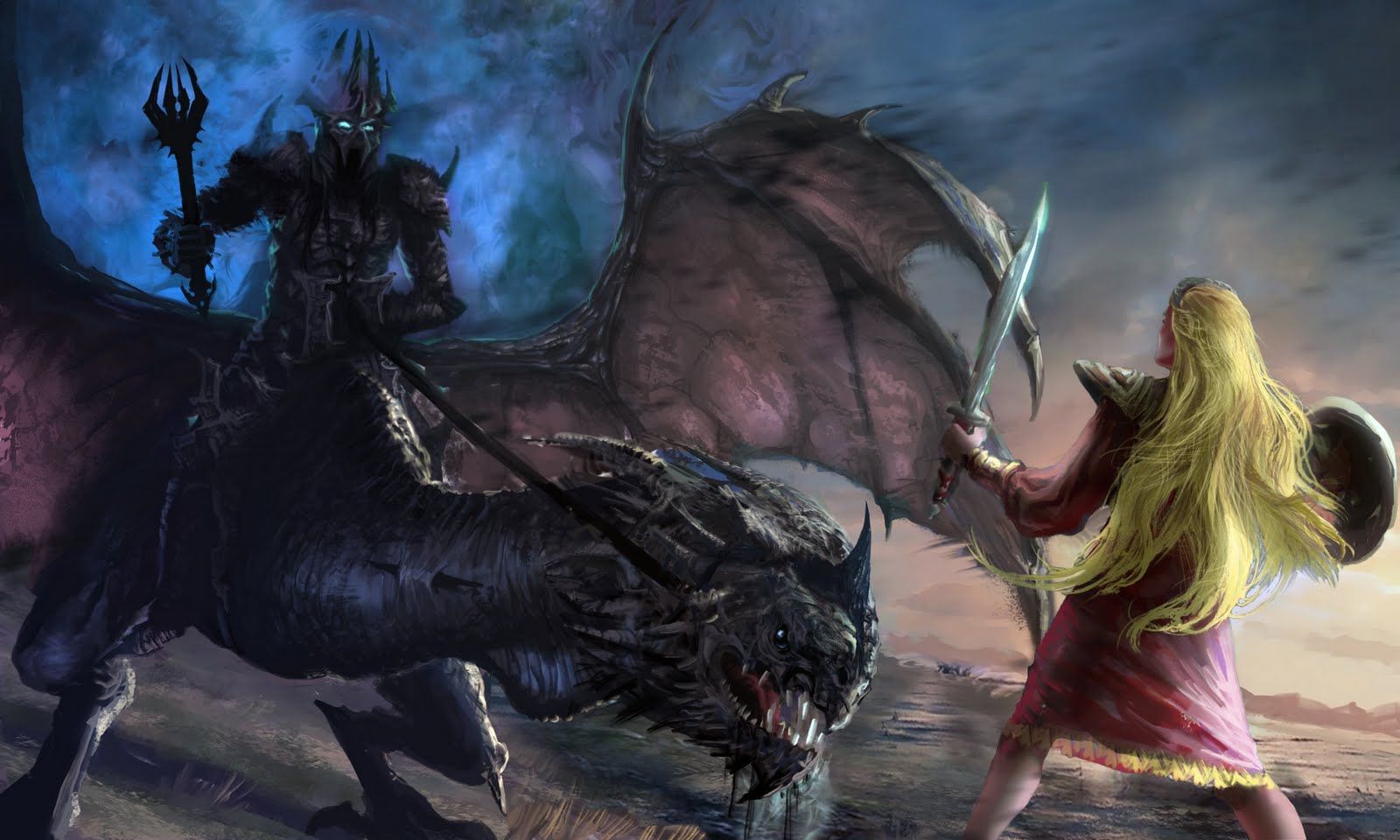
GM: Strong composition, but suffers from almost becoming wallpaper. The dragon is great and menacing, and really has that neck getting close. Love it. But then there’s poor Eowyn, fighting in her nighty again. First, get her in some real battle gear, and second, let’s get closer to her.
DDS: Get that shield off the edge! Move Eowyn a few inches to the left, and widen that wing so it frames her head strategically.
**************************************************************************************************************************
GM: This is strong, but in a typical Frank Frazetta, golden triangle, everything-in-its-place-and-nothing-out-of-place composition. I do like seeing everything here, but on this one I would recommend adjusting elements for size. Try getting Eowyn to overlap part of the pyramid center stage, maybe even get the dragon to come closer to us; give her sword a real swing and not a I’m-showing-you-my-sword feeling; and puh-LEASE get that dang castle closer and into the composition! Great start though.
DDS: Watch your scale. Everyone is too similar in size. Push people forwards and backwards in space so that you can adjust their size. ‘Scale’ is one more tool in your compositional arsenal, and you’re just not making the most of it.
**************************************************************************************************************************
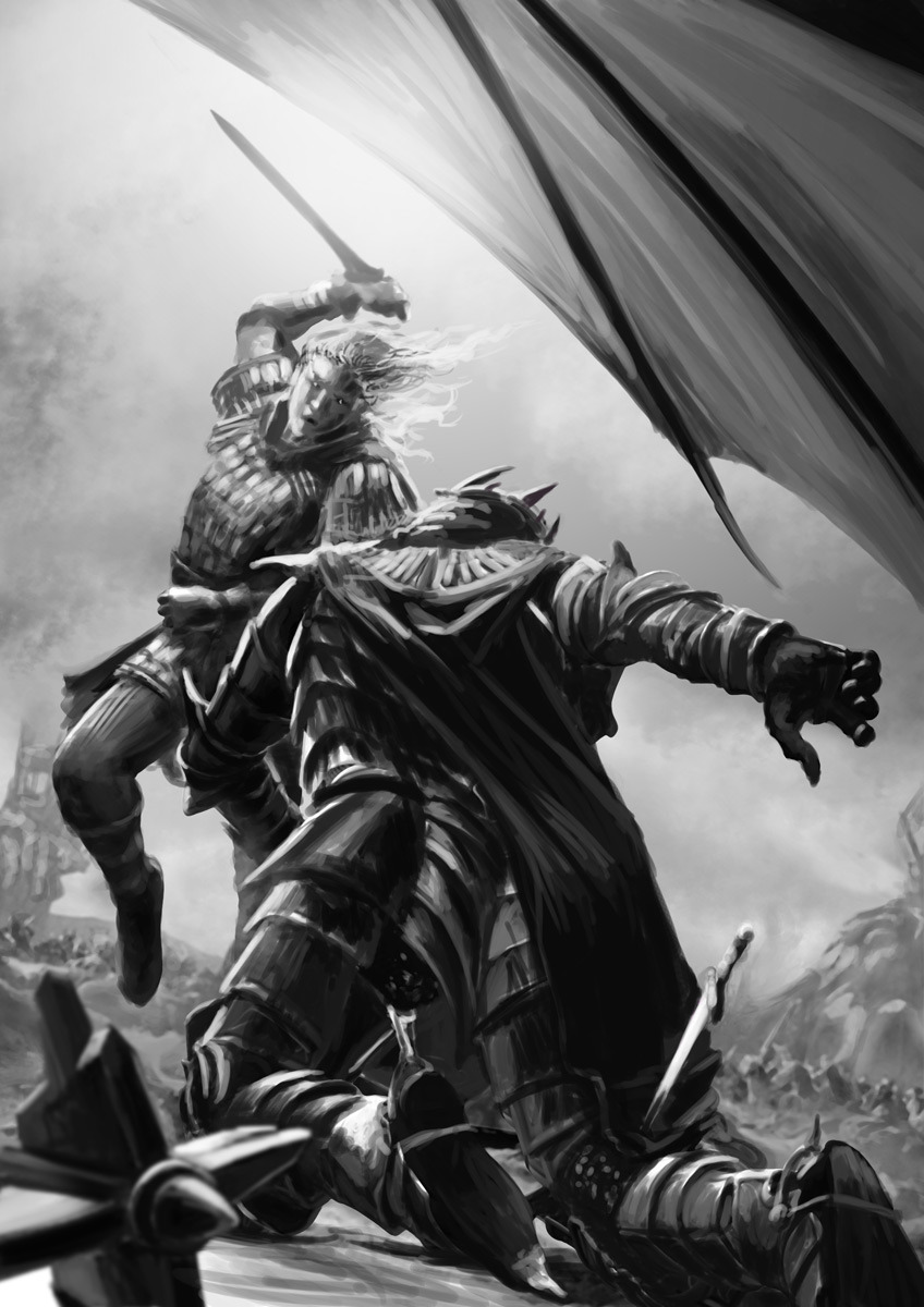
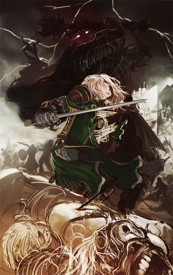
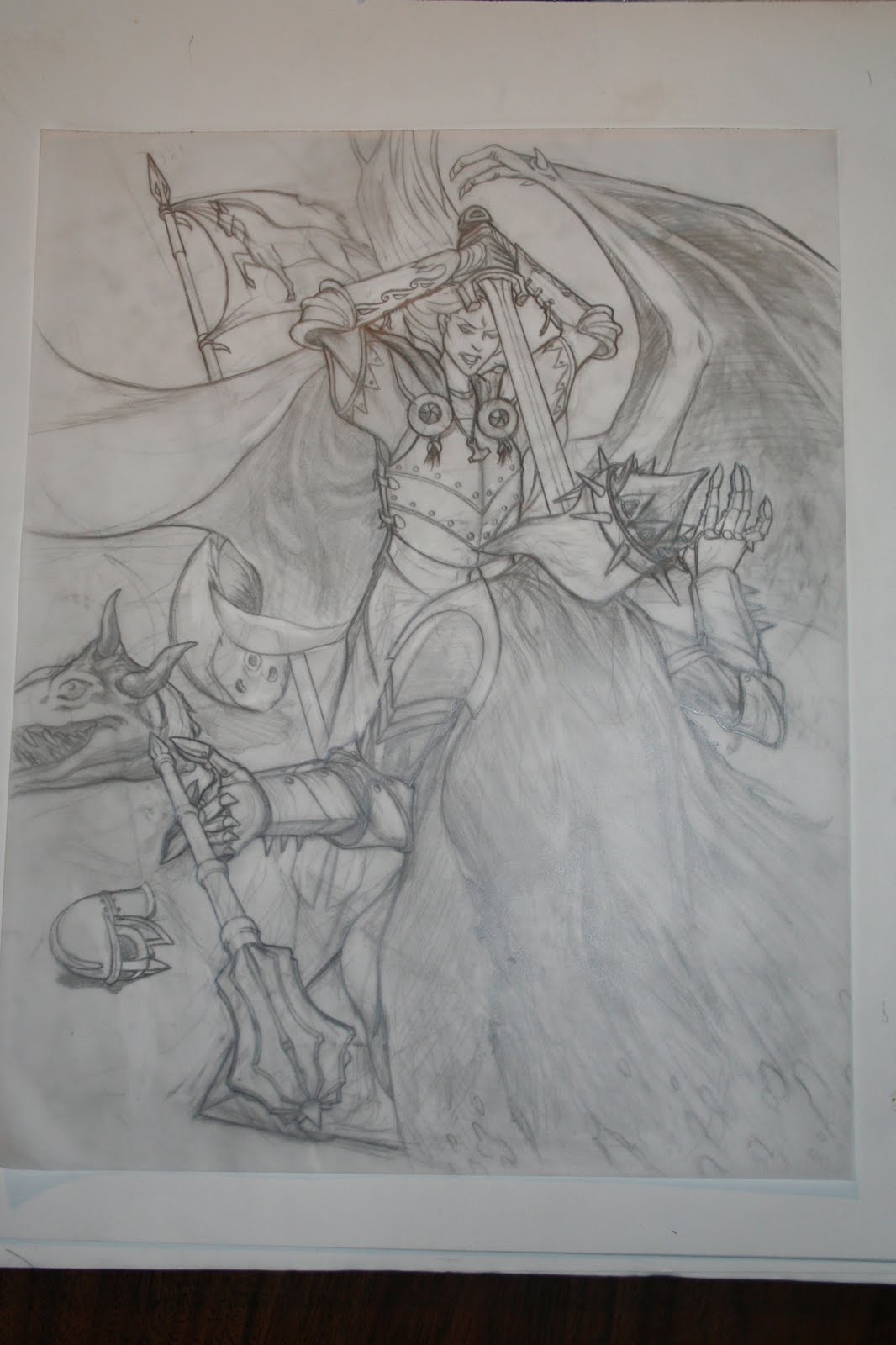
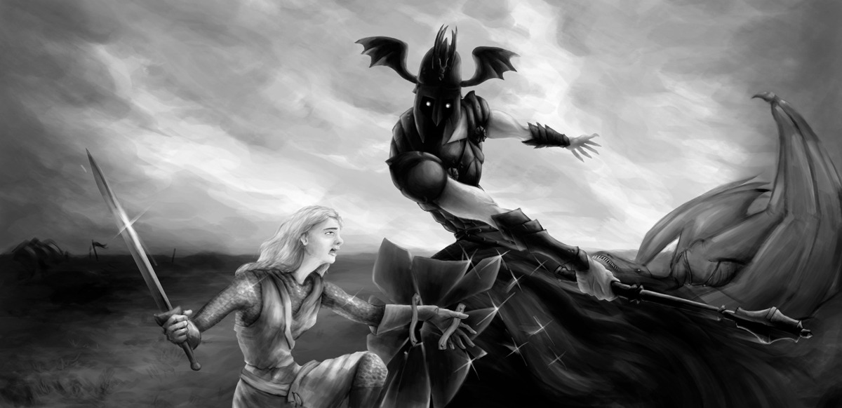
GM:This is a lovely drawing….your skills seem solid. But it’s not enough to carry this scene. The composition works, but leaves us at the moment we aren’t really curious about. It’s the moment of impact. Generally, try to avoid the moment of impact because a painting is stationary, and there’s no getting away from the feeling that whoever is getting “stuck” has been sitting there getting stuck for a dang long time. It’s as if the moment has passed ages ago, and really she’s just dragging him around with her sword down his throat. It kills the action, not the character. AVOID THAT MOMENT AT ALL COST.
DDS: Think of your canvas as precious real estate. You are wasting a lot of it right now. The Nazgul’s cape is taking up such a large portion of the composition, but it isn’t adding anything. That’s not to say that emptiness is bad, quite the contrary. Emptiness can add a LOT of drama if used correctly. But this isn’t one of those cases. Instead, move both figures down, and use that extra space to add some sky around Eowyn’s head. This will allot you more space to do something cool with the wing, and in general balance the piece better. You can also consider flowing the cape backwards more to reveal the armor beneath it.
JG: I think its difficult to choose the actual moment of triumph in an image like this. It’s a great moment, and this is a great treatment of that moment. But I believe that visually it is a cinematic choice that fits better within a sequence of images rather than a static image. A single image has to try to encompass the whole of the narrative moment. If we see the moments that preceded this scene sequentially, where Eowyn is in dire straights, and then also the moments after, when she falls, this choice for a scene would work really well. But looking at this image all alone, the Lord of the Nazgul isn’t very threatening, and Eowyn seems invincible, terrible, unstoppable. The drama is somewhat lessened. I think part of this may be that we have a sword stuck in the guys head. That’s a rough way to go. But it is also the hard part to sell in an image of triumph. The narrative is over. He’s definitely dead. Time to move on to some new challenge or mystery. But, the drawing is good. I think it could work. If we are going to stick with this pose of Eowyn standing above her foe as he is defeated, (and it’s a good pose, and the drawing is really nice) I think there are 2 things that would help:
First, I would prefer to see the right instant before the sword falls. This would still leave more to the viewer’s imagination. Here it’s just, “well he’s definitely dead.” But if we take the moment just before this, where the sword is about to fall, then there are still some ‘what if’s’ posed in the viewer’s minds. And this makes the image more interesting to look at repeatedly.
And second, It will help to show that she has not come here easily. We don’t have to have her bleeding to death on camera, (and really I prefer cheating here and would say have her face and skin still pristine), but she should be torn up a little. The attention to detail shown her in the design of the armor and clothing is really great, so don’t lose that. Just tear it up some, deep slashes in the plating, chain mail ripped up, nicks on the sword, that sort of thing. Something to add to the narrative that tells us a little bit about where Eowyn has been and what she has been doing.
**************************************************************************************************************************
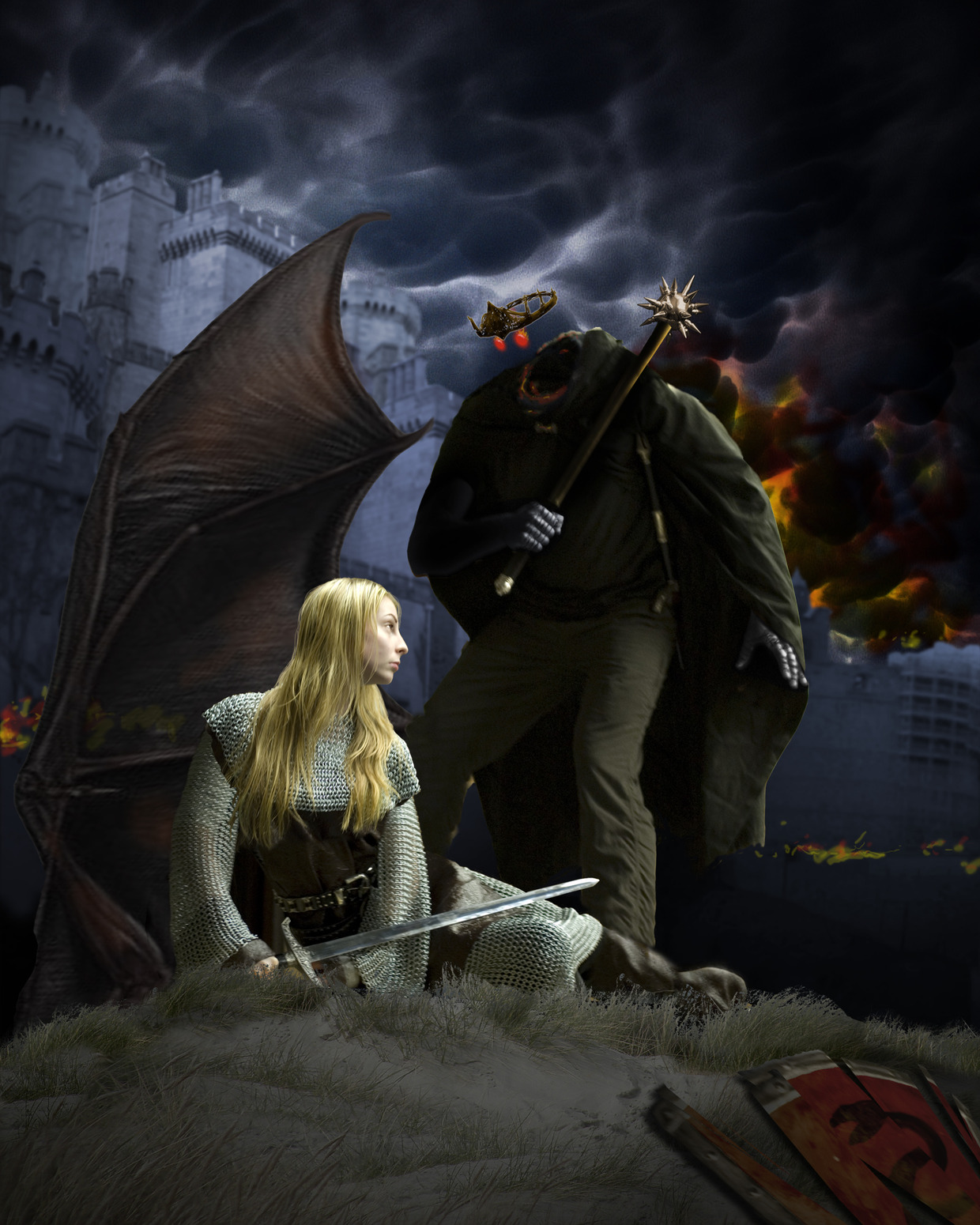
GM: This composition is just “ok” at the moment, but could become even better. It’s a great start, but you are suffering from your reference. It’s still photography here, not a guide. Doesn’t matter if you are doing this digitally and painting over it, you’ll only paint in its dull affect. That’s because the poses are POSED! The light on your female model is lovely, but she looks like she’s sitting in a nice field having a picnic. The Nazgul looks as if he’s been invited to this picnic and is wondering if she has any potato chips. Seriously, I would reshoot your models and get them to MOVE into their poses, not just sit. Your Nazgul figure can really come to life just by giving his legs a dynamic stance. I do love that you blocked most of the castle with the wing….exquisite! (I’d also go in there and make that castle look like it’s on crank) I’d take another crack at adjusting the Nazgul’s eyes so they are more sinister….definitely not round.
DDS: Don’t fall into the photo reference trap. The photos lack drama, and as a result, now your piece does as well. Instead, sketch the most dynamic pose you can think of. Then, take photos to match the sketch. You may need to shoot individual limbs (since the pose may be impossible for a model to actually assume), but that’s OK. You can stitch them all together in photoshop and make it look dynamic. Realism = Boredom.
**************************************************************************************************************************
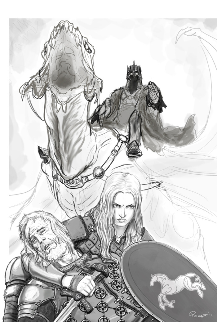
GM: This one was one of the most powerful compositions for me. Looking straight up into that Nazgul. The dragon is fabulous, even if a little weird in the mouth. I’d get a tongue in there to add interest and not become a cavern. Eowyn’s eyes should be looking just to the side as if to say she knows what’s coming. You could try an even stronger head twist, but don’t think logically about it! Think emotionally, and get a subtle twist that reads immediately. The angle on the Nazgul is great…..now–get him to move a bit, even in the saddle. Right now, he just sits comfortably. Make him a tad unsteady or about to climb down, leaning in, or twisting…..something more dynamic, but not over-the-top. I’d also pull in closer to Eowyn and whatzizface.
DDS: The empty space to the right of Eowyn’s face is drawing my eye too much. Try placing the Nazgul’s mace in his hand, hanging by his side. The angle it creates will push the triangular nature of the composition even further.
**************************************************************************************************************************
EF: I think this piece is off to a good start. The atmosphere and hierarchy with the figures is working fairly well. Eowyn’s head again the dark background really makes her pop. Again, some photo ref is needed. Especially on Eowyn. I like her stoic posture. However, her hand and leg don’t feel believable. The leg appears to be connecting to her hips a bit low. Her sword has some drawing issues. It seems to be bending at some weird points. Be sure to give her and her garments as much attention and detail as possible. The antagonist is ok but feels a little stiff. As for the bg character the sword angle doesn’t seem to be matching the hands holding it. Also, be careful about putting his face and back of his arm too close to the leg of the Nazgul to avoid tangents. I just noticed the other flying beast in the sky…nice.
DDS: My biggest concern with this piece is the way the Nazgul hits the top of the canvas. Just add a little more bleed up there. The extra space will strengthen his silhouette greatly, and bring more attention to the impending danger of the mace.
**************************************************************************************************************************
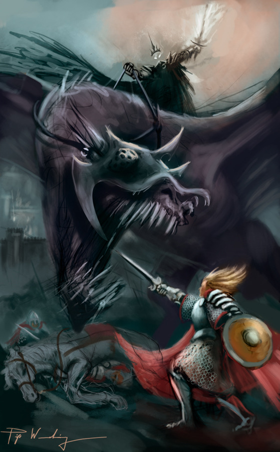
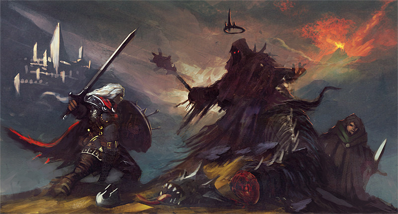
EF: This is looking good so far. Technically it looks like you’re putting in some work. But it’s a fairly straightforward interpretation of the scene. Somewhat expected and predictable. Be conscious of using too similar strokes in the grass. You may want to look at a similar environment to see what other sorts of vegetation, rock formations, flattened patches of grass etc, are available to spice up the land. It currently looks a too contrived. The bleeding from the neck of the winged beast seems to stop at the Nazgul’s leg. Be aware of tangents. I think the lighting shining down from the clouds feel a bit flat because they are all parallel. Perhaps adding a little perspective can give more depth. Also, there’s a purple gray hill just above the beast(also just above the talon wounds in the horse’s back leg) that has an edge that may be a too sharp for that distance. Esp compared to similar edges around it. IE it should not feel sharper than the beast’s wing arm just below it that is closer to the viewer. The blood pouring from the horses flanks may be overly contrasty for a background element. It may be difficult to find but the horse looks like he could use a little more reference as well. The hobbit figure also has some very dark shading and almost black areas. I would tone those dark areas down a bit and let him fall back a slightly. He currently looks a little cut and pasted. Let the atmosphere envelope him somewhat to provide a little more focus to the two main figures. Get people to pose for reference. Esp for the cloaks. They have so much potential to be amazing elements in your piece.
DDS: Merry is -way- too small here. At first glance, I thought he was a soldier in the distance that just had too much contrast. Be sure to make the hobbits look small and short, not miniature.
**************************************************************************************************************************
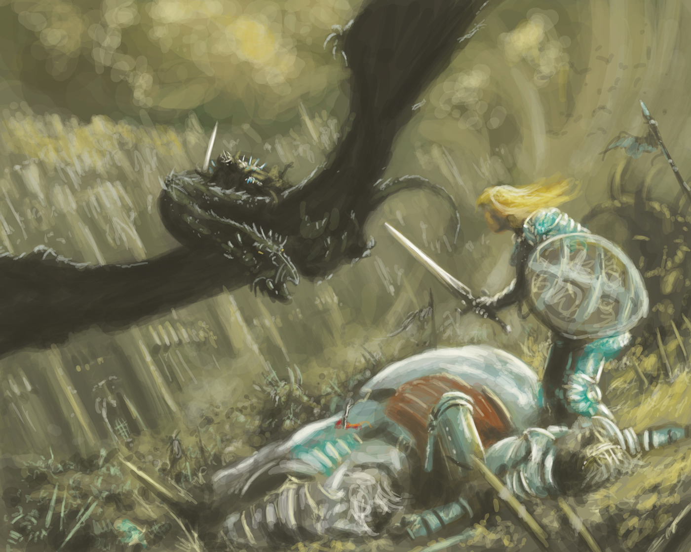
EF: I like the dynamic of the angles and movement within the figures. However, I feel it’s missing the sense that an epic battle has been fought. There is a little tangent where the beast’s jawline meets the hand holding the mace, and another tangent where the point of the back wing just touches the forearm part of the front wing. This piece is also in need of some serious reference for the figures. This will help with the anatomy, drapery folds, consistent lighting etc. Pay attention to Eowyn. The lighting on her is a bit spotty and her head is disappearing into the background.






Awesome awesome awesome. Cheers for takingthe time to do these guys. Lots to think about. 🙂
Wow…very informative. Thanks to all at Muddy Colors for taking the time out to do this crit.
Sounds like you guys would consider an ethnicity and cultural change too clever for its own good, right? This should be absolutely blonde, anglo-saxon, etc.?
@atomikdog:
If you were to be hired to actually illustrate this book, you would obviously have to be accurate. But this is just a personal piece, so do whatever makes you happy. If that's pretending it's a real job, cool. If it's about being as imaginative as possible, that's cool too. Don't worry about us.
Thanks so much for the comments and views I thank a lot
Thanks so much for the critique, guys! This challenge would be astoundingly intimidating as it is, being Tolkien, but the artists have really raised the bar with stellar work.
I've changed my Nazgul and Fell Beast a bit in my latest sketch, but I think I'll change it back to more closely resemble this composition.
Thanks again!
Wow, such a wealth of information! Thank you all so much for taking the time to do this; it's very helpful when considering one's own projects. I can't wait to see another batch of entries next Monday!
Getting my ass in there! Thanks guys!
Greg, you nailed what were some of my own misgivings about my comp. Thank you so much for your time. I have another piece I'd considered to be too far out, now maybe I'll put it on ArtOrder.
Thanks so much, everyone. This is awesome!
Though I agree with the intent of the initial statement about the scale of objects or “super-sizing”, I don't agree with the statement itself. Realism will lead some objects to simply be notable larger than others. That said, it can be a failing to rely too heavily on actual size and not on implied size. It is an example of the concepts that teachers drive home about leaving room for the viewers mind to impose itself.
I wish there was an easier way to leave comments for each painting or respond to some of the feedback.
My compliments to those who put their work out there to be discussed. It's not an easy thing to receive feedback candidly. Likewise, thank you to those offering the feedback. Getting real input and advice can be difficult.
Great work everyone!
Thank you.
-Adam
Thanks so much for taking the time to critique, guys!
Wow, I should have submitted mine for the critique deadline. You folks went way beyond. Oh well I guess I will learn vicariously.
Thanks much for the advice guys. I'm very glad mine was one you chose and I'm about to start working on adjustments based on your input. Thanks again!
Many outstanding images here. Can't wait to see the finals!
some of these crits will help on the current cover job i'm doing. thanks!
Thank you for the critique, I'm working on your suggestions.
I'm in agreement with Adam that emphasizing scale can be a tool to heighten the sense of realism (and drama). As Dan mentioned in one of the crits, following real-life references too closely makes for a boring image.
I think atomikdog has a point too in that creative changes can work well and the text shouldn't always be followed to the letter. I love the interpretations of Donato and others of “A crown of steel he bore, but between rim and robe naught was there to see, save only a deadly gleam of eyes.” Personally I always felt this to mean his face was dark and hidden by cloth or a helmet and not invisible, but I enjoy both.
Kudos to all the artists who posted so much fantastic work and a big thanks to these guys for taking the time to look through and share their thoughts. It's great seeing so many interpretations of this scene.
There's a youtube video about the ridiculously large mace the props people at Weta were asked to make for LOTR here: http://www.youtube.com/watch?v=ZAO4t8672hc
Thanks guys for crits. I will improve my image as much asI can. This is really great to read some professional crits!