-By Dan dos Santos
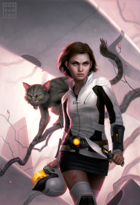
Here’s a new cover of mine that was just released for a book entitled ‘A Beautiful Friendship’, by David Weber.
Yeah, I know… I’m obsessed with pink lately. Something about it is just so satisfying. It may not be obvious to my audience (since they often see my paintings in a different order than what I paint them in), but I sometimes get fixated on a certain color or compositional element, and will re-use the theme in multiple paintings back to back. Usually this is because I felt I wasn’t successful the first time, and so I take what I’ve learned and attempt to implement it better in the next painting. For instance, this painting came right after ‘Switchblade Goddess‘, which came right after ‘White Trash Zombie‘. If you look at them together, you can see the repetition of pink, as well as the stylized blossom branches. Eventually, I will get what I am trying to achieve, and move onto something else.
Currently I’m a bit obsessed with the color red. Given the nature of RGB monitors, it always looks so vibrant on my screen when I’m doing sketches. Capturing that same vibrancy in paint though is a lot harder! I’m on painting #2 now attempting to achieve the results I want. We’ll see how it goes. It’s looking like it may take me 3 attempts to get it right!
Anyways, back the painting at hand.
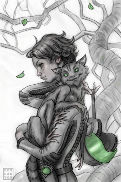
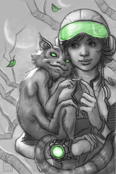
Given the title of the book, and the fact that it is targeted to young-adults (most likely girls), my original concepts were a lot more playful and gentle. They all focused on the relationship of the two characters. After a few rounds of sketches, the AD let me know that I was barking up the wrong tree, and that she wanted the image to be a lot tougher, with some danger and mystery to it. It took a few tries, but I think I finally got what we were going for.
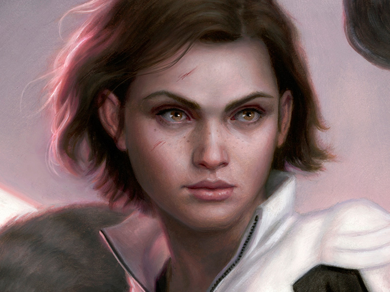
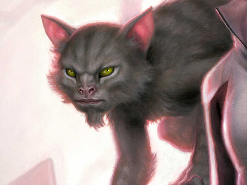
Here are a few detail shots for you.




this could be my favorite of yours dan.
yeup. my favorite.
Soooo nice, man. This muted pink tone is really awesome. Great piece.
It's great to have a night-owl artist like you posting wonderful art into the wee hours of the night.
Man that's good stuff. That soft pink can go into that big pile over there with all the other stuff I could never pull off.
Beautiful! The color is wonderful. Glad you ended up going with the tougher girl too 😉
So Dan, when you are using a dominant color, such as the pink, do you concentrate on value first and then match the color tints and tones to your under painting? Did you utilize glazes with this approach or more opaque layers?
Love her face….especially the eyes.
@Kim:
In this case it's sort of the opposite really. Typically, I would say having the values laid in would be smart. But when I'm trying to get a really bright color, I usually start with transparent washes on a white board to achieve the color intensity I need. Then, I paint all the darker values around those areas, so those those brilliant spots really glow.
Dan an amazing painting as always. If I may ask if this is part of David Weber's Honor Harrington series and if the cat in the image is Nimitz? If it is Nimitz I do have to say I think he should look have a more feline face. In any case still a awesome image and a great rendition of Honor (again if that is her). And thanks again for such a wonderful blog with such incredible work!
Really great stuff, as always, Dan. I'm with Prescott on this one. Were I in your shoes, I'd likely have been flummoxed by the pink. But I have a hard time with bright colors in general, so…
Seriously, though, really nice piece.
I absolutely adore the creature design. It's really cool and the thumbs just make it even better.
I'm with Kiri, that monkey-cat's awesome.
Chris
Cool stuff Dan! Love those thumbnails, especially the first one.
I still like the more cutesy sketches in the beginning, especially the 3rd one with them poking each other's fingers.
I've always loved the way you use lighting and how nice, bright color seeps into strands of hair and folds of clothing. The pink just looks so cool. It's something that I've been trying to work with myself, but it's easy to overdo.
how long do those sketches take? They are clearly more involved then a quick thumb. Love your stuff, it's so yummy
@Anonymous #1:
I don't know if it's part of the same series, but both characters are definitely different people than who you mentioned.
@Anonymous #2: I sometimes spend hours on sketches. A lot of the time is spent concepting rather than rendering, so I may only get 2 done in a day.
Why are you so obsessed with rim lighting? I butchered the piece in photoshop and imho it works so much better without it.
I think this is my favorite of all your work. It's bleeding awesomeness.
@Anonymous #3: Feel free to share your paint-over.
IMHO the anonymous tag should not be available. If you have an opinion be proud of it. I would love to see you make Dan's work better.
It is getting a little ridiculous. I left the anonymous option available because I know how annoying it is to sign-in sometimes, and felt it would encourage comments. But if you are going to ask a question (or make a crit), please have the courtesy to put your name at the end of your post… or initials, or something. Going out of my way to answer questions for people who can't be bothered to identify themselves makes me feel used. Like I am addressing a robot because I have to, rather than addressing a grateful reader because I -want- to.
Oh dud, I love your WIPs (and finished works!, and your rim light for that matter! Thank you for shearing and being an inspiration to a newbie like me! And I'm with Dominick, really like the first thumbnail-sketch thingie.
This is great Dan. I like the rim lighting, it pushes the figure forward and away from the background a little and creates a cool focal point. The only thing I would do different is sign my name to it instead of yours 🙂
Thanks for posting this.
After almost one complete semester studying at TAD under John English, George Pratt et al, the concept of idea and composition being more important than getting a highly rendered or realistic piece is really starting to make sense to me. But man, I really DO like your level of finish, Dan! (not to mean your compositions aren't good – they are!)
Not exactly how my mental image of treecats always looked, but pretty freaking awesome none the less!
For those wondering, the characters depicted on the the cover of the book are Stephanie Harrington and her treecat, Lionheart/Climbs Quickly.
More information:
http://honorverse.wikia.com/wiki/A_Beautiful_Friendship_(novel)
The young adult novel is based on a short story from 1998 of the same name.
as an Honor Harrington Series fan – i love your cover. Brings to life the harrowing situation in which the sentient species meet and develop a bond.
Were you aware of the Honor Harrington Series when you were asked do this?
Because I have to say, I almost mistook it for a young Honor(Stephanie's more well known descendant).
Even though its been a while since I read a Young Adult book, might pick this one up.
I am really liking the picture especially as an advertisement for the story. I loved the original short story and am looking forward to the YA book version.
Overall I think that Lionheart is done very well, I think that you have captured the lemur like qualities of treecats the best of any artist yet. The face is a little too simian for my tastes but does bring out the intelligence very well. Facial structure wise I prefer your cartoonish versions more because they are more “cute” and not as serious, a little more fitting with how I always imagined treecats as hiding their intelligence and lethality behind a visage that humans find rather cute. I personally think the cartoon drawings “get” treecats the best of any renditions I have seen.
As for the painting in total, it's just great, I think it captures the essence of the original story (and therefore the YA extended version) perfectly. A strong young heroine is the first human to meet and form a lasting friendship with the so far hidden local sentient species, and whose bond shall 'quickly' be tested in an encounter fraught danger. It also shows off well the SF setting and the alieness of treecats.
What I really hope is that they also will include your concept sketches as well somehow as an addition. I think in total they depict the human/treecat relationship exceedingly well.
PS. I'm a different Dan than the artist. 🙂
Just thought I'd clarify that since we share a first name.
just love this one!