Gregory Manchess
This is the 3rd and final painting of the series, a portrait of Piye, featured in the procession painting in Part 2. They wanted to showcase a close portrait of the man they had substantial sculptures and some paintings of.
Apparently, it was their intention to put this painting of Piye, known as Taharqa, on the cover. But I didn’t believe them. They’re primarily a photography magazine, and over recent years, they have practically stripped the magazine of any illustration, whether diagrams or narrative scenes (especially narrative). They were no longer interested in using artwork to illuminate a scene. If it couldn’t be photographed, why bother? That was “old Geographic.”
This line of thinking didn’t last too long. Not because they suddenly had an epiphany that painting was cool, but mostly they just ran into the problem naturally. The Black Pharaohs is a good example. How do you show the grandeur of such powerful points in history? Like this: you use your imagination as art and science come together. This, I believe, is what stimulates readers.
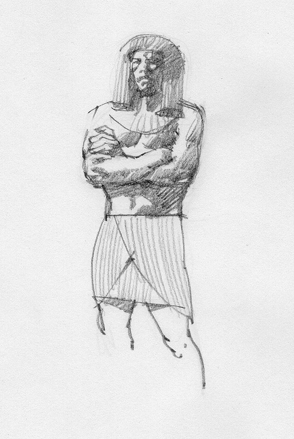
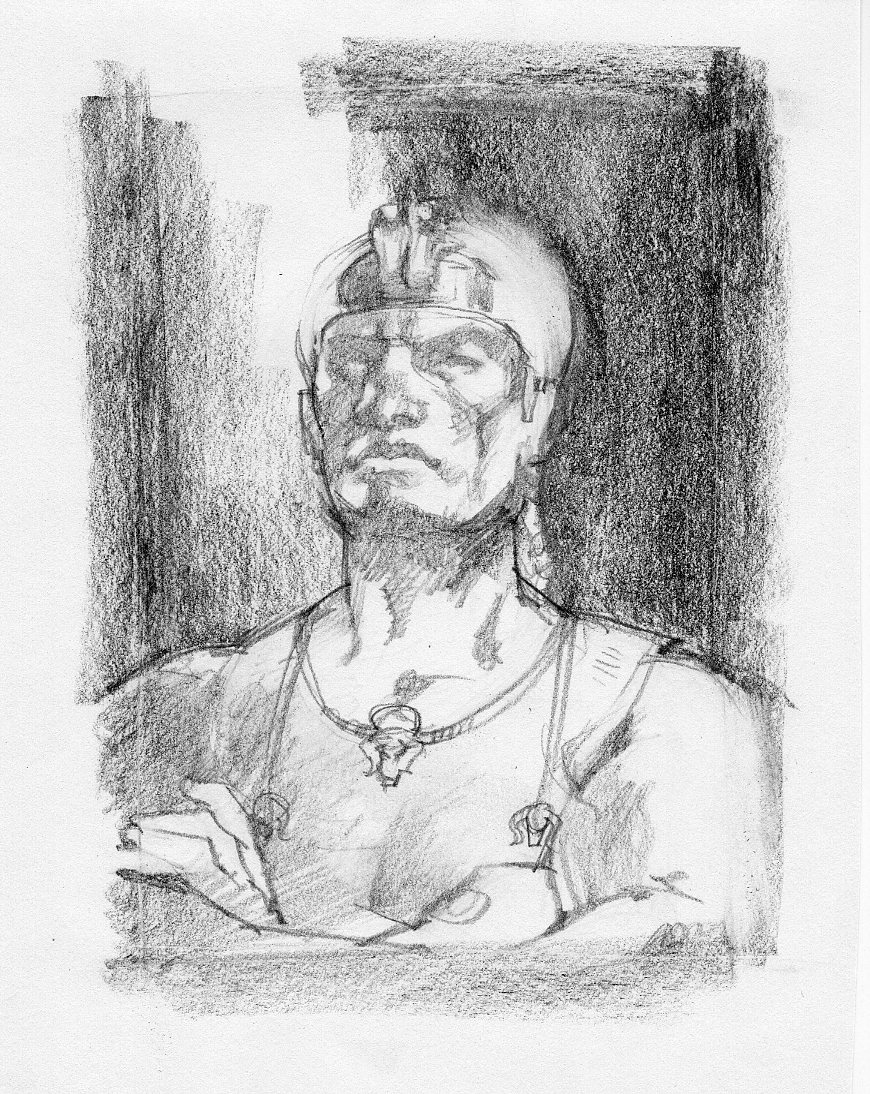
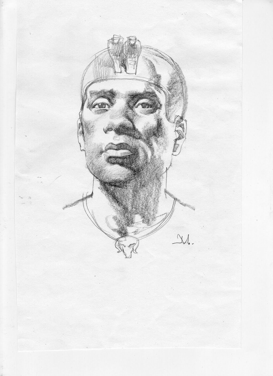
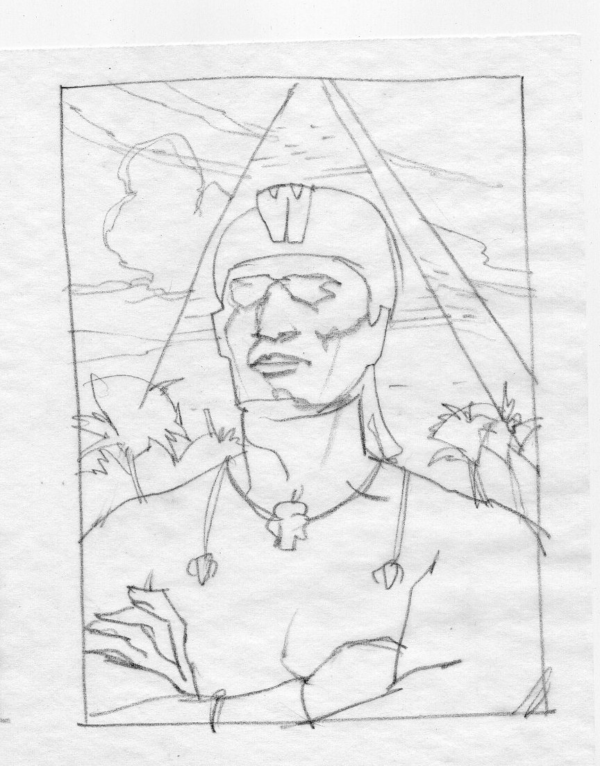
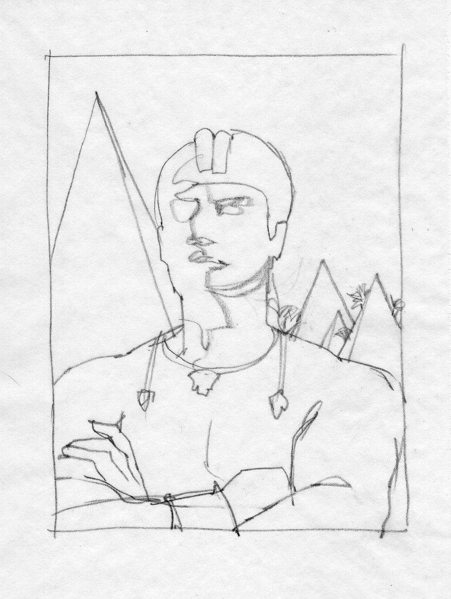
Again, I started with thumbnails. Jeff Osborn and I worked closely together to present Taharqa against a background of pyramids. But as I found out later, these were not your run-of-the-mill pyramids. They were designed by the black pharaohs. Their shapes were more severe, more angular, and quite a bit smaller. There is a site with a number of these as well.
Adjustments were made to Taharqa’s features that NGS requested I make by looking at several sculpted heads of him from the era. I had to add a slight almost-smile.
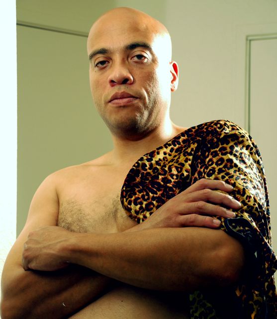
While working these up, I happened to run into my friend, Willy Gilmore, who works at my Oregon apartment complex. He was perfect. I asked him if he ever wanted to be a pharaoh. Of course he was curious. I set up a shoot to use him as reference for the final piece. I told him there was a slight chance that it would be a cover painting.
I got this far, and I still didn’t believe they would use it. I told them as much. It meant that if I got a painting on the cover of National Geographic Magazine, I would be one of only about five guys over the past thirty years that had the privilege. No way the Photo Dept. would go for it. (Secretly, I crossed my fingers.)
Now I needed to find some cheetah hide. The best place to find that was… the Halloween Store. Yes, that little bit of animal fur indication on the final painting is the panties portion of a ‘Sexy Kitten’ outfit.
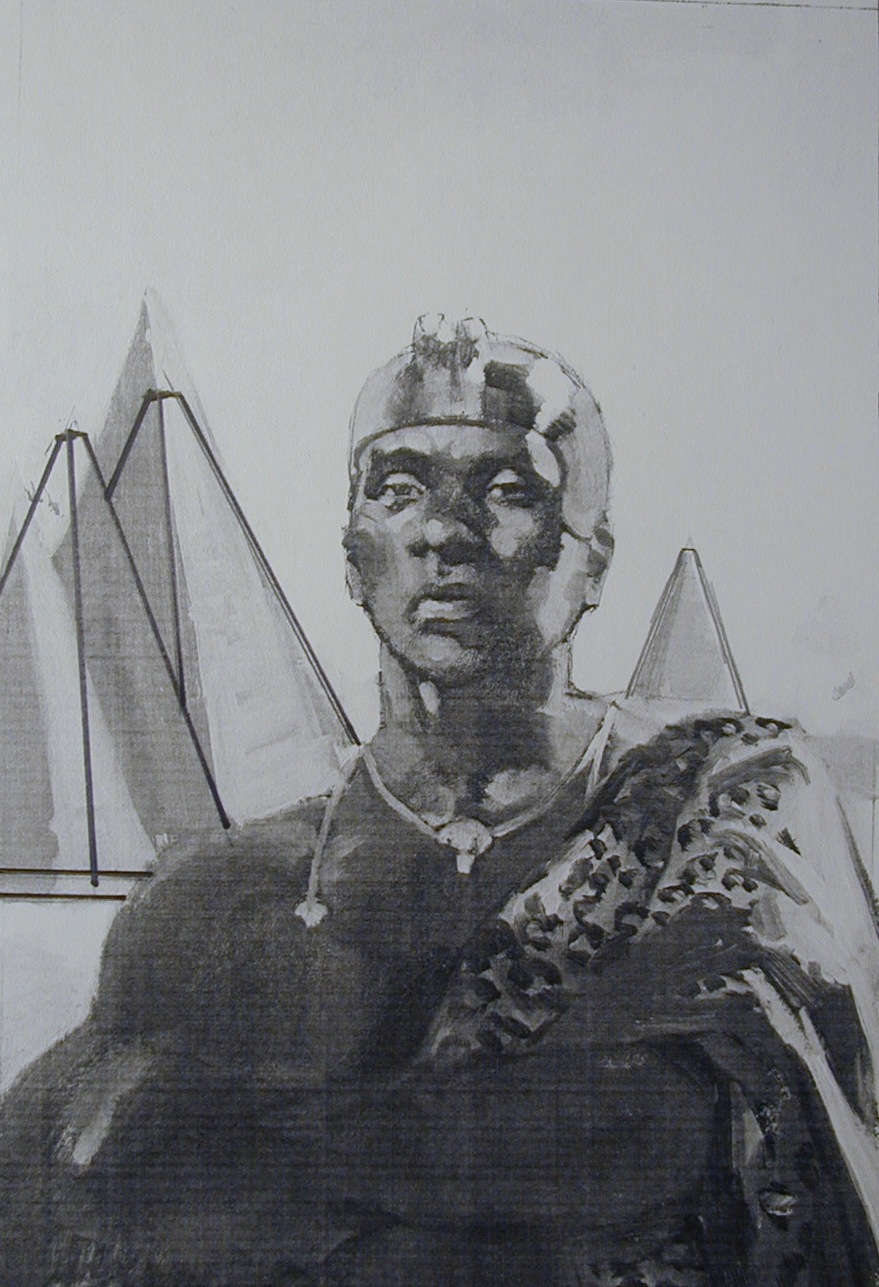
A color comp that I brushed up, then had to adjust the pyramid shapes. Shown here in b/w.
There were minimal changes to the final piece, and once completed, the entire series had taken only three months. Very fast work for a process that usually takes a year and a half. Hats off to NGS for hustling at every turn to get me the information needed.
Two months later, while walking through LaGuardia airport on my way back to Oregon, I spotted the Feb. 2008 issue on a rack. I fumbled getting my cell phone camera out quick to shoot it. I was afraid it would disappear.


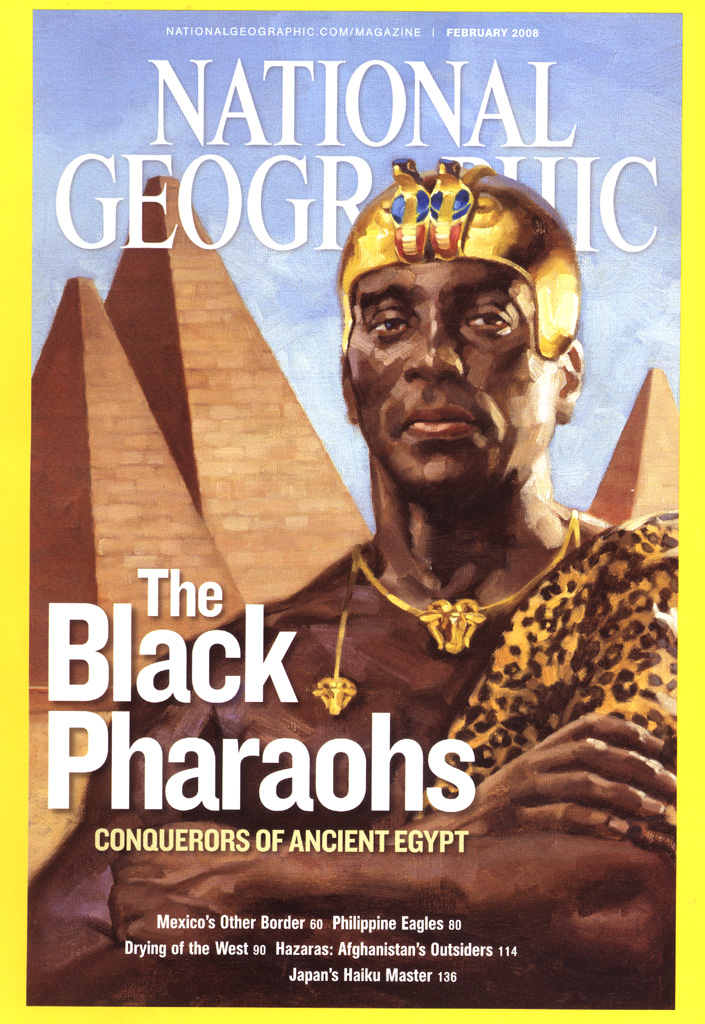

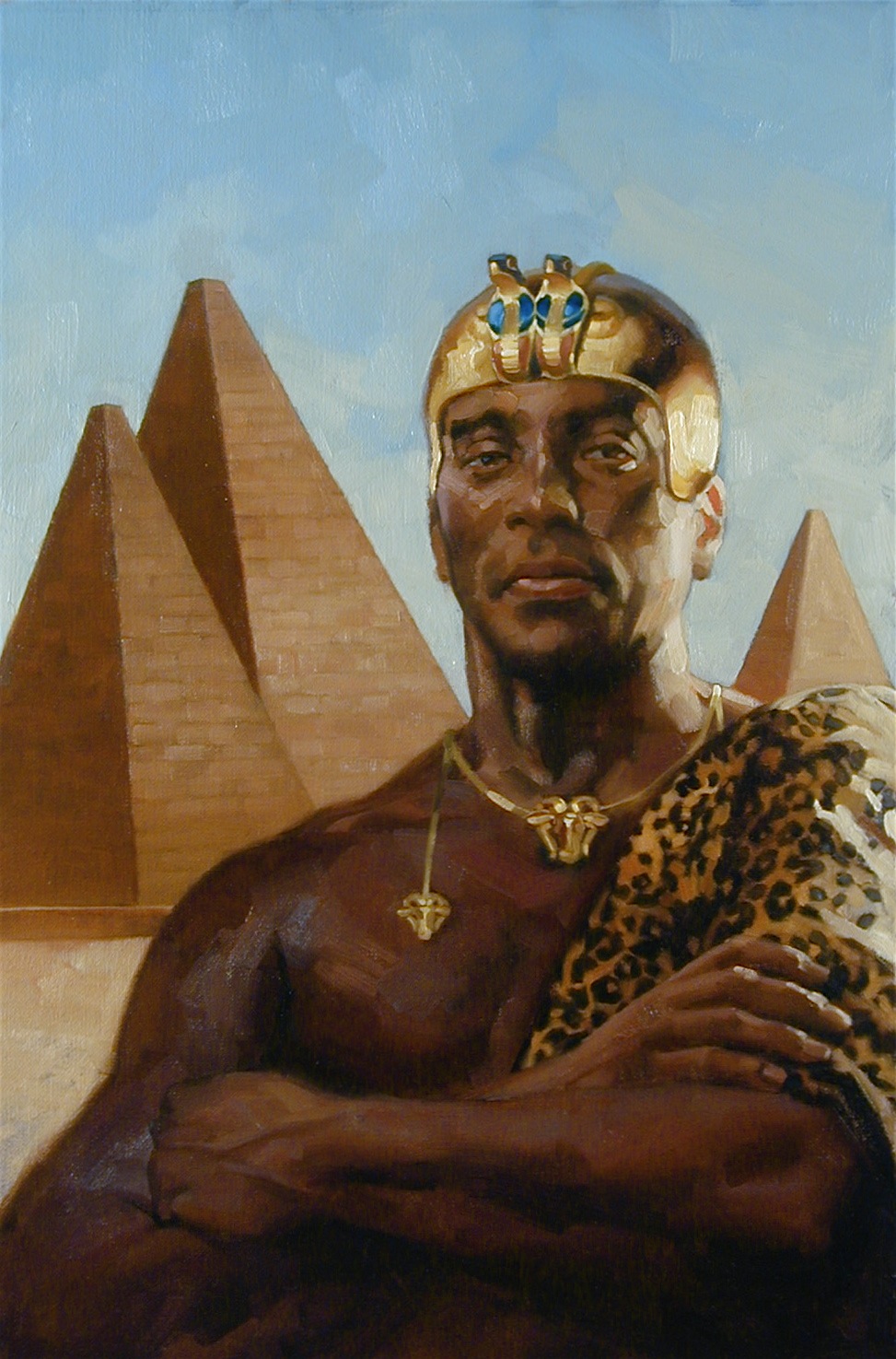
I remember seeing this when it came out and thinking, holy crap, theres a painting on the cover of National Geographic! Then, holy crap, its a Manchess! Maybe they're going to start using more illustration on their covers. Unfortunately this was not the case. Funny how so many equate photographs with science, fact, and accuracy assuming that a painting couldn't possibly have any of these traits. Sigh… Oh how I wish I was around to see the golden age of magazine illustration. Man that would have been such a cool time to be illustrating! Then again the competition would have been Pyle, Wyeth, and Cornwell. Maybe not. 🙂
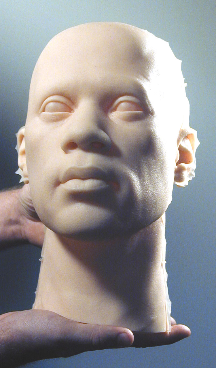
Did you make the silicon head? Also the printed cover just does not do the painting justice even just when comparing it to the scan above.
I've always been curious how this project came to be. Cool post. Thanks!
Hahaha! I bet Willy Gilmore got really scared when he went to your studio and suddenly you appeared with a ‘Sexy Kitten’ outfit for him…. Hahahaha!!! Great cover, Greg!
Dominick: A place in Ohio made the head, and they used it for a character manikin in the Real Pirates exhibit. Another one was actually sent to me for study. Very bizarre receiving a head in a box.
Yeah….sad about the reproduction. You'd think it would've been dead on, but I think they accept more latitude in photos than art. Still, it's all photography, so I don't really get it.
I've wondered if I nixed their enthusiasm for art on the cover, or if the sales for this cover were down. Wish I could've done more though!
Competition was certainly fierce during the golden days, but really no different than today's challenges. It depends on what's the accepted norm. Wyeth, et al, just weren't interested in illustrations of a cake with antlers. They wanted to paint, and they were well trained.
Carlos: Willy and I had a good laugh during the shoot! In fact, it was hard to stop giggling to get a serious shot!
Well I guess I'm not finishing this cake with antlers painting.
Greg- What an awesome story, man. I'm glad you shared it with us. It's awesome that a magazine such as National Geographic isn't afraid to go with illustration in the world of HD photos and frankenstein'd photoshop images. The series for this issue was gorgeous. I hope to hear more stories about illustration getting chosen over photography. What did your friend say when he saw the cover? did he feel like a celebrity? 😉
Congratulations on getting such a prominent role in NatGeo! I grew up with the magazine and admiring the artists work inside, both photographic and illustrative, has always been a joy.
Thanks for the sneak peak in to the process!
Thanks all.
Eric: Willy nearly had a coronary. It was hilarious to hear about him telling his entire family to watch for his face on the cover of NGS magazine!
Thinking of doing a peek into the Real Pirates murals here. But there are 10 of them!
So Epic! Couldn't have happened to a more talented/deserving painter! 😀 The cover is just powerful! I'll be looking for this baby on the shelves!
-J
I believe this painting is copyrighted?
I am writing a (second) book (fiction/horror) in which a character is a Nubian Pharaoh. This painting would simply look awesome either as part of the cover, or as some artwork within.
Is there any way I could make use of it?