Gregory Manchess
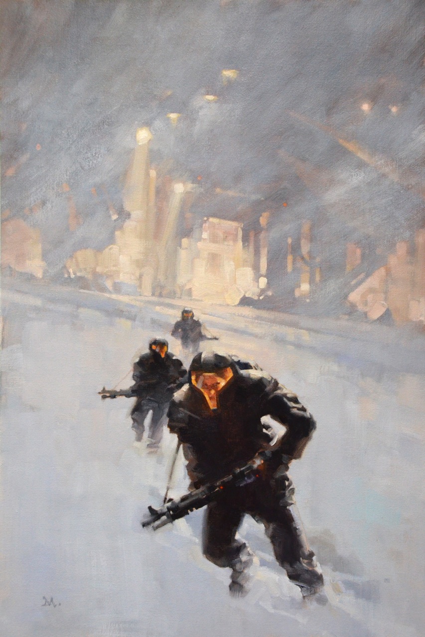
Firaxe
Wednesday, July 13th, 2011
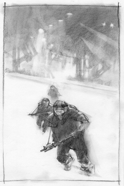
An investigative team explores a crashed alien ship in blowing snow. This was a great opportunity to paint some favorite subjects for a Tor Books cover, Firaxe, by Michael Planck, art directed by Irene Gallo. We also used it as an assignment for the Illustration Master Class in June.
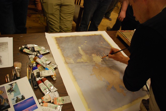
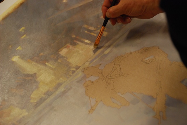
Many of the students chose this assignment for their week’s painting focus. As they worked around me in the IMC studio, I worked on what will be the final cover painting at the same time. This provided two opportunities: they got to watch as the actual cover was created, and I got to watch them go through practically the same steps to build their finish.
More than once I was tempted to drop my idea for one of theirs. But I had already decided on a direction back in my own studio, and I had to follow through. They got to watch that as well. Painting is about decision-making.
Starting with small thumbnail sketches to find the composition. I toyed with showing the alien ship, but opted for showing the team coming toward us, not walking away toward the shipwreck. I also realized during the studies that I wanted to obscure the shape of their command ship and have it frame the background. I liked the graphic flatness of the white snow behind the figures.
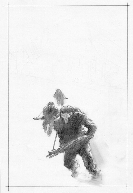
Once Irene ok’d the direction I was taking, I made a more deliberate sketch to fit the layout.
She approved it, so I proceeded to a more finished sketch. I took a few shots to study how the light fell on shapes lit from behind, and refined the figures to read better. I didn’t redraw the background ship as I already liked the feeling I got from the rough sketch. I projected both sketches and redrew the final drawing directly onto the canvas.
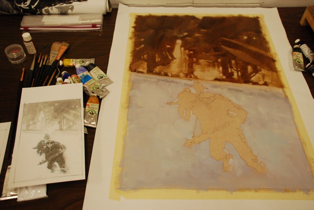
I came to the IMC with my prepared piece and started the final painting there.
The brown background was laid down first to establish shapes and create an underlying value to paint the white blowing snow over, once that layer had dried to the touch. If I didn’t get that graphic, moody background right, there would be no sense going further on the figures. I already knew what the figures would finally look like. Sometimes I start with the unknown areas of a painting and proceed to the areas I can clearly visualize, gaining speed as I move toward the finish.
At this point I haven’t finished the piece yet. I decided to add some touchups to the painting, so you are seeing it here before those last strokes are applied. You’ll have to watch for the final book cover, on the shelves, to see how it finally prints.


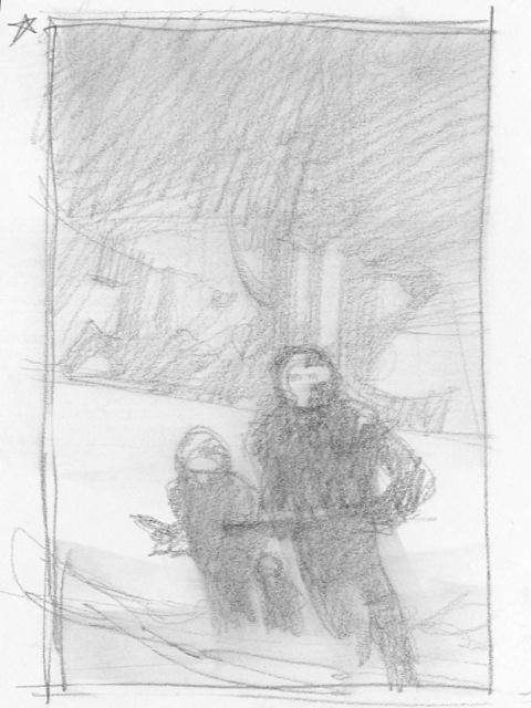
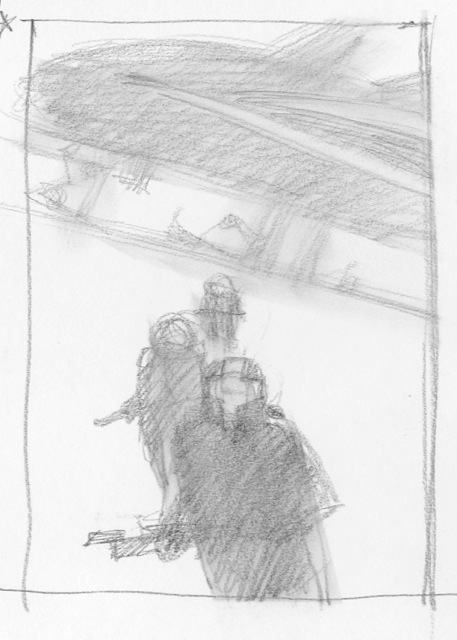
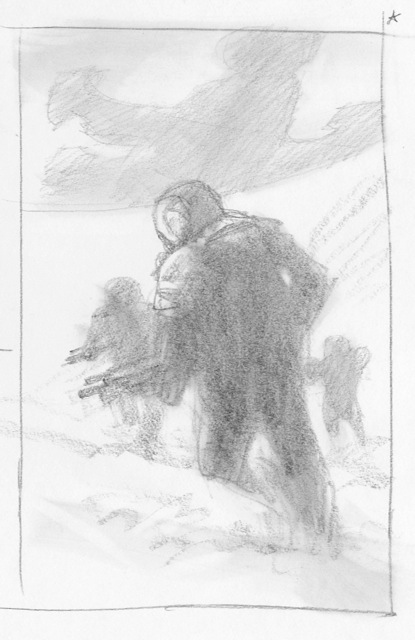


First Image: Instant Inception.
Sorry Greg, we have too much on our minds this days… xD You're awesome anyway!
I remember you working on this. Love the way that it turned out. Learned a lot about how you place the strokes next to each other.
I really love this painting Greg. Maybe you aren't such a hack.
Really beautiful.
I just finished your painting video “above the timberline” and was really inspired. You make it all seem so effortless, and this painting is no exception.
Just last night, I was reading some of Jeff Jones' comments about using colourful grays to unify a piece, which makes the areas of stronger colour use that much more purposeful. This seems a perfect example of how to employ that approach.
I love the compositional simplicity: large swathes devoted to the volume of the air itself, together with a very substantial sense of scale in the background created with a minimum of information. Gorgeous work!
Thanks guys!
Quite simply, less is more.
…in so many ways…
Classic!
Beautiful as always!
Do you always have that many people staring at you when you're working? 😀
Wow, I just found this post. It strikes me as very old-school (which is flattering!). I love the way you created so much expectation and anticipation through posture.
Their command ship is really just an old tramp freighter (think Firefly). You've given it quite a promotion. 😀