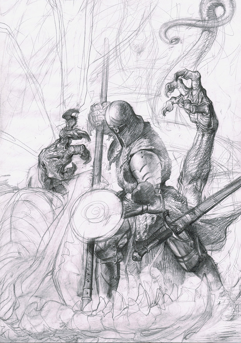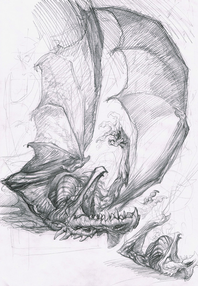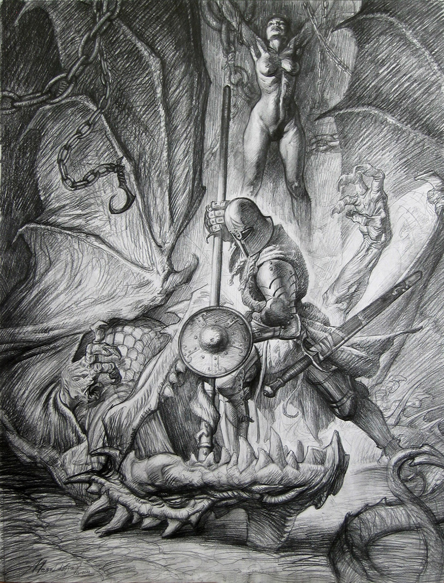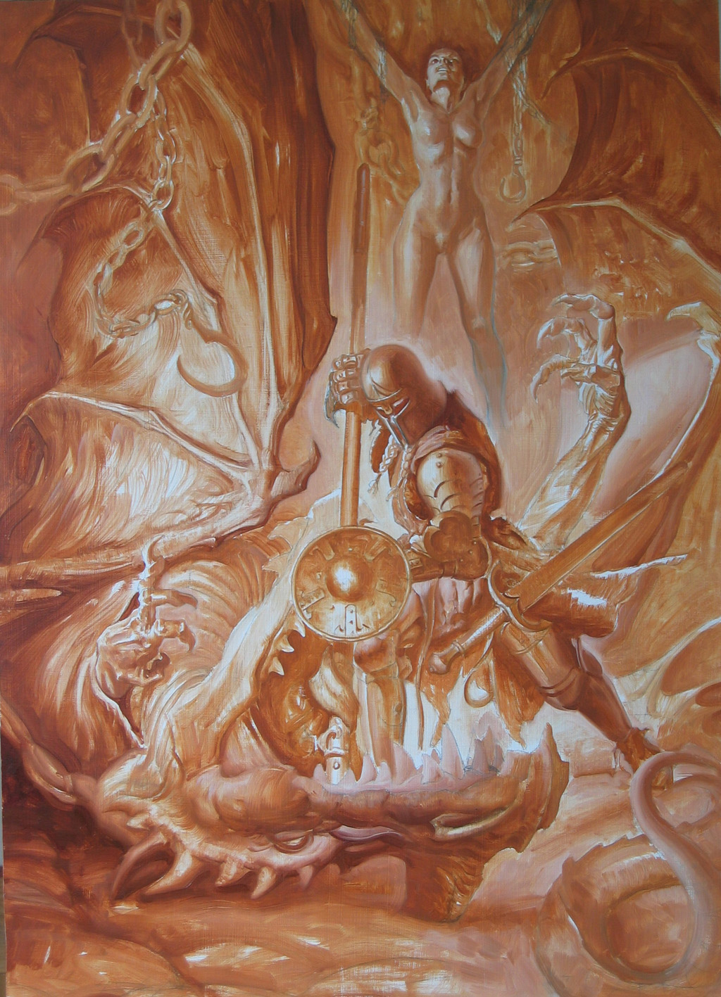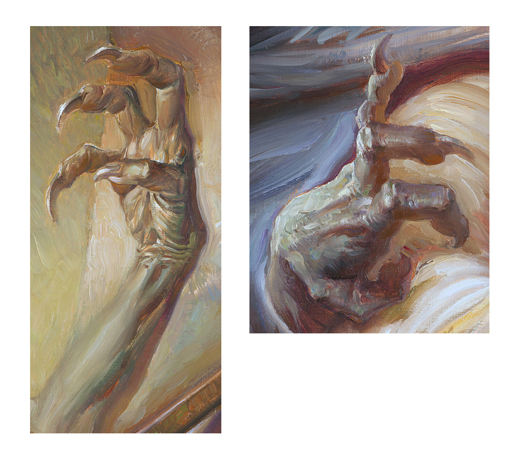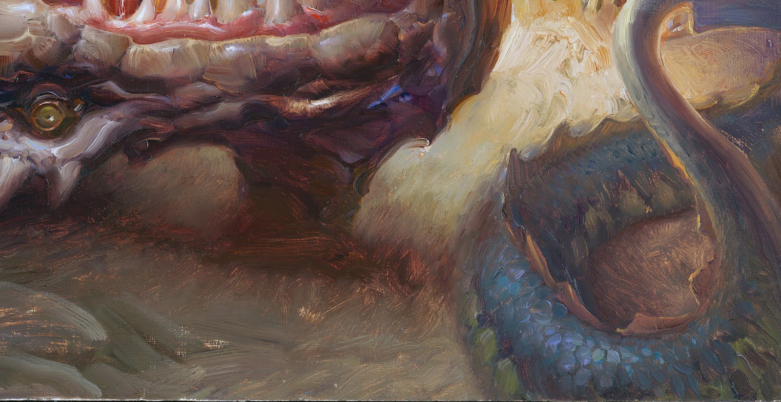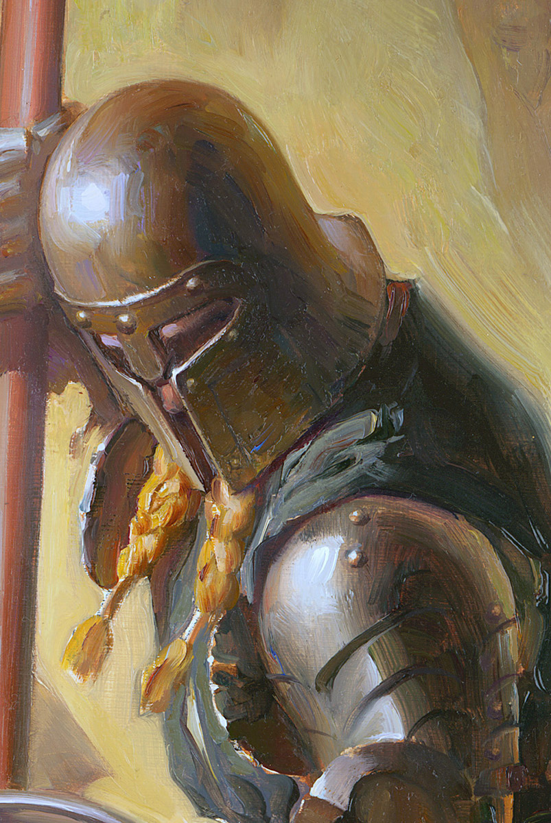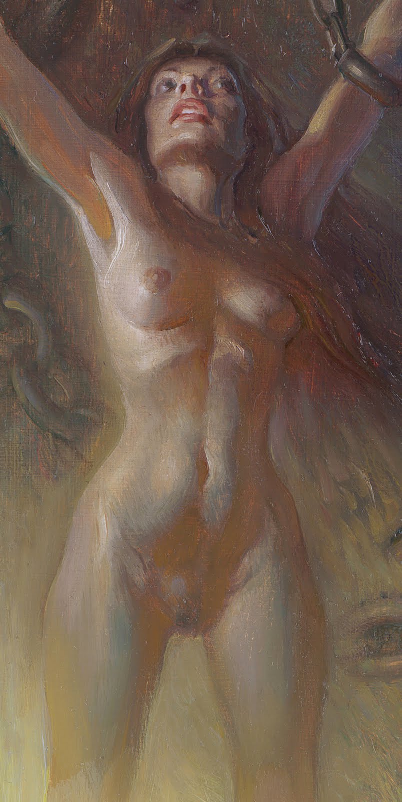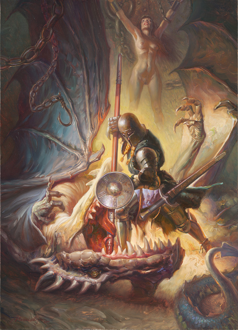
The Rescuer, Oil on Masonite, 60 x 43 cm / 23,6x 16,9 inch, 2011
This painting, titled The Rescuer, has been commissioned by Pat and Jeannie Wilshire, who are the driving force behind the IlluXCon show. The painting will be used on the IlluXCon 4 promotion materials. The other two commissioned artists are Eric Fortune and Mark Zug.The original painting will be on display during the IlluXCon 4 show in Altoona in November.
Apart from being extremely kind people, Pat and Jeannie are internationally recognized collectors and historians within the genre of fantastic art. They are responsible for the creation and administration of the IlluXCon symposium of fantastic art.
“ IlluXCon is dedicated to the validation of the original painting as more than a means to an end and, through that validation, the recognition that the art of the fantastic deserves to be brought out from the shadow of literature and publication, its creators permitted to stand beside their peers in other artistic schools, and their works accepted to hang side by side with the best of all the past generations of artists…”. I love this statement! If you are not familiar with this extraordinary event, you can learn more about it on their website http://www.illuxcon.com/
As for The Rescuer, I have decided not to include any explanation of the process this time, but rather to let the picture(s) tell the whole story.
Petar Meseldžija was born in Novi Sad, Serbia, in 1965. He began his career in 1981, publishing the comic strip "Krampi" in the Stripoteka, one of the best known comic magazines in the country. This was followed by a series of short comics and his work on the licensed comic book Tarzan. He graduated from the Academy of Arts in Novi Sad, in the Painting Department. During his studies he continued to work on comics, but also more often working on illustrations. In 1991 he illustrated his first book Peter Enkorak, published by Mladinska knjiga from Slovenia.
At the end of 1991 he moved to the Netherlands. Soon after, he stopped working on comics and dedicated himself to illustration and painting.
During the 1990s he painted about 120 posters and greeting cards, mostly for Verkerke Reproduktie from Holland. For Grimm Press, a publisher from Taiwan, he did 33 illustrations for the book King Arthur and the Knights of the Round Table. He held his first solo exhibition of illustrations and paintings in 1998 in the Tjalf Sparnaay Gallery in Amsterdam.
He has participated in many group exhibitions in Yugoslavia, the Netherlands and the USA.
His work has been published in a variety of periodicals and books all over the world.
Among many awards which he received for his work are:
“Plaque The International Golden pen of Belgrade, 1994”, Yugoslavia;
The “Art Show Judges Choice Award” – 59th World Science Fiction Convention, Philadelphia, 2001, US.;
Two Silver Awards from “Spectrum 4 and Spectrum 10 – The Best in Contemporary Fantastic Art”, U.S.;
Gold Award “Spectrum 16 – The Best in Contemporary Fantastic Art”, U.S.
From the beginning of 2000 he has dedicated himself to gallery art. Of the exhibitions where he has participated, the most worthy of mention is the Exhibition of Independent Realists. This exhibition, organized annually at the Mohlmann Museum from the Netherlands, offers clear insight into the creative achievements of contemporary Dutch artists in the domain of realist and figurative art. In addition to painting, he continues to do illustrations.
Two other significant projects should be mentioned. He painted 10 book covers for books of children's fantasy literature for the American publisher Scholastic Inc. Likewise, he illustrated the Serbian folk take “Prava se muka ne da sakriti”(“Real Trouble Cannot Be Hidden") for Bazar Tales, a publisher from Norway. In his work on the book, The Legend of Steel Bashaw, he has invested enormous time and effort. This project, for him of the greatest importance, was started in 1993. Including shorter and longer breaks, the longest of which lasted 7 years, he has been working on the book for 15 years, finally finishing it in August of 2008.
His original work is to be found in the private collections in Serbia, the Netherlands, Germany and the U.S.
That's.. mad. The detail shot of the dragon's head and tail is now the wallpaper on my computer. Thanks's for sharing all these progress and detail shots!
@Ralph: I get what you're saying, and at first it may seem gratuitous. But she -is- an integral part of the story. If I remember correctly, the woman is offered as a sacrifice, and in some versions, as the dragon's bride. To me, the nudity seems appropriate.
It's funny how nudity has been depicted in art for centuries, no problem. But when it happens in fantasy, all of sudden it's cliche. Now if she were wearing a chainmail bikini, I'd totally agree with you.
I wasn't aware this painting was based upon any specific story, I just saw it as dealing with a classic scene, which has appeared in numerous tales over time, and been adopted as a fantasy trope.
I am not in any way offended by nudity. I do feel it is a cliche, and a boring one, to show the woman bound, submissive, and with legs apart. I am not arguing whether this is intended as titillation, or demeaning towards women, if I am offended at all it is in the mundanity. That is what ruins it for me, the fact that this idea was done to death decades ago, and that surely there must be scope -especially from such a hugely talented artist – to have a fresh take to the concept.
I feel this more strongly because of the aspirations of Illuxcon, my respect for Petar's work and my own lifelong involvement in the field fo fantasy art.
Ralph Horsley
Apologies for the 'anonymous' posting, I can't seem to post through my Google account – hmm.
I think that calling the girl a cliche may be the wrong way of looking at this. To me the “damsel in distress” is more of a convention of the genre. What can make it a cliche is if it shown in the same manner every time. In pulp magazines of the 40's and 50's, they had the convention of a half naked woman being tortured by a villain on every cover. It started to become cliche because they often did it the same way over and over. But, when someone added a new twist on the idea, it became fresh again.
Political correctness aside, I think that this image is meant to feel like a classic painting telling a classic story, so the submissive female seems to fit.
More important, this image was created by an artist who put into this painting what was important to him, the way he wanted. Personally I like that. It says to me that he wanted this painting to have a certain raw, sexuality to it.
I love how you lay down color and brush strokes Petar, it makes the painting feel like a painting.
Her nudity does not further the narrative, and in fact, her complete lack of interest (i.e., eye contact) in what is going on in front of her totally disconnects her from the entire drama.
The image would be equally, if not more powerful without her.
Steven: I may come across as disagreeing with you, but I'm actually not. I will say that I believe there is no raw sexuality other than her nudity being presented as something to make her vulnerability more blatantly apparent. She is an offering. Has she agreed? Whats the context? The concept of sexuality has been stripped and flayed open from this woman just like many others to get this idea across. Is it a common trope? Yes. Is it appropriate here, I would indeed say yes.
I'm on the fence about any “sexuality” of nude and bound distressed damsels because that right to owning their sexuality is taken out of their control depending on the context of the story. However, this topic aside, my sheer wonderment of Peter, his paintings, and techniques will always, ALWAYS astound and floor me before anything else. I like this painting a lot.
I want to see what Mark Zug also has to present as I've also been a big fan of his for years.
Howdy, I had the same initial reaction as others, why does she have to be naked? More of a distraction at first. But I think her facial expression wins me over and leads me to wonder what else is going on, what is she looking at, is there something else out there? Her expression also gives a sense of terror, almost a madness of fear, in that she has seen and experienced to much. I didn't know the story was about St George and His Dragon… which leads me to say, never assume anything… Also, I've never read the story. With all that said…. I can feel the power of the knight putting the dragon out of his misery…Thanks Petar, I like the painting and will return to it to explore your story further… [but probably when my wife is out of the room… 'cause no matter how many times I say I'm studying your composition, style, strokes, hues, values, etc… all she's going to say is… “how come you don't look at me that way anymore?”] As always, thanks also to the Muddy Colors crew… Cheers, and stay cool, Mike
Petar, wonderful as your work is, you need to reconsider the woman. Because she is totally uninvolved in the story, other than to present the rescue aspect, the purpose of her frank nudity is to attract eyeballs, and that's it. Good sales tactic, but not very complimentary to either women or men. It would be much more acceptable, and even titillating, if she wore a few wispy clothes, or fully medieval clothes that were mussed. Think more Waterhouse than Penthouse.
Frazetta's women were often nude or nearly so, but they were powerful, involved, even when just there to be rescued. Here, the woman is more like a somewhat rote anatomy lesson or a cheap S&M porn piece. The hurt to the painting is that it strongly distracts from the rest of the vibrant, powerful imagery. The greatest concern is its stab against the real value of women, which only marginally concerns their sexuality.
I have to agree that the woman is distracting in the composition and seems uninvolved in the action…. nakedness or not (though the boring lack of body hair feels depressingly porn image influenced). In the initial sketch, she is partially hidden and to me looks to be looking directly at the action. It is too easy for these to get lost in execution – I do it all the time, nice to see the very best practitioners do it too… thank you for sharing.
Did you use dry medium or something for this ? do you usually use them ? Everybody knows about the pretty long drying time of oils. Do you photograph them or scan them after they are dry ?
Damn, now I want to go out and buy a bunch of oils myself. ^^° Though I am afraid it wont look as sweet as this.
Well, guys, having in mind the bound naked woman, I have expected a “bombardment” of criticism to come from the female part of the Muddy Colors art community, not from the male part. Therefore I am a bit surprised, and at the same time quite amused to see that there are still plenty of St. Georges in this world who are willing to stand up and defend the injured honor of a woman.
“Cannot see the forest for the trees” (as we know, refers to people who get so involved with the details of an issue that they lose sight of the larger issue) – I must admit that this proverb popped up my mind while reading some of the comments about the naked woman in the painting. Now, I know that the majority of us, if not all of us, perceive and experience the world that surrounds us through our own projections. In other words, we deal more often with the reflection of our own projections, than with the objective picture (truth) of the perceived world. Although quite common and normal, this attitude can cause many errors, and one of these errors is nicely expressed in the above mentioned proverb.
And because we are dealing here with a powerful archetypal image/symbol, which is very old, and as such deeply rooted in our Collective Unconscious, we therefore intuitively (or subconsciously) projected our own insights, desires, frustrations, preferences, etc. onto this picture. Perhaps some of you have been projecting a little too much of your own stuff. And while you kept your eyes fixed to a tree (of sexuality and political correctness), you failed to see the forest.
There are several ways (I suggest four) to perceive this picture: as an interpretation of the known Christian legend of St. Georg and the Dragon, as a mere fantasy scene (that is in fact, here in the West, rooted in the mentioned legend), as a scene with a mythological fundament, or as a composition that reflects, or deals with, the primal issues of the existence, expressed in a symbolic manner.
It is apparent that the main twist point of this painting is a naked woman, and the way it has been depicted. First of all, and as Dan has already pointed out, the woman is an integral part of the story. Regardless the angle from which we approach the picture, without her I am afraid this composition would turn into a predictable, too often seen, and probably shallow depiction of yet another scene of the senseless violence against dragons. I think that this would be a cliché!
As far as my intentions as the creator of this painting are concerned, there is not much sense in accusing the painting of being disrespectful towards women, or to call it “a cheap S&M porn piece”, or to say that “good sales tactic” is the reason for the inclusion of the naked woman in the painting. These things have never been my objectives. However I have no intention to explain what my objectives were. In fact I already did it through the picture itself. You get it, or not. You agree to my vision, or not.
Naturally, I cannot prevent people from misinterpreting my paintings, and although it is a part of the game, it is never pleasant. Fortunately there are always people who do understand what the artist wanted to say with the picture .
Anyway, I would like to thank you ALL for your comments! Quite frankly, it’s much appreciated!
Heimer – for the biggest part, it's just one layer of thick paint.
Markus – I work mostly in so called alla-prima technique and therefore have no problems with the drying time of the oil paint. As for medium, I use a usual Talens painting medium. I scan all my finished paintings, I do not photograph them.
“…and probably shallow depiction of yet another scene of the senseless violence against dragons…”
Ahh ha, screw the naked woman, alas the truth comes out… you're a dragon lover… and that's why the girls so upset… it's a hidden message of your disdain and shock at all the antidragonites out there.
Well stated, Petar. You're right; I have trouble seeing your forest because of this particular tree. Yes, it's a function of my own perspective, as it is for all of us. It just seems out of place with how you've depicted women in your other works, especially those in Steel Bashaw (thanks for signing my copy at Illuxcon last year. Yay!). Perhaps women are not offended by this depiction; dunno.
Whatever, you continue to invigorate the science fiction illustration market with your marvelous style. Well done, and more power to your good works.
My surface reading was your second offered interpretation: “as a mere fantasy scene (that is in fact, here in the West, rooted in the mentioned legend)”. I saw it embracing the core generalities, rather than specifics of any one telling of the story, because of this I absolutely agree that the symbolism and allegory attached to those key iconics is central to it's narrative thrust.
I very much enjoyed seeing your work at last years Illuxcon, and look forward to doing so again this year.
Is it the case that we have projected too much of our “own stuff” onto this image- seeing it through the lenses of our “insights, desires, frustrations, preferences”- or is it the case that you did?
It is awfully hard to see the forest through the trees, when one tree in particular is… very out of place in the forest, shall we say?
It seems strange to relegate so many criticisms to mere “political correctness” considering that the comments came from the Sci-Fi/Fantasy crowd which is steeped neck-deep in sexually charged images.
Perhaps, just perhaps, there is a line that can be crossed that leads us out of that romantic and mythical world of beasts, steel, chivalry, and veiled, primal sexuality… and into one where our own visions of blatant modern sexually intrude too strongly, and thus ruin the illusion.
Something to think about.
But, aside from all that… you're work is fantastic.
Well as a female, it's not the nudity.. nudity is part of this genre. It's the oddness of a knight in attire which is clearly heavily, if not entirely, weighted towards an historic scene, yet the woman is inaccurate – modern – I'll spell it out: she's no body hair. Historic knight, modern female… incoherent. (A commenter tried to point this out above – it's a porn sensibility). It is a minor detail in reality though art is about details is it not? As a woman I look at it instantly furrowing my brow: “she looks odd… ooooh, blimey…. eh – what's that about?” rather than an unimpeded “Wow, brilliant” (which the work is in all other respects).
SatanismonFigure I’d post some of theseIf you are preparing to receive deliverance ministry, there are several steps you can take to help make the process more effective
That's.. mad. The detail shot of the dragon's head and tail is now the wallpaper on my computer. Thanks's for sharing all these progress and detail shots!
ooh, the steps and details are quite interesting, thanks for posting.
I really like the composition and latent energy of this painting. I always find your paintings very inspiring.
However the bound naked woman ruins it for me, it seems such a negative, and unnecessary, throwback. Hasn't fantasy art moved on from this?
Ralph Horsley
@Ralph: I get what you're saying, and at first it may seem gratuitous. But she -is- an integral part of the story. If I remember correctly, the woman is offered as a sacrifice, and in some versions, as the dragon's bride. To me, the nudity seems appropriate.
It's funny how nudity has been depicted in art for centuries, no problem. But when it happens in fantasy, all of sudden it's cliche. Now if she were wearing a chainmail bikini, I'd totally agree with you.
@Dan,
I wasn't aware this painting was based upon any specific story, I just saw it as dealing with a classic scene, which has appeared in numerous tales over time, and been adopted as a fantasy trope.
I am not in any way offended by nudity. I do feel it is a cliche, and a boring one, to show the woman bound, submissive, and with legs apart. I am not arguing whether this is intended as titillation, or demeaning towards women, if I am offended at all it is in the mundanity. That is what ruins it for me, the fact that this idea was done to death decades ago, and that surely there must be scope -especially from such a hugely talented artist – to have a fresh take to the concept.
I feel this more strongly because of the aspirations of Illuxcon, my respect for Petar's work and my own lifelong involvement in the field fo fantasy art.
Ralph Horsley
Apologies for the 'anonymous' posting, I can't seem to post through my Google account – hmm.
I think that calling the girl a cliche may be the wrong way of looking at this. To me the “damsel in distress” is more of a convention of the genre. What can make it a cliche is if it shown in the same manner every time. In pulp magazines of the 40's and 50's, they had the convention of a half naked woman being tortured by a villain on every cover. It started to become cliche because they often did it the same way over and over. But, when someone added a new twist on the idea, it became fresh again.
Political correctness aside, I think that this image is meant to feel like a classic painting telling a classic story, so the submissive female seems to fit.
More important, this image was created by an artist who put into this painting what was important to him, the way he wanted. Personally I like that. It says to me that he wanted this painting to have a certain raw, sexuality to it.
I love how you lay down color and brush strokes Petar, it makes the painting feel like a painting.
The woman does seem very gratuitous.
Her nudity does not further the narrative, and in fact, her complete lack of interest (i.e., eye contact) in what is going on in front of her totally disconnects her from the entire drama.
The image would be equally, if not more powerful without her.
Ah well… wonderfully executed, though.
—Steve.
Steven: I may come across as disagreeing with you, but I'm actually not. I will say that I believe there is no raw sexuality other than her nudity being presented as something to make her vulnerability more blatantly apparent. She is an offering. Has she agreed? Whats the context? The concept of sexuality has been stripped and flayed open from this woman just like many others to get this idea across. Is it a common trope? Yes. Is it appropriate here, I would indeed say yes.
I'm on the fence about any “sexuality” of nude and bound distressed damsels because that right to owning their sexuality is taken out of their control depending on the context of the story. However, this topic aside, my sheer wonderment of Peter, his paintings, and techniques will always, ALWAYS astound and floor me before anything else. I like this painting a lot.
I want to see what Mark Zug also has to present as I've also been a big fan of his for years.
krh
@Ralph: The story is St. George and the Dragon. I think the artist assumes his audience knows it.
Are the colors glazed over the under-painting, or is that just another whole layer of thick paint?
LOVE IT!
Howdy, I had the same initial reaction as others, why does she have to be naked? More of a distraction at first. But I think her facial expression wins me over and leads me to wonder what else is going on, what is she looking at, is there something else out there? Her expression also gives a sense of terror, almost a madness of fear, in that she has seen and experienced to much. I didn't know the story was about St George and His Dragon… which leads me to say, never assume anything… Also, I've never read the story. With all that said…. I can feel the power of the knight putting the dragon out of his misery…Thanks Petar, I like the painting and will return to it to explore your story further… [but probably when my wife is out of the room… 'cause no matter how many times I say I'm studying your composition, style, strokes, hues, values, etc… all she's going to say is… “how come you don't look at me that way anymore?”]
As always, thanks also to the Muddy Colors crew… Cheers, and stay cool, Mike
Petar, wonderful as your work is, you need to reconsider the woman. Because she is totally uninvolved in the story, other than to present the rescue aspect, the purpose of her frank nudity is to attract eyeballs, and that's it. Good sales tactic, but not very complimentary to either women or men. It would be much more acceptable, and even titillating, if she wore a few wispy clothes, or fully medieval clothes that were mussed. Think more Waterhouse than Penthouse.
Frazetta's women were often nude or nearly so, but they were powerful, involved, even when just there to be rescued. Here, the woman is more like a somewhat rote anatomy lesson or a cheap S&M porn piece. The hurt to the painting is that it strongly distracts from the rest of the vibrant, powerful imagery. The greatest concern is its stab against the real value of women, which only marginally concerns their sexuality.
I have to agree that the woman is distracting in the composition and seems uninvolved in the action…. nakedness or not (though the boring lack of body hair feels depressingly porn image influenced). In the initial sketch, she is partially hidden and to me looks to be looking directly at the action. It is too easy for these to get lost in execution – I do it all the time, nice to see the very best practitioners do it too… thank you for sharing.
Boobs make everything better, OBV.
Did you use dry medium or something for this ? do you usually use them ? Everybody knows about the pretty long drying time of oils. Do you photograph them or scan them after they are dry ?
Damn, now I want to go out and buy a bunch of oils myself. ^^° Though I am afraid it wont look as sweet as this.
Well, guys, having in mind the bound naked woman, I have expected a “bombardment” of criticism to come from the female part of the Muddy Colors art community, not from the male part. Therefore I am a bit surprised, and at the same time quite amused to see that there are still plenty of St. Georges in this world who are willing to stand up and defend the injured honor of a woman.
“Cannot see the forest for the trees” (as we know, refers to people who get so involved with the details of an issue that they lose sight of the larger issue) – I must admit that this proverb popped up my mind while reading some of the comments about the naked woman in the painting. Now, I know that the majority of us, if not all of us, perceive and experience the world that surrounds us through our own projections. In other words, we deal more often with the reflection of our own projections, than with the objective picture (truth) of the perceived world. Although quite common and normal, this attitude can cause many errors, and one of these errors is nicely expressed in the above mentioned proverb.
And because we are dealing here with a powerful archetypal image/symbol, which is very old, and as such deeply rooted in our Collective Unconscious, we therefore intuitively (or subconsciously) projected our own insights, desires, frustrations, preferences, etc. onto this picture. Perhaps some of you have been projecting a little too much of your own stuff. And while you kept your eyes fixed to a tree (of sexuality and political correctness), you failed to see the forest.
There are several ways (I suggest four) to perceive this picture: as an interpretation of the known Christian legend of St. Georg and the Dragon, as a mere fantasy scene (that is in fact, here in the West, rooted in the mentioned legend), as a scene with a mythological fundament, or as a composition that reflects, or deals with, the primal issues of the existence, expressed in a symbolic manner.
It is apparent that the main twist point of this painting is a naked woman, and the way it has been depicted. First of all, and as Dan has already pointed out, the woman is an integral part of the story. Regardless the angle from which we approach the picture, without her I am afraid this composition would turn into a predictable, too often seen, and probably shallow depiction of yet another scene of the senseless violence against dragons. I think that this would be a cliché!
As far as my intentions as the creator of this painting are concerned, there is not much sense in accusing the painting of being disrespectful towards women, or to call it “a cheap S&M porn piece”, or to say that “good sales tactic” is the reason for the inclusion of the naked woman in the painting. These things have never been my objectives. However I have no intention to explain what my objectives were. In fact I already did it through the picture itself. You get it, or not. You agree to my vision, or not.
Naturally, I cannot prevent people from misinterpreting my paintings, and although it is a part of the game, it is never pleasant. Fortunately there are always people who do understand what the artist wanted to say with the picture .
Anyway, I would like to thank you ALL for your comments! Quite frankly, it’s much appreciated!
Heimer – for the biggest part, it's just one layer of thick paint.
Markus – I work mostly in so called alla-prima technique and therefore have no problems with the drying time of the oil paint. As for medium, I use a usual Talens painting medium.
I scan all my finished paintings, I do not photograph them.
“…and probably shallow depiction of yet another scene of the senseless violence against dragons…”
Ahh ha, screw the naked woman, alas the truth comes out… you're a dragon lover… and that's why the girls so upset… it's a hidden message of your disdain and shock at all the antidragonites out there.
Well, Dinners ready, got to go…
Well stated, Petar. You're right; I have trouble seeing your forest because of this particular tree. Yes, it's a function of my own perspective, as it is for all of us. It just seems out of place with how you've depicted women in your other works, especially those in Steel Bashaw (thanks for signing my copy at Illuxcon last year. Yay!). Perhaps women are not offended by this depiction; dunno.
Whatever, you continue to invigorate the science fiction illustration market with your marvelous style. Well done, and more power to your good works.
@Petar
My surface reading was your second offered interpretation: “as a mere fantasy scene (that is in fact, here in the West, rooted in the mentioned legend)”. I saw it embracing the core generalities, rather than specifics of any one telling of the story, because of this I absolutely agree that the symbolism and allegory attached to those key iconics is central to it's narrative thrust.
I very much enjoyed seeing your work at last years Illuxcon, and look forward to doing so again this year.
Ralph Horsley
Petar,
Is it the case that we have projected too much of our “own stuff” onto this image- seeing it through the lenses of our “insights, desires, frustrations, preferences”- or is it the case that you did?
It is awfully hard to see the forest through the trees, when one tree in particular is… very out of place in the forest, shall we say?
It seems strange to relegate so many criticisms to mere “political correctness” considering that the comments came from the Sci-Fi/Fantasy crowd which is steeped neck-deep in sexually charged images.
Perhaps, just perhaps, there is a line that can be crossed that leads us out of that romantic and mythical world of beasts, steel, chivalry, and veiled, primal sexuality… and into one where our own visions of blatant modern sexually intrude too strongly, and thus ruin the illusion.
Something to think about.
But, aside from all that… you're work is fantastic.
All the best. ….Steve.
Les and Ralph,
You react as true gentlemen. Thank you!
See you in Altoona in November.
Steve,
You can't argue with taste! This painting is apparently not your cup of tea.
All the best to you, too!
Petar,
True enough!! 🙂
Be well.
…Steve.
Well as a female, it's not the nudity.. nudity is part of this genre. It's the oddness of a knight in attire which is clearly heavily, if not entirely, weighted towards an historic scene, yet the woman is inaccurate – modern – I'll spell it out: she's no body hair. Historic knight, modern female… incoherent. (A commenter tried to point this out above – it's a porn sensibility). It is a minor detail in reality though art is about details is it not? As a woman I look at it instantly furrowing my brow: “she looks odd… ooooh, blimey…. eh – what's that about?” rather than an unimpeded “Wow, brilliant” (which the work is in all other respects).
Just a female point of view. All the best 🙂