by Eric Fortune
I’m off on some new work. As usual I’m excited and ready for the challenge. Best to enjoy that while I can:) This is the first of a series I plan on doing that will incorporate figures with more interior elements. As always I’m going to try and stay a little looser in the beginning of my painting and try not to get too fussy too early.
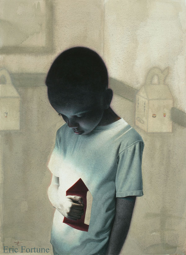
I’ve been thinking about where I want this work to go. For reference I think I’ll be revisiting a piece I did a few years back for The National Labor Foundation. I thought the piece was fairly successful and I rather enjoyed working on it.
Here I scanned and blew up my thumbnail with is actually about 1.5 x 2″ so that I would have a larger image to look at when posing my model and shooting reference.
I normally like to save time and loosely transfer my thumbnail onto the paper and proceed with the final drawing. However, there were enough anatomical things that were bugging me that I felt the need to work out my refined drawing separately prior to transferring. I actually made even more adjustments in photoshop after scanning in the final. Was it worth it? I hope so.
This piece is in it’s infancy and I’m just beginning to refine the face. Stay tuned for more.


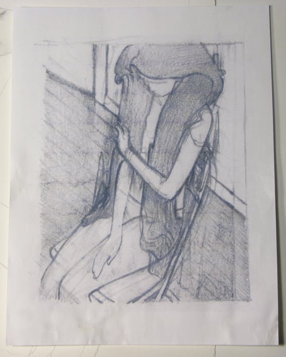
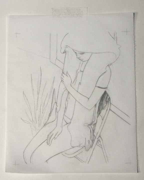


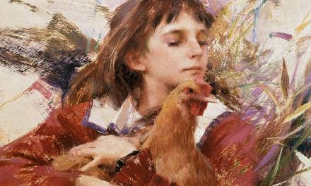
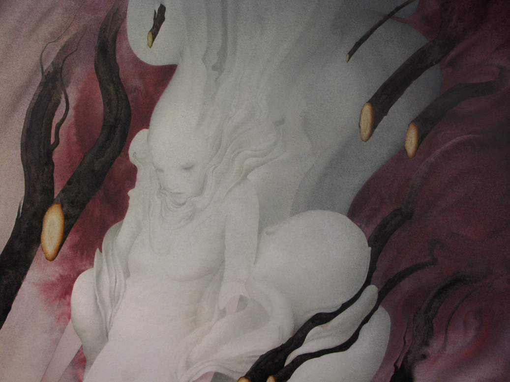

Nice to see this from scratch. Feels a little like it could go into a Klimt like direction, especially with the hair. Looking for more.
Agree about the Klimt infuence, beautiful. Will the hair be red / orange? 🙂 Think the line where the floor meets the wall needs to stay quite prominent as not to have the eyes flow off the bottom left corner.
Being from Africa, I must say the 1st image and the others you have done have really captured the way light reflects off black people's skin superbly. Is funny, how from their warm skin, light reflects in such cool hues and sharp edges. Well done!
Admittedly, I not that familiar with Klimt's body of work. Just the few very famous pieces. Definitely worth revisiting.
Nico- I think I want the hair to be a dark somewhat graphic shape. Leaning towards blackish but will see what happens. Thanks for the feedback
I've always loved that first piece Eric. Every time I revisit the annuals it's in I think it should have won medals.
The picture of the boy is very haunting and mysterious. A lovely and intriguing art work.
Bill- You should definitely judge Spectrum more often 😉 Thanks for the kind words.