-By Jesper Ejsing
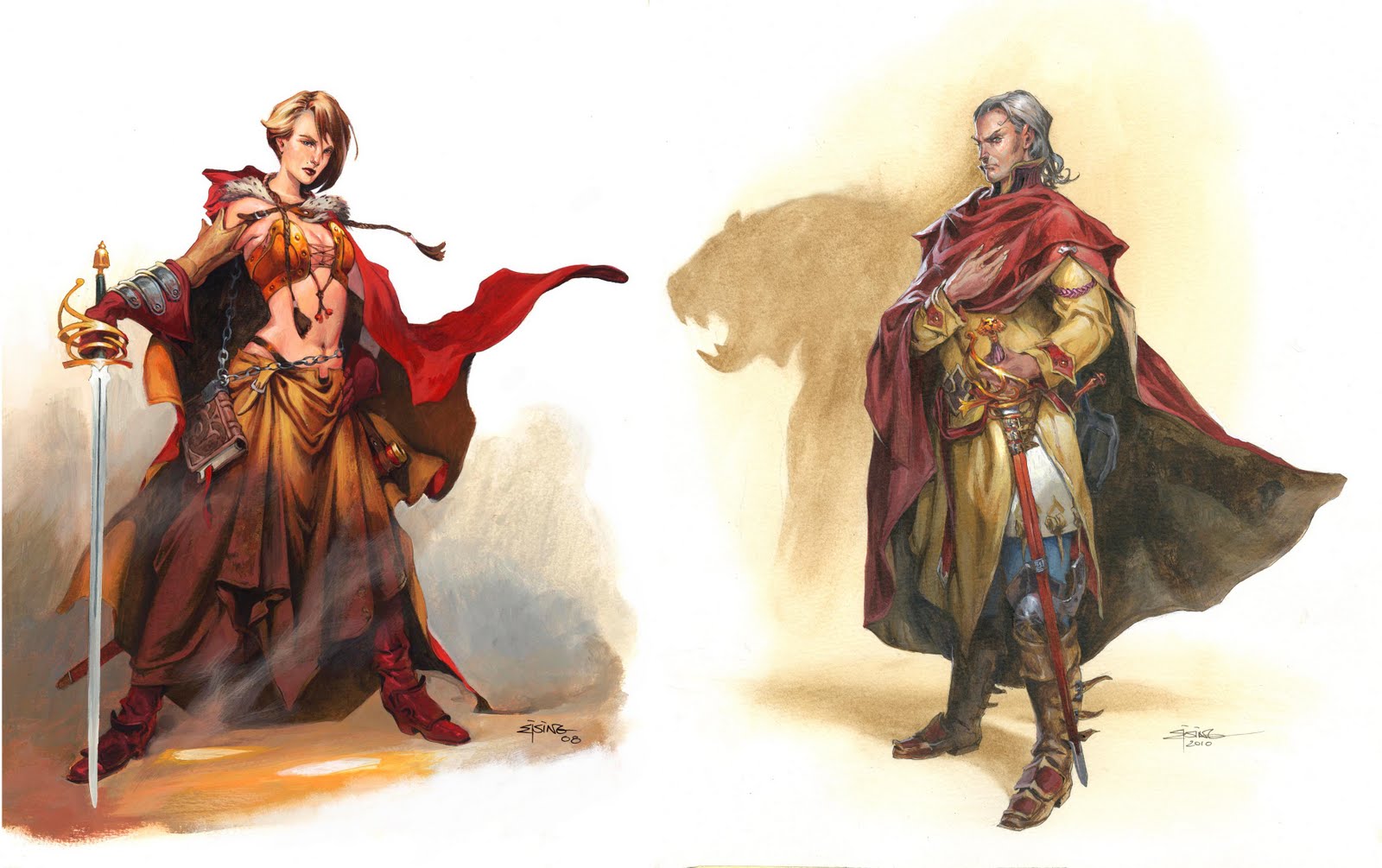
Just the other day, I was trying to find an old sketch of a dragon in the big pile of drawings right to my desk. The pile is also where I keep most of my illustration not on boards but on paper. Here I found an illustration from 5 years ago of a female warrior mage. While looking at it I thought “this is pretty good”. Usually I do not have that kind of thoughts. If a painting is older than a month I start seeing it anew and find all kinds of mistakes I would change now. While looking at this girl illustration some more, I started thinking something was wrong anyway. Not in the sense that one of the arms was too long or the eyes placed wrong. Wrong in the way that, this is not how I would have painted it today. So I pulled out a new illustration of a similar figure. This is a guy portrait, also with a sword and a cool looking face and heavy standing pose. The sword are almost identical. But what is (to me at least) tremendously different, is the rendering of the colours.
Girl:
Each element is coloured separately. Gloves, cape and boots equally red and without dirt of transparency to the colour underneath. The metal band of the gloves are “metal colour” and is clearly separate from the gloves colour. Look at the gold in the handle of the sword. Yellow and orange to show it is gold. Not much of a mix between colours.
This is the way I painted then. Almost as a colouring book where you colour by numbers.
Guy:
Compare the swords. Instead of filling in the colours of “gold” I have focused on light effect rather than colour. It is the exact same colours I have used – straight out of tube. I do not blend much on the palette unless I have to – but they have been dotted on with much more carefree strokes with a larger contrast. The white light is the main element, NOT the colour.
Another huge difference is the rendering of metal. If you go back and look at the girls glove and then compare with the boots and leg armour of the guy you see that there is a world of difference. In the guys boots I have used the under paint as a base colour and only slightly added some grey on top in rough dots. The key element that ties the shapes together is the highlight. Not the metal colour. I did not need to element colour all the kneecap to make it look like metal. I only needed the light to look reflective.
The skin tone look more alive. I tried to make it dirty and used grey and green around mouth and chin and hairline.
When seeing these 2 illustrations together I become aware of the road I am going. I am slowly becoming more a painter than a colourist of drawings. I am loosening up. “Why did I not see this ten years ago?” ( I keep hearing in my head )


I really enjoy seeing these comparisons of yours, Jesper. I've been looking at certain older works with the same kind of assessment recently (even re-painting them in some real “what the hell was I thinking?” cases).
It's always very enlightening and encouraging to see one's progress and the changes in thought process, even within just a year's time…
I just wanted to say that I really enjoyed this self reflection on your art and process. Thanks for sharing.
Thanks for sharing this wonderful pictures 😀
It's very interesting for me to see your progress!
Keep on the good work and the progress.
All the points that you bring up are very valid and true. But I think that the final use or size of the illustration play a critical role. At the size shown here (on the web) or if the final use is a collectible card then the older illustration on the left is more clearly defined and easier to “read”. At least to my eye. Perhaps if I were looking at a poster or book sized print I would prefer the more painterly new image. Or it could just be that aesthetically, I'm at a place where you were ten years ago. Either way both illustrations are beautiful.
I really enjoyed this post, have me a lot to think since I tend to be a color oriented guy.
Keep being awesome.
Huge difference. Congrats 🙂
many thanks for sharing this insight, jesper!
The first drawing was from only 3 years ago, so maybe you're progressing faster than you thought!
what a nice and interesting contrast! I can totally see how you've grown as a painter! Neat!