-By Dan dos Santos
Thanks again for all the wonderful submissions, guys! I swear some of you are just trying to show off. Quite a few of the pieces were really spectacular, and definitely not in need of any real critique. Perhaps we’ll share those here someday.
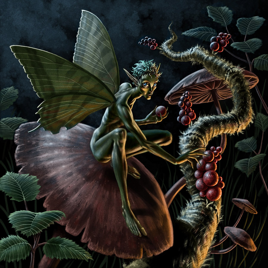
I’ve chosen a piece by Ryan Valle, that I personally thought was quite close to being successful, but just suffered from a few minor faults.
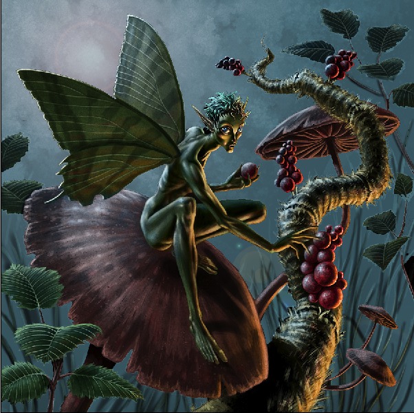
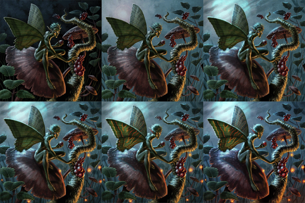
The first step was to lighten the background. I just drew a lasso around all the black, lightened it up using ‘levels’, and added a little bit of lens flare to see if I liked it. Any variation in the sky’s color was already there… it was just too dark to see.
I did like the way the lens flare helped to pop the figure, so I pushed it further and painted it into a moon. I also amplified the backlighting on the subject to help reflect this change.
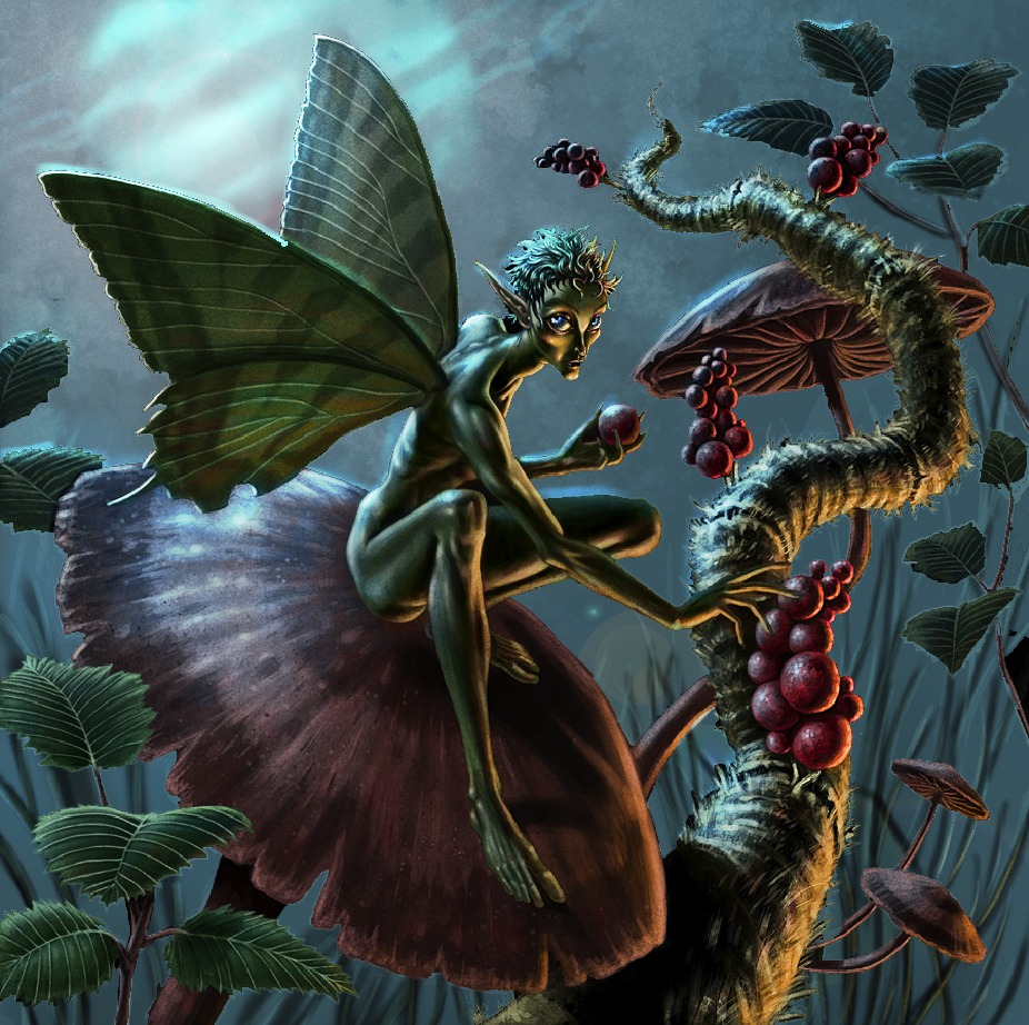
The subject never felt particularly ‘grounded’ to me, mostly due to a lack of believable shadow. In the pic above, I simply added a more obvious cast shadow from the figure onto the mushroom. I also added the indication of a few more background elements (hidden amongst the grass) to help push the sense of depth.
The fill light on the front of the figure was a bit unjustified… and actually a tease. We know something must be illuminating him, but what? A lantern, a bug, a village? Narratively speaking, the piece is better off showing the source of that light. In this case, I felt lightning bugs would do the trick.
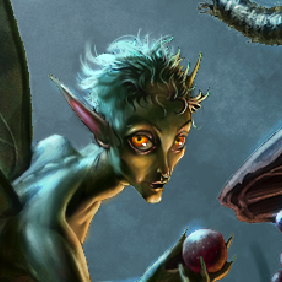
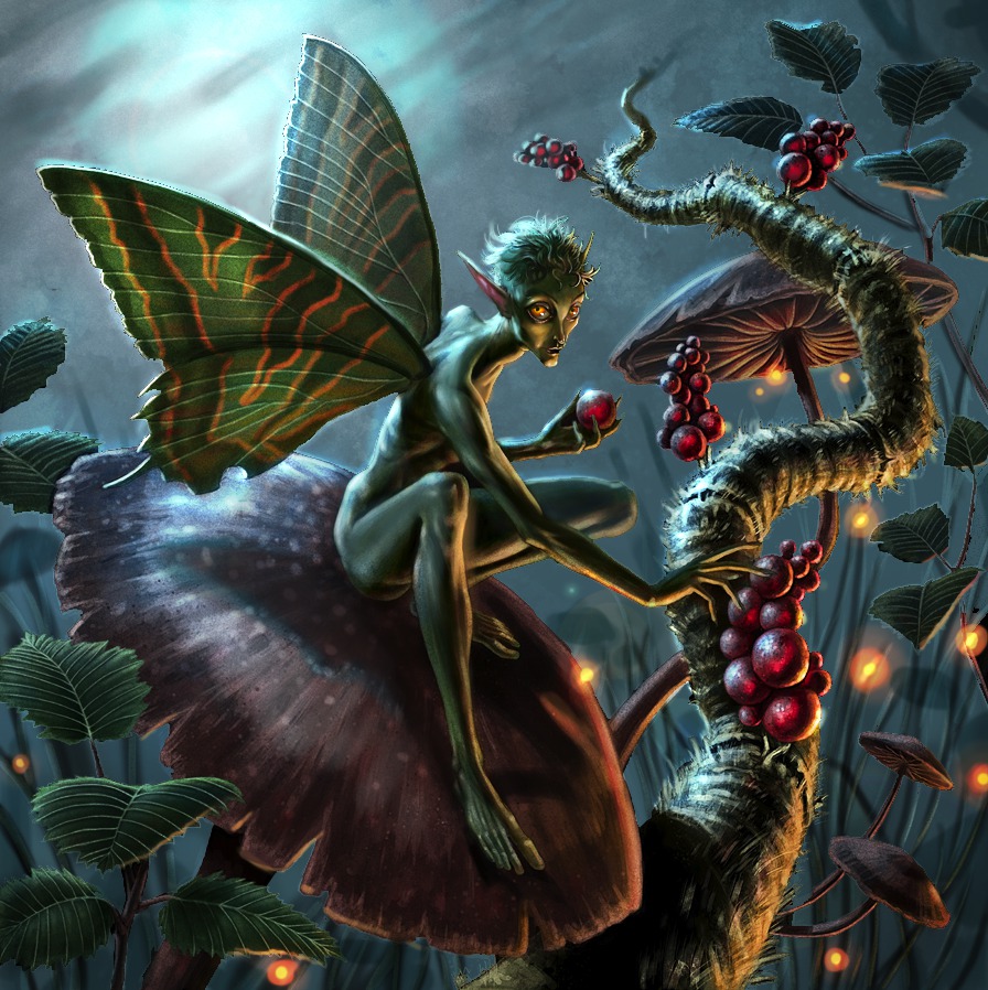
The artist chose to give the fairy blue eyes in the original piece, shown above.
I felt the subject would be better served with orange eyes, to help make him stand out more.
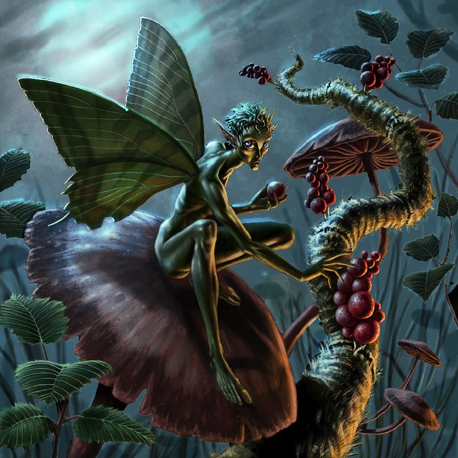
Liking the way the orange of the eyes popped against the blue, I decided to push those orange accents even further, and added some additional decoration to his wings. I also added a bit of glow inside the berries to make them look a bit more magical. Again, this was a narrative consideration. Maybe the berries aren’t food, perhaps they are medicine, or eggs?
I adjusted the color balance here just to accentuate the blue/orange theme.
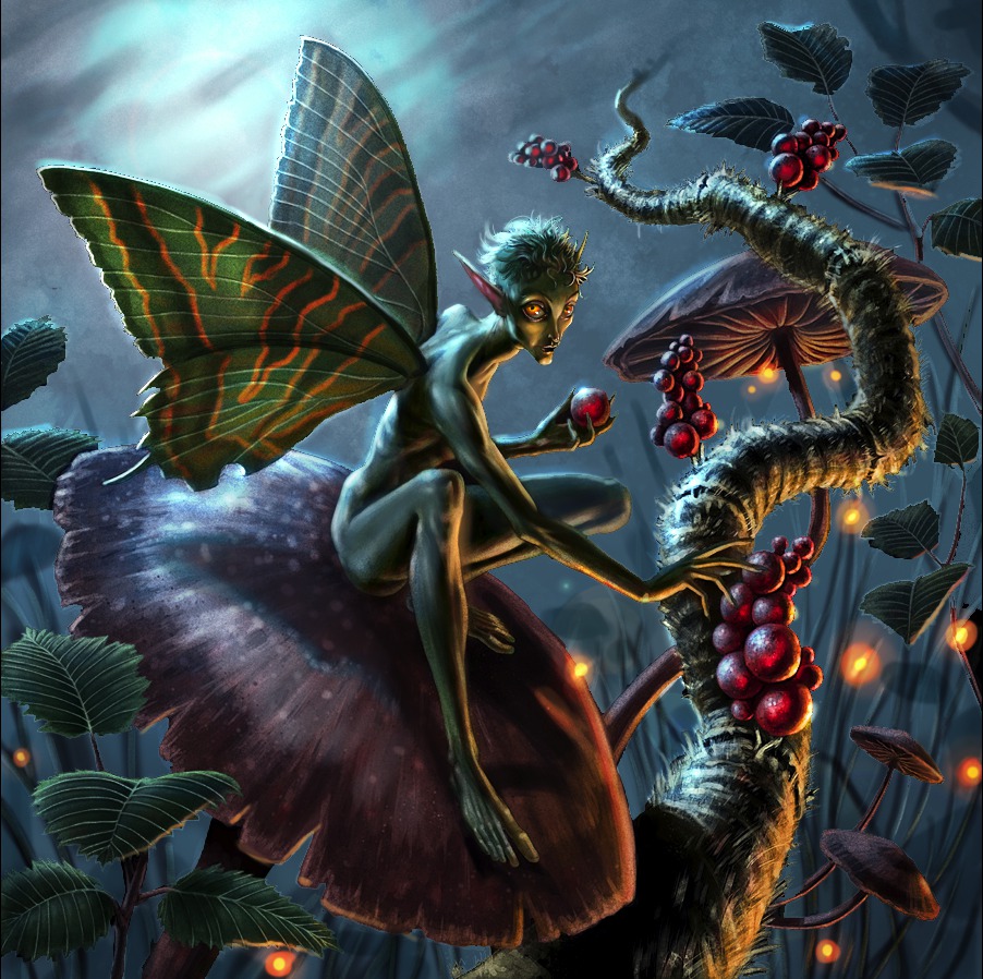
Lastly, I added a bit of orange glow to the bottom of the canvas to imply that more may be going on just beyond our view…. giving us our final picture.
Thanks again to everyone who participated, we really appreciate your enthusiasm. And a special thanks to Ryan Valle for being brave enough to let us all learn from his work.
Stay tuned, as I may post a few more crits over the weekend that I already started, but just need to polish up!






Gorgeous. Small changes but such a big improvement.
Wow. That was really informative.
Fantastic. Really pushed an already nice piece into the superb range.
These critics are the most interesting and useful readings I found of all blogs! Thank you so much for posting these! Really informative!
that's an amazing transformation.
Sorry, but I'm gonna offer a dissenting view here; and overstate my objections a bit to stress the points. All the changes made to the original piece are intriguing and instructive, to be sure. They're a lovely lesson in adding jewelry or chrome, all skillfully done and an impressive display of digital dressmaking…
But my opinion is that each one does more harm than good to the impact of the original, making it increasingly more generic and less focused, sacrificing all its character and emotional clarity for the sake of graphic glitter. And all together, I find them fatal to the original, turning a unique piece into a forgettable one, an emotional statement into an FX display, and a story into a decoration.
It started out, in my view, as a striking blend: Dramatic, inventive lighting, a distinctively somber mood, and a striking character study. That's a weird and engaging being caught in a lonely moment by a chilly spotlight that I found haunting. Despite the rich detail and overall interest, there's really only one place to look: The creature's face; it drew me back no matter where else my eye wandered.
But once glittered over, there's no place in the piece I want to linger, and no hierarchy of interest; every inch of the thing equally zings with light and every bit of lonely life and emotional uniqueness has been covered over, as if the piece were a Xmas tree or a quilt of special fx. And the main character, once I can force myself to locate him in the overall uproar of lights, is suddenly no longer a character or the point of the piece; “He's” now an “it”, a standard happy fairy from central casting, an extra in a cheery, magic'ed landscape instead of a star on a unique stage, whose wings are now more compelling than its face, and whose presence has evaporated.
I both agree with, and disagree with David's assessment. The purpose of a crit like this, at least in my mind, isn't to say “this is how you should have done your picture.” It's to point out options and other things the original artist may not have though about. You may not think the final result retains the same mood, and that's perfectly valid, but the final result, and the steps that got it there, do present a lot of food for though on what the original image lacked: a sense of depth and environment, a grounding of the figure to that environment, thoughts about color harmony and story.
Obviously Dan may not know what story the original artist was trying to tell, and may have got it wrong (or perfectly right, who knows!) The point is, he was trying to show how story should drive the picture, and more importantly, how your *choices* about that story should drive the picture. Maybe the original artist would have made different choices, but it's those choices that matter, and sometimes those choices just don't work in an image, and that's one of the dilemmas of the artist: making your story choices work and still have your image work.
Regardless if this is how the original artist would have envisioned this picture, I think if you take the ideas Dan presented about considering your background more, bringing depth into the scene, careful thought about lighting and color harmonies, all these ideas should benefit the original artist to bring the image to the next level and still fit in his/her vision of the picture.
My 2 cents.
The beauty of being an artist is that what we create is subjective. Not everyone is going to agree or like it. I have to disagree with David in his assessment. Not that he is wrong in anything said, just that I feel the changes made for a much more interesting and successful picture. My biggest problem was the lack of silhouette value in the figure/ground relationship. There was no real logical differentiation in the masses of the object, therefore the shapes were difficult to read. I much prefer Dan's solution though I might have toned down the lighting slightly on the figure's back and right leg to let the dark mass carry the figure shape even more. This exercise is always bound to stir a bit of controversy because everyone will see different potential in how they might have adjusted the work. That's what artist's do and that's why everyone has their own style. I for one would be interested in seeing more than one solution for the same piece in a future post, just to get a different perspective.
Well said Forest. I also believe that Dan may have been putting this piece into context as he is an illustrator. Maybe a cover, at least a narrative. In that case black, in the amount used for the original piece, becomes a character. It takes on a presence that overwhelms the narrative. I don't think there is any question that the paint-over implies narrative rather than makes a heavy handed attempt at mood.
There is a psychology involved with using heavy amounts of black on the cover of something meant to sell. That also might be part of Dan's point in his update. Hanging a piece on the wall with this quality might appeal to certain people but as a tool used for selling or illustrating a book it can be problematic.
Maybe that is the crux of the problem. The original piece can appeal on different levels to someone simply looking at the work. The uniform edge and harsh quality can be appealing in some situations. But as a narrative and/or a book cover it might not be as successful.
Not sure why I feel the need to defend but I do feel the direction Dan took it to be more successful as an illustration.
People often make the comment that art is subjective, and this is only partially true. There are rules that exist that, in the context of an illustration, can be right or wrong. Composition, value relationships, etc. have to exist for a painting to be successfull. That is not subjective.
The painting as originally done is cool, but, because of the black background and lack of depth, it looks like all the elements exist on the same plane. Also, there are no shadows to ground the character to the background. Now, if this was meant to be a decoration, then I think it would be fine, but I think the artist was doing an illustration, so based on that I think Dan showed what was “wrong” with the painting in that context.
Fine art can be subjective, commercial art has right and wrong, and this is a great example of the difference.
Thanks Dan for a great learning experience
Obviously Dan's the expert here; I guess he's in effect acting like an AD in this case, and as such we can assume he's the one who knows best what the real job at hand is–what the piece has to do–and he's the one with the clearest view of how to fulfill that job. So in that sense I certainly would defer to him and would look at his changes to the piece as instructive gold, assuming I wanted to sell him more work.
Without having any explicit job description for the image, I'd guess from the changes that Dan has a cover in mind rather than, say, a suite of inside illustrations or a panel in a graphic story. At least there's no question that his version of the image would be a better (more attractive, more light-filled, more colorful, more warm, more friendly, more populated, more up-beat, more competitive…) cover than the original. I'm intrigued with how this do-over points to blue/orange as more appealing (current?) than red/green, and to multiple, scattered points of interest/areas of contrast and more world/scene focus than face/character focus as being what's wanted.
That said, maybe it's pedantic of me to suggest that if that's what's going on, the changes here are not so much about serving a story, as about selling a product, establishing a genre, a style and a mood known for appealing to a particular market. At least that's another way of stating my original objections to the changes: To my eye, they completely changed the image from one that actually does tell a story, or part of one (it creates a character in a specific situation and establishes a distinct moment/flavor, a scene if you will, within a larger story) to one that could hold its own in a rack of similarly illustrated book covers. It now suggests to me a genre rather than any specific story, and establishes a quite different mood, which might suit the overall story rather than some moment within it, who knows? Whatever–It's now a more universally attractive product.
Thanks for the critique Dan! I really like the improvements you made. I'll definitely apply what I've learned here in my future work.
I'm with David. I thought the original piece was striking. I think the do-over is blah, and wouldn't (at least to me) stand out amongst other pieces.
To me, the original “differentiates” (to quote AD Jon Schindehette) itself – the do-over doesn't.
Man, you guys love to analyze stuff.
To -my- eyes, the original piece lacked a believable sense of depth and legibility, and the figure lacked real form and weight.
Yes, the image was striking as is (that's why I chose it), but at what cost?
Perhaps those errors in realism don't bother some of you guys as much because your eyes aren't as attuned to them. But to me, the artist appeared to be trying to achieve a certain result, and I thought this would help him get there.
Some of you may think it looks better the old way, and maybe Ryan agrees. All I can say is, that to my eyes (which deal with this stuff 24-7), it looks better this way.
Then again, I like lots of stuff that other people don't…
Like musicals…
and black jelly beans.
And, of course, black jelly beans look the coolest too.
As a first hand witness to Dan's obsessive love of Little Shop, I assure you, his tastes deserve a healthy grain of salt.
I think the paintover is brilliant and dealt with a lot of things that Were off with the initial picture. It definately turned out different, and perhaps not what the creator intended, but it's a lot more interesting pictorially imo. Even if the end result isn't what the creator wanted he/she should have learned a lot from reading the critique.
Thanks for all the compliments to my original piece everyone. I really appreciate it. Thanks again Dan for the great critique. You're absolutely right about what I was trying to achieve with the original piece. You're paint over fixed a lot of problems I hadn't noticed and really improved the piece overall. I learned so much from this critique, it was really invaluable.
I tried applying the fixes to the original myself to see how it looks painted in my own hand, and I also made some further changes that occurred to me while I was working. If anyone is interested in seeing a comparison of all three versions here it is http://praxiteles.deviantart.com/art/Fairy-Comparison-256576099
@Ryan:
That's SOO much better!
Definitely better than my own.
I think your decision to keep the sky a little darker helped to maintain some of the impact the piece initially had.
I'm happy you liked the paint-over,
and even happier that you've decided to implement the ideas and improve upon them in your own way.
I had looked through your portfolio prior to doing this paint-over, and noticed that the issues with black seemed to be prevalent in a lot of your pieces.
I hope this exercise will help you find new compositional solutions in the future.
I LOVE LOVE LOVE black jelly beans! And red too. although if I eat too many, my tummy is unhappy. My tummy is unhappy a lot.
What an improvement. Thanks for sharing all of this useful information and tutorials with us Dan. Really helpful and to top it off, you seem like a truly nice fellow!
I think the changes are helpful, definitely even to those looking on. I didn't think my work would get chosen, but just seeing your thought process helps me to improve. Thank you for taking the time to critic these works. It has inspired me to do the same on my own art blog. http://ashleywalters.blogspot.com/2011/09/crit-day-post-before-11th-and-get-cc.html