Gregory Manchess
This one was a bear.
I had no deck plans for the Whydah, Black Sam’s ship. The client knew what the ship looked like, but because we were all moving so fast on the project, I didn’t get the 3D animator’s images in time to use on this one. I was nearly in the dark for reference, and had to listen to general descriptions and look over deck plans from a ship of the same time period, circa 1717.
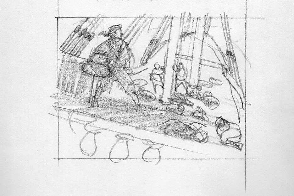
This was the only thumbnail sketch I made. From there I shot my models and sketched directly to the canvas. There was just no time to do a finished sketch.
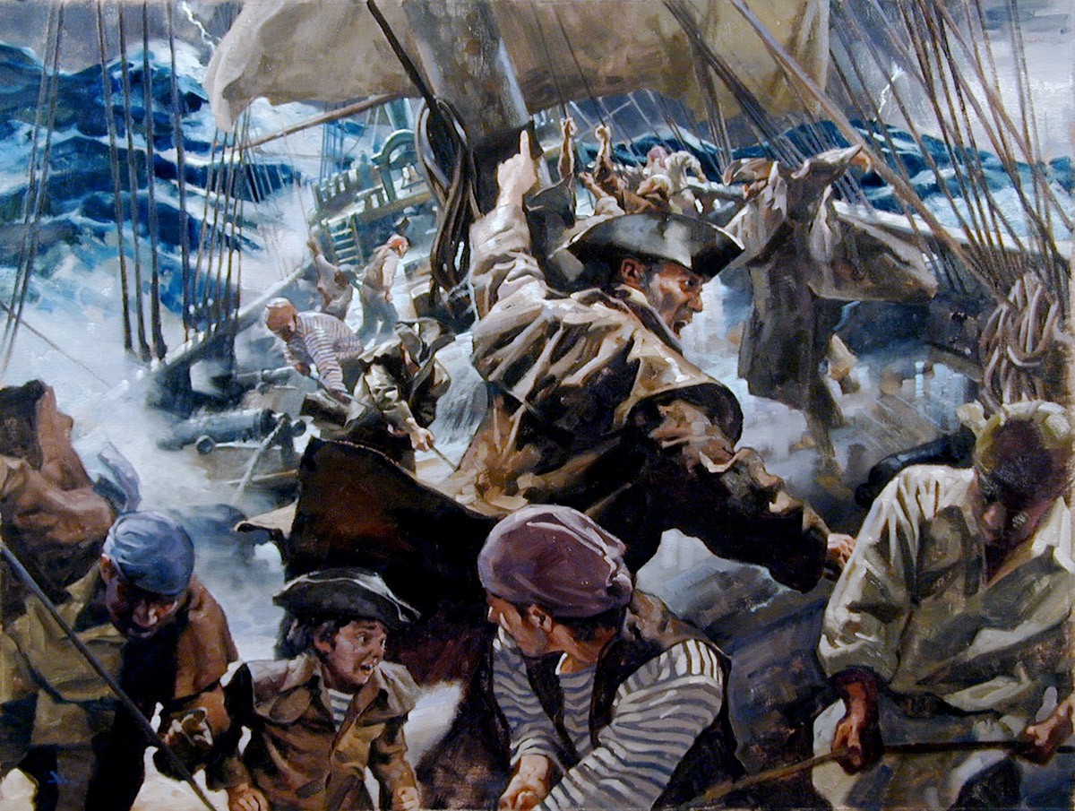
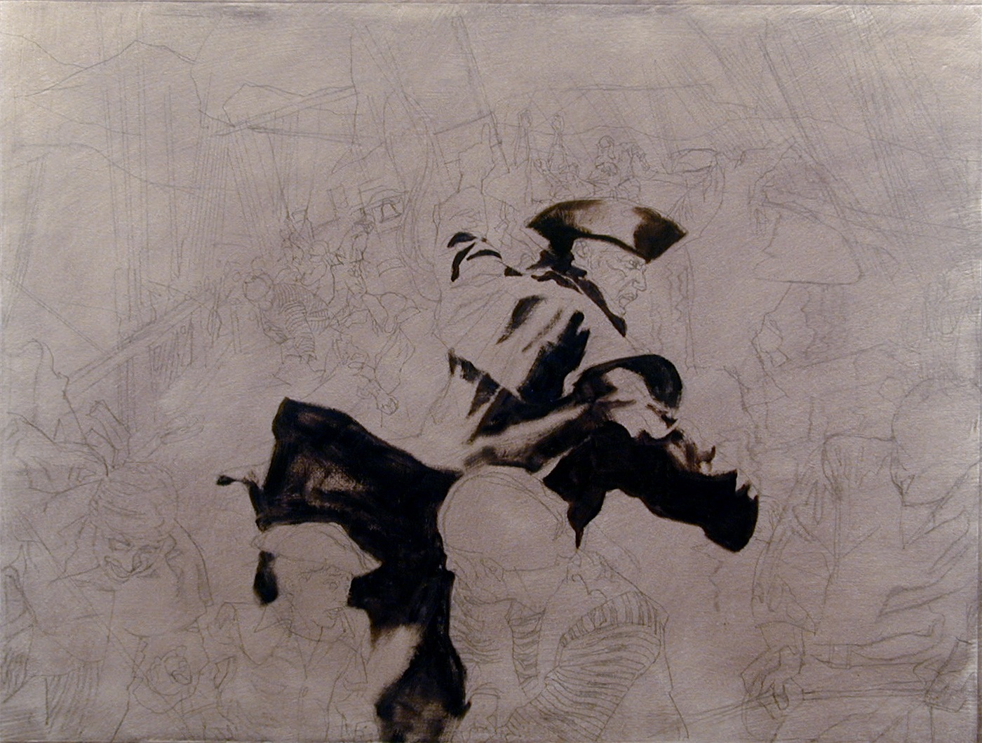
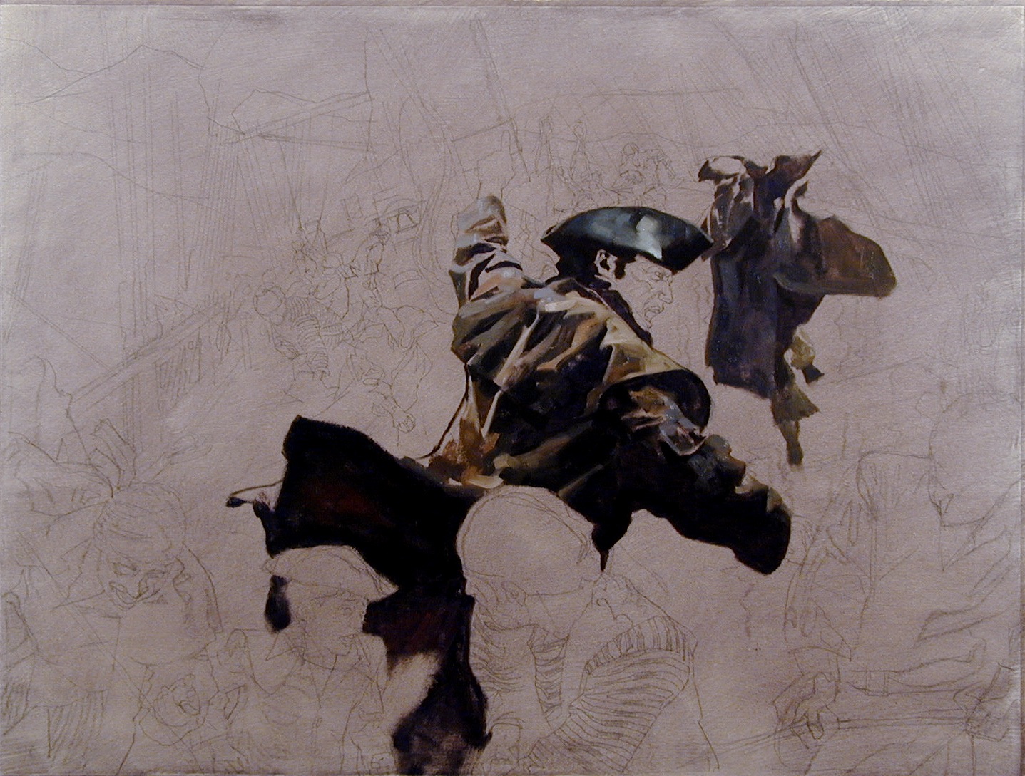
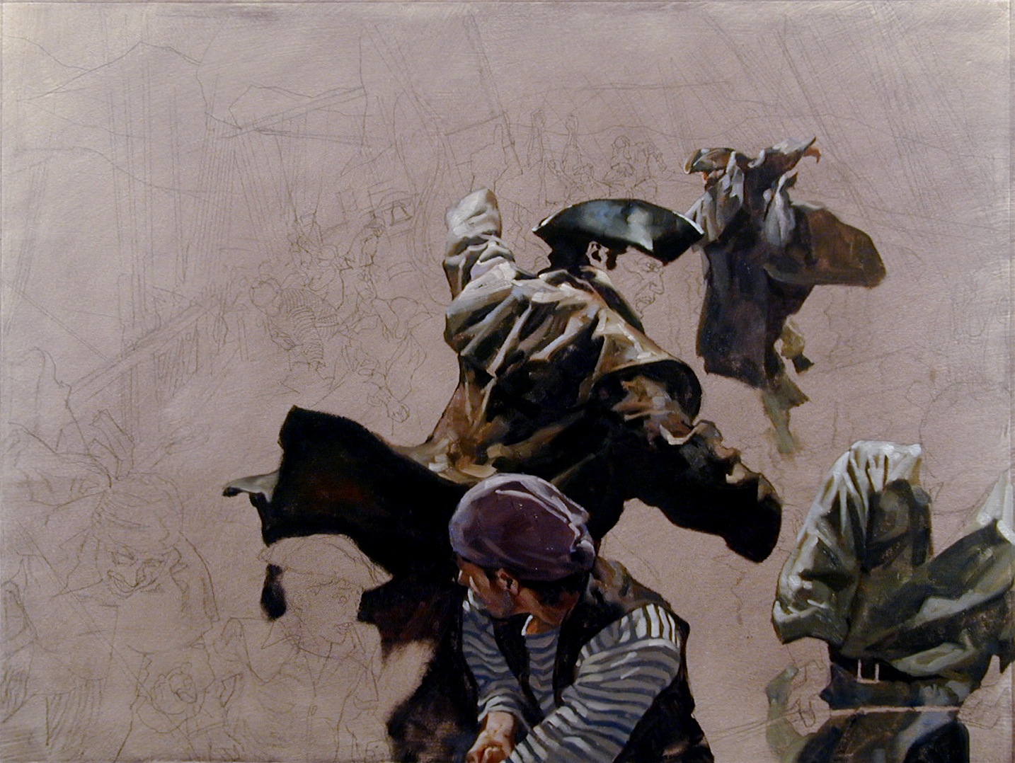
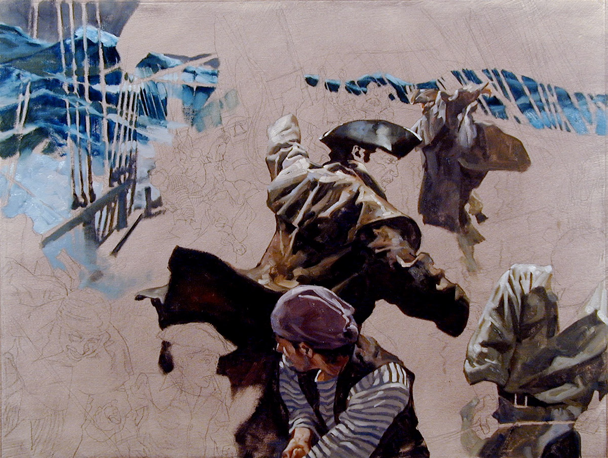
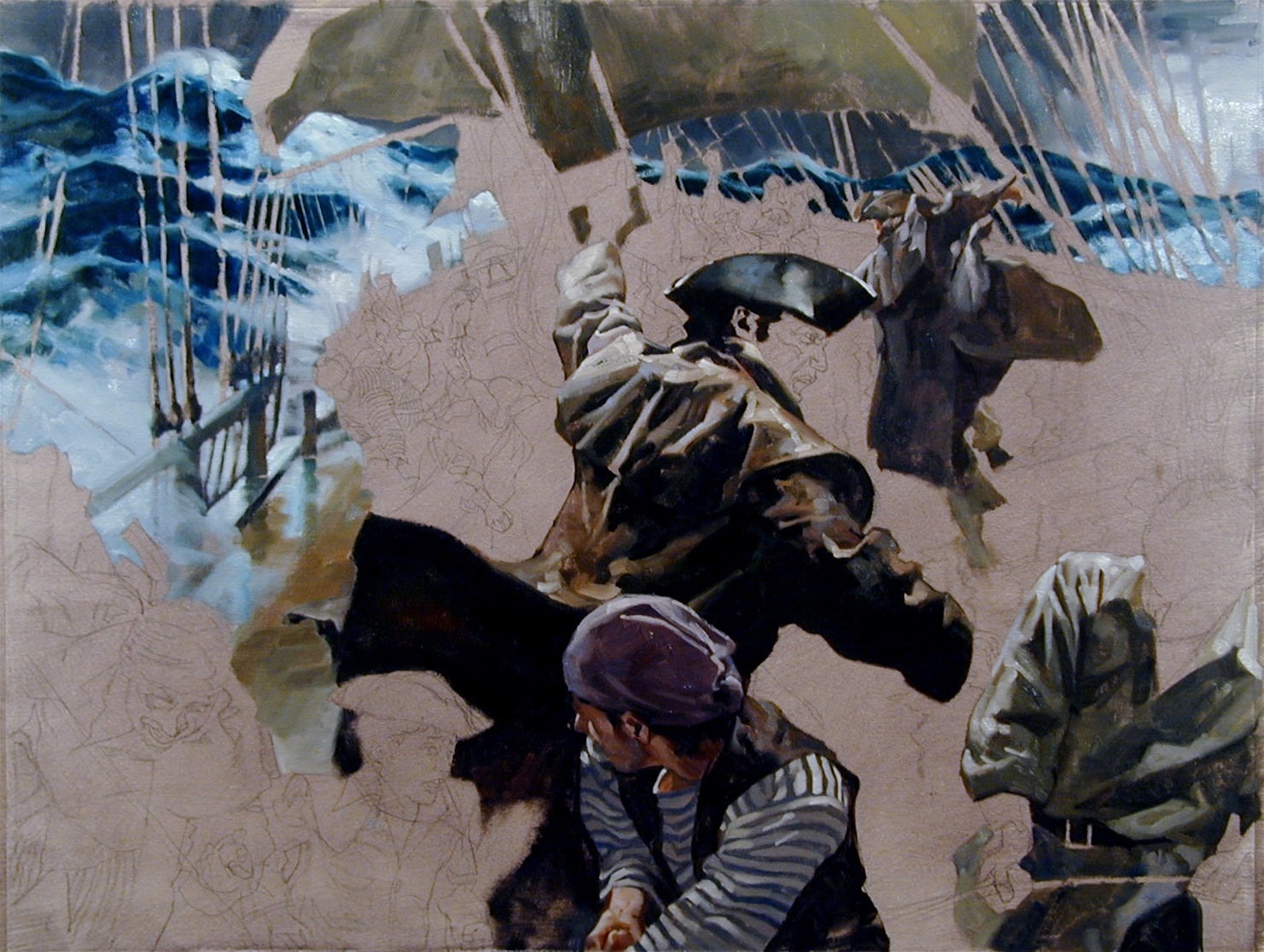
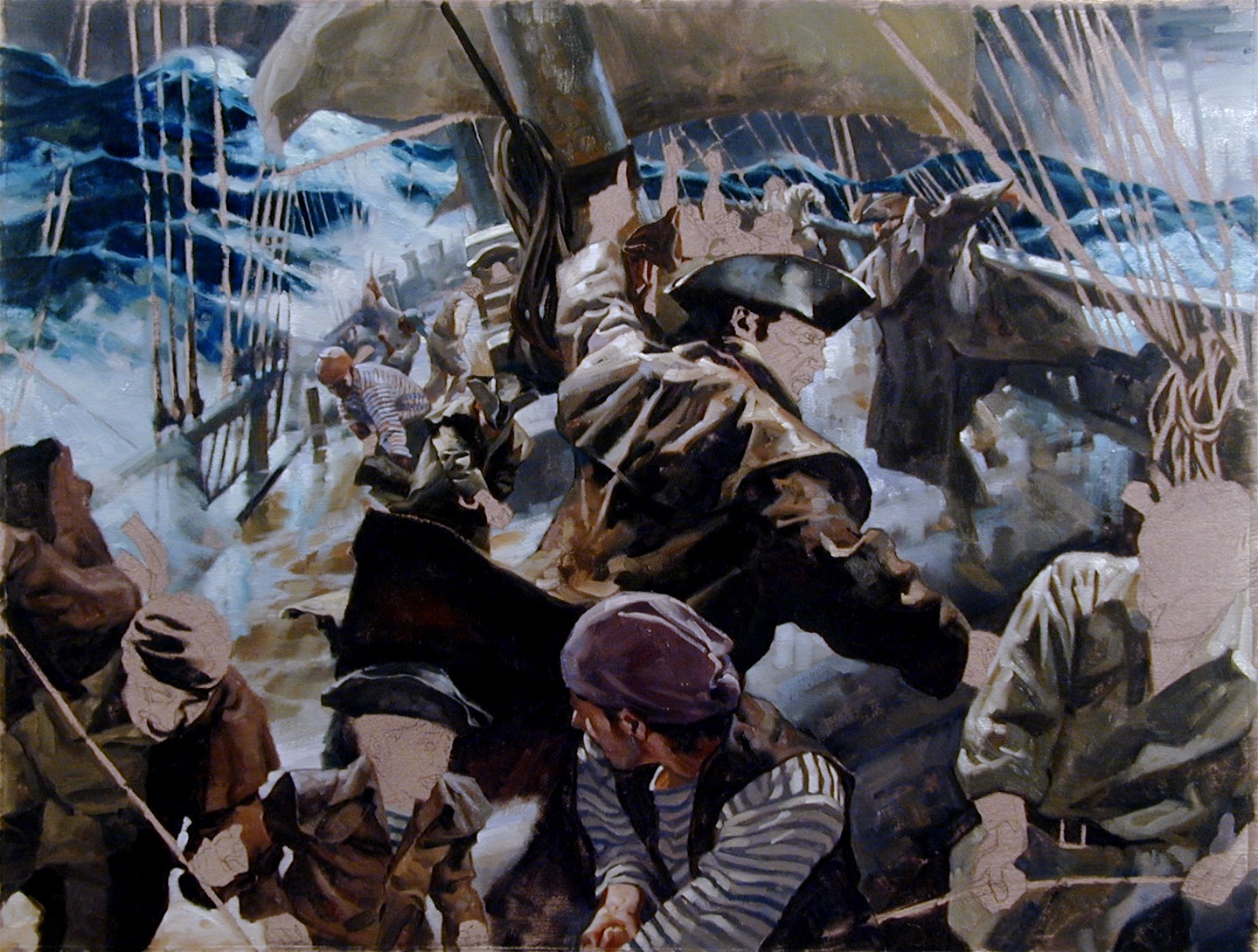
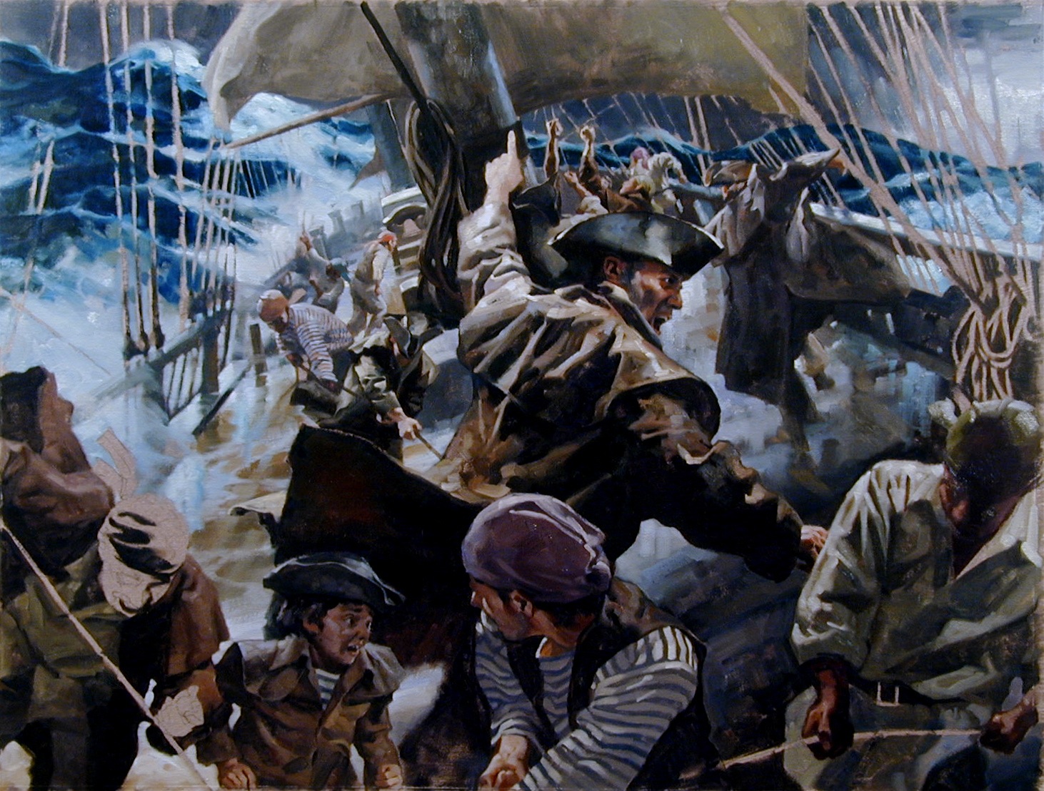
Here’s the basic sequence. Nearly finished and after making the deck glisten just the way I wanted, I realized I’d forgotten the cannons that lined the deck. I also noticed that the ship’s bell, the main artifact that told the divers they had actually found the Whydah and integral to the Geographic exhibit, was placed on the wrong deck. It was supposed to be mounted on the forecastle. This was going to take a total deck redesign and lots of repainting.
Notice the lack of cannons in the last frame…
What did I do? The first thing was to scream, “NOOO!” (and other choice phrases). I mentally beat myself to a pulp until I was begging myself to stop, slumped in a chair, and noticed the clock. No time to grieve.
I continued immediately by redrawing over the top of the mistakes with the brush, redesigning as I went, cussing a blue streak until I had control of it again.
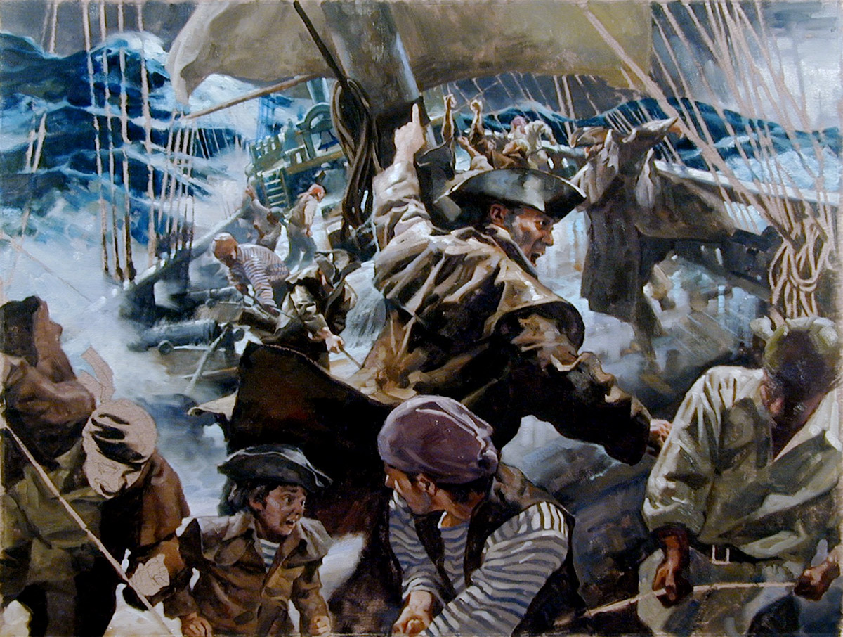
Here I’ve added the cannons.
And redesigned the forecastle.
The final painting.
I pinned it on the wall and moved on to the next painting that involved the Whydah’s capture. Four down, six to go…one month left.







This is something every art student who complains about a 4-week “deadline” should see.
Gorgeous and staggering as usual.
You're a sick man! Nobody should be THAT good!!!
JK
You're the best!
Profound changes done, late in the game … and not a clue left for the viewer (except Muddy Colors followers). That alone is a great achievement, and then there is the painting as a whole. Well done and best of luck for the other paintings to be done still!
Gregory Manchess?
That like in JACHESCO ?
Or COMANCO?
Or is that more like CONESSA?
Point is, we know Al Gore and the Netherlands with Dot had a few things going on with NESSESSCO?
And so when we see GEOLOGIE with HURE and into Colorado , it's got to be IRENE, NICE, with ACE.
And so it happens that LA ties VIRGINIA!
And that got attached to REGIS and OREGON and LIZ.
And all due to Palm Beach!
Hi Greg, [a follow-up to my similar question in pt 2]
Looking at your process it looks like you set up your foreground lighting with the captain, followed by mid ground with a crew member with a similar style jacket, and then worked the ocean and large sail. Unlike the Pt 2 article where you had the moonlight as a main light source, part 3 must have been more difficult in that you had lightning and then storm cloud lighting and white water reflections… though it's hard to tell what time of day or night it is. Did they define a time of day for you, or was that your choice? Also, as in part 1 and part 2 it looks like your painting the clothing first to help set up the lighting of your characters faces. Am I reading/following your process correctly? Sorry if I am stating the obvious in some of the above, just trying to make sure I am understanding your approach to these paintings. The fact that you are waiting to paint your characters faces late in the painting is something I don't think I ever tried before. The characters facial expression is where I go first and seems so key, but I definitely see where that is probably not always where you want to start. Thank you for showing your work. Mike Perusse.
That actually makes me feel like im on a ship, reminds me a bit too much of my navy days
Wonderful painting Gregory! And a great read too.
I'm wondering how you go about picking colors that “jive” when you're working on smaller areas and not the whole painting at once?
Thanks, all!
Mike, because of the flashing lightning, I wanted an overhead whitish light, bleeding softly through some places, in others, more harsh light. So this painting became a stage as well to play light against. It's an overcast time of day, so I had that control again. That's why I waited to paint the faces, as they would be balanced by the light that hit the clothing. if I did the faces first, I'd probably have to keep changing the color of them to fit what made more sense in all the other areas… In short, it was less risky to start with the clothes than the faces.
Which leads me to your question, Daniel. I start with a very clear vision of what's going on in the lighting concept. From there, as each color goes down, it dictates what color will be next to what, building as I go. Overall lighting affects every single part of a painting scheme, so it all falls in as puzzle pieces. If it's a sunny day, it will dictate using certain colors…it must, or else it won't look sunny, or rainy, or wintery, or overcast, or night, on and on.
Also: Nico, I hope I haven't misguided you or anyone here. The paintings are all done already. I'm just re-counting the process for the Muddy followers! Yep….I made the deadline. But just barely! I trust that doesn't ruin it for you.
Yet going through the steps and writing about it gets me nervous all over again….