Focal Point
Wednesday, December 7th, 2011
By – Jesper Ejsing
Thinking back on Illuxcon I realize that I said the same thing to everyone approaching me with a portfolio or asking me to review their artwork. Maybe it is because it is the one thing I got right, or maybe it is because it is something you can apply to almost every illustrative painting. Anyway; the thing is “Focal Point”.
Every illustration has an area where I want you to look first; a place that first of all, should draw the eye. That is the focal point. To me it is almost always the face of the hero or the main figure. That point should, in every way, be the brightest, the most detailed, the most saturated, the most contrast full and the place where all the compositional elements are pointing toward.
Like ripples in water, the further you move away from the focal point, you drain away color, detail and so on. In the farthest area away from the focal point the painting should seem almost grayish and on focused to not draw any attention at all. If not, the reading of the painting becomes confused and the eye starts to wander aimlessly around not knowing in which order to understand what it is seeing.
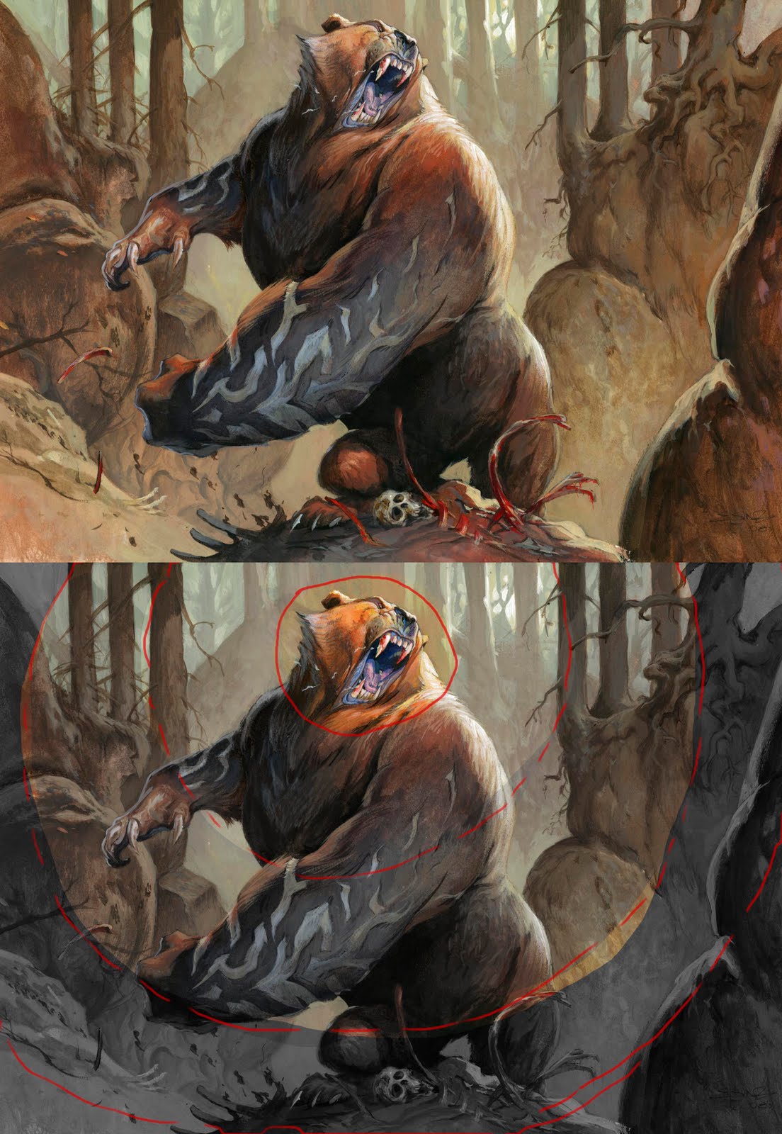
This image is an illustration called Rune Claw Bear from Magic the Gathering. To show what I mean I have circled in the area of interest, the focal pint, and added the “ripples”. The tools you can use for emphasizing the focal point is these:
Texture:
I try to add the most detailed strokes in the face and shoulder of the bear. The tongue is very detailed and the strokes are fine. Compare the rough and broad brush strokes in the cliffs or the stomach. In using different size of brushes I automatically get the texture difference I need.
Contrast:
I added the strongest rim light to the face and the shoulder. The black nose vs the white light, the light teeth vs the black hole of the mouth are sharp contrasts that makes this area look more important. It is the same rim light that is on the cliff behind his right claw, but I sucked out the light of it making the contrast much less obvious. Imagine what I white rim light would have done out there in the background?
Everything but the main figure has no super dark or black in it. It is all kept in less contrast to make it disappear.
Saturation:
I used orange/reddish brown around the focal point: yellow and white for the light. The rest of the Bear is more dark brown. For every ripple I go a bit more dark and less saturated. Especially in the background you can see it almost looks like there is a filter of more and more grey being put in front of the lens.
Brightness:
The lightest value will also keep the eye focused. That being said I think I needed a light source within the frame and added the sun shining through the trunks. It is a second focal point, but I consciously put it close to the face to even up. But still I kept the brightest part of the bear to the top and the face.
Composition:
I used the trunks and the cliffs as a frame for the figure. The tall vertical threes creates an ease that makes the dynamic shapes of the bear stand out: Also the sticks from the trunks points toward the focal point, the skeletal bones do the same. Even the arms of the bear points toward the face.
You can easily create a fantastic painting without getting every one of these points right. In multiple figure paintings you need to soften up a lot of the rules, but still, knowing what these elements do and how to play them, is a key to making a successful told story. And every painting is a story.
( even a little tiny story of a Bear saying “RAHHHHg, my kill. Stay away”)


I know this stuff but important is to really use it 😛 Thanks for the reminder.
Thanks Jesper, very cool. I'm going to apply that to the cover I'm currently working on.
Thanks Jesper! I'll try to keep this in mind while I work on my newest illustration.
Wonderful post!
That is a really helpful and new concept to me – thinking of focal point as concentric rings.
Thanks for the great insights Jesper!
-Will
Great post!
Just one comment: I recently had some lectures about focal point, and it was made clear that what is unique in the image is what will draw the eye. So your focal point doesn't necessarily have to have the highest saturation and highest level of detail and so on. If you have a very busy, detailed, highly saturated background, and then add a character rendered with smooth texture and calm colors it will immediately become the focal point because it works as a contrast to the background. This approach is probably a bit more difficult to get to look good – but it's worth keeping in mind 🙂
Thanks Jasper! This really helped. 😀
Thank you for this post. I'd like to think that focal points are one of those art principles that artists need to re-learn again and again.
That is one cool bear, too! Thank you.
This is perfect advice for people looking to take there work to the next level.
Very cool and helpful, thank you.
I also recognized the illustration right away!
This was a great post. Easy to digest, and will provide, um, lots of focus for my future attempts.
Much appreciated! Thank you
excellent and concise tutorial.
Great advice Jesper, and breaking it down with that bulls-eye effect really hammers it home.
Đây không chỉ là những kỹ thuật vẽ, mà còn là cách để kể một câu chuyện trực quan một cách thành công. Cảm ơn vì đã chia sẻ kinh nghiệm quý báu này!