-Dan dos Santos
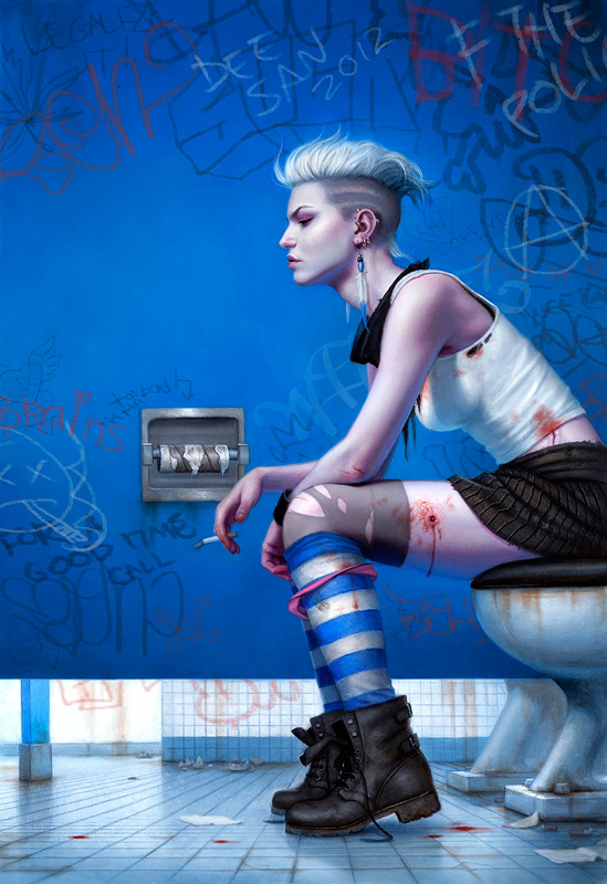
Here’s a painting I just finished up. It’s for the book ‘Even White Trash Zombies Get the Blues’. Which, in case you couldn’t tell, is the sequel to ‘My Life As A White Trash Zombie‘.
You may remember me mentioning in a while back that I was referencing Norman Rockwell for a piece I was working on, particularly to examine the way in which he flattened space to create a more graphic effect. Well, this is the painting that I was attempting to achieve that look on.
Sequels are always tough. They have to look good on their own, but also need to compliment the series. The first cover in the series was particularly successful, but also a bit of a deviation from what I normally do. So it was a bit tricky for me to maintain that same flavor in this piece. Very flat color, very flat space. I still don’t know if I was entirely successful or not.
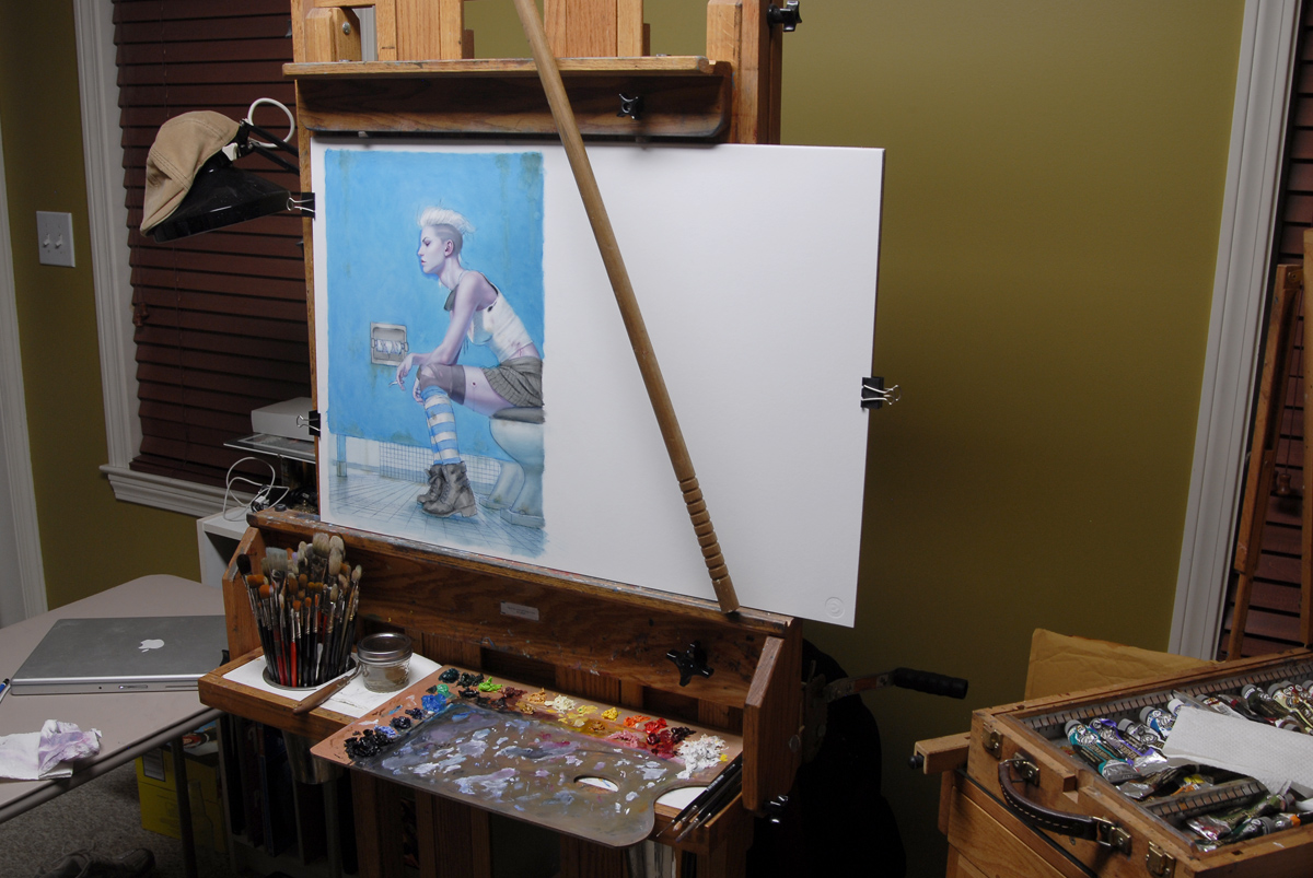 |
| My messy studio during some VERY long nights. |
The job was a real rush, and I only had 6 days to complete it, concept to finish. The blues just would NOT dry in that short of time, so I added all the graffiti in digitally. Probably a wise choice anyways, since it is quite possible that I will need to rearrange things to accommodate the type (which will also be done in a graffiti style, primarily in the empty space you see).



I loved this one, the bounced lights are perfect. You can feel the environment where she is. Congrats for this one!!
I like it-rly nice choice of colours , even though i am not sure if zombies go to the private place in fact 😀 And since it's a dirty urban toilet i'd love to see my fvourite graffit “Everyone can piss on the floor, be a Man- shit on the ceiling” 😀
Wow, I love it, this is an amazing piece!
May I ask what kind of reference material you used?
Dan, please don't tell me it's an entry for Spectrum!
(the graphic composition touch works great, I'm digging it. I would only lift up bottom edge of blue wall a bit – so you can more easily notice Rockwell-like background)
A very bold and brave concept for a cover image, I'm curious to see the final layout with title treatment and cropping. Six days, that's tight! Great Job.
Dan, you hit the emotions and mood fantastically. That first micro second look from title to image was dead on great.
I can see where your research/exploration of Norms work has helped. This painting seems to be at a higher level from your other work. Especially the mood.
Cool Beans, nice work. As always thanks for your efforts with Muddy Colors.
~Mike
[Seeing this painting and your success and hard work is the reason I swing by Muddy Colors everyday. It's just such an inspiring and energizing blog for art.]
That why I art lover. -cheer-
i think you have achieved success in this piece…very beautiful….for a white trash zombie that is!
Gorgeous!
Oh, wow, this is so cool. I haven't read this series but after seeing your picture I really want to.
Love it! The melancholy atmosphere is spot-on. This may get a frown from people, but it really reminds me of the countenance cats take on when doing their business, lol! In my eyes the graphic quality has been achieved completely and works great.
HAHAHAHA!!!
“Messy” ?!? seriously?! MESSY STUDIO?
Dude… you'd have a heart attack if you saw mine right now..
Even when mine is “clean” it still seem to be cluttered and junked up. lol
messy. ha.
My first thought was: Ooooooh pretty blue….
My second thought was: Zombie's use the bathroom?!
My third thought was: Uh-Oh that poor Zombie girl is out of toilet paper.
Words cannot express my thoughts . . .
That is a beautiful blue though! And as brilliant as the pink was!
Congrats!
The blending and color on her skin is so soft and perfect I almost thought it was digitally painted. That's wild.
My Hero! Beautiful blue…Nuff Said!
great, great great great great great great!!! Dan, you are one of the best!
How do you bring your images into the computer to work on them digitally?
I take a photograph. I hope to write a whole post about that soon.
I thought the same thing. I even called the author to make sure that the heroine still had bodily functions. She assured me she does!
Nope. I painted it after the New Year, so it's technically not eligible yet. Next year though!
I took photos of one of my favorite models. Quite possibly the most awkward photoshoot ever. Asking a model to even look like she is peeing is weird.
Digested braaaaaains.
What a great image!
But, I feel that, in order to really invoke Rockwell, her ass should have been just a few inches deeper into the bowl. That and her heels just a little farther apart to get the right slightly awkward gesture that even the most confident have when relieving themselves. But I love the socks and I love her expression!
Also Balgus82 is totally right! The poor broad has no paper! Shes gonna be pissed when she notices!
SIX DAYS?! That's crazy. Out of curiosity–and feel free not to answer if this is too sensitive–but did they pay you a rush fee?
The colors are gorgeous, as usual, and all the details…wow. I'm constantly inspired by your work!
No, no rush fee on this one. Sometimes if a client books me last minute, I do charge them for a rush, about 20% or so. Mostly because I have to push back other clients, which isn't fair.
But the client on this piece, Daw books, is really good to me, and they really do try their best to always meet my scheduling needs. In this case, Daw booked quite early. The short deadline was a result of unavoidable delays in the approval process and no fault of their own.
surface on which this painting was made?
Wow, so far my favourite from you. Don't know what it is but I was amazed when I saw it. Marvelous, eyecatching work.
haha,I bet so! Vampires and Zombies have rly strict diets 😀
It looks amazing!
Strathmore 500 series Illustration board, cold press, 20 ply. Acrylic primed on both sides.
Judging by your painting she must have done a great job 🙂
Excellent, and oddly quite funny. The bottom-left of the painting, the receding floor tiles and the way the light hits them… that's super!
Do Zombies poop? 🙂
I love this. The colors and perspective are just fantastic. Gorgeous as always DDS!
You should read the book, that's actually how I found this page 😀 The only difference between her and a stereotypical zombie is she has zombie-powers and just needs brains every once in a while…
Dan, that is really good, what medium is that? You mentioned paints, but when I first saw it on the book, I honestly thought it was digital, you are amazing! You should post some tips or something, I'd love that :]
Beautiful color painting.