-By Dan dos Santos
Art teachers will often prohibit their students from using black on their palette, instead requiring them mix their own black from a combination of blues, reds, and greens. Really, it’s a shame, because black is such a potent and versatile color. The purpose of restricting it’s use though, is not because black is an inherently ‘bad’ color… it is just an abused color. Too often students will turn to black to create shadows, never really questioning if those shadows should be warm or cool. The result is chalky flesh tones, and a monotonous painting devoid of any real luminosity. By making students mix their own, they will hopefully learn to create a variety of different blacks.
There are many ways to create a variety of warm and cool blacks, the easiest of which is to simply add a little Alizarin Crimson or Ultramarine Blue to the respective mix.
A slightly more advanced technique though, and a surprisingly simple one to use once you know how, is to control the temperature of black through it’s transparency:
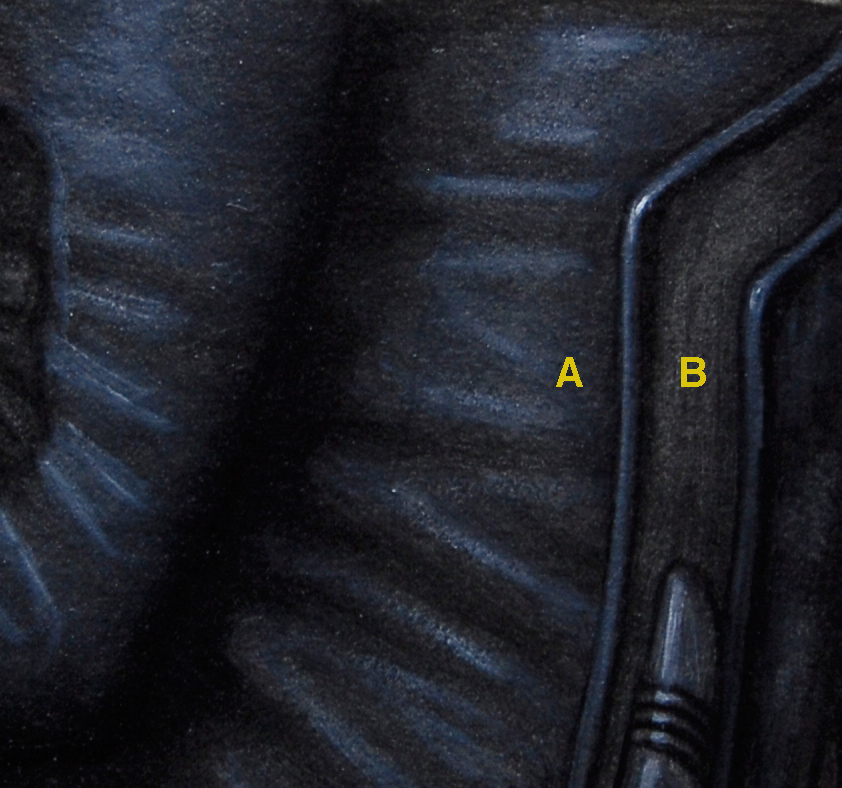
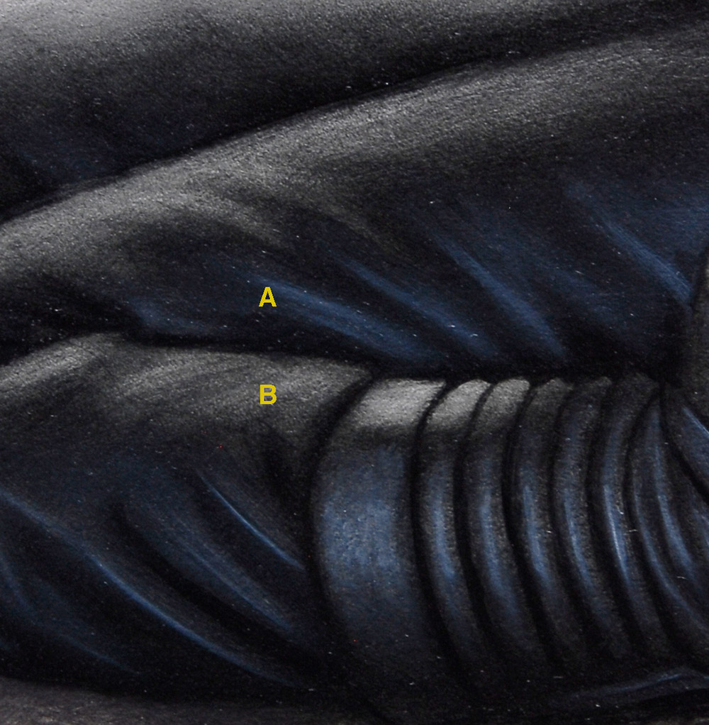
Take the pictures below for example (an excerpt from an upcoming painting of mine).
The area marked ‘A’ is Ivory black mixed with Titanium White.
The area marked ‘B’ is the same Ivory Black, glazed over a white surface.
Titanium White, being devoid of any saturation, will naturally desaturate any color it is mixed with. When you mix white with black, the result is a very cool ‘blue-grey’. But if you apply that very same black in a transparent fashion over a white surface, you get a much different color… a ‘warm-grey’. Even though the value may be the same, the resulting temperature is quite different.
So by simply letting the white of the board do the work for me, I can create a variety of blacks very quickly. This is a tremendous help when trying to create contrast between warm and cool light on a monotone surface.



Lovely examples, really makes the difference as apparent as day/night. Personally I prefer Payne's Grey over any 'pure' black but the results are not that far apart.
Thanks!
When this post title popped up in my news feed, my first thought was “Dan's one of the whitest people I know.” But then I got Mos Def stuck in my head so I didn't dwell on it.
Great post, by the way. I'm intellectually curious about the temp shift you show with ivory black, though. I always attributed it to the white being cool. I'm not sure I can wrap my brain around why a cool black produces a warm grey when transparently applied. Have you noticed other colors shift temperature based on transparency? Is the warm shift in ivory black only when glazed over white? Or does it shift when glazed over another color as well?
@Ben: I think it's more about relationships. The “A” section is cooler than the “B” section, so “B” looks warm. In the link I put a warm glaze over the “A” section to make the “B” section look cool even though it isn't changed from the original.
http://imageshack.us/photo/my-images/851/black3v.jpg/
I had no idea about the differences that come about through mixing vs layering 🙂 we need an article like this for white and pthalo blue next!
@Ben: I do tend to think of white as a cool color, but technically it's not. It tends to desaturate rather than cool, which are not always the same. Consider mixing white with blue. It will not get cooler, just paler.
@ David– Yep, I think I meant not so much that the black is overall cool or warm, but that it's properties shift based on transparency. More on that in this reply to Dan:
@Dan– And that's why I'm intelectually stumped by this specific set of properties you describe for ivory black. I've witnessed it firsthand (and your examples illustrate it beautifully), I accept it, and yet my brain doesn't really make sense of it. Here's a color that, by your own admission, behaves like a dark desaturated blue in other color mixes. So then you add white, and theoretically it should desaturate… shift from blue towards grey, which I think of as a warming shift, not a cooling one… So why then does the same value grey appear warmer as a transparent black than a grey mixed with white? Like I said, I always attributed it to white being naturally somewhat cool (I sneak yellow into my “hot” whites all the time) but that doesn't always hold true for white in other mixes…. Clearly I'm overthinking it, but I like to analyze this type of stuff, so I find this a fascinating exercise.
I have also found black to be beautiful. I use primarily acrylics now and have discovered Golden's Carbon Black.
In the past when I have mixed black I always got darker versions of a color whether in oil or acrylic. Carbon black has some magic voodoo that creates beautiful new colors as I mix it with specific fluid acrylic colors. I'm sure there is a real exlpanation but I prefer magic.
It may be a good thing to teach black avoidance in the beginning, much like Payne's grey in watercolors, but when one knows it's secrets black has magic.
Dan, this is exactly the kind of advice I've been giving to fellow artists. Black has a beauty and richness all it's own that so many artists tend to avoid, when it can give art more depth and life. So many sources teach not to use black, and they tend to give the impression that black is plain “bad”. Used properly, the results black can give could be stunning. Thanks for the post!