-By Jesper Ejsing

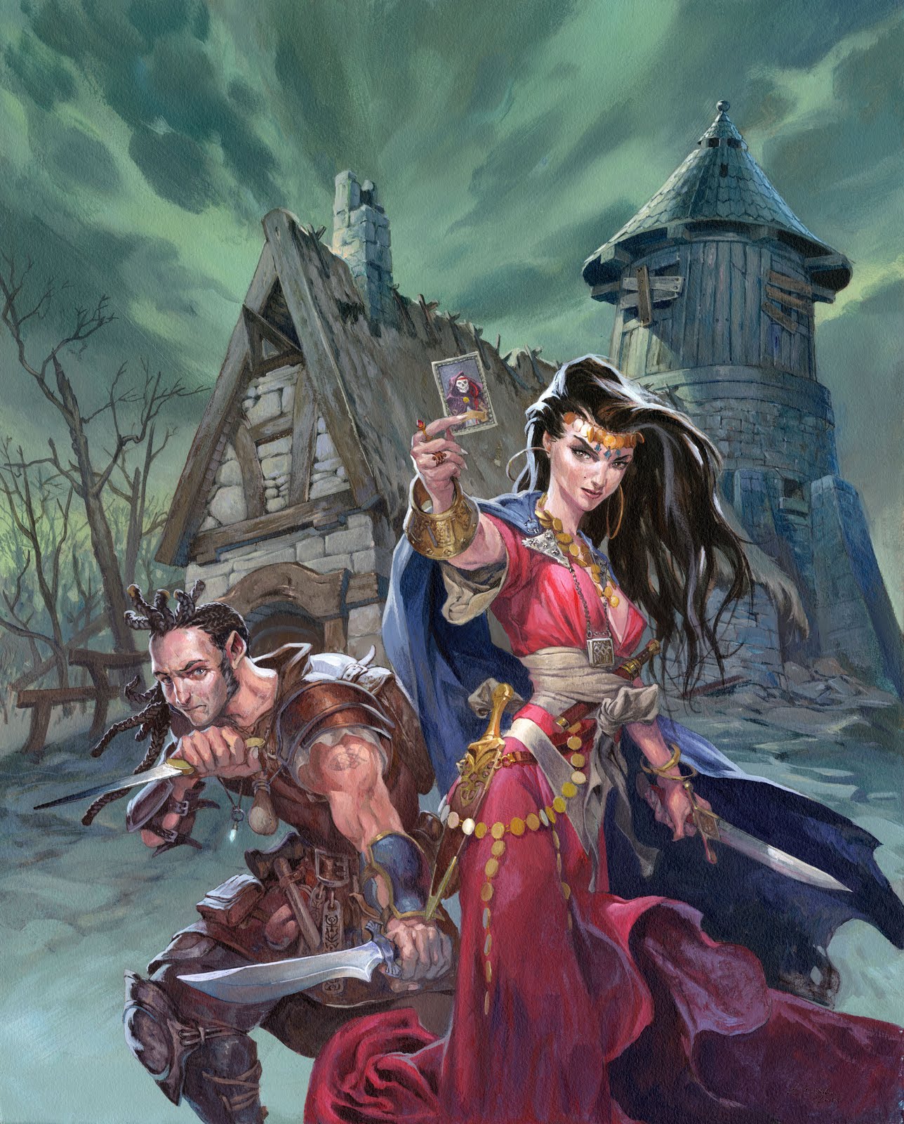
About a year ago I painted six theme covers for Wizards of the Coast. This cover is ‘The Rogue Profession”. Once again I was going to do a night scene. A Persian-like princes showing a tarot card of “Death” and a Hafling wielding 2 daggers. The background should be a haunted farm house.
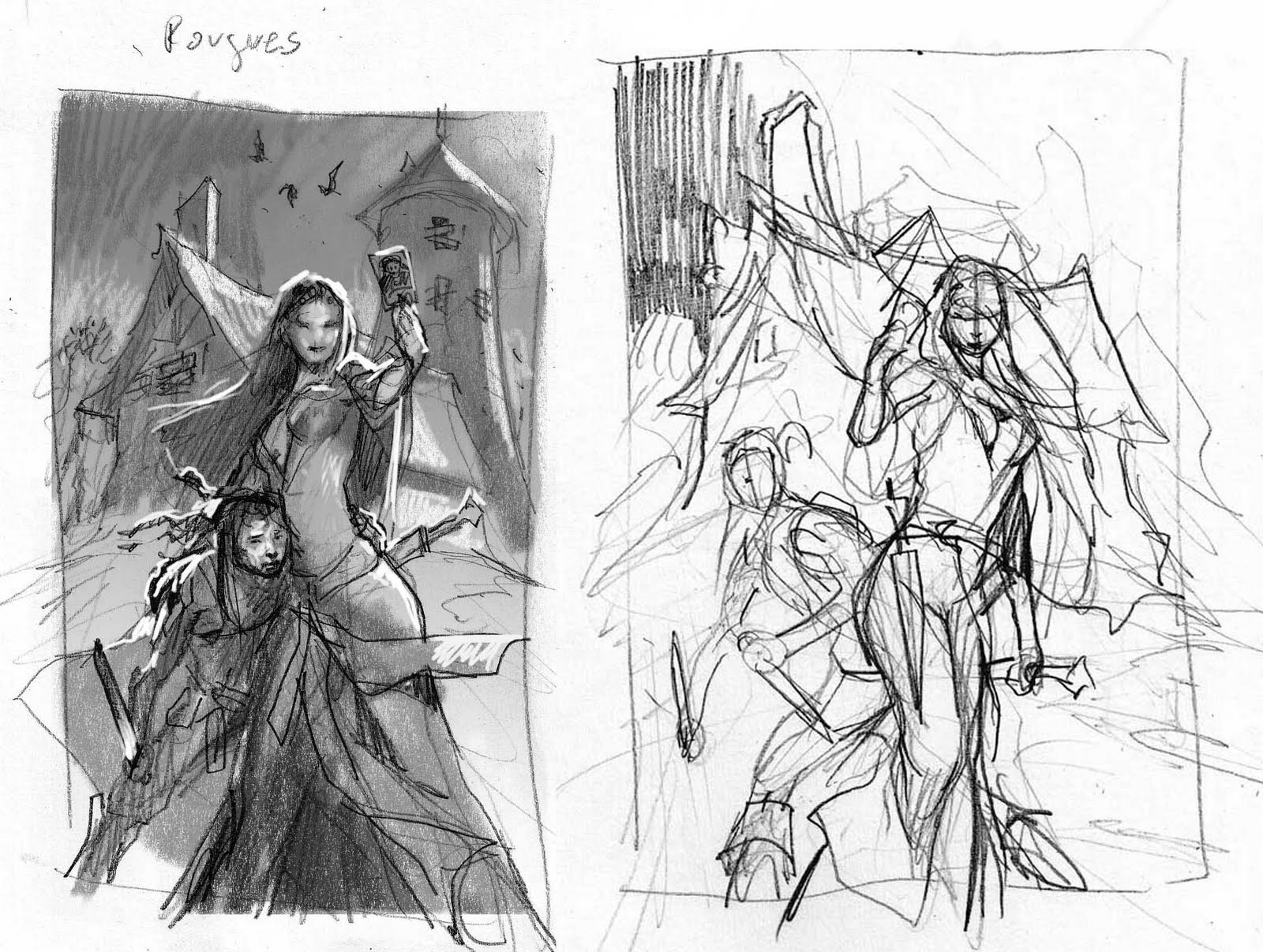
I remember the haflings to be a race of scared little guys mostly I got that impression from reading Dragon Lance when I was a kid. So my first thumb had a very anxious hafling clinging the female figure. I really liked the female figure in this thumb. She is extremely self secure and strong, but the hafling looks like an underdog or a child. They were supposed to be equals.
So in my second attempt I turned them around like they were more back to back ( you cannot show the backside of a figure on a cover, so more like back to back-ish ). I really liked the silhouette of the house, so that one is the same in both thumbs. I am almost embarrassed now, to see my second thumb. I didn’t even crisscross out all of the sky as black. I simply stopped as soon as I was able to see where this was going and when I knew what to turn into a real sketch.
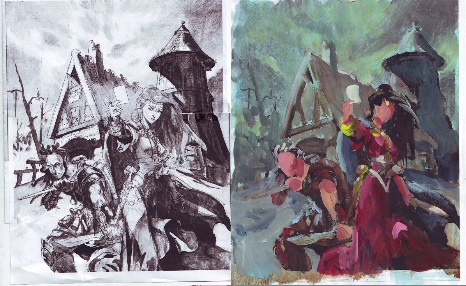
So I sketched the figures out on separate papers. For the girl I used a H&M magazine for the facial features. The hand was my own, holding up a magic card in front of the mirror I got at my table and the cleavage once again came from my dependable selection of Playboys Lingerie magazines. The hair was the most difficult thing: I wanted it to drape well and believable pulling myself away from the stylized flat black hair I sometimes do, so for that I looked in a lot of clothing catalogues until I found the right hairdo.
Reference of the hafling was singled down to my own hands in the mirror again wielding a letter knife. I always stand up and position myself in the pose of the character I am drawing to get a feel for the pose. With the hafling it felt okay, but when I look at it now, I think the angle of him is too high. It seems like he is seen from above where as the girl is seen a bit from below. Mistakes like that happens when you do not draw out the whole figure and place the feet in the same perspective-grid. I usually feel it out instead of going all technical. Most of the times I am right. Sometimes…not.
When the transfer and the grey tones are done I make a colour rough from a printed out scan. My idea with this colour theme was that it was going to be the green cover in the series. Since it is night I chose all cool reds like magenta and pink for dress and skin tones and went for a greenish yellow for bracelets and gold. My colour rough did not have the strong white moon rim light that the final have. It was a choice I made during the painting process because I thought it all became too dark and moody.
2 things I really like about this painting is the movement of the clouds sucking you into the painting and pointing towards the figures, and the shadow side of the tower.


I love this! Thanks for sharing! When I look at your process shots I cringe because you have a beautiful b/w “sketch” and then you successfully paint over it. I am/would be a coward because I'm not sure how one can paint over something like that and remember the values that they have placed! id be scared! Thats just my inexperience showing no doubt.
Another observation is your costumes. do you know of a good reference book ( at least a starting point)? No doubt you have tons of different places you pull from for reference.
This is great!