By Justin Gerard
I am working in Adobe Photoshop CS5 for the digital final for this painting. (You don’t always need the latest and greatest in software, but CS5 is amazingly stable by comparison to CS4 or CS3, both of which would crash regularly based on alignment of certain stars and lunar cycles. And on Tuesdays. And really just any time that they felt like crashing.)
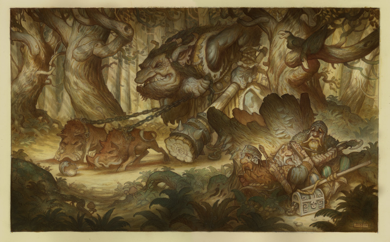
Up until the halfway point I work in only multiply layers. I am using these layers very much like thin transparent watercolor or acrylic washes.
Digital Work In Progress: Midway Point
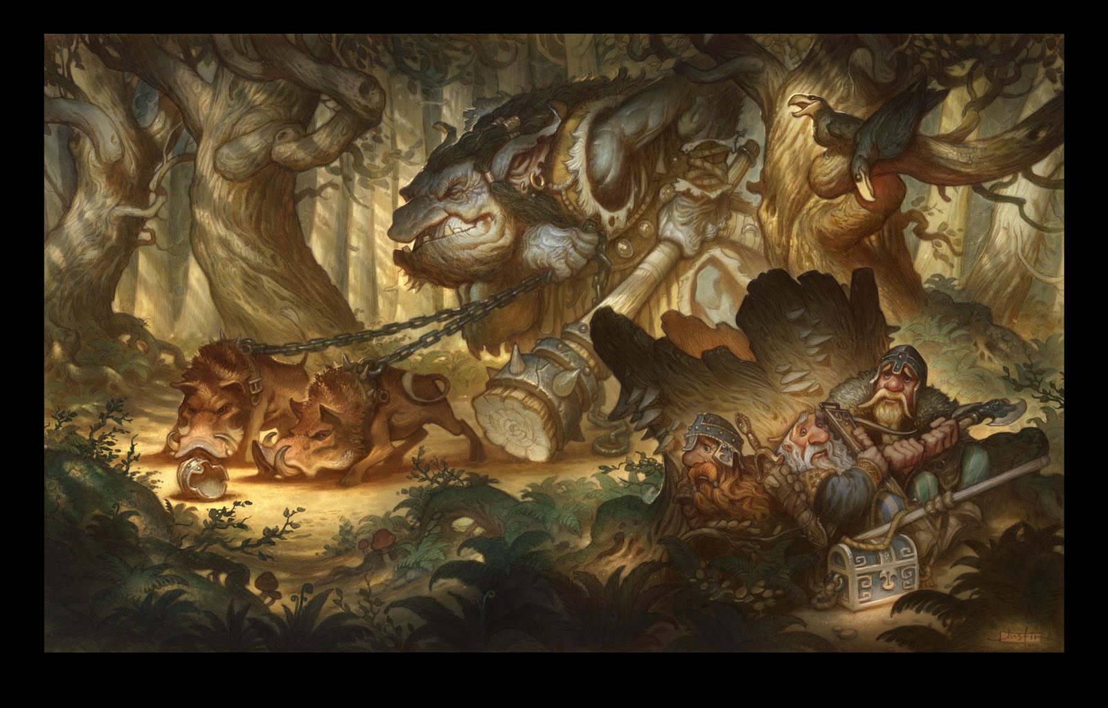
After the midway point I will switch into other layer modes, like screen and color dodge for highlighting. And some normal layers for opaque details.
Final Digital
You will notice that I added a few elements to the image at this stage, like the extra foreground foliage. These were decisions made after letting the painting sit for a few days and then coming back to it with a fresh pair of eyes. It can be a risky business to always be going back and correcting an image. Sometimes it is better to just leave your first ideas alone and move on to work on new projects. (You hear me Lucas?) I will only do it if I feel I absolutely have to. In this case, I had lost some of the forest-ness of the scene, and wanted to recapture a bit of it.
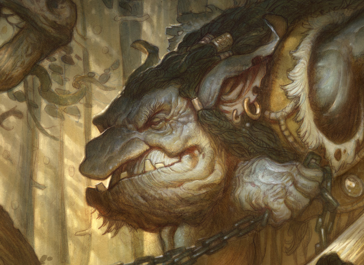
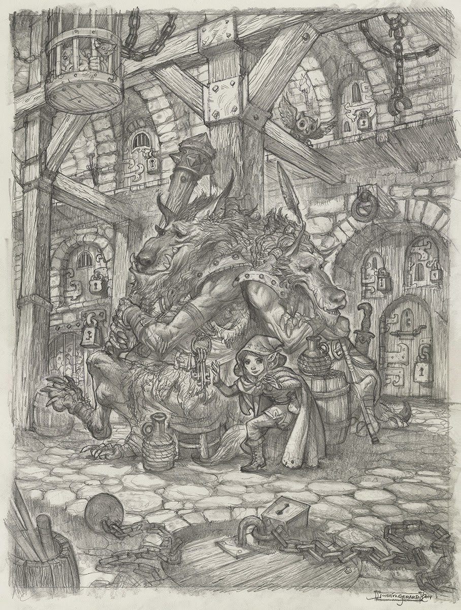
Troll Detail
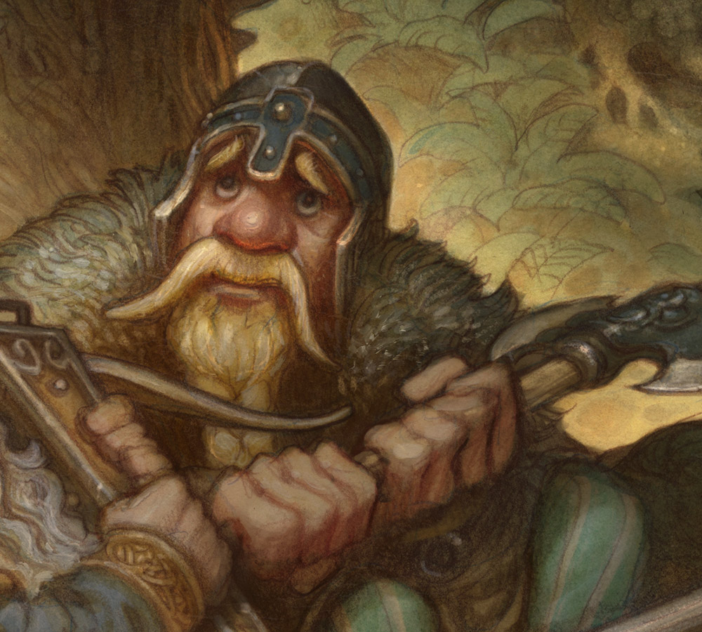
Dwarf Detail
Thank you everyone for all the support and really helpful feedback!


nice outcome
Very cool to see “behind the curtain” — thanks for sharing this.
Not to mention just how cool the painting is to begin with!
This turned out great, Justin. Seems like a really fun process – except for the re-drawing the whole thing part. I want to try it at some point!
Since everybody on the internetz has an opinion, I'm going to chime in and say that I find the glow on the tree stump behind the dwarves distracting. I think that toning the glow down a little works better. That way you get a nice simple, dark shape for the dwarves to sit up against (which I think is needed because of all the dappled light).
Great work man. Is this going to be a print anytime soon?
Wow, it turned out great Justin, thanks for sharing all the steps! It really didn't loose any of that traditional feel, and still kept strong colors! Awesome! ;D
Hey Justin!
Looks amazing! The digital part of the process is kind of like a sugar glaze on top. Now, when you work in these multiply layers in the 1st stage, and through out the digital stage, are you using just default brushes, or do you use more of the custom brushes you've created?
This has been a super fun painting to see come together – revisions and all!
-Will
From the first forest troll post, I have looked forward to how you would take this project to final. I deeply appreciate your time and attention to conveying your process. Makes me want to dedicate myself to learn watercolor again! Please keep doing process tuts like this one. It's been a gem!
Best, Dave
the picture looks great and it was a jopy following your process. however I agree with Benjaminba: especially the middle dwarf seems to merge with the stump which makes him and the tree read a little flat. darkening the tree stump would also enhance the feeling of perspective as right now fore- and background nearly have the same values.
I think the piece deserves this last effort as you put so much love into it 😉
This turned out great. It was really fun taggin' along for the ride!
You wouldn't happen to have recorded a process video for this, would you?
This is great! I love this painting! I'd totally buy a print. My new desktop. There's just one thing that distracts me; the center dwarf looks like he's missing a helmet. Either that, or his head was put thru a table saw.
Check on the road over by the boars.
Hi guys!
Benjambi and Mathias,
I am sorry, I cannot turn off the glow filter in my head. I can't help myself. If it could possibly glow, then it must glow. I will watch out for it in the future…
Will,
Since there is already sufficient texture underneath, I don't need to use much in the way of textured brushes (as I would with a purely pencil and digital piece) So in this case, all the brushes are just the basic Photoshop brushes.
Logan,
Sorry, I have not yet mastered the art of video recording yet… so no video process of anything at this point.
Anonymous Post,
In my defense, these are dwarves, dwarves are sometimes portrayed as being a little misshapen. And in general I think you can get away with more exaggerated characterizations with dwarves that you wouldn't be allowed to with other races, like elves, humans etc. So you can play up or play down physical features a little more, which I really like doing. I didn't realize it would be so distracting for people. It was mostly done to draw more attention to his eyes.
Gorgeous work. Thanks for sharing.
after every post in your process I've thought to myself that it looks great, and wondered how you could possibly improve it… and each time you do! splendid work!
I love, love, love the light on the ground before the boars, and how it contrasts with the darkened roots and plants in the foreground. Damn. Really wonderful.
…Steve
Thanks for sharing, Justin! I am intrigued by the fact that you work with multiply before painting in opaque layers. I have been doing the opposite, but want to give this twist a try. I love the richness that multiply, as well as screen and overlay, can add to an image, and I find myself getting tangled with using the layers over my painting and having to work below them in order to change my opaque layers. Your approach looks very promising. The transparent effects are spectacular in your painting! BTW, do you love the freehand rotate tool in CS5? I use it all the time.
YES! during my illustration class we are encouraged to bring in cool stuff to share. I will share your posts to encourage us all to have the courage to rework things when they don't feel right, even if it means redrawing it 😛 as silly as it may seem, i guess we all find ourselves saying “its good enough” when it has so much more potential!
woot woot!
Thanks for all this! I learned a lot!
I do love the freehand rotate tool, and I am ashamed that I don't use it more. Not only is great for shading at awkward angles, but I also love it for flipping the image upside down to catch errors in proportion. I should be using it more.
Beautiful as always.
Wow. Just…wow. The dappled, flickering light is amazing. Wow.
Beautiful work once again. Not ashamed to drool like a fanboy over this style and subject matter. Bravo!
Love this picture! I like seeing the process
Simply gorgeous. It's amazing how the illustration changes from classic children's book line and wash to digital cinematic excellence. Both versions are equally impressive. Thank you for the journey!