By Justin Gerard
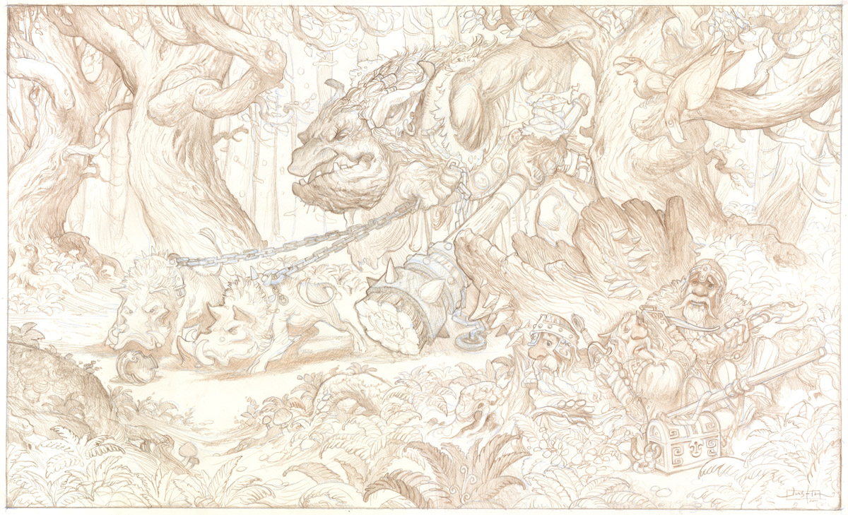
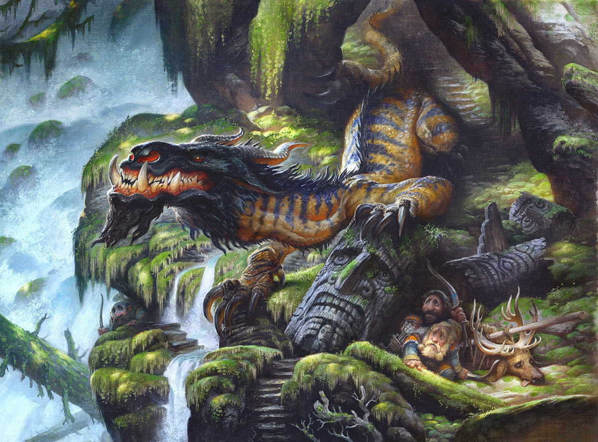
I am much happier with the composition this time around. Starting over from scratch generally involves an entire day of wanting to kill myself. So it’s always a good feeling to know that it was the right choice.
The trees do what I had hoped that they would do and the image is a lot more comfortable to look at now.
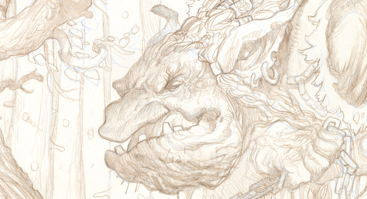
Well… unless trolls with large clubs make you uncomfortable. In which case there may be no hope for the image.
Next: Watercolor



I entirely agree, this has just got stronger and stronger. And it's a joy to be along on the journey of developing it. Thank you for sharing the process as it happens.
This is looking great. I agree that the changes have made it a much stronger composition.
What type of colored pencil are you using? I know prisma color would be too waxy to put under watercolor… (My apologies if you have already covered this already)
Thanks for sharing!
John Martel
Fabulous redo Justin. I agree the whole thing is much more comfortable to look at (and personally it's the warthogs that creep me out:)
You actually seem to have created an 'S' shaped eyeflow with the composition moving from left to right. It reads like a story now, & I'm sure that's why we all feel right at home! Thanks for keeping us posted. And to anyone listening, I think someone should start some kind of Muddy Colors 24hr Help Hotline where we artists can cry on someone's shoulder when we have to rework an entire finished drawing 🙂
-Will
Love it. Great improvement. One thing I might suggest is reworking the trolls right arm a bit. Maybe to be lower or more off behind his right side. Right now it breaks up that great profile. You've left it light, so it works now, but when you start coloring it I'm worried it might muddle things up there. Just a thought. Great work and thank you for sharing your process!
Hi Guys!
Swervdriven,
I worked with a little Prismacolor, but mostly with Caran d'Ache Pablo pencils for this one. These pencils feel slightly less waxy than Prismacolor pencils but still hold up well under watercolor washes.
Will,
A Muddycolors hotline might not be a bad idea…. I'll talk with the other guys and see what we can work out. You might be on to something there.
-J
Thanks for sharing your process, Justin. Very nice work as usual. It's interesting that the whole time I've been watching your posts on this piece I perceived the tree above the dwarves and the mushroom-covered stump just above their heads as one mass—it was separating the dwarves from the rest of the comp for me. I think it was because of your initial color comp (it looked like one mass there as a solid brown). Now, with the changes and redraw, I see those dwarves as more in the open (even though I know they're hiding) and cohesive to the rest of the image.
One last thought: Thanks for making me laugh—your writing style has a fun humor to it.
Brandon,
You have no idea.
http://lightnightrains.blogspot.com/search?q=induction+night
And this only contains an excerpt. The entire thing goes on for pages. Someone should try to bribe Cory to post it in its entirety.
Thanks for the additional laughs. You guys are funny.
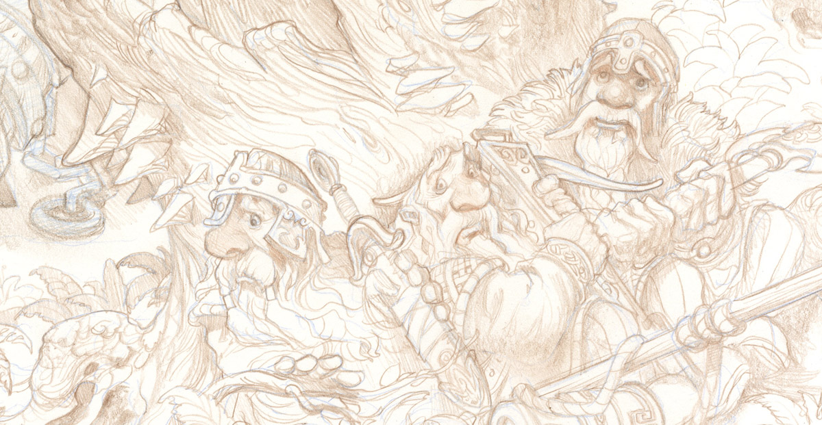
You are one sick baller for redrawing that completely. The composition is looking good, and the repetition of three big trees create a great sense of depth. I'm wondering why you chose to change the group of dwarves – before, they were showing different personalities; the grim veteran dwarf, and the frightened sheepish one in the middle, and the last one peering anxiously out from their cover. Now they are all looking awfully frightened (makes sense, but still!). I guess I just wanted to believe they weren't going to be eaten…
Your drawings are looking really, really good btw. It seems like your focus on draftsmanship has paid off. Seeing a bit of Claire Wendling in there, especially in those warthog studies; lovely fluidity in the lines.
Ahhhh yes… the Induction Night incident.
Benjaminba,
Good catch noticing the change there. I was initially going for that narrative twist, showing the hardened veteran in the group of dwarves to give it more backstory. The main reason for the change was that I liked his relationship to the crows more if he looked nervous about them giving away their hiding place. But it was a hard decision because I really liked both narrative directions.
Wow!! Beautiful Rending. I like the composition better know as well, the trees framing the Trolls face works. (May I be so bold….The tree boughs are similar in shape and thickness to the Troll's arm, don't want to loose that arm.)
Cant wait to see the final with all your dreamy, smoky, soft colors.