Gregory Manchess
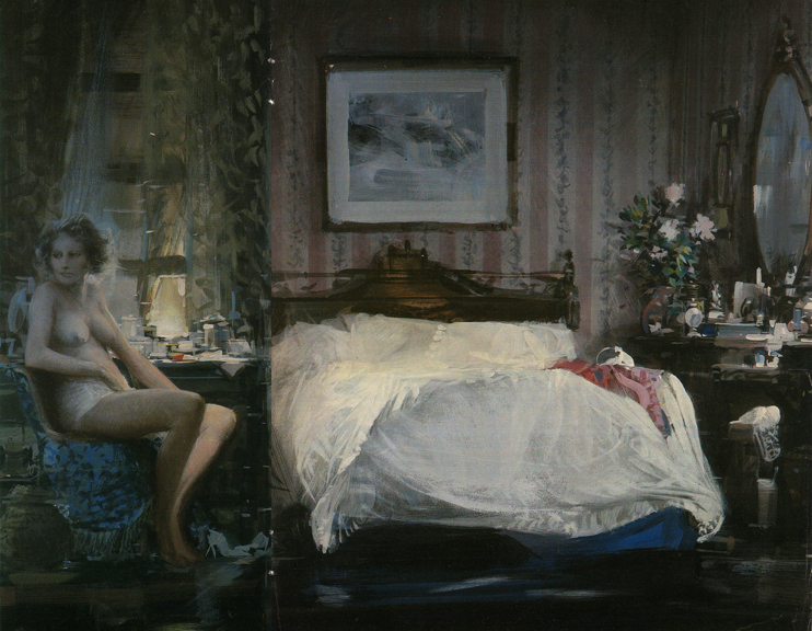
Most of you may not remember this gorgeous piece by the Hall of Famer, John Berkey. It appeared briefly in Penthouse Magazine in the 80’s and disappeared, but not before setting off klaxon alarms across my brain.
As much as I had admired Berkey’s paintings for National Geographic and other science magazines, calendars of all sorts of historical subjects, and book covers of every genre, I had no idea his deliberate, architectural strokes could approach the sensitivity so evident across this canvas. The preeminent science-fiction painter had just blown every artistic synapse in my head.
Most of my painting heroes have been capable of a broad range of work, applying their skills to whatever subject was necessary to tell the story, or stimulate a creative response. Sometimes one can study an artist for a long time before having one piece scream its intent so purely, so distinctly, that it instantly reveals the inner thoughts behind the artist’s work.
Study John’s paint here. Notice the soft range of values, from the wallpaper to the sheets, punctuated by bright, stabbing strokes indicating the vanity objects. Here, Berkey used his knowledge of architectural lighting to structure the sheets, vanity, window, night stand, and headboard as he had with his unique spaceship shapes. The light in the window is gently manipulated upward, like his backgrounds of nebulas in deep space. The figure, softened and finessed, yet slightly stiff and angular, contrasts the angles used in the other objects.
It is one of the best paintings Berkey ever accomplished. Clearly, a masterwork.
This piece reminded me so very clearly that an artist must have range. For me, it’s not enough to paint in one melody only. I want that broad playing field to allow my interests to thrive. John Berkey captured that thought for me in this one, quiet, delicate moment.
Oddly enough, it was this kind of painting that drove me to focus my portfolio, from a strangely scattered try-anything mishmash into an all oil painted book. From there, once I had captured enough clients to gain the attention that I could handle paint, I stretched my work across a diverse field of subjects and become versatile again.
That versatility has kept my portfolio alive.


A magnificent painting, so quietly powerful. Most people tend to focus on Berkey's spacecraft—and they definitely are wonderful—but for me, his nudes are under-appreciated masterworks. Great post, Greg!
Holy moly, this is beautiful. I know I must have seen this before but why don't I remember it. It's like uncovering a new masterpiece. You know I've heard so many young guys comment on Berkey's work being digital because maybe it's too overwhelming to think that someone could actually paint that stuff.
Thanks, Greg, for this insight! I did not want to become pigeon holed and you just gave me the recipe I needed to find that way to keep my work from becoming about just one thing! I'm with you on Berkey – it was his space ships that drew me in to his work but it's the agricultural and figure work that makes my jaw drop! Thanks again for your insight! (The current issue of Illustration Magazine has a fabulous collection of his non-spaceship stuff and it's printed so much better than the book I have on his stuff!)
What a master! I've never seen anything but his spaceships. Thanks for this Greg.
Thanks Greg. Had no idea John Berkey painted this way. I have only known him as a space ship artist up until a month or so ago when I was researching some of his space ship art and came across is other illustrated work.
Thanks also for the final comment on focusing… I'm still working on “focus”, on the tools to work with, and the topics I want to paint. Your statement helped.
Cheers,
Mike
Believe it or not, I built up the nerve to call him one time. I gushed about this piece and asked if he had it, could I buy it. He was so taken that I even remembered it that he offered to ship it to me “to live with for a while.”
Speechless. I managed to squeak out that as much as I thought that would be over-the-top incredible, I wouldn't feel comfortable taking such a gift until I could pay for it. (I realized later that he didn't know what to charge me for the painting. He loved the fact that someone loved it much as he did.)
I got to meet him in person at the Society sometime later and thanked him for the offer, and that I would get back in touch about it.
He died not long after.
A beautiful story with a beautiful painting. Love it!
Greg, So where is the Painting now? It sounds like you where not able to get it?
In regards to talking to art hero's…. I met Michael Whelan at the Words and Pictures museum in Northampton and had done so much research and reading on him , his art and techniques that when it came time to talk to him in person I didn't know what to say, or ask, or do… but look like a deer in heads lights with a stupid grin on my face… …anyway… I am digressing…
Thank you…
~Mike
Beyond the beauty of the composition and incredible paint application, what really struck me as amazing was the woman's left leg. No way is there that much light on the inside of her leg. But it reads correctly because of the counterchange and the fact this master clearly knows what he is doing.
Just discovered John Berkey. Incredible work! really inspiring stuff, makes me want to push… that… much… harder, and given that i work in digital, i'm left with no excuses but to paint.
Nope, Mike, I didn't get the painting. I think it must be in the estate's collection. Not sure. Also, I too, have been caught in the same illustration hero's headlights. It helped me learn how to talk with clients and other artists. I found that most of them are just the same people we all are. Similar interests, etc.
I love the light on that leg too, Mark, but you know…..sometimes bounce-light from flesh across flesh is quite bright….
Glad you are inspired to paint, H4lfM4d!
Is the drapery line and bed post really in line like that? I was looking at it last night but couldn't really tell from the image.
If it is, I find it intrusive, but attention grabbing… my eyes wonder from left to right, but that line just snaps me back and leads me back to the woman and then to where her eyes are looking…
It's also interesting how he balanced the drapery with the corner of the room.. The painting certainly makes you want to stay and look around…
Sorry to hear you didn't get the painting.
Cheers,
Mike
Thanks Greg, great story and nice to see this piece again!
@ Mike, I thought so at first.
It looks like the 'gutter', the allowance for the center of the page for printing, cut out part of the painting (in the middle) during printing.
This looks like a tear sheet, the actual magazine page. You can see the staple holes.
I just looked it up in the archives. The family still has this original painting and many more nudes from John. If anyone is still interested in purchasing this go to http://JohnBerkey.com/contact send an email and note box16-7460 as this is the archive it is in. I'll then look up the asking price.