-Jesper Ejsing
Doing a single figure portrait is a favourite discipline of mine. I try to minimize the background to almost only a texture surface at the bottom or even only a cast shadow to show that the figure is not hovering in midair. I put all in the figure. What I like about this kind of illustration is the clean and simple expression. I do not have to tell a story or place him or her in an environment. I do not have to consider all these things as: environmental light, bouncing light, readability compared to the background and all that stuff, that usually fills my head to the brim of disaster. I can relax and focus only on designing the figure and capturing his or her sentiment. ( I am getting a little overexcited here, since almost all of my single figures have one of the same two expressions: either sexy or tight-lip-angry and determined. I should try to jazz it up by combining the two?. Never mind. Tried it in the mirror; doesn’t work ) I always sketch these figures very large and rough at first trying to capture a twist or a movement to the body. It is kind of the same way as you would do nude model drawings on time. You have to get it down on paper very fast in 2 or 3 minutes.
 |
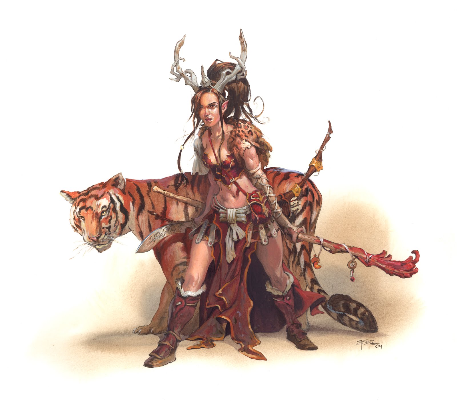
| Packlord Paragon, interior illustration for DND Primal Power |
The female figure I captured in first try. After noting that date down on a calendar I proceeded with a little tonal value and then sketched the figure in full detail. The art description is mostly about race, equipment, weapons and character class. There is just so many ways to make a figure “just standing there” look boring and uninteresting. I would like the body to have small twist and turns and bends in the torso and wrist and so on, to make the pose believable and interesting. This means I have to stand in the pose myself. I get up and grab a staff and a knife and try to pose myself in front of a mirror. I really recommend doing this to every pose, to get a feel for what feels right. I just think the way she has the weapons actually slightly behind her body is carefree and shows that she can handle you even with the weapons not ready. They are out to the side saying: “come on. I´ll let you get one strike at me for free”. I used a H&M catalogue for facial references and almost completely stole the tiger pose from the internet. The colours I kept very close to red and orange. The only cool contrast is a small sky reflection on the back of the tiger, to not make the light look too flat. I added some small cuts and fresh scratches to her skin. And the usual mud on the boots. Even elves get dirty and have twigs rip their skin and clothes when running tree-hugging through the forest.
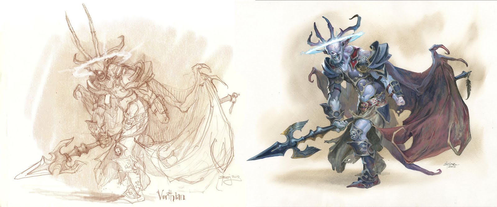 |
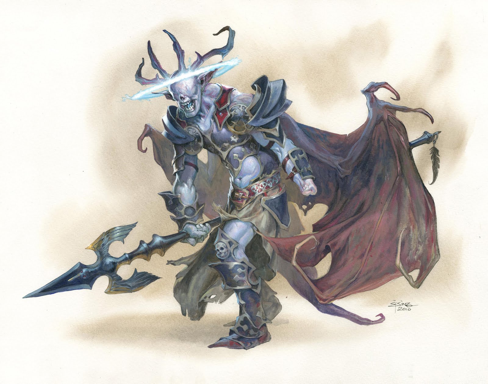
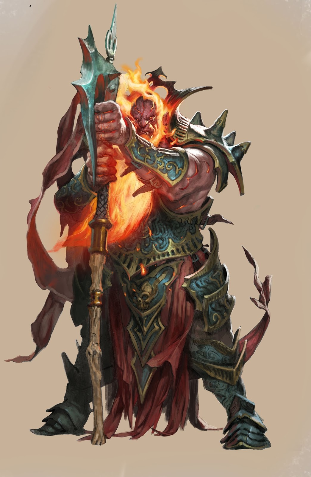
| Vorthian, Interior illustration for DND Shadowfell |
This guy is a Demon prince. The description of him sounded very complicated yet very free. He had no eyes, a halo, missing the left hand, having wings, and carrying a giant spear. The rest; armour clothes and, well the rest, was up to me. I have no idea why I chose the walking stance for him. But I went for a twisted torso with us looking more into his neck area and torso than right upon it. The hunched pose seems right for tough guys or fighting stances. They protect the neck by hunching and make the critical part of the body difficult to hit. I used a skull from my studio to get the structure in his face right. The wings I folded and bent so that they were more hanging or draping behind him like a cape billowing in the wind. The could have been stretched out basking or moving but I just liked them as a graphic element more than them being included in his weapon arsenal. I think they would draw attention away from the main part if they had been stretched out. Basically all my choices are moving around drawing too much or too little attention. The background I had to fill out, behind most of the figure, since I needed something to establish a contrast to the bluish white halo. You cannot paint light without framing it in something dark. Also this allowed me to exploit my favourite trick: rim-lighting. I did try to tone it down here. Kept it only on the face and the arm with the spear. “Oh well the hip also, for Christ sake, but that was only as a last resort to keep it clear of the wing behind the hip. Let it go!” There are two things that I really like in this illustration: One is the arm stump. I have never seen one and I didn’t dare Google picture-search that particular word. I just imagined the area around the bone would make the flesh bulk and grow uneven together. The little red dot and pinkish tone in the final makes the old wound look irritated. The other thing I really like, and it might sound stupid, is his left boot. The lowest part of the leg and greaves are captured and rendered with as few strokes as I possibly could. I always try to go less and simple instead of dotting and rendering layer upon layer. It almost always doesn´t succeed and I end up with much more nitty-picking than needed, but in this boot it came out simple and elegant.


These are both really well done. Not so much equipment and accoutrements that you lose the figures but just enough to make them look interesting. Good job on the stump too!
Sweet! The design for that demon prince is ace!
These look fantastic! You mention layers but could you say how much is done in Photoshop, pencil, etc.?
these are great drawings. seeing your images makes me want to run home and start drawing!
Really really two fantastic work Jesper !!!
These pieces are both gorgeous! I'm especially fond of the Vorthian piece! I see the mouth was a little different in the sketch and the horns were also longer in the sketch as well. Were these changes made by yourself or the AD?
the mouth was changed by me. More grinning, less mindless. The horn was the artdirector. granted, teh were a bitt silly poking up in the air like that.
layers of acrylics, that is. I am stricktly a traditional artist. ( but funny that the word “layers” has changed in understanding to be a word desribing a funktion in Photoshop.
Outstanding work as always. I like the muted palettes in these. I'm accustomed to your more punchy use of color.
Question: How do you go about transferring your rough/energetic sketches to the illustration board? I notice you retain a loose drawing feel… so are you re-drawing directly on the board, or inkjet printing a scan of your sketch? Curious, because I like how you maintain the energy “life” in each iteration.
Wow! I am even more impressed–no “Save” button! How long does each stage typically take?
Fantastic work! Very inspiring.;)
Hey;
These 2 were both done on watercolor paper: So what I did was transfering very loosely with a lightbox and then doing the actual drawing on the paper i am going to paint on. thus keeping it fresh and alive, like you said. I think the trick is to constantly leave something for the next stage, so that you are not just analy transfering every detail.
It works for me that way.
When I transfer to board I smear the backside of teh drawing with graphite and draw ontop of the drawing to push the dust onto the board. Also very loosely. Then I do the final drawing directly on the board. I only transfer figures. the background is always done directly with the thumb as a referance.
Hope it answered your question
Good Luck
Ejsing
nice work…………