-Jesper Ejsing

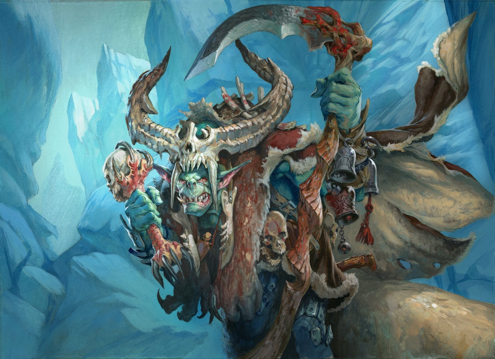
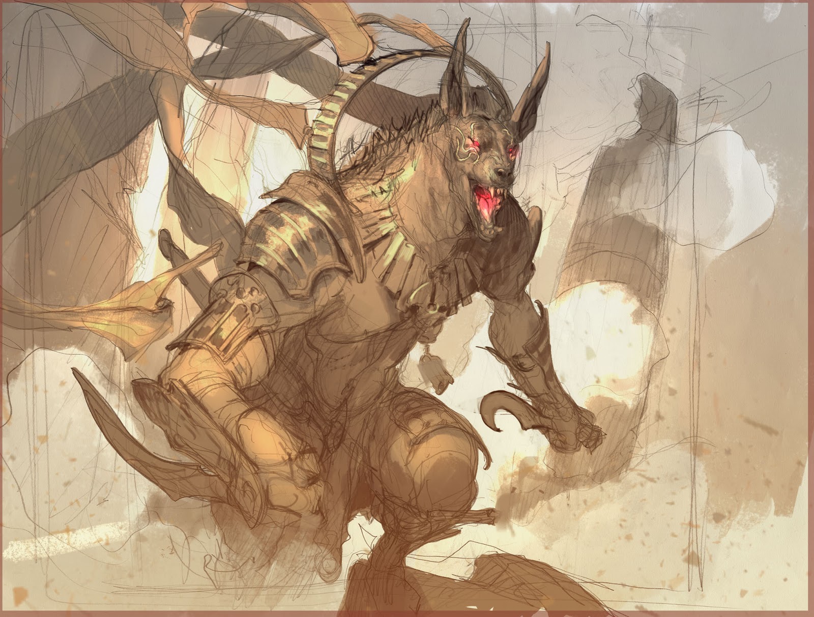
To be honest I do not know anything about composition: I have had no training or teaching about it and never understood the Golden Section. What I had to do is go by instinct or what “feels right” and in that way I have found some principles that works and creates an ease and a clarity in my paintings.
It is all about making the image clear and easy to read. If too many lines confuses the directions in the image and point this way and that way the eye do not know where to look, doesn’t know what is important.
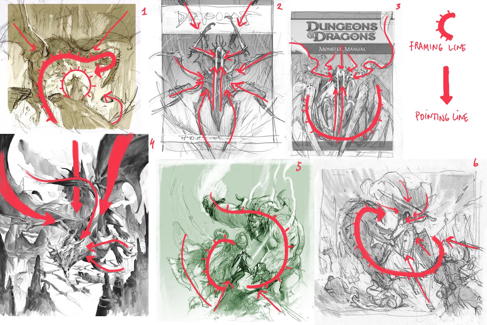
The other thing I started doing is finding ways to frame what is important in the image. ( It sounds so naïve and simple that I feel retarded to exploit it) The frame helps to cut of the “not-so-important from the very-important. The framing lines circles in the focal points and simplifies the whole.
My first example is 2 sketches for the same cover.
The first version has lines all over the place. The figure is not framed, the sword is pointing the right way towards the figure, but the rest is not consistent.
The second version is overly simple in the way the spear, swords and faces and everything frames the main figure with arrow like lines. Here the spear points are actually arrows pointing to where I need you to look. Doesn’t get more simple than that. The rider functions as a stopper for all the action lines.
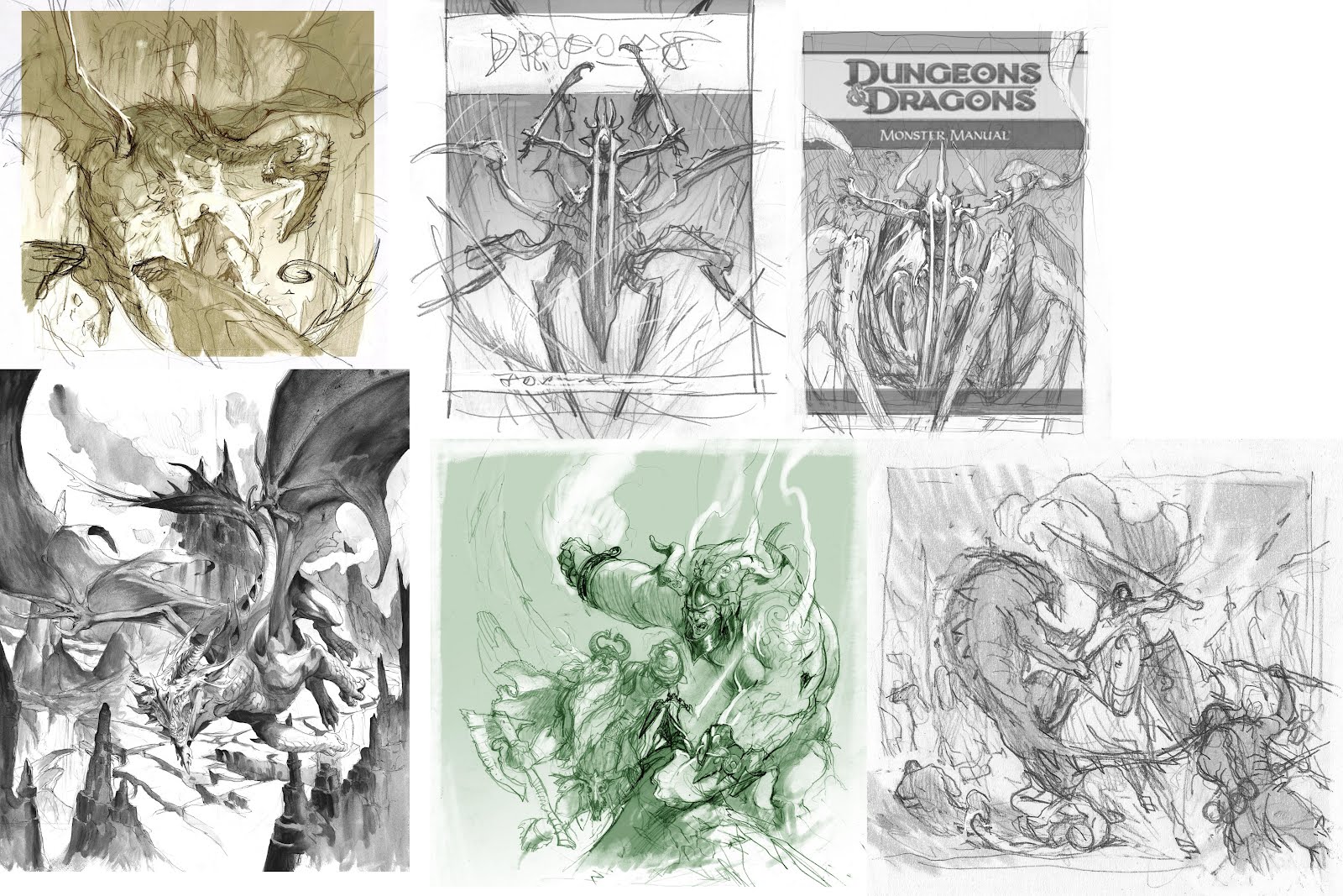
Here are some sketches that I have found exemplify my tricks:
1. This is the clearest I’ve got. The dragon creates a circle around the figure, ending in a face that points toward him. The magical barrier is a repeated circle shape enhancing the framing composition.
2. All the spider limbs points inward to the centre, the hair stripes points up toward the face. The centred image helps a lot to create calmness. The swords are the only messy/living lines in the composition.
3. Hair crown and arms with the billowing cloth all points toward the face. The bulky spider body creates a bowl-like shape that frames the figure.
4. All lines points toward the head. The volcano eruption is the calm straight line creating an ease/contrast to the more dynamic shaped lines of the dragon body.
5. Since I had a very little main figure in this image I had to make the 2 giants frame him by hulking over him. The arm of the giant to the right circles in the knight, as do the left giant by closing of the background with its body silhouette. The triangled shape of the snowy cliff pints up, like an arrow to the main figure.
6. This is almost the same as number 5. The whole composition is build up around framing circular shapes that closes around the main figure and his face. The cloak and the arm and the spear points toward the knight and his face.
Most, if not all, of these compositional elements are something that evolve during the sketching process. It doesn’t start by me saying “ I wanna do a circular shaped cover this time”. It is something that I catch when I see it, and enhance when I discover. But knowing about it ( a gut feeling standing on the shoulders of thousands of errors ) helps me to spot the good compositional lines when the opportunity presents itself.



Well, you've certainly have a keen for breaking down a composition. I could never point it out to myself in a thousand years. Well, maybe I could if I had a thousand years, but it seems simple enough to frame a composition and then I realize how many times I have to break away from drawing in order to not miss those very elements of which you've written.
Thanx for sharing these beautiful works.
pretty interesting one!! sometimes i see grat artits whose work doesnt shine due a poor composition… composition is like the 60 per cent to me… i try to do it thr best even when im placing minis in a diorama 🙂
It would've been great if you structured your text as mindful, as you structure your pictures!
Still, very useful information!
This is very helpful! I appreciate that you mentioned how you don't start with “I want to do a circular composition shape”, and how it evolves while you are sketching it out. You explained composition very clearly and concisely. Great stuff!
This is awesome. I never understood “composition rules” either, but the idea of noticing instinctual elements and enhancing them is great!
It's fixed. Blogger isn't as user friendly as one may think.
Thanks Dan
Sometimes I am not usefriendly
E