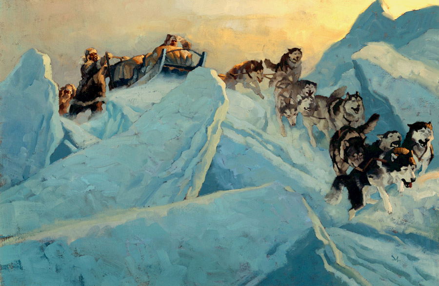
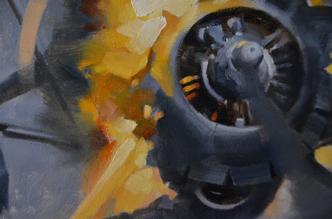
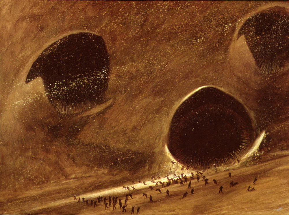
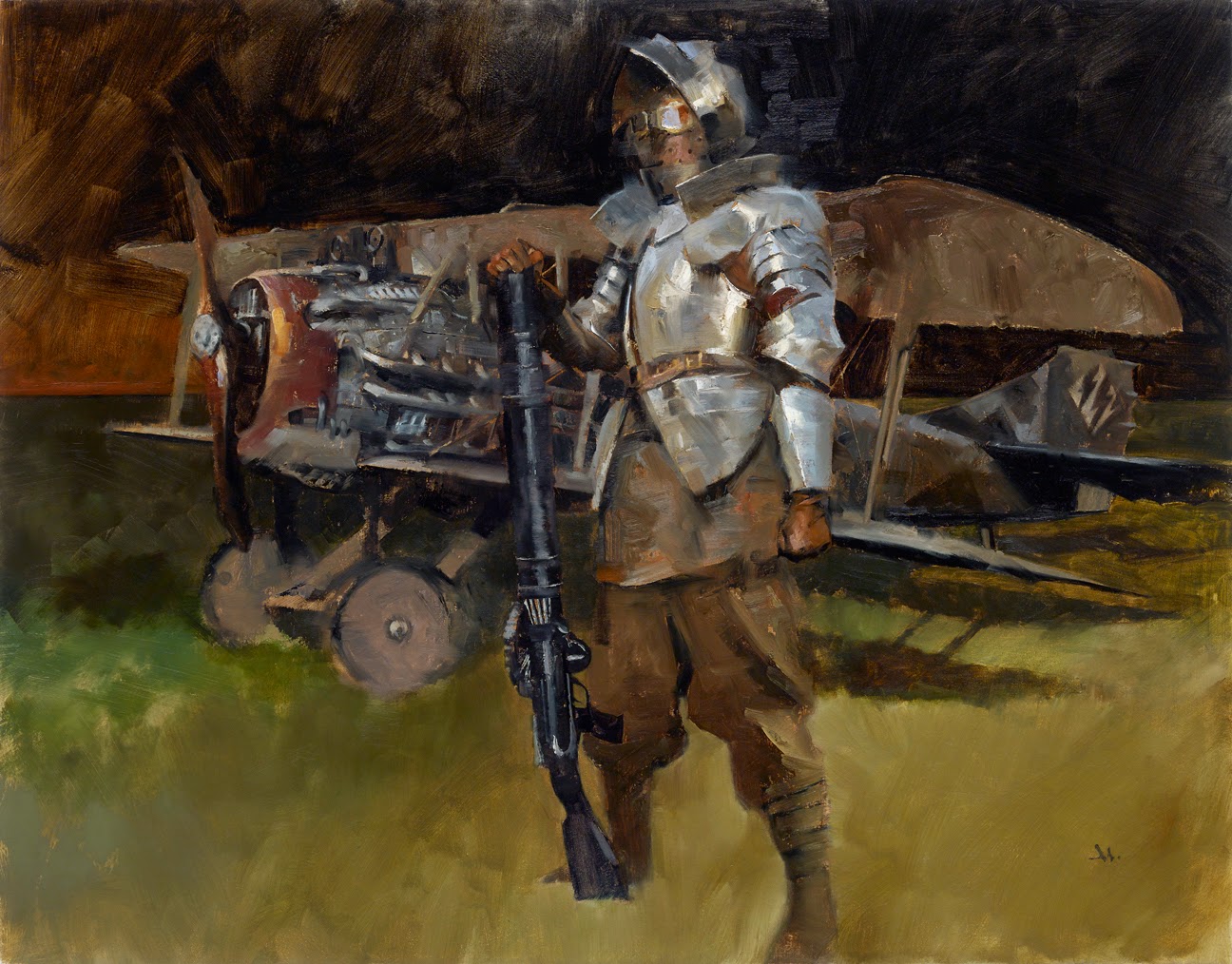
-Gregory Manchess
Since it’s all about me…You may notice that I changed the title to ‘Things I Remember”, realizing that these things come from my own notes about my painting career. I’d rather avoid the preaching when possible. So the rest of these post topics will focus on my selfish perspective, and hopefully you’ll be able to take something away from it to use.
1. Start small
One word: thumbnails. I remember the day I realized that tiny little drawings, if designed well, will blow up into the same exact proportions. In other words, what works small, works large. Not the other way around. One problem: I hated my thumbnails. So, I spent years going through the agony of learning to draw shapes fast, and as accurately as possible. This saved tremendous grief down the line. Measure twice, and all that. I got more excited about…well, everything really, when the thumbnails were solid.
2. Find a better point of view
I found that by drawing small, I could cover more ground, keep from getting lost in one composition, and find angles I hadn’t thought of. I explore all those angles. I want to show the viewer how much I love what I paint. I want to take them with me. And I’ve found over the years that they’re willing to go. Besides, I don’t want my portfolio full of boring pov’s, unless I can bring something special to it.
3. Lighting
I ask myself right away: how is this baby gonna be lit? What’s the light in the world of the painting? Time of day? Year? Setting? Weather? Indoors, outdoors? Is the lighting the focus, or the subject in light? What kind of light do I want to try, play with, understand. Then I search for ways to express it in a way I alone want to see. This helps make it unique. I don’t want my list of work to reflect the same damn light angle, from the same damn source, painted under the same damn conditions, every time. Shoot. Me. In. The. Head. Boring.
Which leads to…
4. Value
Lighting determines much of this. But I have to pay attention to whether it’s about a bright picture, or dark, haunting, moody, or uplifting. I study the differences all the time as to what makes pictures inspire certain feelings. What kind of light makes me feel certain things. There must also be a range of value to convey this. Once decided, the light values must stay consistent to be convincing. The more convincing the painting, the better the illusion.
5. Design the entire space
Every piece of space in the painting is important to me. I want to fall in love with every angle, every twist, turn, value, shape, and line. Every figure. Every face. I design out the space so that it works side-to-side, top-to-bottom. It is a fine designed window into the scene, and every piece is critical. Every piece. If it isn’t, it’s out.
6. Use line to direct the eye
I don’t trip over silly philosophies about how this line mimics that rhythm, or that gesture connects to this line. Or how movements repeat. A through-line, just like a story plot, leads the eye through the painting. If it’s a scene, I want to lead the viewer through it, looking from the most important element first, through to all the supporting pieces. Nothing complicated. Edited and simplified.
7. Foreground. Middle ground. Background.
As with 2D space, I also design in 3D: front to back. I find the focal point of the piece, and load the picture from there, working to allow the foreground to take my eye past it, into the picture, all the way through to the far background. The background will support and hold firm what I show in the middle ground. Everything is supported by the other elements. If it doesn’t, it’s adjusted or it’s gone. I don’t have the time in my composition to waste on elements that don’t support the whole.
8. Overlap
When I notice that I’m spending too much time on an element, it means I’m too much in love with that particular detail and I need to incorporate it into the balance of the whole picture. There’s not much sadder to me than to see a painter miss an opportunity to thrill by pushing and pulling pictorial elements apart or together. Elements must vary. Overlapping adds depth and interest at the same time, and keeps my compositions from becoming staid.
9. Think it, feel it, research it
I think a lot about what I’m to portray. Then I try to feel the elements. Is it leather? Steel? Hair? Skin? This gives me the feeling I need to go after, and the best way for me to get it is to research it to exhaustion. I get every sort of reference needed about it: photos, video, the thing itself. I try to get it in the position I need, but I’m not always successful. So, I surround myself in reference. I rely on my memory for the idea, not the final.
10. Photos are guides
They are only there to remind me of the actual thing. Otherwise, I’d have the thing in front of me. Certainly I work from photos, from sketches to finish. I remember that the photo is not the painting, so in the end, the very last thing to do is reject the reference in favor of the painting. And make it work.


Thanks for sharing!
great post, i enjoy it very much.
thank you for sharing! 🙂
This is gold!
Thank you!… And… y'know… keep sharing those very personnal and selfish insights! 😉
Brilliant sir, I love the simplicity with how you approach this subject. It should serve us all well in the days that follow. Thanks Greg;)!
Great list! And beautiful painting too, haven't seen that one before.
Very good summary of what I've read at many places!
Hearing you talk about planning images changed the way I approached my compositions. Thanks for reiterating these words of wisdom!
Excellent points all, thanks Greg!
Do you ever make color studies and if so are the the same size as the thumbs or larger?
Thank you Greg! I think I need to print these out for reference later on. Such a lot of useful information!
Best,
Will
This post gets a 'thumbs' up from me.
That just about sums it up. Well said!
Pretty amazing! Thank you for this reallygood tips, like you did. I feel unconfortable to draw thumbnails, I think I'll do the same and study some forms at small sizes.
Brilliant! Just brilliant. Keep those lists coming. You are helping many. Thank you Greg! Love the kickass painting BTW.
I think you nailed all ten things on your list!
I usually don't do color studies, other than the one in my head. Mostly because of the deadlines. It just seems like I'm painting it twice. That's what I was hoping to use the computer for, back in the late 80's when no one was doing that. And today, nearly everyone does, and I haven't spent the time to learn all the new cool stuff!
If I do a color comp, it's usually the same size the reproduction will be. That way, I'll get a good idea of how it will turn out.
I should explore more color comps. Perhaps soon I will be doing more! Thanks!
Print them out Will! I should, too, but this list is ingrained in my nerve passages, wrapped in thick myelin sheathing. (for another post on talent sometime)
These are CLASSIC points to meet for planning paintings. I had to relearn them all over again as an art student, from square one, because the school I went to didn't believe they were worthwhile any longer.
And that school was FLAT-OUT WRONG.
Thanks you guys! I will be posting quite a few lists coming up. And please, if you have topics you'd like to ask about, let me know. Perhaps I've already got it, or I can generate a new one.
Keep drawing, keep thinking! Keep GOING.
Thanks for this! I feel more prepared for the next time I try to paint.
Do these things Adele, right down the list, and your work will be so much farther along, you'll be re-excited to continue. And it's all about keeping it going….
Awesome Greg:)
How about a post about how to paint metal? Stuff like that C3PO painting in your RS portfolio.
Hi Greg – very helpful list; I will be printing it out too : )
As for topics I'd like to ask about, here's a couple of ideas –
When a picture is not working, do you have a kind of checklist in your head to run through to try to find out the problem? E.g, anatomy/form okay? Move on to composition, then to value, then to colour, general feel., etc.
I'd also like to ask about colour. As an illustrator or someone painting from imagination you have to make it up or base it or photo reference, in contrast to someone painting from life. Do you have any approach or methodology to approaching made up colour? For example I've noticed that artists often put blue in the shadows when painting a sunny scene. Yet in reality I do not see any blue in shadows when I go outside and take a look. I understand the rationale that the sky is blue so there must be blue light in the shadows but to my eye this is not the case. I also often don't see the green in faces that portrait painters seem to refer to rather a lot. How much colour in a painting is “real” and how much is made up? How should a beginner artist approach this subject? Here's another example. Say I want to paint a snow scene. I get my photo reference and see that basically a snowy landscape is kind of white with a bit of blue in the shadow areas (I can see the blue here 🙂 so I paint the scene using just ultramarine and white, but it ends up looking boring and somehow wrong. Why? What is a better way of approaching this sort of subject? How much colour choice is artificial but works well in a painting?
Well, you did ask : )
Bloody brilliant as always Greg. I've put a link to this list on my Art Inspiration Tumblr. Looking forward to more lists.
Metal is a tough one to come up with a list for, Bryan, but I'll give it a shot. I've been planning a list of mixing colors for certain things: skies, grasses, mountains, brick wall, trees, gold, metal, etc….could be fun!
So, Alex….that leads to your color question, which is good, but tough to answer quickly. Let me just say this fast though. Most objects in the environment are affected by sunlight bouncing all over the place. When a figure stands next to something cool, it's as if that cool light bleeds off and onto the subject…it bounces onto it. This gets complicated when the subject is warm and the light is cool.
So, you have to practice mixing the color you observe. When you do, you'll find that in order to capture it, you'll be mixing more than just 2 colors. Ice and snow are FULL of colors you might not think about. Pay attention to observing for more. Ice can have pinks and greens mixed in. Don't think of ice as all blue and white. The same goes for skin.
You'll see it when you start to mix it. Just get your paints and a subject and try to copy certain areas on the subject. Don't try to paint it out, just practice mixing and matching its colors. You'll find that most colors are made up of at least three to four colors from your palette. If it doesn't match, stop and start a new pile.
Don't be distracted at this point by the stupid color wheel. It will only confuse. Mix by trusting your eye. Study the C wheel later, for back up.
Remember my statement? Draw first, think next? Same here: mix first, understand it next.
Last point: Ultramarine Blue is a dangerous color. Use it sparingly at first. It will likely kill a nice color mix you have going and turn it to instant mud. Go slow with that one!
Another thought….about that ice painting. Don't think ice! Don't try to think ice and paint it, too. To be successful, you must remove what you think you know about ice, and merely paint the shapes, values, and color.
Also, there's no “color theory.” Color is real. It's the SCIENCE of light. We study how colors make us feel, and wrap silly thoughts around what to do with it, but fact is, this doesn't change. Light acts the way it has for all time.
You'll be able to play with it the more you learn the facts about it.
Hi again Greg
Many thanks for such a full answer to my question. I really appreciate the time it takes to run a blog like Muddy Colors and to respond in such detail to people's questions.
I will follow your suggestion as to mixing colours and try painting some areas of colour from life. I will be interested to see if I can observe colour in the way you describe.
I found your comment on ultramarine blue very interesting. I really wish someone had told me that when I started painting. It was recommended in all the books I read and it was only very recently that I began to wonder about it.
If you ever have time to write more on the subject (or do another video) it would be very helpful to have more observations on colour like that.
Thank you again.
This is awesome, Greg. Thanks for sharing.
Thanks, guys. I'm enjoying the sharing of all this experience. I didn't get this stuff as a student. I couldn't find anyone to teach it. I had to learn it on my own. So I'm happy to tell you what I know about it.
I will probably be wrong from time to time or it may not work easily for you, but that's part of the process, too: finding out how to paint what you want to paint for yourself.
Yes, that ultramarine comment took me 40 years to realize. That and light yellow, will screw up a developed mixture in a heartbeat!
Lastly, just remember that color is not, repeat NOT the rocket science some people would have you believe.
And….best of luck for your studies.
I love these kind of lists. I'll look forward to more. Thank you.
I agree with all the other posts here, very informative indeed. Thanks Gregory!
This is an amazing, down to earth, well written list. A lot of artist books I have bought are written so bizarrely, that I don't understand what the author is talking about! Esp. some of the painting books. Not only are you an amazing artist and story teller, Greg Manchess, but you can really communicate (as well as teach). To find someone who can teach, communicate and do beautiful work is rare. Rare indeed. Thank you for sharing your knowledge! Kimberly M Zamlich
Thanks so much for this list Gregory!! I'll be spreading the word ^_^
wow that's really amazing.
planning drawings
You guys are wonderful All of you makes a good point here.
christmas lights and more