Most know that we’ve got a modest event scheduled next month. As part of the process, a whole batch of advertising, collateral material, and press releases have been created to help get the word out in print and for listings on the internet and the social media.
Advertising anywhere tends to be stupidly expensive these days and, as a result, ads try to cram as much information as possible into each spot, leaving subtleties by the wayside. The message tends to be shouted as an attempt to get immediate attention in the hopes of hooking an audience, but there’s no guarantee that the details will be remembered—just as there’s always the risk of missing the mark by being too clever.
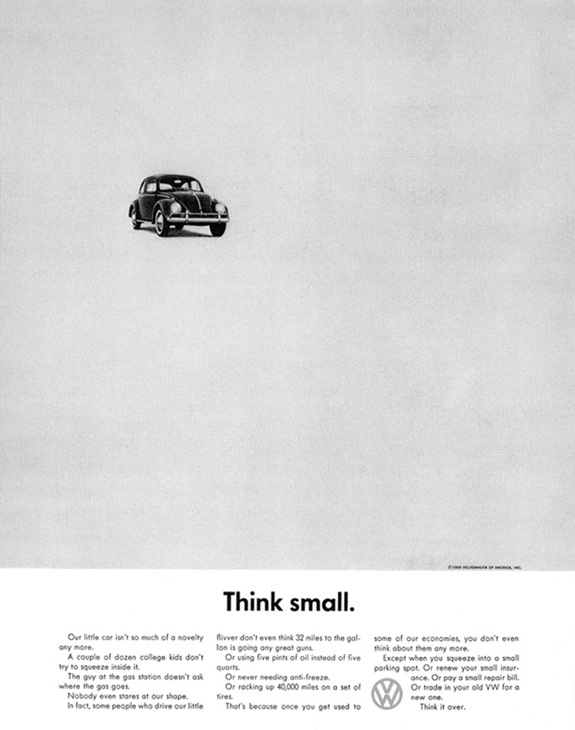
It’s interesting to compare two classic Volkswagon ads. The “Think Small” compaign (below) set the advertising world on its collective ear back in the day and turned the Beetle into a phenominal success. Money rolled in and Bugs filled the streets.
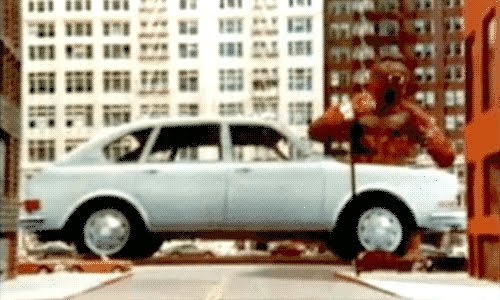
Whereas, a few short years later, Volkswagon’s ambitious King Kong commercial—featuring stop-motion animation by the late David Allen—was an expensive flop that aired only once. Why? The word was that VW executives objected to the image of an ape driving their car (Kong toodles down 5th Avenue in the spot’s conclusion), but the results of a survey of people that saw the ad revealed that while they liked the idea of Kong in full color tremendously, they couldn’t remember that the ad was selling a Volkswagon.
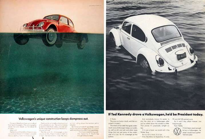
Just as another VW aside: their Beetle marketing was so popular that eventually one ad inspired a parody (side by side below) from the National Lampoon (in their Encyclopedia of Humor). Volkswagon sued to have the books recalled, ostensibly because of misuse of their trademark, but…a lot of ’em are still out there.
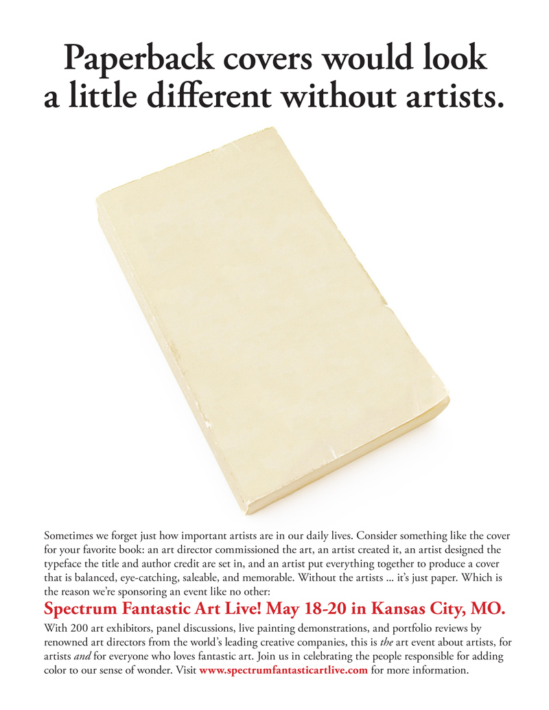
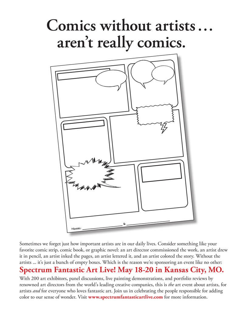
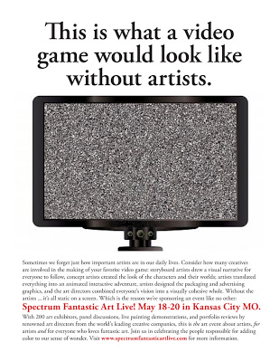
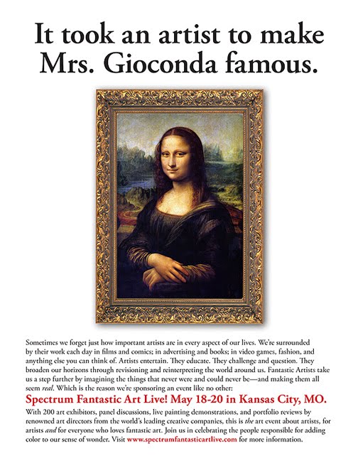
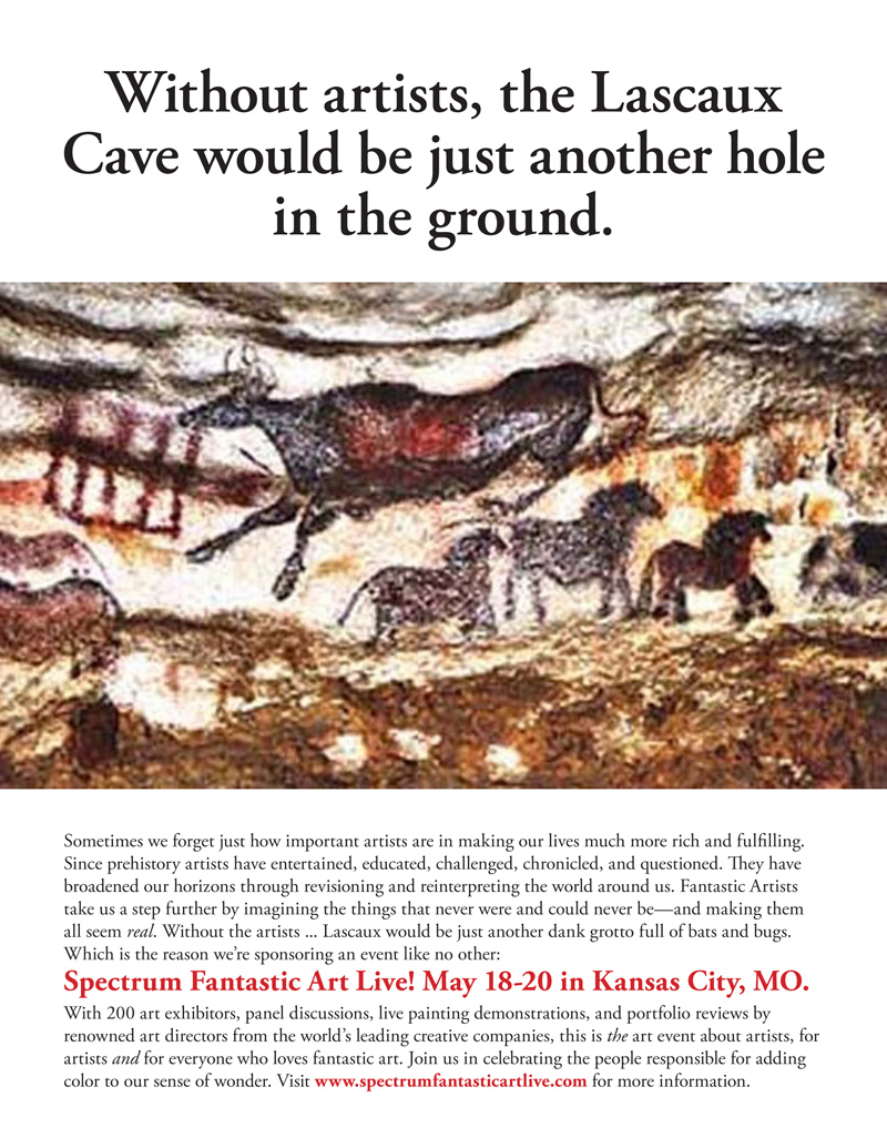
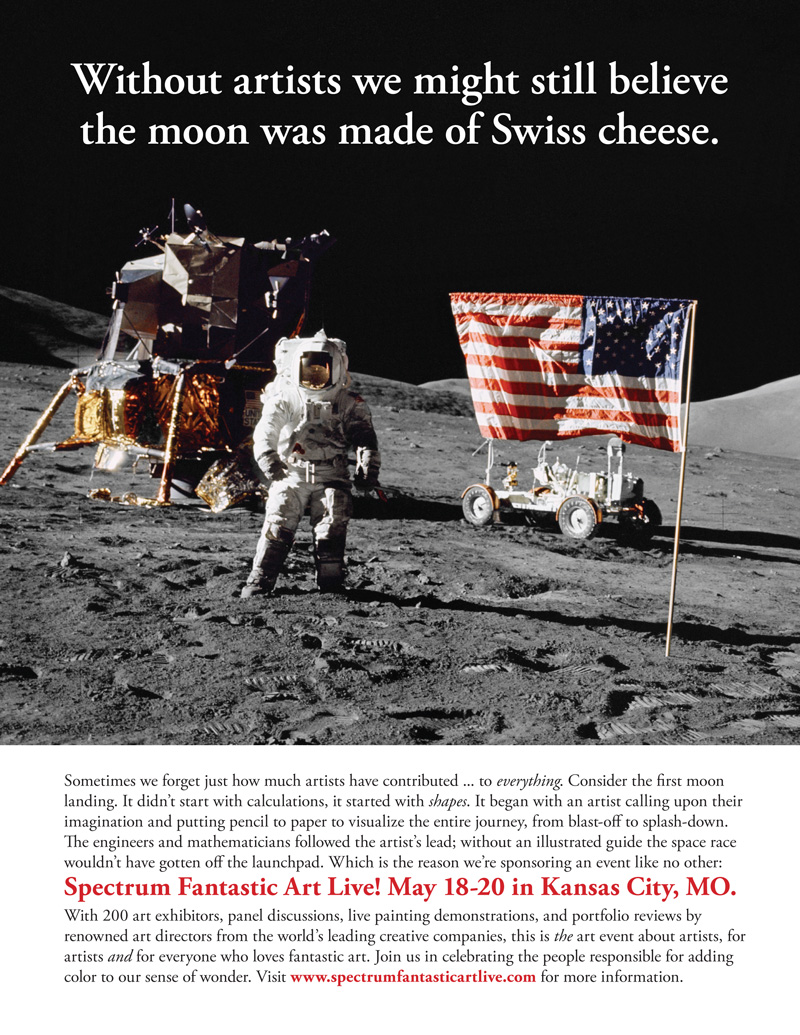
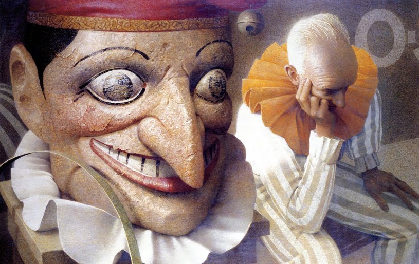
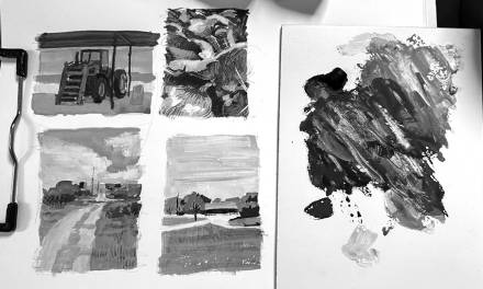
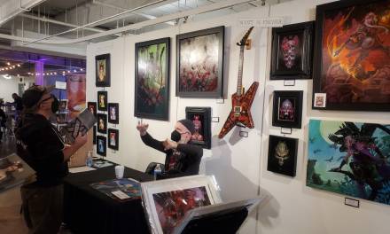
Anyway, we’ve done our share of ads that hit people over the head about Spectrum Fantastic Art Live, but we also wanted to do some that were a bit more “quiet,” ads that reached out to new people and gently mention the importance of art and artists in their daily lives. Plus…they were fun to do. And—to give credit where credit is due—the lunar landing ad was all Greg Manchess’ idea.




Those are absolutely wonderful ads.
Don Draper would be slowly nodding his head whilst sipping on his fourth whiskey if he saw these.
Had to correct my comment: I like that these ads employ so much white space. The Elements of Graphic Design, by Alex White, teaches all about that — good design lets the message breathe, much like the sophistication of a good shopping center or physical space employing abundant open space.