This is a Magic card that just got released. It is published in the M13 Core set of Magic: the Gathering.
I sketched 2 versions and sent both off, since I couldn’t decide which one I though was the best. I liked the one with the old gnarled thief hanging upside down, but was afraid how the image would read at card size. The other one is more like a Batman silhouette and I kind of knew it would be pretty clear. Jeremy Jarvis, the art director, chose the “Batman” one and I went for that.
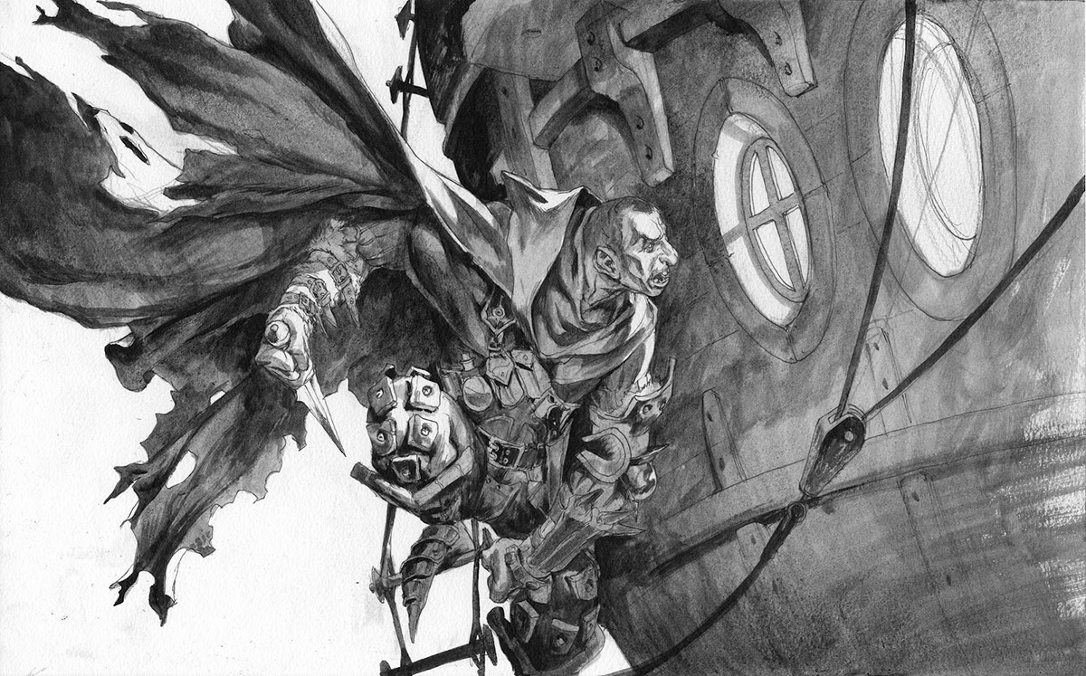
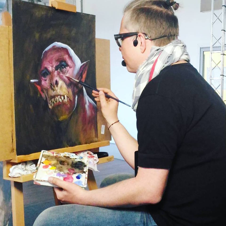
When sketching it and transferring it to board i enjoyed giving him a bit of character by making him really messed up in the face, ugly as hell. I imagined he had always been the ugliest kid around and that he was teased an bullied by the other kids. the life of an outcast has lead him to become the Master Thief and now he is getting back at the world. he should be as ugly as his deeds. Well; it is a lot of thought for a Thief illustration, but making stories up like that, helps me add mood and character to the figure.
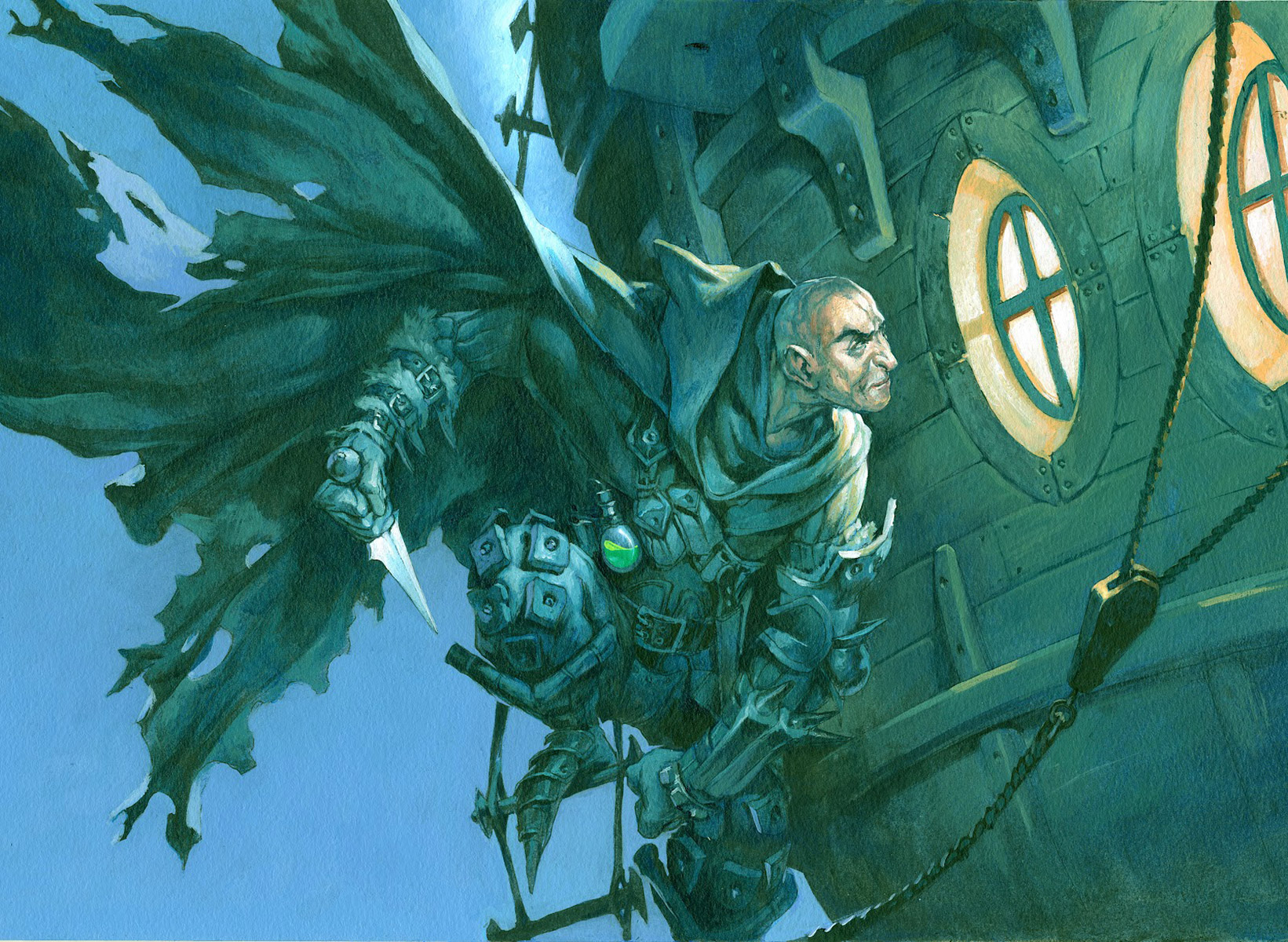
Unfortunately he ended up being too ugly. The Art Director asked me to submit a “hero” version that would make the players want to be the figure instead of being repulsed by him.
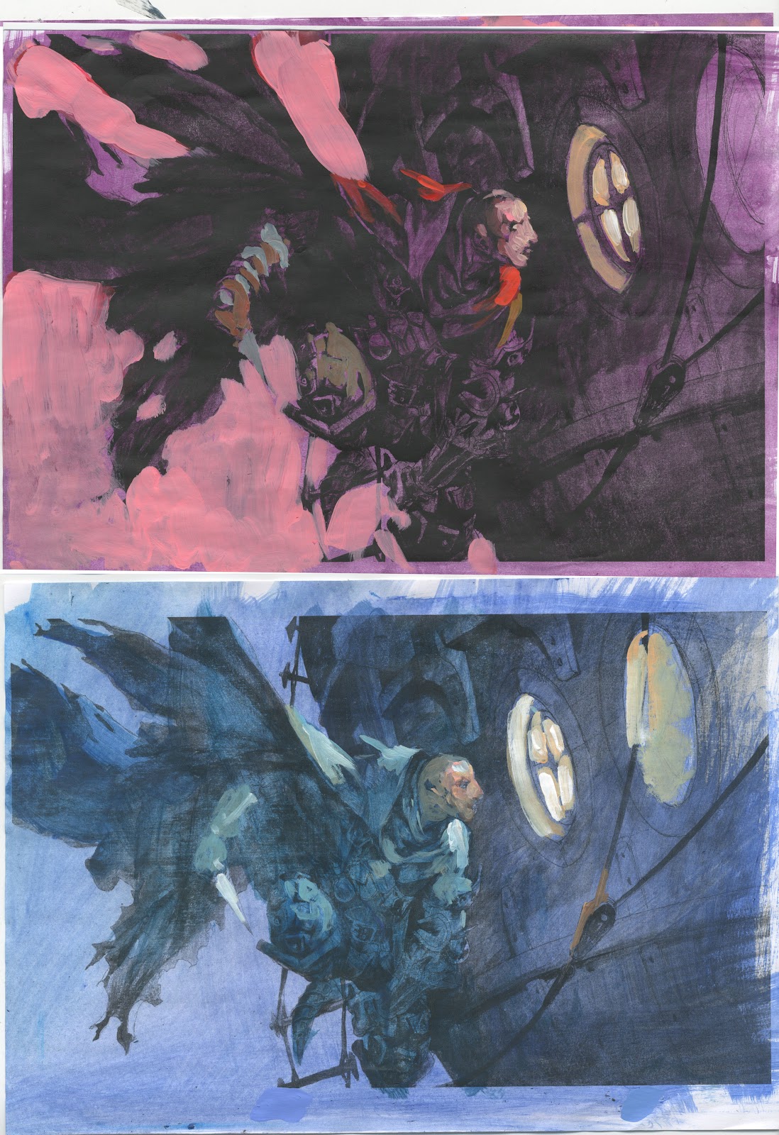
So I painted another face on top. I should have done it on a separate paper, or digitally or whatever to keep my original face intact, but I have found out I can better do it this way. When I spread an illustration out over several sheets of paper and the final is a collage of all, I lose focus and make a weaker painting.





great piece! not sure which i like as far as the face goes, as they are both great. you make a good case for the ugly face one, haha. makes the story have more depth for the character. ah well.
you're upside down pose would have been great in a larger format!
love your work
I love the words at the bottom of this card too. It fits perfectly with the image and tells a short story with just a sentence. Really cool!
Really great work! I personally prefer the ugly faced one more. The character to the face adds a lot of depth to the story.
Nice bandit.
It's a little funny though that he propably wont fit through the windows. ^^
I just fell over this blog from somwehere, and I really like the second face: I reckon that fits the story as well as the ugly face: he's risen above the bullying and is a calculating mercenary who gets a kick out of being smarter than the people who bullied him.
Being the kid who was picked on in school, this was he sort of person I sometimes wanted to be: exacting a lifetime of revenge on my former schoolmates.
love the choice of colour and as always your thumbnails and process.
still my favourite fantasy artist, KEEP ROCKING THA AWESOMENESS
I like the ugly one better, rly adds a lot of char to it, I also wish your art director had chosen the “Spider man one” instead of the Batman pose 🙂
I LOVE this painting, Ejsing!!!
I really love paintings about stealth….
Great job!