It’s Summer again, and for many of us in our industry, it’s also the season for going to, participating in, and networking in the many conferences and conventions taking place across the nation, from the San Diego Comic Con on the West Coast to DragonCon in Atlanta, Georgia.
Speaking of Georgia, I’ve just returned from Savannah, where I gave a keynote presentation and all day workshop in Creature Design and Animal Anatomy at the Guild of Natural Science Illustrators’ Annual Conference. The GNSI is an organization of professional illustrators who specialize in scientific illustration, which is very broad—medical, veterinary, zoological, paleontological, botanical, geological, and even astronomical. They use a variety of techniques, both traditional and digital, and their clientele ranges from National Geographic and similar publications, to zoos and museums, NASA, the US government, textbooks, field guides, medical journals, and many universities across the country.
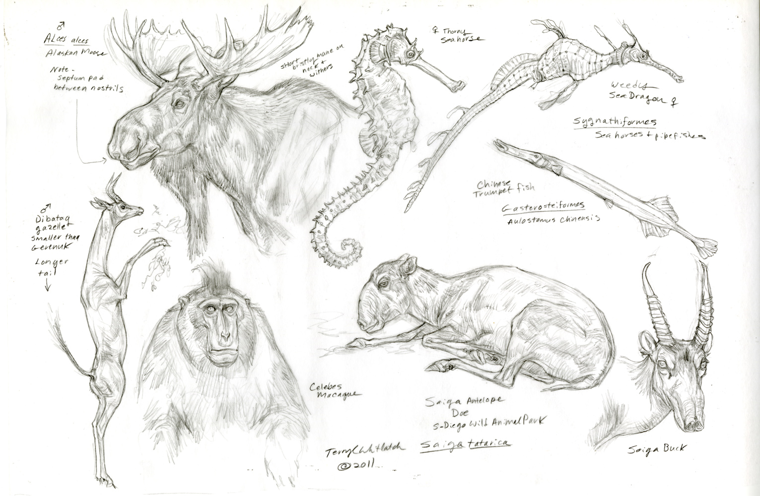
These artists are trained to really see and observe—their artwork must be precise—scientific papers and breakthroughs relay on their accurate interpretations, and in the case of medical illustration (including the portrayal of surgical techniques), lives may depend on this.
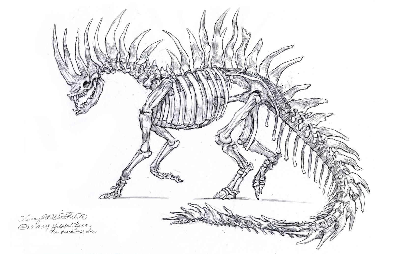
This level of accurate portrayal and artistic integrity has broad implications for a crossover into creature design and concept art, and part of my presentation was devoted to this subject.
But Summer is also a time to relax and to play, so, inspired by the antebellum beauty of the city of Savannah, with its historical architecture, beautiful parks and squares, live oaks draped with Spanish moss, fountains, and horse-drawn carriages, I thought I’d share a little sketch, for the sheer delight of drawing and whimsy.
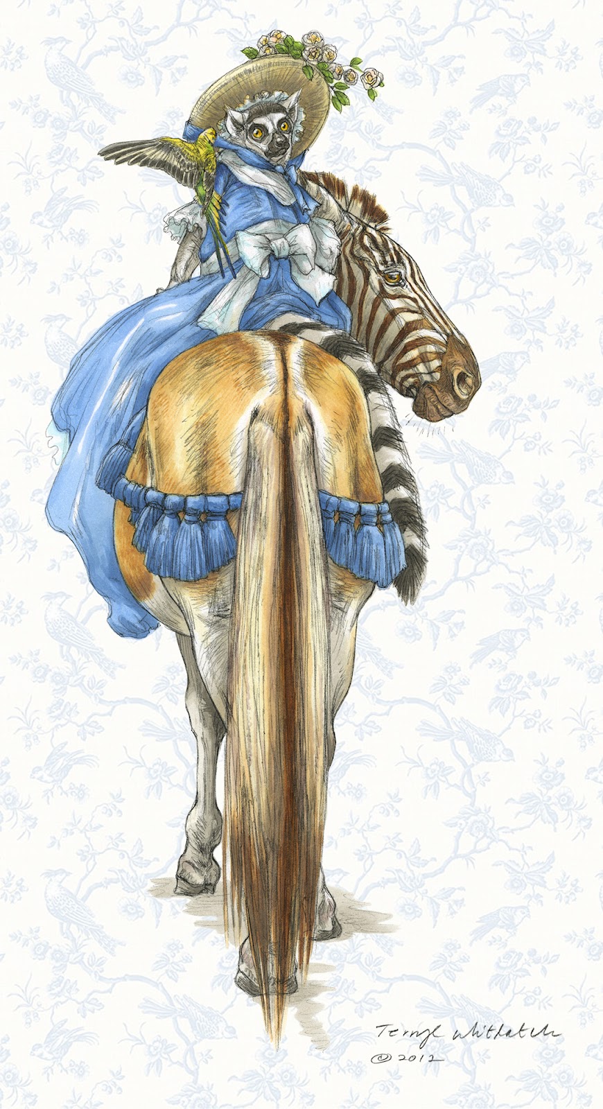
Savannah was established in 1730, and is perhaps one of the utterly most romantic towns you could visit, and so, in the spirit of romance I drew two of my favorite animals, a quagga (a zebra subspecies) and a ring-tailed lemur (or lemurette?), complete with a 18th century costume, and with a nod to Edward Lear.
Marker washes were applied to the sketch drawn on paper, and then, to keep in the spirit of the graphic design of that time period, a toile textile pattern was digitally added to the background.
So, here we have it—a simple little sketch with anatomical fundamentals common to both scientific illustration and creature design, combined with the fantasy element of our genre, which adds up to why we all do this anyway—joy in drawing what transpires in our imaginations.



Terryl, you are a professional, informative, and wonderful addition to Muddy Colors.
Love that zebra head 😀
Elegantly controlled. Simple and wonderful. Love it.
Thanks so much for coming to Savannah! We enjoyed the presentation and the Workshop very much. Workign on a blog entry about it, and Copic markers at http://www.gnsi.org/blog/working-copic-markers-virtually-conference-report-3