By Justin Gerard
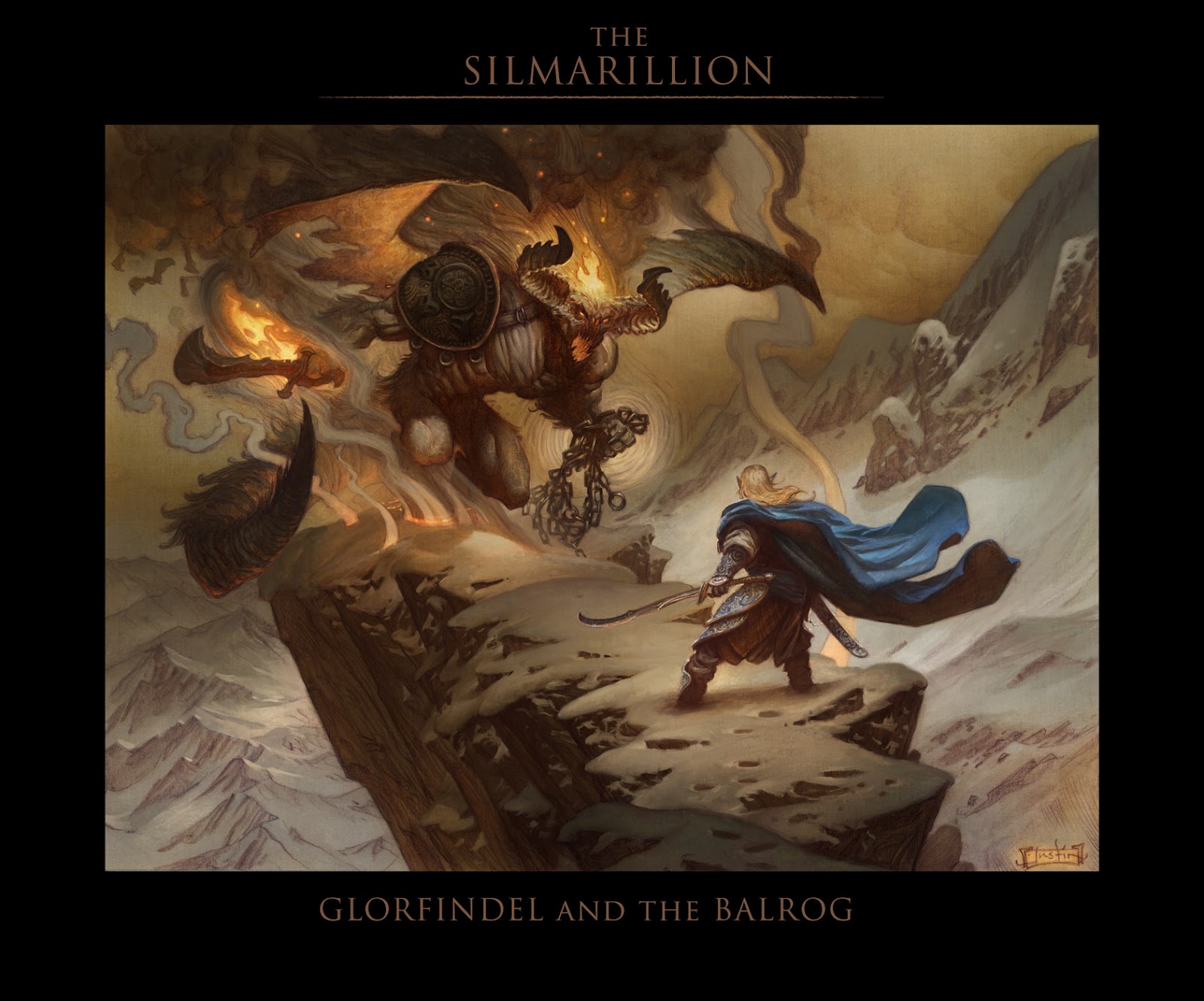
So I know I said I wasn’t planning on doing (or monkeying with) any of these Silmarillion pieces digitally. But I gave in and joined the Dark Side for a bit to push the Glorfindel and the Balrog piece a little further.
I can’t help it, sometimes I just have to monkey with the paintings. This version of the image is much more like the frame that was in my head originally, with a little more emphasis put on the fire and atmosphere. Hopefully the digital work doesn’t affect the overall classic feel I was going for in the original. Having things turn out too synthetic looking is always a concern when painting in Photoshop.
In the end, I just love pushing the traditional parts further on the computer. Like the Dark Side, Photoshop can be a lot of fun to work in once you really figure it out.
But this is where it starts guys. One day your happily adjusting Photoshop dials, the next thing you know you’ve built a Deathstar and are blowing up Alderaan.


Luke take my hand,… Welcome to the dark side.
This looks great, original (paints) and digital.
I want THIS as a print in my room pls!
dark side-shmark side, it looks awesome!!!
Vanja
Beautiful painting Justin. You do an excellent job of retaining the life and depth of traditional work – probably due to all those awesome warm, sienna/umberish shadows and Rembrandt inspired lighting.
Great stuff man, and you could always go the route of printing the digitally enhanced image onto canvas and adding oil work on top to finish it off (Scott Fischer comes to mind…)
Thanks for the update on your painting! It's always interesting to see what can happen with a little monkeying around. I think that you were able to keep the traditional atmosphere of the original very well. It probably helped that you had brought the original to a finished state, your line work was where you wanted it, values, etc. Then with the Photoshop fiddling about, it was able to take on a different depth of value, without having to change the overall feeling and look of the image. I don't know if those were things you were thinking about or if you had a different process in mind as you painted it, that's just my take on it.
The areas that stick out to me and are the parts I like most would be the folds of the cape and the smoldering snow around the balrogs feet. Thanks for taking the time and effort to make this post, we all appreciate it.
Well Darth Gerard, it appears as though your skills are complete.
This painting looks amazing with the digital work applied, and to be honest with you, there is enough texture and line quality showing through from the original painting in the final, that I'm really not even thinking about this thing being digital when I look at it. There is a huge difference between a traditional piece slightly modified by digital techniques and a piece that is 100% digital with no underlying grit or texture.
But I would like to know what kind of layers you're using here. How do you get that soft buildup of light without it looking like somebody (like me) using an FX layer to get some kind of sappy glow going on. Are you actually adding color in Photoshop or are you just coaxing it out of the watercolor with subtle adjustments?
Or maybe that's a question I need to ask next time I run into the Emperor.
-Will
Vveeerrrryyyy nice.
Hey guys! Thanks for the feedback!
And Will,
The layers are almost all multiply, many many hundreds of them, all very light, some with color and some with just value. So the lighting effects end up mostly just being the absence of shadow.
I will occasionally use soft light to punch up a color, as with the flames, but I tend to use it very sparingly. (most FX layers are dangerous IMO) Some of the more softly lit areas will have a very few normal and screen layers, but again, not many.
I am also using some of the new painter brushes in CS5 for final detail effects, like in the cape or the horns or the patches of lit snow. I like to do this in detail focal points as it sharpens them up a bit. It kind of gives more clarity to the little moments of the image as the viewer looks around it.
Thanks Justin. I'm really trying to figure out where photoshop belongs in my personal toolkit. I want it to be something I use to enhance, not create my illustrations. I mean, it's so easy to let the software do some random stuff and say, “oh that looks cool”. I'll definitely be playing around with some of these methods you're describing – it just looks like too much fun:)
I'm actually going in the other direction with my work. I'm primarily a digital painter, but am finding myself workign more and more in traditional mediums because it's just easier to get some looks that way.
And as a response to Will Kelly, traditional artists can just as easily let the interaction of paint and canvas or paper texture 'do some random stuff and say, “oh that looks cool”'.
Some things I really would have had to work hard for in Photoshop are effortless and practically build into some mediums like watercolor. It's all about intent and aesthetic in my mind.
Looks awesome, really unique tridimensional, tactile feeling. Lovely work!
Very nice work Justin! I love mixing digital and traditional.
Why dont you try doing the opposite at some point? Scan your drawing and do some quick value studies, then try to push your watercolours to the same valuerange? Just an idea 🙂
I'm one of those people who pretty much only work digitally anymore… and that last line of yours cracked me up. So true.
J'adore ! C'est très efficace !
But I still prefer the traditional method for setting color. I'd like to see your work with treatment with acrylic, with more material.
Thank you again for all your work.
Cheers, MB