Sometimes, paintings just need more work than you set out to give them. They reflect your state of mind so well, that at times we manage to ignore what’s in front of us, when we should follow what’s going down.
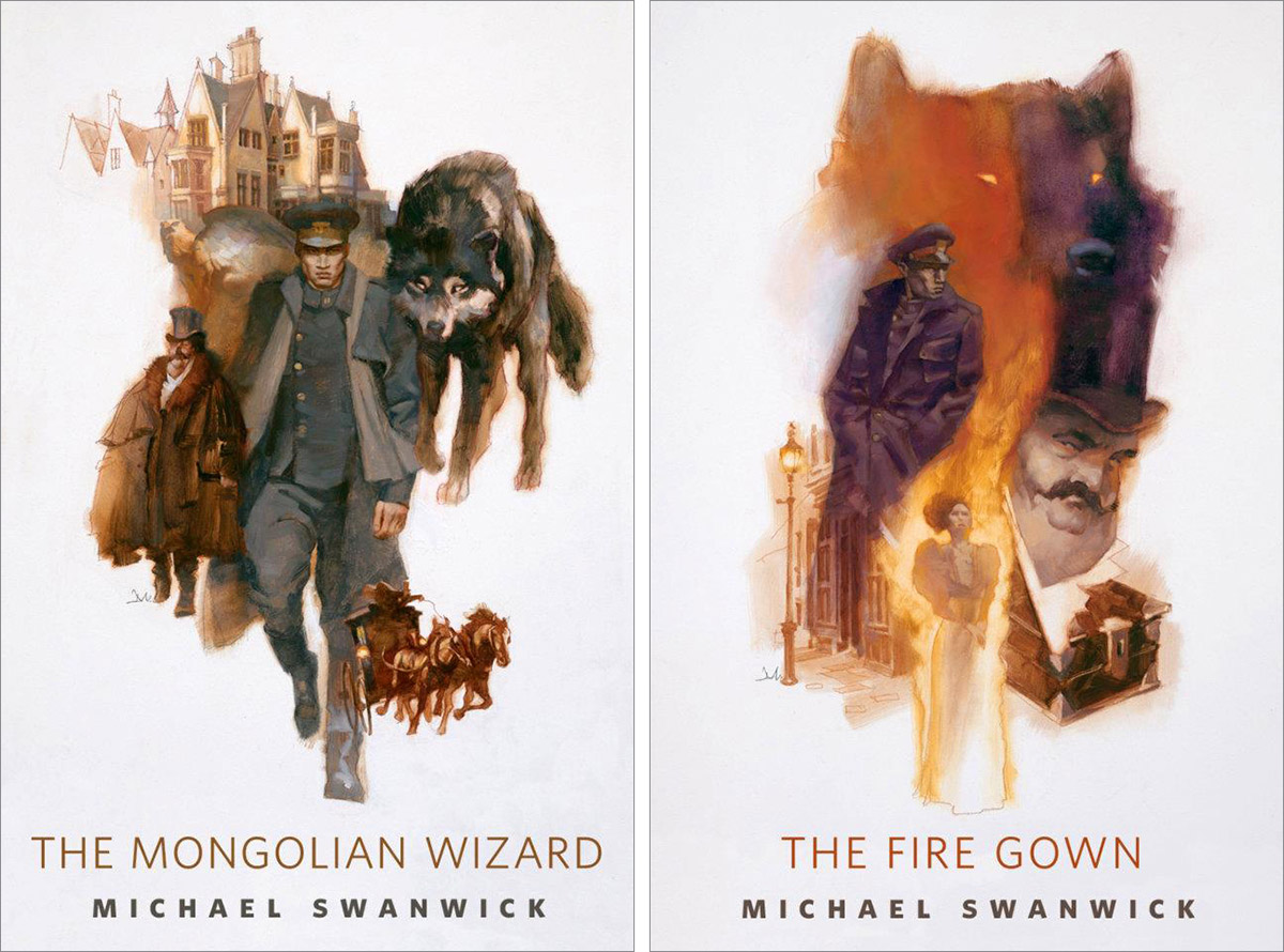
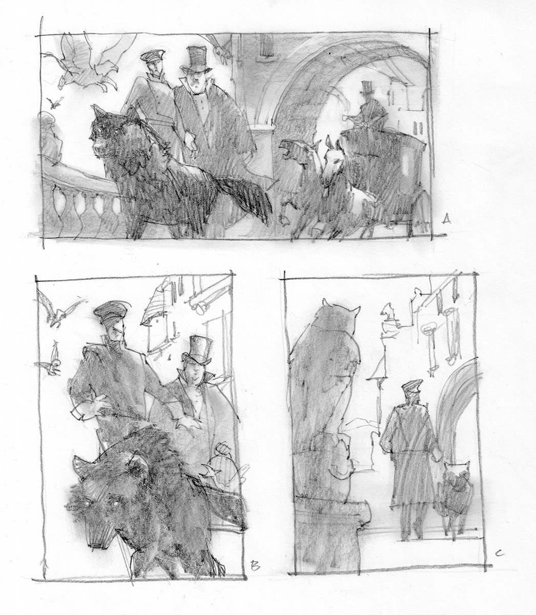
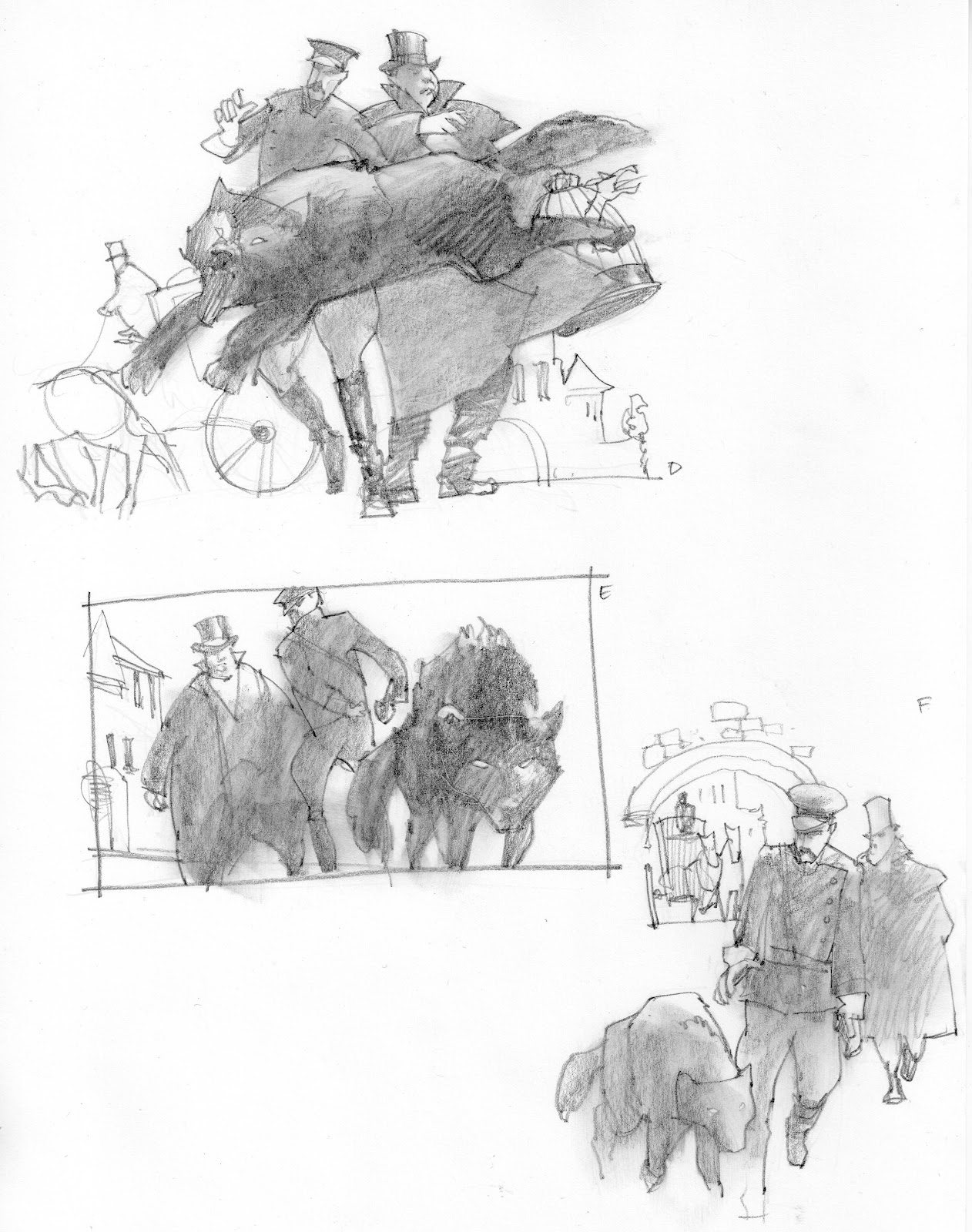
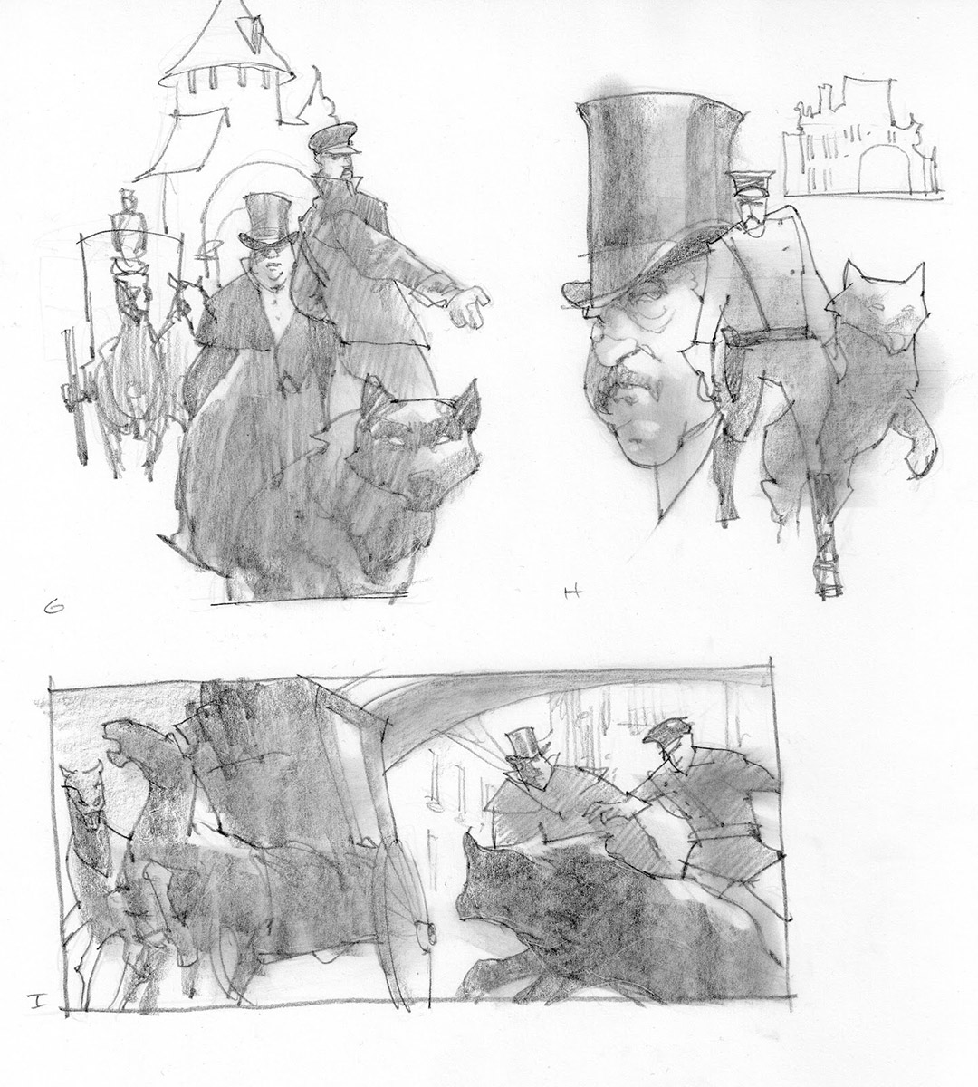
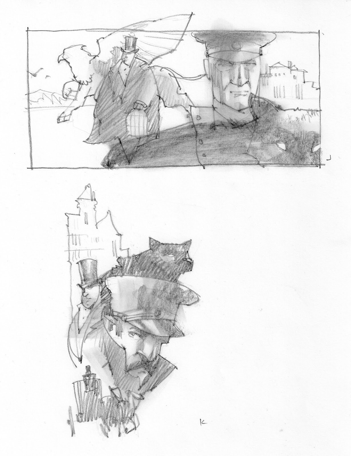
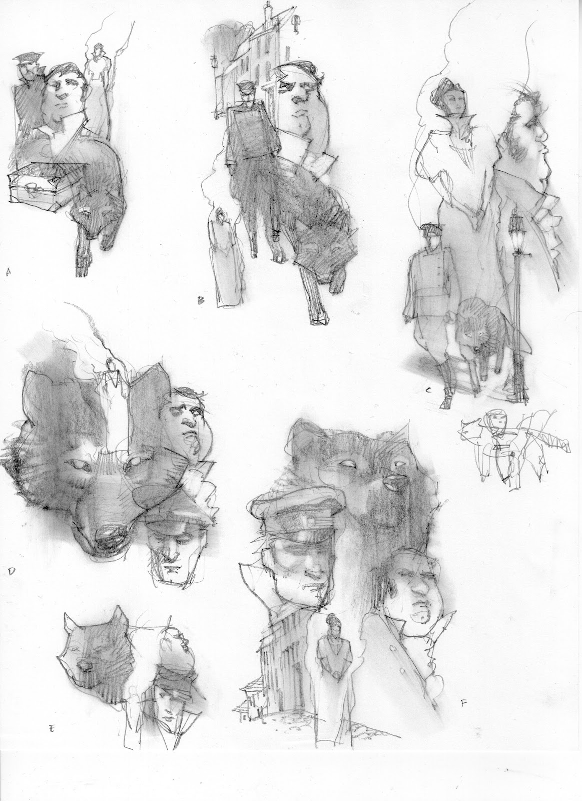
This is the sequence of painting two images of a six story run for Tor.com. The stories were written by Michael Swanwick and art directed by Irene Gallo. They have a touch of steampunkiness to them, along with vaguely recognizable historic elements. I read them both about three times each, then started as usual, with a slew of thumbnails.
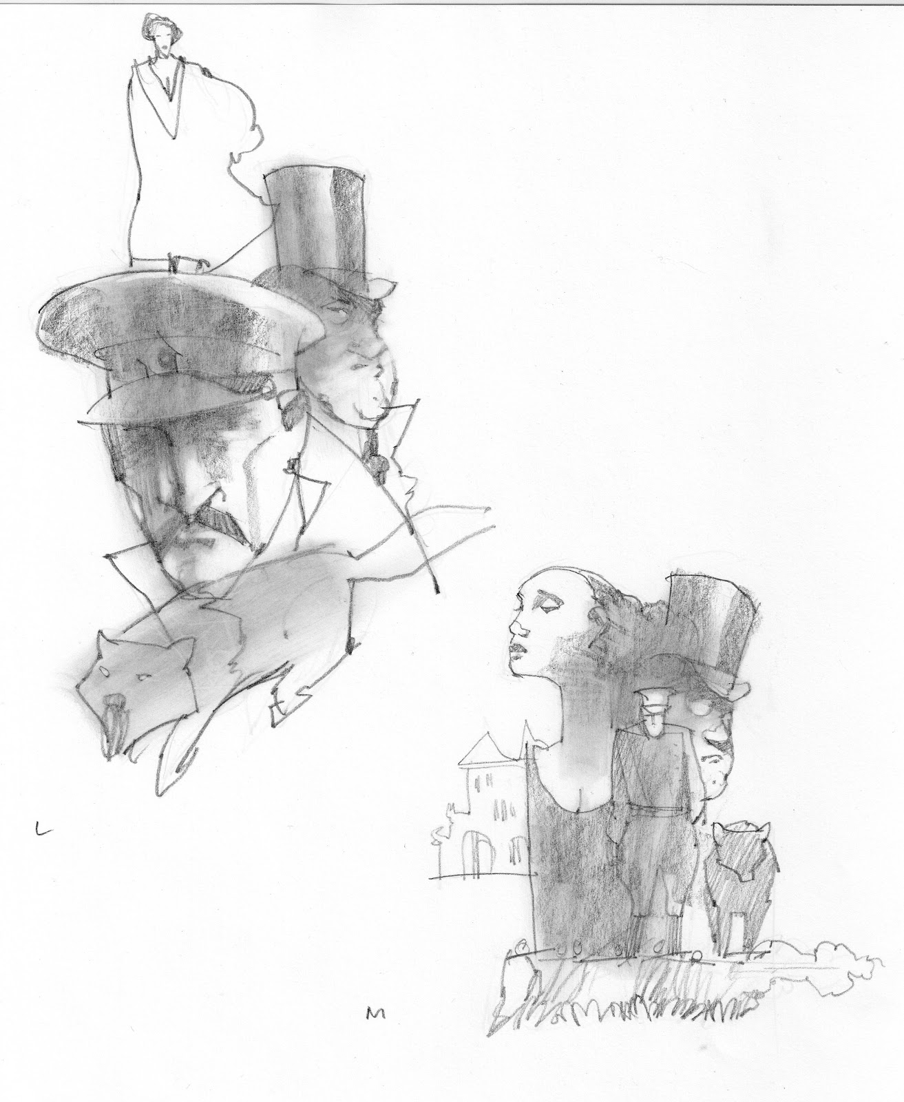
Because the stories are full of so much great imagery, I thought I would design montages for each installment, thereby giving each story a unique flavor, and the overall series a cohesive look.
After the first set of thumbs, and much discussion about whether to paint scenes vs montages, Irene and I thought the bottom thumb (second to last page above) could be used as a base design and modified for each story.
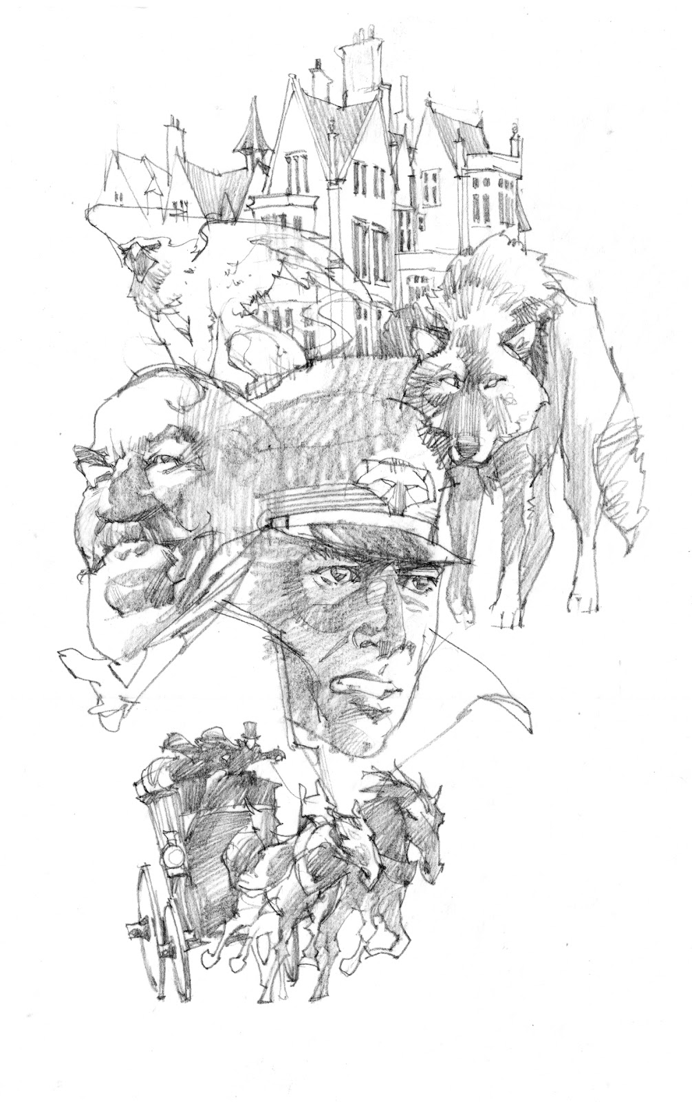
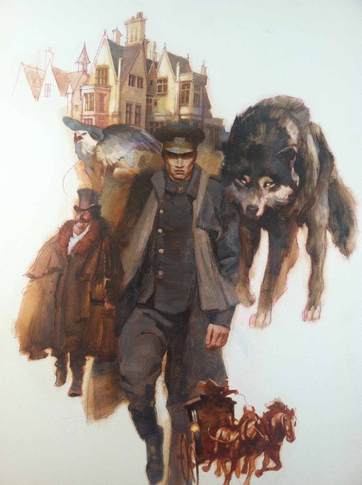
This is a much rendered sketch for the final of the first story, The Mongolian Wizard, and even at this point, Irene was a bit reluctant about the approach. I had shown her stylized thumbs, but my sketch was more realistic. This was the point at which she got nervous about what the finishes would look like.
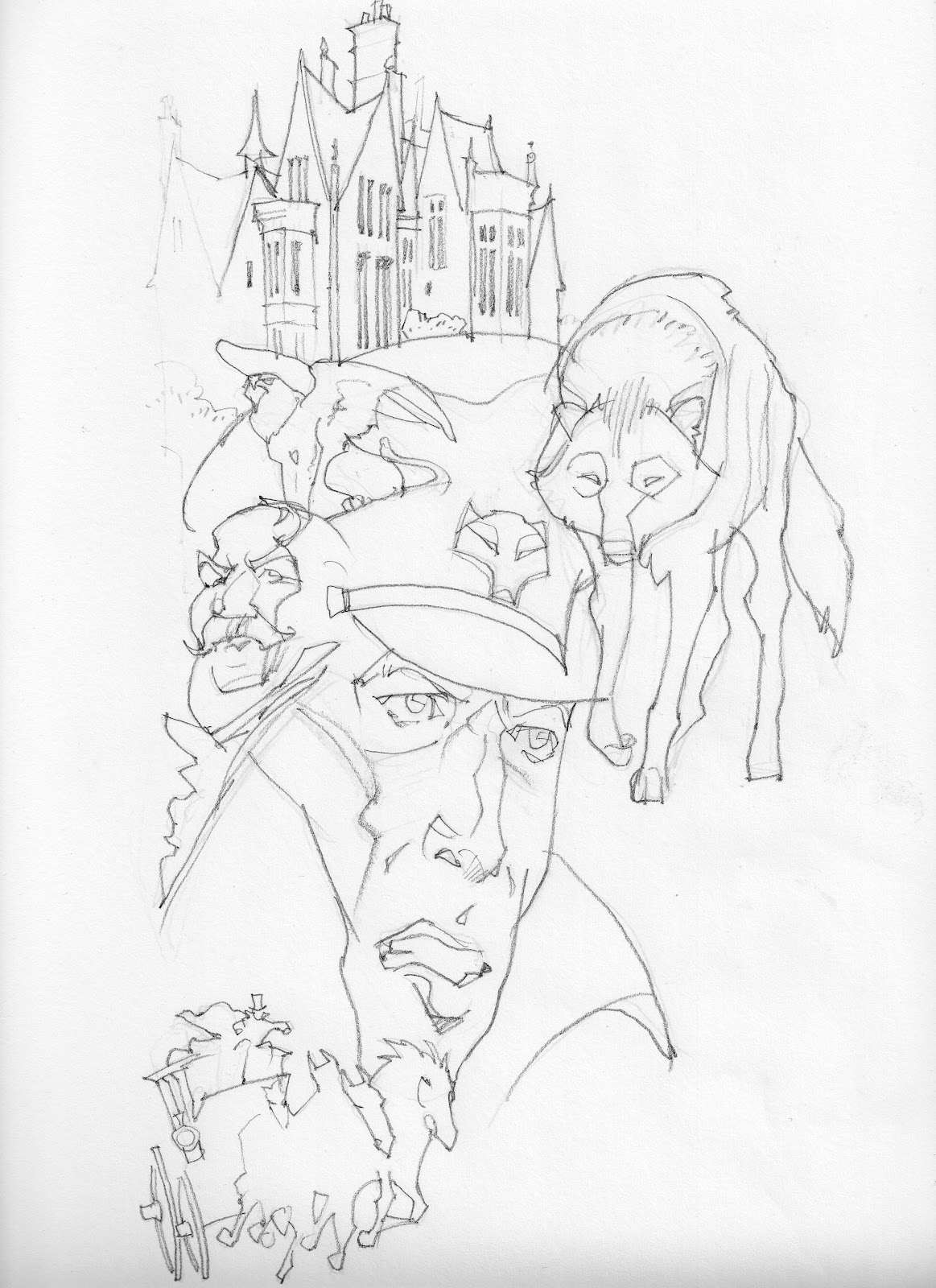
This second sketch is closer to what I had in mind. A little more distortion and personality, which she thought sounded good.
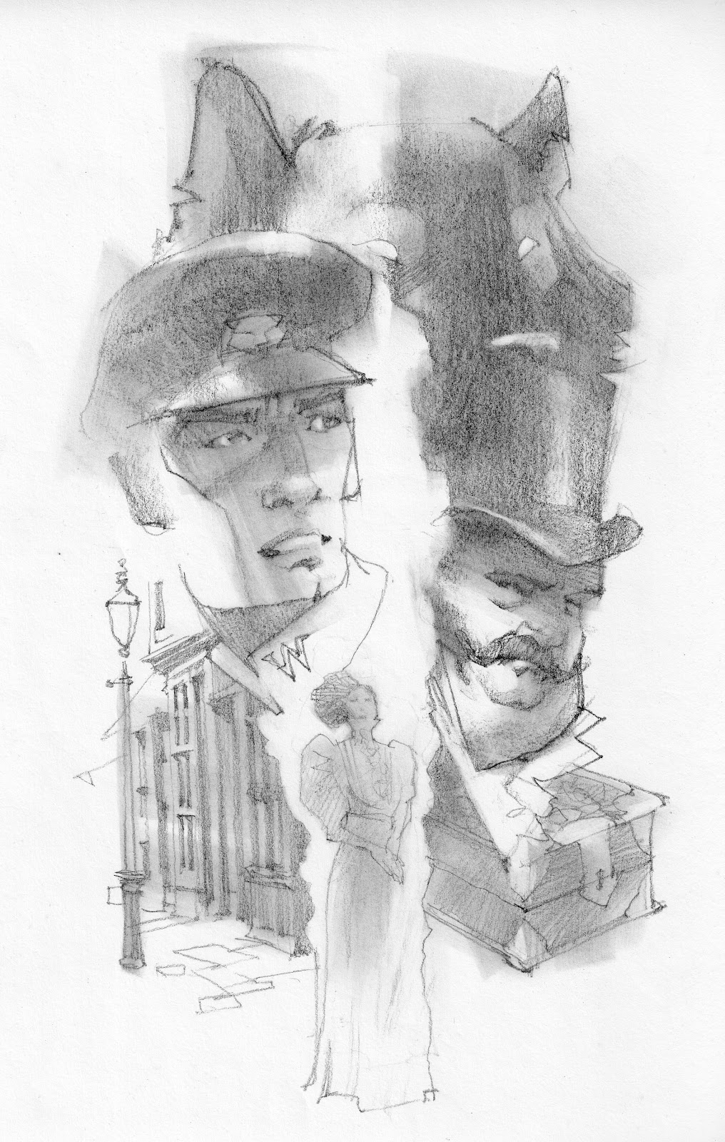
Based on the first set of thumbnails, I started the second story, The Fire Gown, and did just one page of thumbs.
And the final sketch. Irene felt there was a disconnect between what we were talking about vs what we were looking at. I just figured the stylization would come out in the paint.
First painting done. But even now, way in the back of my mind, I questioned some of the color.
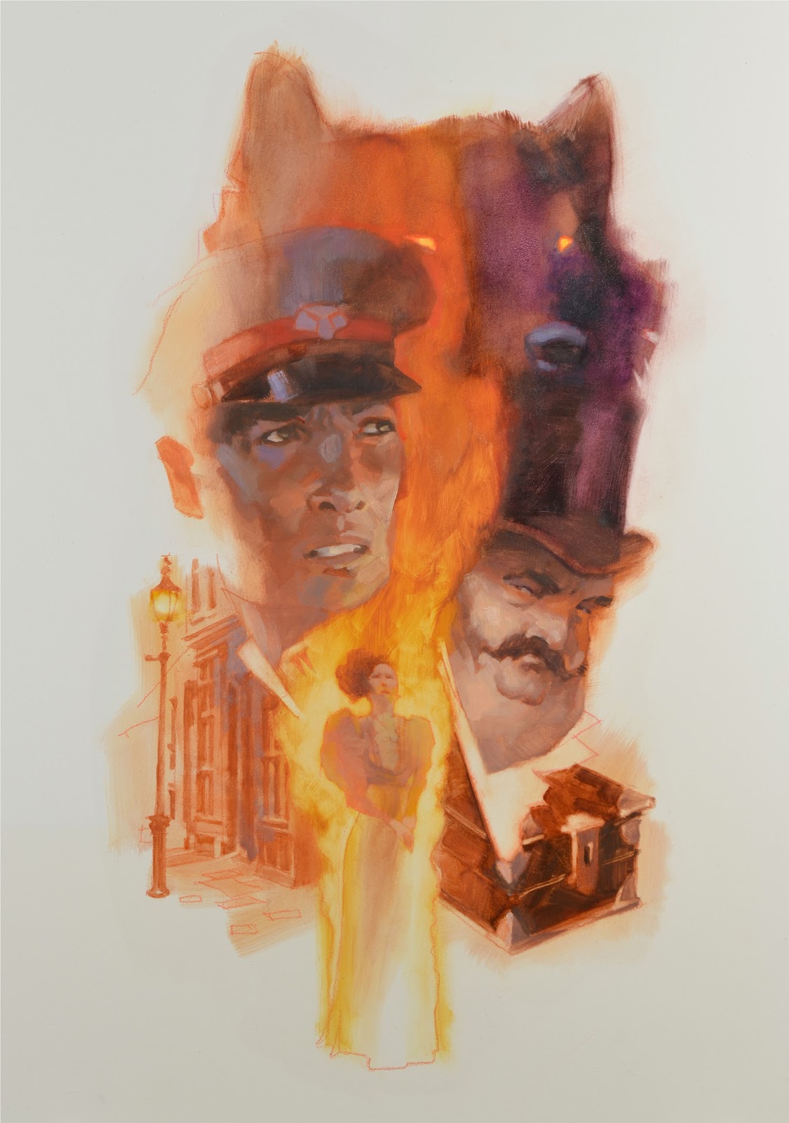
I moved on to the second piece, with Irene asking if this one could be brighter. There was extra pressure for these first couple images to be right because Tor.com would be wedded to the look for the entire series.
I was happy with them. By this time I had finished both pieces in about four days, and shown them to Irene. Silence. I finally asked about her impression of them. Her response was mediocre.
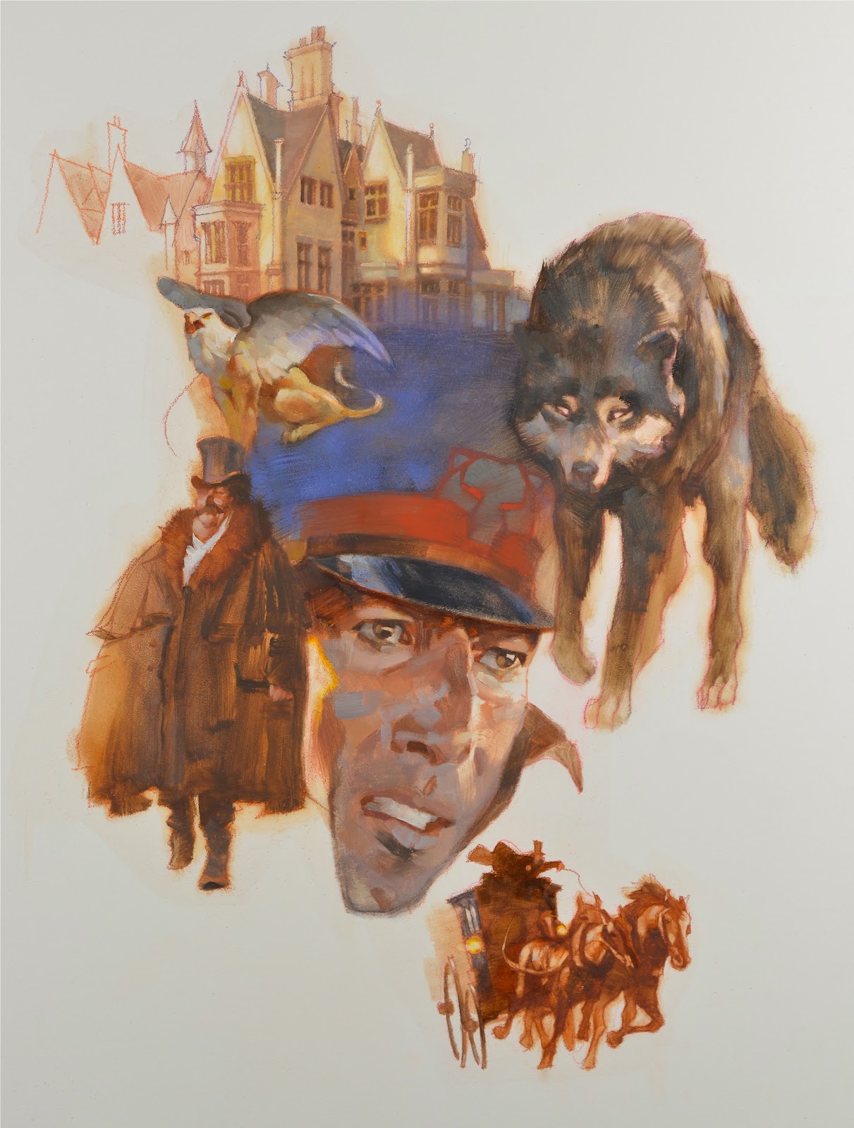
The problem with the first painting was two-fold. The large head caused a rather awkward space in the center of the composition, and the stylization of the whole piece was inconsistent. And also, the second painting would need to match the first.
Now, I was in trouble. How was I going to fix these pieces so that they were accurate to the story, and still be nice images? Other deadlines were pending for me, so I promised I would make good on the designs and decided to give it a rest for about a week. Luckily, she had some time.
I went into an immediate slump. Had this happened earlier in my career, I would’ve probably panicked, not slept for days, and fought off pounding headaches. Instead, I relaxed and let my mind dwell on the problem. When I did that, it went to work in the background, and foggy solutions started forming.
The large head had to change and the colors had to meld together more. I finally explained to Irene my master-plan for fixing them both. She shared her fears with me about whether I could pull it off, and frankly, I wasn’t 100% convinced either, but I trusted my experience.
I made some sketches of pieces that would be dropped into the actual paintings, old-style, on the original. I didn’t want to correct it digitally. (I know…but I wanted originals in the end, not pixels.)
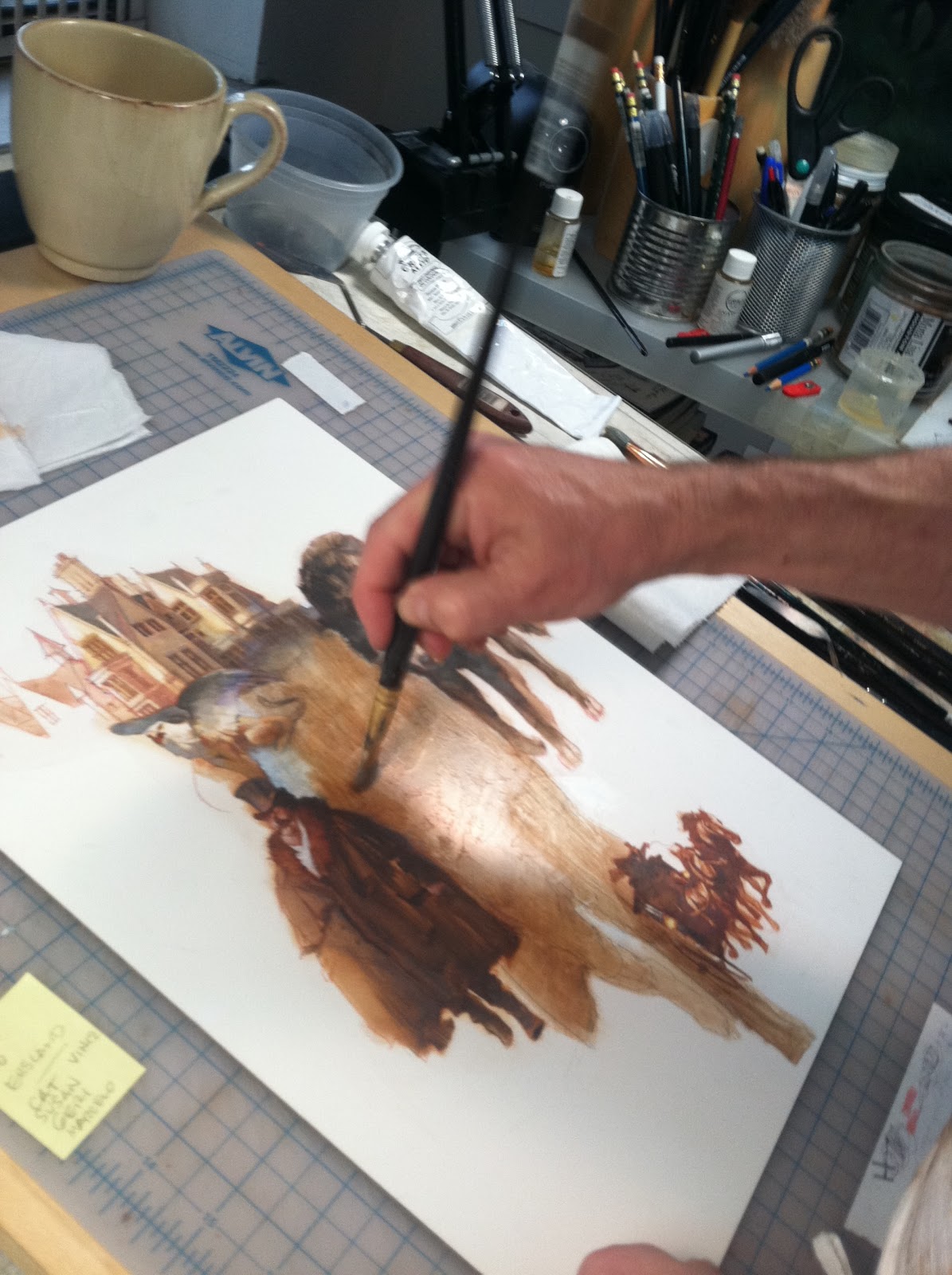
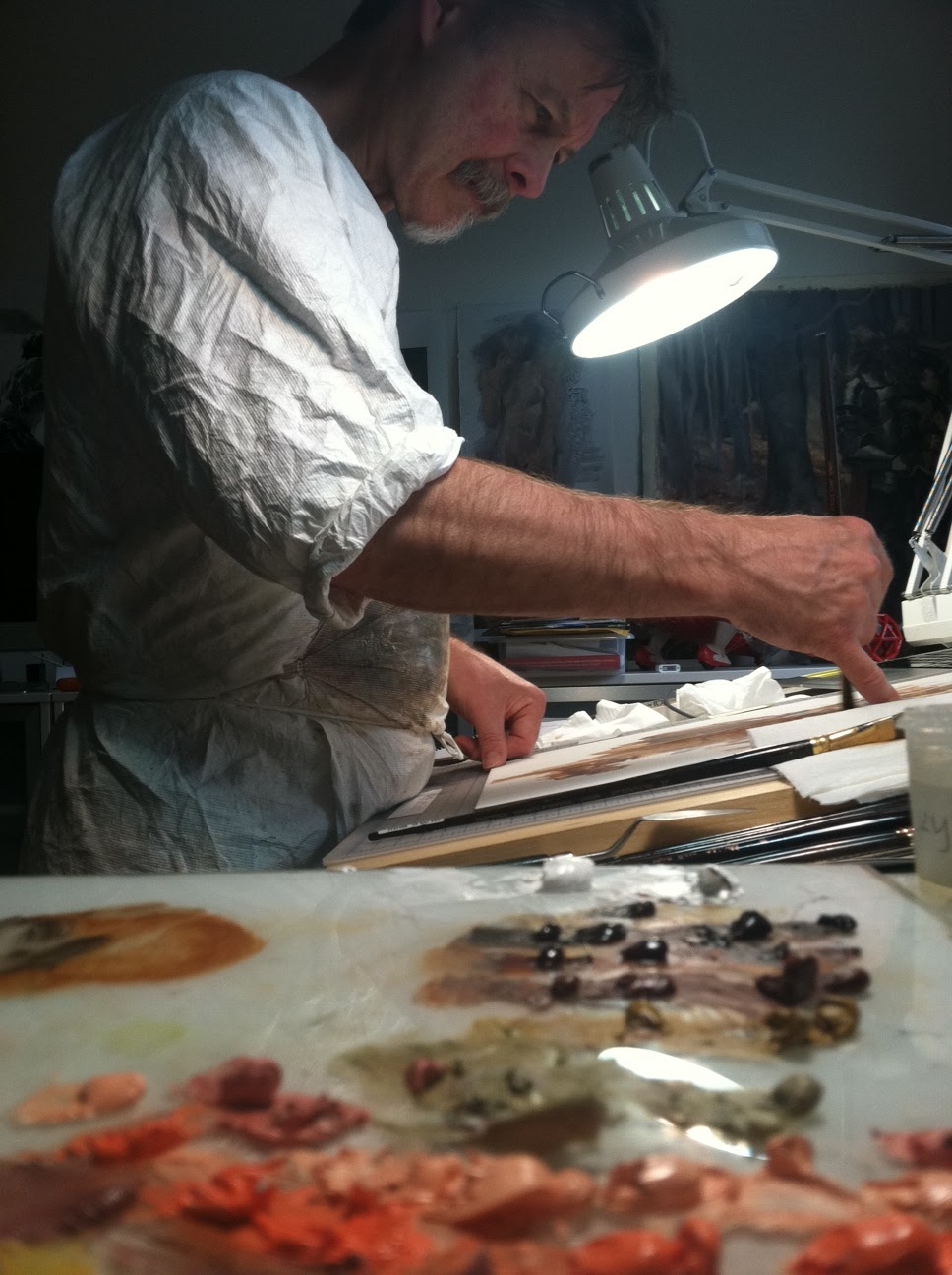
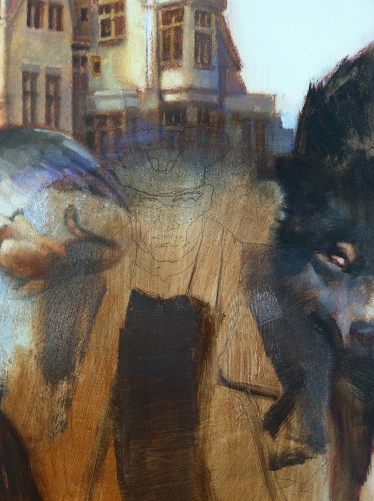
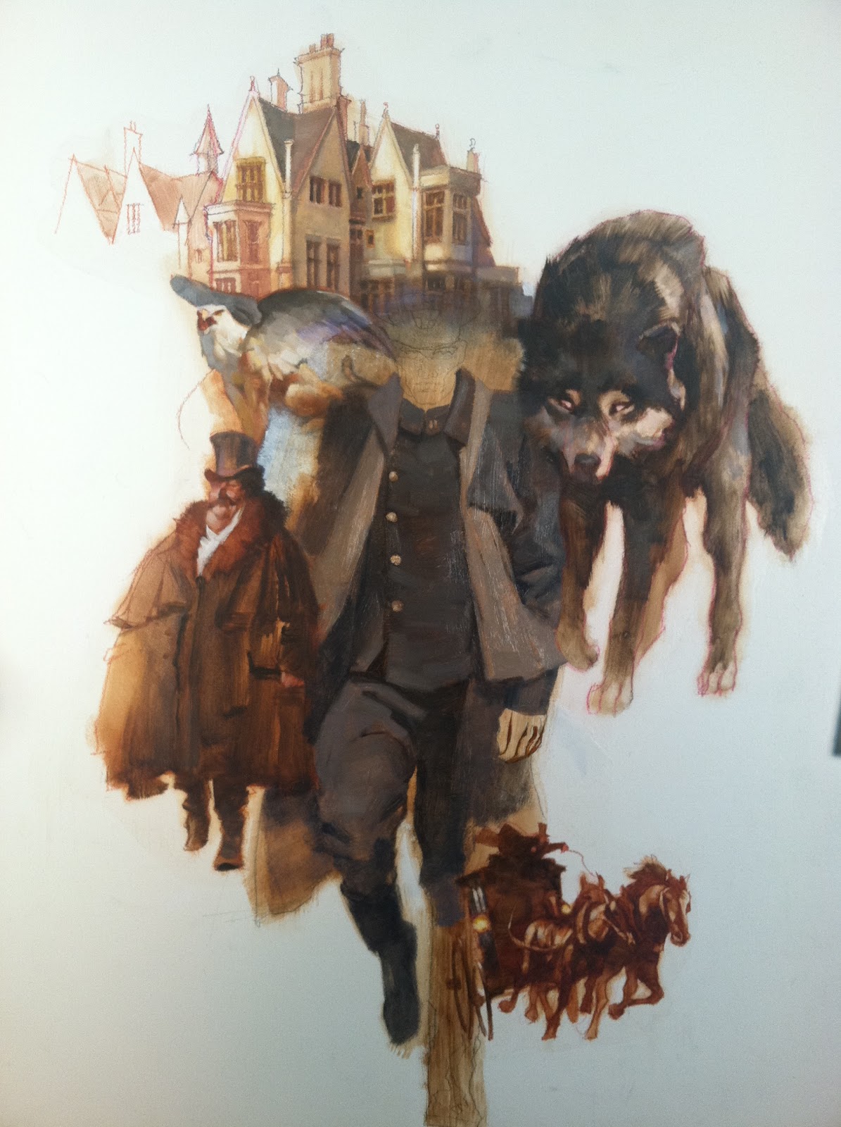
Below are some shots of the process. The first step: I sanded the board to scrub out the main head, but that failed. Next, I had to paint it out completely to white, so I used a palette knife to smooth Titanium white over the head and waited overnight for it to dry. After projecting my drawing over the white patch, I penciled in the outlines. I covered this with an acrylic wash, and then laid in the oil.
This rescued the first story and I moved onto the next painting, with the same steps as above. Irene was delighted on how effective the changes were.
I was even more happy with the second piece and Irene was elated that they were better compositionally, and with the colors being different, yet holding the set together. When Michael Swanwick saw them, he felt I had captured his characters accurately, saying, “These pictures make me happier than I can say. Above and beyond the fact that they portray the characters as I imagined them, they really sell the stories. People are going to start reading the text hoping for exactly the story that’s there.”
There are times when one has no idea how something will play out. I’m not one for relying on faith alone. This problem came down to trusting the process I have been working with for decades.





Fascinating post, Greg – as usual, you manage to post something like this on exactly the kind of day when I need to be reading something like this. I really appreciate your openness about the difficulties involved and about everyone's thought processes.
I love the pieces themselves and the “classic” feel they have, and the slight degree of stylization is very satisfying – proper covers, in my opinion!
Greg- You're so talented;)
Awesome post – thanks for for showing all the thumbnails and the editing process! I love the way you melded the images together in the montage. The warm-cool contrasts and shapes are really sweet.
Yes, come over to the darkside of stylization. This is why I will continue to write you love notes. You do what is needed to solve the problem and you do it so damned well.
Beautiful finishes, Greg!
Dan Dos Santos approves of this montage
Excellent Greg, Love this treatment thanks for sharing.
Thanks for sharing all your drafts! Seeing that progress is often more helpful than just a stunning final product.
reading this was like reading a novel of it's own! my heart started pounding halfway through with anticipation of wondering how you would correct it, even though i all ready knew the ending. it's a very insightful look to the world of back-and forth between art director and artist, too. thanks again.
Greg, you are a wizard.
that is some amazing work. quite breathtaking. did you use acrylic as a ground simply for time-sake? I assume?
thanks for sharing
So wonderful to see your process, Greg — especially after just meeting you last weekend. I am in awe of both your talent and your ability to articulate your process.
Those finished pieces really make me want to read these stories!
Hi Greg, Thank you for writing about these two illustrations and their challenges.
I am working on a new painting, doing studies now, but do not have the experience to rely on my process when I am still trying to understand my process, my paint, and my tools. My thumbnails gave me a path to follow, but I couldn't get my pencils studies to visualize what I see in my minds eye so I finally started putting some paint down last night on a small study and it worked well enough to give me a better direction to follow later this evening.
I know that drawing is such a big part of planning a painting but I find that sometimes I have to stop trying to draw and get on with trying to paint to find the direction I am looking for… not sure that’s the best option but sometimes it helps calm the panic/doubts.
I notice that a lot of illustrator’s say they read the stories they are illustrating, which makes perfect sense. How much time do you book for reading the stories when you are given a commission?
Thanks for your time, and see you next week at Normand’s place. I am so much looking forward to learning, painting, and hanging out with artists for a week.
Cheers, Mike P.
I can´t imagine the pressure you went through when making this assignment happen, the 30 plus years of experience definitely pay off in this kinds of situations. At the moment you started telling how you would redo the illustration I went “oh no D:” hahaha, thanks for sharing all this insight!
Hey Greg this post couldn't have come at a better time. i am struggling with a piece right now that i have a tight deadline for and this post made me feel a lot better. I know i just have to work through the ugly patches but saying that and doing it is totally different. And seeing someone else preserver and trust in their process shows that it is possible to turn lemons into lemonade!
Thank you for the inspiration Greg. Not a lot of people would post that they too have to push through those rough patches to make great art. as well as show those rough images.
The paintings are very gosgeous. I love the color pallettes and the elements you've put together. Thanks for sharing this interesting challenge, in the end as poeple is saying here, it was paid of. 🙂
It's admirable to stay calm and still be creative in such a situation, and then produce such a killer painting.
Greg, you nailed it. I really enjoy hearing about your struggles to pull a project together. We all know what it's like to fight a painting, so it's always great to hear tales of struggle from fellow pilgrims:)
Looking forward to seeing more of these.
-Will
Greg, thank you for sharing a very in depth look at your process. Not so much the “I used burnt umber here” that we can get from other sources, but the process of dealing with an art director. Lines don't always mesh, ideas are hard to make come across in words, and sometimes even sketches. It's kind of nice to see that even a seasoned professional like yourself struggles with this as much, if not as often as a far greener artist.
This was a really interesting post. I enjoy following your process. I really love the final results, the painting almost has a feel of oil pastels to it, it is very beautiful. You really manage to make the subtle colors pop without overwhelm. Love, love, love it!
I'm not sure if it's incredibly reassuring or a little bit frightening to realize that even someone with your skill & experience has those pieces that just aren't working out… I know that feeling, and it's inspiring to see a rework (and a non-digital one at that) that completely turns things around.
absolutely stunning!!!!!!!!!!!!!!!!!!!!!!!
I still contest that you do the most gorgeous thumbnails on the planet, Greg (well, and your finals aren't bad either 🙂
Thanks, everyone! It was….not the easiest thing I've ever done. Lots of sweating and scratching the head. Taking drives and daydreaming. And that was just to get over the frustration. : )
Justin…wish I was a wizard sometimes. Would make things a bunch easier. But maybe boring?
Mike P….we did hang out and we did have a great time at the Rockwell workshop, didn't we? Keep painting!
Matt D….happy to help out! I bit the bullet and figured I could show you all. You'd understand the struggle. Paintings go through an ugly stage (I made that up years ago to cover for a failing painting during a demo….I think people use it now!) just not AFTER they're finished!!
Wylie….supposed to be inspiring, hopefully. I had heroes that never shared this kind of process exposure, or honesty about failure. I want to remedy that. I trust that seeing a process like this will give you energy to stay with the task in your own work. It's really the only answer…
I LOVE to hear that…..especially since there was a time when they looked awful and I hated them. I just decided to get better at it, and then practice. They makes the whole process easier–by stimulating your idea and giving it more life from the outset.
Like your finished pencils, Tara! Full of life! : )