Start small.
Thumbnails. Learn to draw them. Learn to use them. Learn to love them. What you design small will always blow up proportionately. Starting out large will not always work. Use the small size of thumbnails to structure your painting quickly, expediently. You can cover greater ground in a small size. Thumbs will teach you how to draw better, and how to design better.
Don’t think they will? You’ll discover the contrary all too quickly, while others speed beyond you.
Think inside the box.
I always start with a perimeter, a box, to contain my design. There really aren’t any spaces that don’t demand balance, even a vignette. It must always balance. So I design within a rectangle, like a book cover, to get my composition. Design the entire space from side to side, top to bottom, front to back. Everything on the page must be there for a purpose, even if enigmatic and weird, it still must balance.
This is the time when ‘thinking outside the box’ is not appropriate.
Look for a better pov.
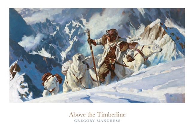
I strive to look for a better angle, a better point of view to express my narrative picture. I can’t stand how often artists choose the same design: one figure, smack in the middle of the painting, at noon. I want to get pulled in to a piece, to learn more or to spur my sense of wonder. That’s what makes the viewer linger and think. Search for the interesting points. There’s always too many, so pick a good interesting one.
Research.
If I’m going to paint metal, then I think about how metal looks. Try to feel it. Then I go get some metal to study, or reference of metal to look at. Or flesh. Or water. Or mountains…
What’s so hard about this? No one wants to get the right reference to help themselves. Probably still suffering from thinking we paint from our heads. We don’t. Research your materials.
Lighting decision.
Right off, I decide what time of day or night the picture lives in. Decide if it’s stage lighting or natural light. Overcast day or sunny? Moonlit night, or man-made night light? This is the very first thing I must do to get ahold of my value structure. I can always change, but I start right here with light.
Value control.
Along with lighting, I think about contrasts. How will my figure contrast against the background, or the sky, or the landscape, or interior? Is it dark and moody, or a bright daylight piece? Decide. Early. Then blend and adjust shadows and lighting so that it works as a whole, using light, silhouette, shape, and mood to control your values. I study great black and white art and photography. I watch noir films. Study comics. I live in a b/w world for a while.
Overlap stuff.
When we create characters we want to know all about them so we tend to draw them completely. The same for the next character, and so on. We keep them all separate, so we can see them. But this makes the most boring design ever. Things don’t look like that in life, so avoid it. Elements overlap, always. Things get hidden.
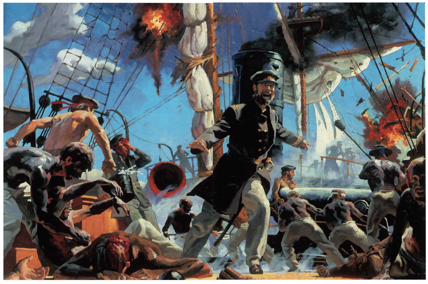
I DESIGN my paintings so that figures overlap. It mimics life and creates tension and depth. Just like we see things.
Clump elements.
Did I mention I overlap figures? Mountains? Trees? Animals? Buildings? Colors? Objects? Yeah, well….when I overlap elements, I design them so that they tell a story in clumps, patterns, groupings. Ya don’t paint every cow leg in a field. Most of them overlap the cow next to them. Same for trees. Same for people. Same for…..
Put them in groups, or clumps, so that it breaks the monotony.
Lead with line.
Don’t go crazy with this. The lines I’m talking about are simple and direct. They lead the eye to the primary viewing spots of a painting, AND THAT’S ALL. They don’t spin the eye, rotate the eye, they don’t mimic repeating shapes, and they never cause the eye to “leave the canvas” or even “reenter the picture.” This is all bunk.
The line I’m talking about is something where a figure or an arm leads your eye to the center of attraction. Other lines help to lead to the same spot. AND THAT’S ALL. (see points on balance above if you have questions about this.)
Foreground, middle ground, background.
That’s what I meant by front to back above. I think of my painting as a stage. Build the stage. Put figures on the stage. Costume the characters. Light the stage. Now pick where the camera (eye) is going to look at that stage.
At this point it has depth. I have to move stage characters around (called blocking) so that I can see them, keep them overlapped, and still tell the story of the picture, which is now a slice of time.
Keep it simple. Am I being obtuse? What’s so hard about this? So many want to reject it. It’s been this way for a couple hundred years. Classic stuff. Gotta learn it before you can modify it.
I know, I know. You can modify things as you learn them, but you’ll always end up returning to these basic principles. Promise.


compile into book: 100 things…about painting like a badass
I've just got myself lost in struggleing with composition. Sometimes it is just come almost without thinking, but now and then I just cant't get it right and lose the point. Like now. All I needed is clarifie basics. This post is pullinng me out the hole! Thanks a lot!
It almost seems like it's a good idea to make a work sheet where you check these things off as you go. Sometimes I will have an image in my head and I'll try to skip one of the early steps and it's true I usually end up paying for it either by the piece not turning out well or it just takes way longer to correct all my mistakes!
100 Things…..hmmm…..nice title!
A checklist of these items makes logical sense, and wouldn't that be great? But like so many things, it's not quite that easy. Most of those points come together at once, so it's difficult to separate them out when planning. But don't stop trying.
I learned the hard way about composition when I was first in the business. Some professional friends looked at one of my pieces and said, “it's very spotty.” I had no idea what he meant, and I was embarrassed that I didn't know. (with my lame art education, it was no wonder I hadn't heard the term.) Of course–nothing touched anything. Not one element overlapped another. Everything was conveniently placed so that it could be 'seen.'
It stung. I'd worked so happily on that piece, and several guys tore it apart in a nanosecond. I'll never forget that feeling. And I've never repeated that mistake ever again.
Look at your work. If things are just right, just so, and have no visual conflict, it's likely it will have no emotional conflict either. Meaning: it's probably boring.
Move stuff around. Design. Plan. Anything to avoid your colleagues spotting your weaknesses, eh?
: )
I find myself having a hard time drawing my box for a thumbnail first. probably because I struggle with getting the shape/scale of the rectangle correctly (i know…how hard is it to draw a rectangle really?!) so I end up drawing something out and then cropping it how i want.
the problem there is that im just drawing with no boundaries and my compositions look bad. buess i need to learn to draw triangles.
drawing figures and scenes like a stage is difficult because, like you said in your post, so many people draw one lone figure on the page. the difficulty lies in the ground they stand on, for me. and showing depth in that plane and placing objects. I guess when it comes right down to it, keeping the correct camera angle or “eye” to keep things cohesive is a big issue for me.
Thanks for the post! It helped me look at where I am at give me some things to work on.
Hey Kyle…..draw that rectangle, baby. Sit down–draw it! You're right, it's not hard at all. Doesn't matter if the first one or few don't work right, do it again until you get the feel for the space. DRAW THAT BOX, dangit.
Yes, you can draw with no borders and then crop it. Takes time to develop that. But honestly? You'll be drawing an imaginary box in your mind's eye to contain the elements you are putting down anyway, so you might as well draw that box! Even a vignette has an imaginary space containing it. It's the balance that matters.
Look, it shouldn't matter to me if you do it or not, right? But I just know….down the road, weeks from now or (heaven forbid) YEARS from now, you'll slap your forehead and realize: a box would help this SO much more!!
So I say—do it now. You'll thank me later. I promise.
great! Thanks for the reply. I'll do it.
also in my post above i didn't mean “triangle”. gosh i don't even know my shapes….
Just thought you were going for the hard stuff….!
Great pointers. Thank you so much for posting this up 🙂 It's the “keeping it simple” that is the hardest for me. It's not that I consciously tried to complicate things. But things seemed to complicate themselves. Heheh. So yeah, I should take my time and design everything as early as possible.
Again, thank you so much for this.
Amen and AMEN! This is great advice that us semi professional/ amateur artists need repeated in our ears. I can usually tell when I'm not following one of these foundational principles. . . because something is really wrong with my picture!
Really solid and helpful advice, thank you! I love these 10 things – posts. They would definitely make a for a great book.
I love sending my students here. It's funny how you can say something in a thousand different ways for years and it's only when Greg Manchess says is does the light come on. Muddy Colors and Manchess make my job a little easier. I may retire early.
Another successful “10 things about” post Gregory! After reading this I rotated my head 90 degrees to analyze the painting I've been working on for the past week.I took a very careful look at it and found I was missing some of the 10 things in the post. Thank to your post I'm going to start reworking the painting to overlap improve the value contrasts. Thanks for the always excellent advice Greg!
LOL! Yer killin' me, Bill!
Happy to help….but your students should know (let 'em read this), they're working with a real master that's right in front of them. As with so many things, sometimes, we just can't see it.
Down the road, it'll be YOUR words that magically come back to them…..not mine.
; )
Thanks, Kiri….I've been thinking of making a small chapbook kind of thing that I could give away as gifts or something….
I've been a little reluctant to post some of my thinking about painting, never wanting to sound preachy. That's why I write it from my pov, and not as a global message.
If you have ideas of other things you'd like me to address, just let me know! : )
Thought I should mention this, as I think it will help you:
Not that many years ago I realized that I've actually followed the same well traveled ground that so many painters have. At that point, I could see that there were principles sitting in front of me that I'd ignored.
I can admit here that when I started out, mostly like all of you, I rejected more than I absorbed. I didn't think any of that technical planning stuff was for me, and felt no real need to learn it. I wanted to invent my own wheel.
Then, when I developed the desire to depict scenes, narrative work, multiple figures, I finally understood what needed to be learned. I wasn't about to reinvent the same wheel of education….what would be the point? As soon as I started to absorb what great painters have known for hundreds of years, I embraced nearly all of it.
And it kicked my work into high gear. I saw the results, and was so much happier. So much more in control of the craft that I could dream up whatever image I wanted.
It was thrilling…..and I want to see you all get that same thrill, have those same realizations….and if you follow, I can short-cut some of your grief and guarantee you'll do so very much better. You'll make some wonderfully fabulous images.
No question.
Great advice! I have been reading this “10 things…” posts you have made.Wonderful points.Thanks for the honest words.Much appreciated.
heh i was waiting for you to say just what you said. I would have been disappointed if you hadn't, Bill. lol I totally egged you on.
Greg, Bill is stealing all of your ideas and trying to manipulate our tender minds. He is doing a good job too, even tho some of us still do bad thumbnails. notice i didn't say that I DON'T do thumbnails, Bill. I just said im terrible at them.
you guys are great.
I suddenly pictured the Triple Rock scene from “The Blues Brothers”, with you in the James Brown/Reverend Cleophus role, pointing your be-ringed finger straight at me: “Do you SEE the LIGHT??”
Preach it, brother!
Oh Greg, how I love what you have to say about lines.
For so many years I have been reading bullcrap stuff about leading the eyes and thinking that I certainly don't look at images that way. Someone would analyse an image and say that X would lead the eye this way, and Y would lead the eye that way and that people look at an image in this order or that, and I would think:”Why don't *I* look at it that way at all? Am I anormal?”
Then I got to thinking that the emperor had no clothes. And then James Gurney posted studies about how people actually do look at art and I found out I was normal (in that respect, at least.) And then you went and made it a “Rule” I'm so happy. I look forward to less pompous complicated eye-leading theories that just don't work.
Thanks, Greg.
It`s really so easy to look at all these advice and nod and say YES I`LL DO IT, but… when it`s actually down to you, your work and the brief, there`s always this pre-conceived image of how the scene should be illustrated in your mind.
It`s so hard to just think of another P.O.V. to tell the story from. No matter what you think of or put down on paper, the mind just keeps defaulting back to it.
How do you always refresh your mind`s eye when you do your thumbnails and seek out new POVs?
Max
Thanks again for your wonderful insight. It really helps me! And I love that you still have so much enthusiasm for beauty in painting! Melody
Generating fresh pov's can be tough, Max, but there's so many good angles to approach something.
I think we get a little staid with our compositions at times, so what works for me is to set my stage with figures….actually put them in a film in my head, and then fly around the scene as if I'm a bird, looking for a place to alight. (deck of a ship, mountain pass, great hall of a castle…)
Flying overhead, between legs, behind figures, in front of figures…..light the scene in your head as well, and as you fly, watch how the light perspective changes…..this can give you clues to unique lighting ideas.
You mind WILL try to default to that original idea, so get that thumb down first, good or bad, and get it out of you. Then as you put down more thumbnails, one after the other: fly, draw, fly, draw, etc…. You'll find that after a while, you'll be drawing angle after angle.
Then the problem will be: which one!
Oh man, thumbnails are golden! Back in the day, I used to struggle constantly with composition, it all seemed hopelessly hit-or-miss. And then I discovered thumbnails, and I haven't looked back since.
And I'm increasingly appreciating the advantages of thumbnailing everything in alternate points of view. It's a great way to stumble on fresh compositions I would never have thought of otherwise. (Thumbnails + constant experimentation with POV is especially relevant to any kind of comic or sequential work, for sure.)
Really Informative, thank you!
I agree with Greg. Draw the box.
Don't forget that you are working small. The benefit is that you can knock out several thumbnails, and try all of the variations you can think of, in a small amount of time. Then you can look at them side by side, and the differences will be immediately apparent.
I set up two different 'grids' on a standard Letter size sheet. I slide them under my sketch paper, which is usually just cheap copy paper, which means I have no fear of getting it wrong or wasting precious art materials. I try to fill the entire page with sketches, which makes me push beyond my first few ideas (which can be pretty corny and boring.)
I posted my process on my blog, along with .pdf files of the grids for you to download:
http://mikeyzart.blogspot.com/2014/05/the-grids-for-my-fellow-artists.html
Perhaps this will help.
I like you check list idea Jeff… why not create a little structure to the process? Your idea has helps; thanks! Angie
Hi Gregory,
Are there any books you would recommend that might help expand upon dynamic compositions? I'm trying to break out of my 2 dimensional thought process, but am having difficulty making my compositions have depth and dimensionality. Thank you!
Great!! Thanks for Sharing with us..