When constructing my compositions, I tend to think in triatic arrangements of Foreground, Middleground, and Background. In order to heighten the relationship between each of these various depths, I try to restrict each area to a general range of value; favoring either black, white, or grey.
For instance, you can let the background be predominately white tones, the middleground predominantly greys, and the foreground predominantly black tones. Or, you could reverse it.
Of course, any arrangement of these three values will work, and there are a lot of combinations.
By restricting your values in each of these areas you visually reinforce your image’s sense of depth, thereby making the silhouettes very easy to read… and that’s important! Legibility is essential to a good picture. Muddy value structures hurt the viewer’s ability to discern shapes, especially at a small scale. This is why you will see technique employed so often in trading card art. When your piece of art is going to be reproduced at just a few inches tall, high contrast compositions work especially well.
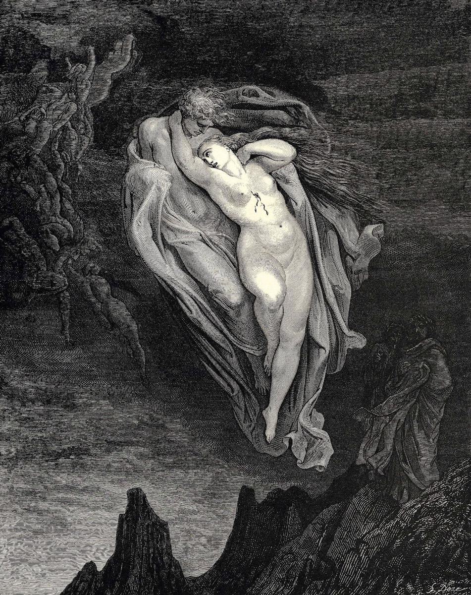
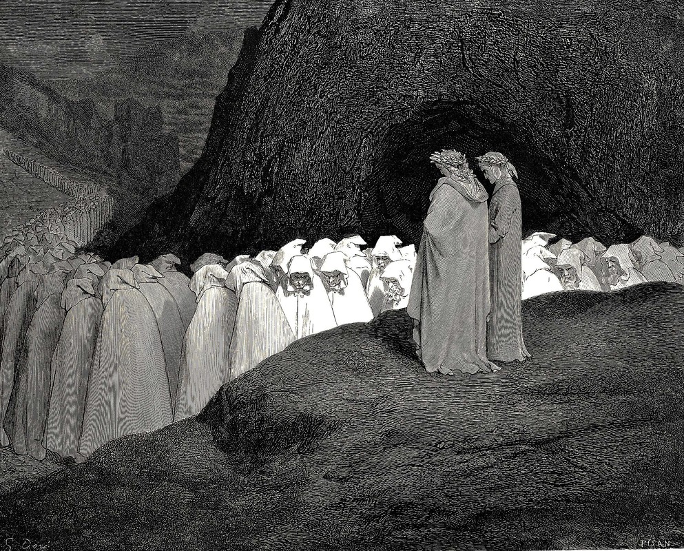
Tryptic value schemes like this are readily apparent in Old Masters works, particularly in the engravings of Gustave Dore. Here are three examples of Dore, each one showcasing a different arrangement of black, white and grey in order to emphasize the difference between foreground, middleground and background.
 |
| BACKGROUND: WHITE MIDDLEGROUND: GREY FOREGROUND: WHITE |
 |
| BACKGROUND: GREY MIDDLEGROUND: BLACK FOREGROUND: WHITE |
 |
| BACKGROUND: BLACK MIDDLEGROUND: WHITE FOREGROUND: GREY |
Howard Pyle, Andrew Loomis, and many other illustrators have implemented a similar method, but instead utilized 4 values: White, Near White, Black and Near Black. In doing so, they eliminated the midtones, which are arguably the weakest values in a composition since they describe neither light or shadow. Either way, their intent is the same… to better separate, or unite, areas of a composition through restricted values.
It really doesn’t matter which method you use. Whether you started with 2, 3, 4, or even 5 basic values really becomes moot once the subtleties are added. What does matter is finding a method that makes sense to you.


Great article! definitely cleared some of my doubts, now that i think about it (correct me if im wrong) i also could notice this method on Bierstadts work.
Thanks so much for this helpful guide! And for all the artist examples!!
Thanks for a great article. Instructive and inspiring.
Something I've tried to parse out of this that I've had trouble with, and I hope someone can clarify for me: With setting up these values, do you then draw out value shifts within each group?
The way I've interpreted this is to figure out the 3 or 4 major tonal shifts, then have value structure within those. So, for instance, the white value would encompass white through 30% grey, mid grey would be 40%-70%, and black would be 80%-black (those value divisions are arbitrary, of course.)
So in the end the 3 or 4 basic value structure keeps the organization clear, but you're free to have variations within those (Like, I wouldn't find myself using black in large amounts in my white value.)
Is this the right way to interpret this? I hope I described it well enough.
Yup. You've got it. You just restrict each area to a few values. You don't have to be super mathematical about it though. It's obviously OK to use a little black in the white areas, or vice versa. You just need to be sure that when you blur your eyes, as a whole, it falls into the proper range.
Awesome! I'm glad I got the right of it. After Gurney mentioned this waaaay back I've tried to mull it over in my mind exactly how to translate that over to a finish piece, and I just rolled with the conclusion I came up with above. Good to know I'm on track with it.
Thank you, this is awesome!
Great post, Dan! I remember coming across this concept with Loomis first, but always found 3 tones, rather than 4, to give something that's just that bit punchier from the off.
Very helpful post, thank you!
Fantastic post, thank you so mcuh! This is very very helpful.
This subject seems to muddy the waters in peoples mind more often than not…and I was one of them. This post ties in well with what James Gurney mentioned in his blog post in the past. Thanks Dan, for your input on the subject.
Thanks for this Dan. It was amazingly helpful.
Should one group of values never touch the next one? I always find it hard to do that, especially when working with skin tones which can be very light.
I read in James Gurney's blog some notes that Pyle had on tones, and this one caught my eye for the same reason:
“If a face against the light seems dark, it sometimes can be lightened by darkening the hair or hat.”
In that case, should the lighter tones in the darkest values be always darker still than the darks in the mid values?
Awesome article, thank you.
Awesome Article Thankyou