By Justin Gerard
Color Comp
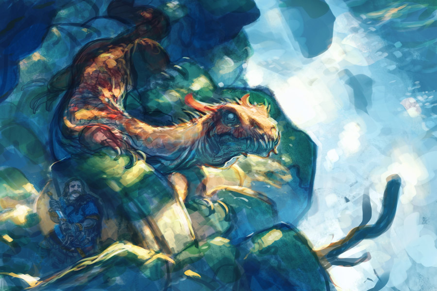
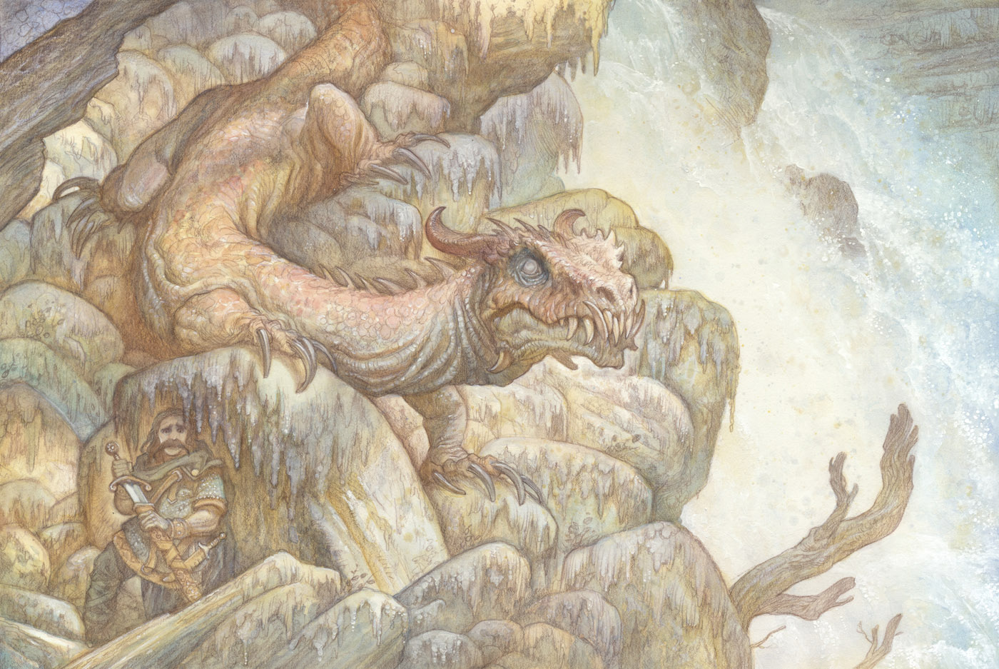
Last time I posted a color comp and a few studies for a recent personal piece. This is how the watercolor turned out:
12″ x 18″ Watercolor on Bristol
As you can see, the watercolor is not nearly as intense as the color comp. This is something I run into a lot when I do really saturated color comps. I would like to say that it is a “feature” of my work, rather than a deficiency in my own ability, but I never plan for it. Somewhere along the way I get taken in by the subtleties and then can’t quite bring myself to take it further traditionally.
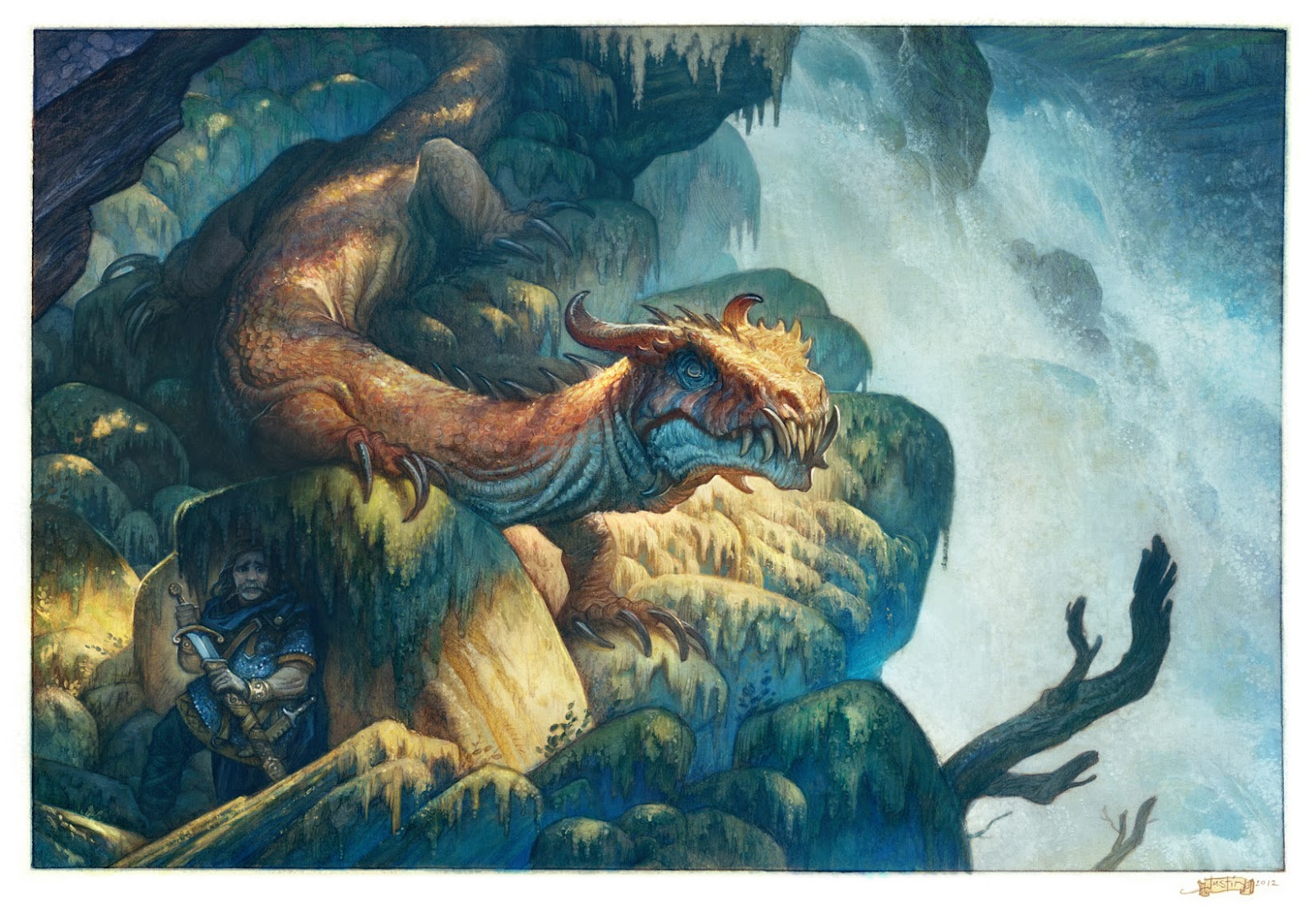
Which is where the digital comes in:
Digital work over Watercolor
The digital allows me to get a lot closer to that initial comp, while at the same time leaving the watercolor alone. But this, like invading Russia before a winter, leads to its own set of problems. For one, things become more tedious. In the initial color comp, you are pulled along by the joy of exploration. There are still mysteries and borders never crossed in the world. But with our comp, we have already been there. Now we are going back with magnifying lenses and little shovels and rock sampling kits. It takes a different mindset for exploration. And while I usually love it, it’s generally not as exciting as the initial comp for me.
I find that often the only time I ever get excited about a piece again, is after it is printed. Only then can I really judge wether a digitally modified piece has been a success or not. The digital format can tell awful lies. Sometimes you need to get a piece into the light of physical reality before you can really know.
Until then, like others whose armies got bogged down in Russia in the dead of winter, I am usually left second-guessing myself and wishing the final was a little closer to the original comp.
—
In other news: I have been working on Sketchbook 2012. Preview next week!



I think you did a great job with the water. Funny thing, when you originally posted the first comp, i thought the warrior was a reflection on some giant helmet!
No matter what happens on this day in the life of the Dragon… the man with the sword is going to have to change his shorts… I know I would.
The illustration succeeds very well in that I am not thinking of the painting, I am thinking of the story it tells of a situation I hope I never find myself in… and whether or not I could jump into that wonderfully turbulant water fall before I get CHOMPED in two…
Thanks Justin.
Mike
Justin, Beautiful work! not being critical by any means, I'm just curious that if the comp is what you are after, what is the reason that keeps you from getting the values in your watercolor closer to the ones in the comp? Is it the nature of watercolor; not wanting it to get too muddy? Clearly you have the chops, so it mus be a choice of some sort. Thank you for you time and unending stream of inspiration.
Justin,
This is looks great. I just wanted to say that I like the details that you think about and put into your work. Like the right amount of foreshortening on the warriors sword. Many times swords aren't angled at all and it looks a little funny. It's the little details like that, they make me always come back for more of your work. And thanks for the in depth explanations of your thoughts and experiments.
The muddiness is indeed the main thing. A good example of what it looks like when I take it to full saturation is the post on the Billy Bones Character Design a few articles back. I just never really like the way it turns out. Digital has perhaps led to some false expectations for me.
But the lesser issue is that I just end up really liking the combination of traditional and digital more than going completely one or the other. (For my own personal work anyway.)
Justin,
I really love the watercolor one. Could you talk about how you add opaques to it? I've been messing with adding opaque acrylic over watercolor and it works'ish… What are you doing?
Sorry man, I really respect your talents, but I think you're terrified to actually delve into a physical painting. Drop the digital and keep working into your watercolor to get the depth in the color. Push the darks. I've seen incredible drawings and paintings out of you, but instead of pushing forward in paint you quit halfway and go digital. Great, but I challenge you to complete an oil painting entirely in oil.
the darker watercolors usually require thicker medium to be laid down, which obscures the linework, which is part of the charm of the technique. i think the digital post work is wonderful, and allows for the retention of the character that makes this work attractive.
using multimedia is not quitting half way because one is scared.
I have attempted some multimedia myself (pastel and digital) and I love it – I agree it has a place in its own right. The big question for me is how do you transfer the work from the board to the digital realm? I have tried them all and all fall short of ideal, but maybe my equipment is not adequate. I would love to know which method you use.
I love the piece BTW, both the restrained watercolor and the digital version. I found the color comp a bit confusing, the two finals hold together much better.
I think you should stop dissecting your process, it is what it is. This method just happens to be one of the thousands of ways you could work and you should accept it for what it achieves and leave it alone for what it never claims to be. The fact that you like to retain your very detailed pencils makes this process rather ideal so stick to this method when you want to keep the drawing. When you want to get a more saturated traditional piece without going digital why not try a mix or acrylics and colored pencils? You can still build up layers but you can also lay down opaque layers and keep up the details with the colored pencils. Or just lay the drawing down on some wood and just start slapping some oils around if you enjoy the exploration. I cant draw with ink and markers and wonder why my piece doesn't look like oils. Our tools can be manipulated to a certain extent but sometimes we have to step back an allow them to be who they are, and watercolors usually don't get as vibrant as your color comp especially if your keeping the line work. peace.
It is a combination of gouache and acrylic. Anything that looks like it is opaque or dimensional on there is white (titanium) heavy body acrylic. Anything that seems thinner or transparent is likely gouache.
I like the gouache for its amazing workability and control. However, I find that it is a little temperamental and dries an ever so slightly different value than what it is applied at. So for some areas I turn to acrylic when it really needs to hit white.
Of course, the better solution in watercolor is use the paper itself for white… But sometimes I can't see where I highlight would need to be until all the paint is there on the paper.
Some people photograph their work, which I think works well if the surface is patchy or too shiny. Since most of my work has a purely matte surface to it, scanning yields the best results. I am currently using an ancient Epson GT 15000. I need to upgrade very soon though. The color sensor in it is starting to go. When I do get a new one, it will again a flatbed that can take at least 12″ x 18″ and capable of 1200+dpi scans.
Also, Photoshop's new tools for stitching together an image from multiple scans are quite powerful, so I wouldn't worry if your image is larger.
Hey guys,
Thanks so much for the feedback on this. It is really encouraging to hear. I do occasionally end up chasing my own tail over trying to find a silver bullet process.
(To Elliot) I love oils, and do actually work with them from time to time. However, in spite of my sincerest efforts, nothing I ever finish is ever at the same level of quality as these watercolor and digital pieces. And I just never enjoy them as much.
However, I plan to keep dabbling in oils. I still think that nothing quite compares to a finished oil for wall display.
But as Anonymous and H4lfm4d say, there is something there in the linework that I lose when I transition into working with more opaque mediums. And in the end, I really love the lines and how the final product turns out when I work this way. I will probably always be doing experiments to try and push it further, but you are probably right that I should stop dissecting it so much (and just get down to working.)
Thank you everyone for all the feedback!
I think you have little to worry about in regards to how successful it is if, like myself, the viewer gets the undeniable urge to draw and paint (if possible to something close to your stuff :D). That may very well not be the stick you are using to measure each piece's success but i thought you might like to know your art constantly gets my butt on the chair and my arm scrawling, the whole being full of inspiration. I can only hope you keep doing what you do! 😀 Cheers.