This past week found me on vacation with the family (thus excuse the brevity of this post), but before that happened, I had four uninterrupted days in the studio. Time which allowed me to put finishing touches on a major commission and luckily find rare hours with which I could revisit a handful of paintings which had been lying around the studio begging for a little love and care. Why are there unfinished works around the studio? (a laughable question I know!) Let me make excuses…
As you can imagine, the constraints of commercial assignments place deliver dates above any other factor in the work. The old adage of an illustrator is that there are three issues at stake in commercial work: quality, price and deadline. The client gets to pick two of those, the artist the third. Thus with many commercial assignments, date and price are the main constraining factors, with the artist left to decide on the quality they wish to deliver.
While I always strive to give my clients the best my skills can offer, sometimes a bit more time is needed on a work of art, time my commercial clients tend not to have. Therefore, I polish the work so that it is fine for publication, with the intent that I will revisit and put that last 5% back into it to at a near but later date. Many times those near dates stretch into months and then into years! As a traditional artist, once a painting leaves the studio you will never get to work on it again, and it is for this reason I will only exhibit and offer for sale original works which are 100% completed.
While I have dozens of works in this purgatory stage, some good news this past week is that I was able to finish eight oils, and they are now ready to photograph and share online and at conventions. Dan Dos Santos recently posted on how he touched up work for DragonCon, likely with similar reasoning behind the presenting of his works. Luckily I am not alone in my procrastinations!
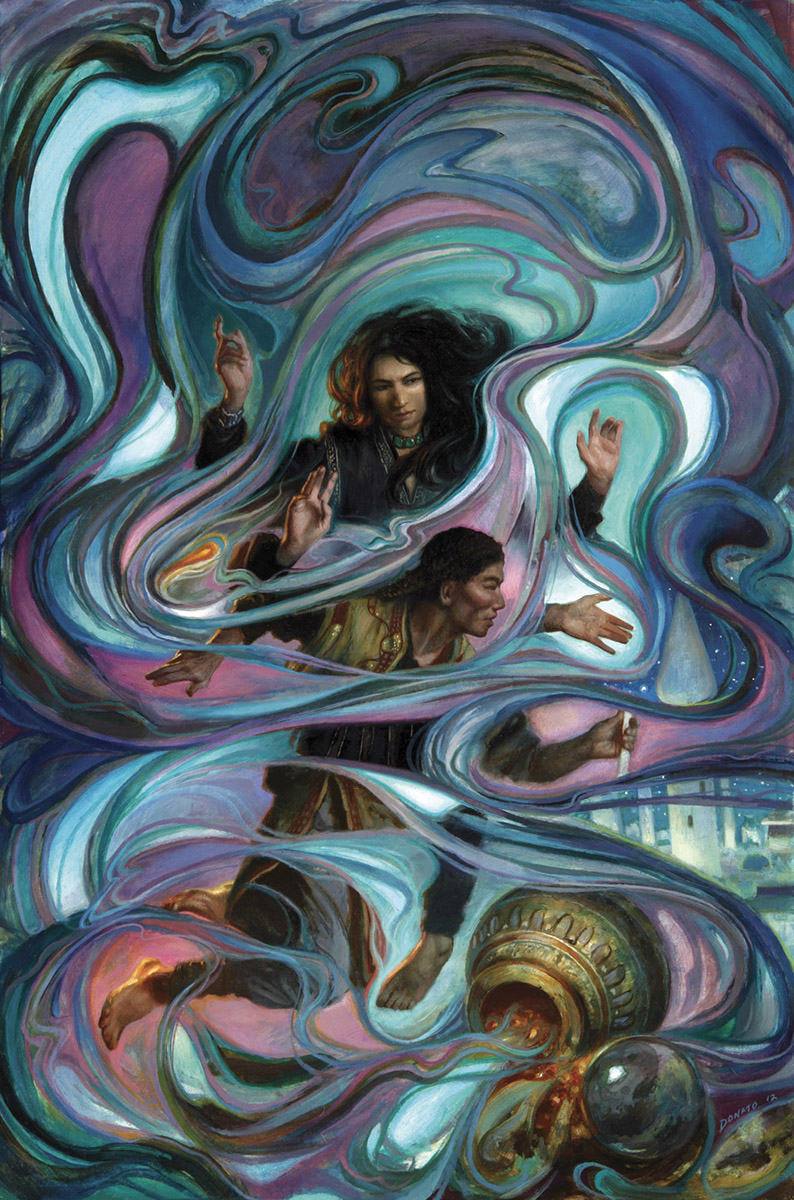
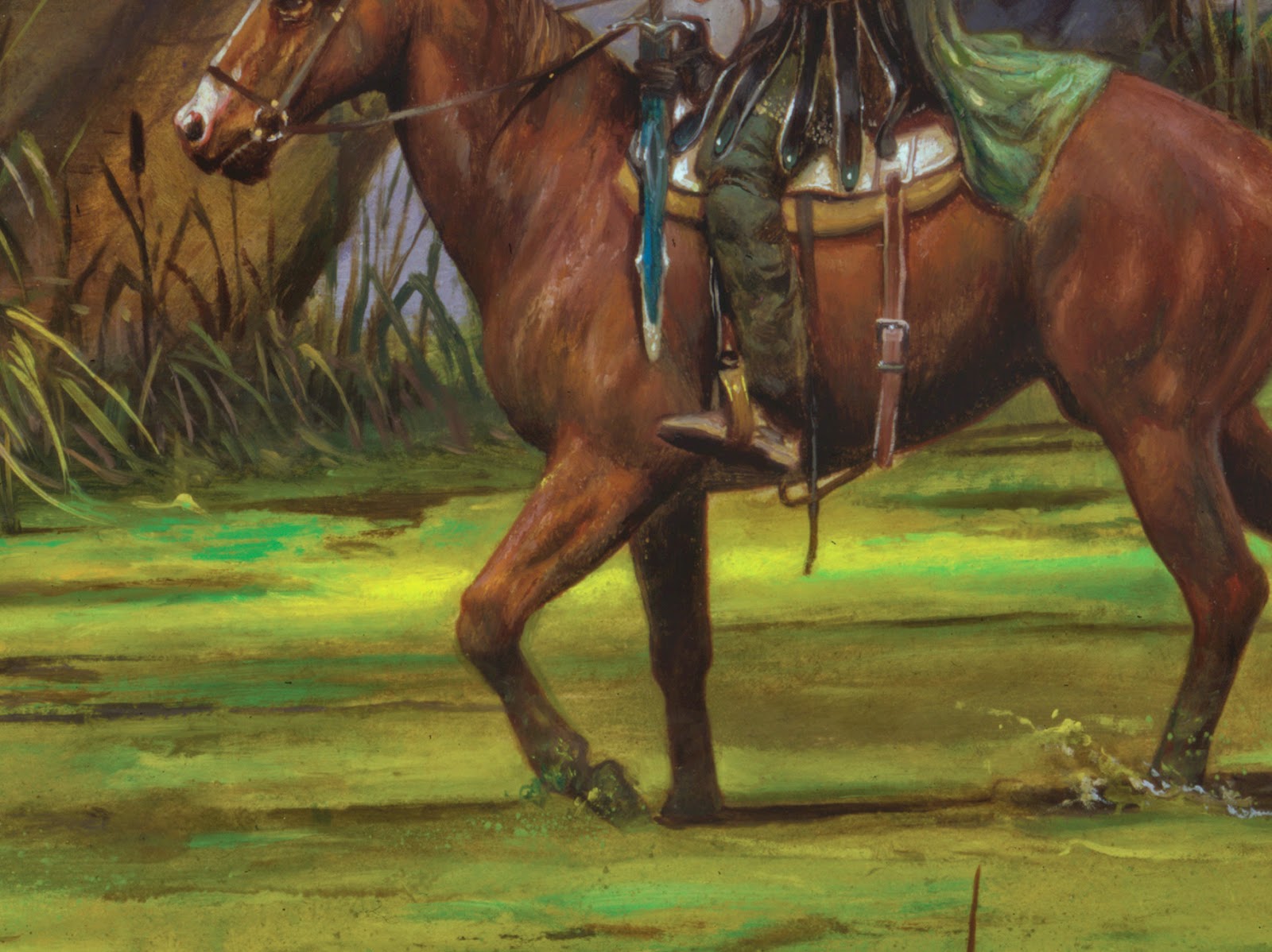
Below are two of the oil paintings. I will post the others when scans are finally ready. To some of you who have seen these works in other venues, the changes may be imperceptible, but there certainly are surface modifications and detailing which makes all the difference to me…
Enjoy!
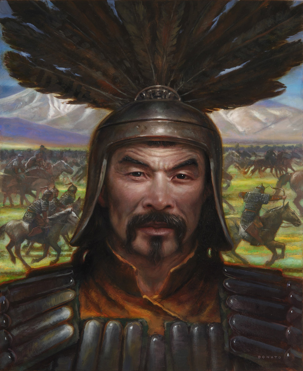 |
| Genghis Khan 18″ x 24″ Oil on Panel commissioned by Der Spiegel |
 |
|
| Shattered Pillars 16″ x 30″ Oil on Panel cover commission for novel by Elizabeth Bear |
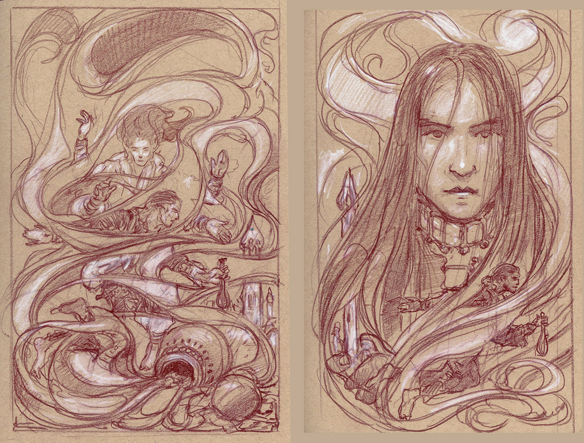 |
| Shattered Pillars rough drawings |




Thanks for sharing! I really love the “Shattered Pillars” one… all those organic, colorful, and magical waves and lines around the solid figures is beautiful.
Amazing as always. You have such abstract compositions sometimes, as Shattered Pillars demonstrates. Could you, if you have time, do a post on how you come up with this kind of layout? What motivated such a deviation from a more “traditional” composition? Where there any outside influences in it? I can see from the sketches it was a theme in the initial design, was it your idea or the editors?