Neil Young, for Rolling Stone Magazine, issue 1169, November 8, 2012
I’ve painted long enough to know that much of this list has become second nature. Neuroscientists call it ‘automaticity.’ Similar to driving, one practices the technical skills so that later our brain focuses on what’s important: getting somewhere safely.
My favorite medium is oil paint, but these will enhance most painting styles.
Value range.
I start with darks first, to get the deep shadows laid in. Obvious places: nostrils, eyelids and eyebrows, mouth line. Next, I’ll put in broader, but slightly lighter shadow shapes like under the nose, under the eye sockets, under the bottom lip, chin, deep cheek bones, hair. I place the boldest shapes to establish deeper values, then work my way up through the darker values of color to the lighter values placed on top.
Avoid highlights.
Until the last bits of painting, I avoid the highlights as long as I can. Two reasons. One, I need to work my way up, so putting them in too soon will defeat that effort. Two, I leave something fun for the last. I delay gratification as long as I can. The best part of painting in oils occurs within the last few layers and strokes.
Vary forms.
Hair is a bold shape, not individual hairs. I study folds and constantly vary them. Repeating the same folds will kill a painting as dead as an assassin’s shot through a pillow. I don’t think about the object I’m painting. I separate myself from the subject and only paint the form. I won’t ‘follow’ the form either. I cut my strokes across the surface of the forms. This adds dimension and lets objects feel sculptured.
New painters: Avoid primary colors.
Ultramarine Blue. It’s deadly. It’ll make mud faster than 35 school kids running for the bus. And no, Cadmium Yellow Light is not a miracle color. Get over it. Using it straight from the tube does not show how brilliant one is at mixing paint. Same is true for Ultramarine. New painters seem to think they are phenomenal because they used Ultramarine Blue straight from the dang tube. They step back and declare, ‘look at me, The Genius. I have explained the essence of pure painting by opening a paint tube and using yellow next to blue. Admire me.’
Using primary colors as a statement of painting brilliance screams ‘AMATEUR.’
Amount of pigment.
I trained to know just how much pigment is on the end of my brush. No matter how large or small, my awareness of the amount is paramount to good layers, good coverage, good overall effect in any painting.
I studied calligraphy. It taught me how to make letterforms with a brush or pen. Knowing the amount of ink held on an instrument for calligraphy is critical to achieve a skilled work.
Brush angle.
Calligraphy also taught me how to angle a pen or brush. Making letterforms is a key factor in learning to paint. I know many great painters who also started by copying letter shapes, making signs, copying comics (bang! zoom! pow!). They learned to handle the brush and at what angle AT ALL TIMES.
The angle of the brush helps lay down the right amount of pigment, at the right angle, in the right direction, with the right pressure to achieve a free and confident stroke.
Brush size.
I start with the largest brush for as long as I can and work my way down to the smaller brushes. Many times, as I near the end of a painting, or even slightly before, I switch back and forth. It’s a good, general idea to keep things from getting too focused too early.
Stroke speed.
Painting fast and loose comes the same way as anything else: with time. I painted very slowly in the beginning, placing my strokes deliberately, to look as if they were painted fast. Once down, it’s usually hard to tell the speed the stroke was laid. Over the years, I built up speed through confidence. It’s just plain ol’ experience. And LOADS of training.
Patient strokes.
I don’t judge my strokes too quickly. I lay it down, and press on. I come back to that area after a bit to judge whether it was the correct feeling, size, color, etc. I don’t lay one down, hate it, and take it off. Or worse, try to keep changing it.
At this point in my career, I lay strokes down that don’t make sense, but I let them sit. I find that they are just fine once I come back to judge them in context, against other strokes that are adding to the whole piece. Judging too early destroys spontaneity.
Scale.
I decide how I want the paint to feel once a piece is finished. I scale the brush size to fit the scale of the painting. If it’s a small painting in a magazine, I have to decide how clearly the strokes will be seen and what feeling they project to a reader.
If it’s a large painting and I want it to feel loose, I have to decide on the size that feels best. Paint it too large with small brushes, and when it comes down in reproduction, it can look too detailed. Too small with large brushes, and the piece can look too loose, too unfocused.
New painters can make the mistake of painting too small with too large of a brush and vice versa.


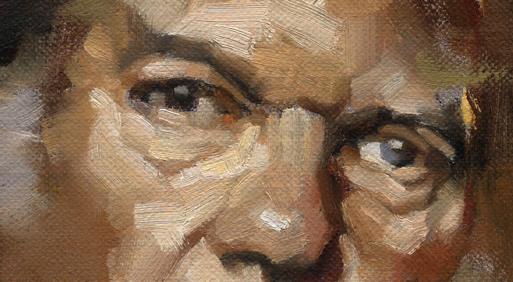
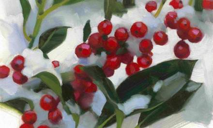
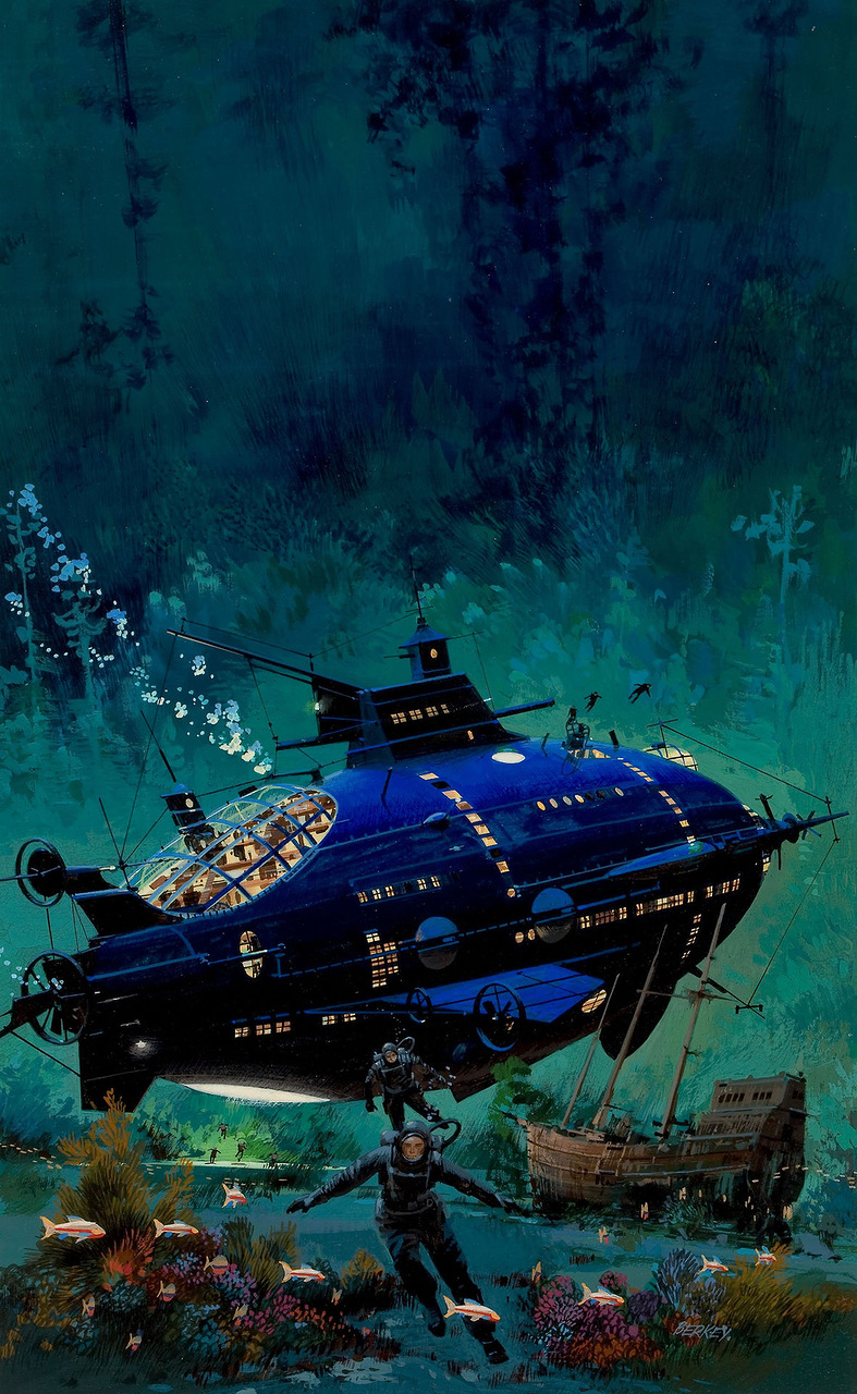
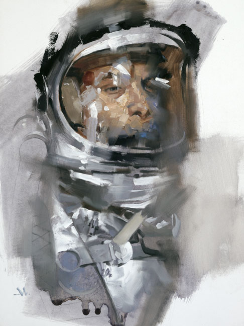


“I painted very slowly in the beginning, placing my strokes deliberately, to look as if they were painted fast.”
Good stuff!
Phil
Great post! I have been a signpainter for the past 30 years and though the computer often takes the brush out of my hand these days the brush dexterity you talk about learnedfrom letterforms has without a doubt greatly helped my oil painting. Thank you for these lists…they really hit the spot!
Greg, what's the actual issue with Ultramarine Blue? Do you mean that it's not good to use it unmixed, that it mixes too muddy, or that it's just not good to use it at all? I've actually been using it a lot recently, mixed with Venetian Red and some Burnt Sienna. If it's problematic, what blue would you recommend over Ultramarine? (and why?). I'm just curious, as I didn't know there was any kind of stigma attached to it…
Thanks for the post – always lots to think about in a “10 Things..”.
ps – I'm definitely still an amateur, but I do not have a tube of Cadmium Yellow Light, if that counts in my favour. 😀
Yes, please more info on why Ultramarine Blue and Cadmium Yellow Light cause problems.
Thank you.
Wow, that is just a downright beautiful Neil Young portrait Greg!
The “patient strokes” part hit me right in the heart. It's something I have been struggling with since the beginning. I always feel the stroke I place isn't right and I end up going over it a thousand times. I know I shouldn't do that, but getting this advice from a master really solidifies this idea in my head.
Straight. To the point and worth remembering… just like your subject.
I don't think Greg's problem is Ultramarine Blue exactly, so much as it's the way people use it. New artists tend to think of it as a definitive blue, rather than an ingredient for making other, more beautiful colors. I know I'm guilty of making no shortage of bright blue and yellow paintings as a Freshman,
Very helpful post. Thanks for taking the time 😀
Fantastic post Greg . When the screen loaded I thought :” since when did Saul Tepper do a Neal Young portrait?!”
my favorite quote here “At this point in my career, I lay strokes down that don’t make sense, but I let them sit. I find that they are just fine once I come back to judge them in context, against other strokes that are adding to the whole piece.”
Took me a few years out of school to get to that point to make marks and just let them be even unfinished. I feel once you get to that point of confidence they you are really starting to fall into your own. As always great words of wisdom Greg. Looking forward to more.
personally i thought the hair had a nice Bob Peak flair going on.
And as always, you guys are the best! And you usually take the best from the 10 Things list. I'm happy for you and happy to share. Wish to hell I'd have had someone pointing to things that we all encounter back when I started out. (I suppose there were people saying it, but I needed to have it spelled out for me! Tattooed to my forehead!)
Ray–LOL! Thanks for THAT compliment!
About Ultramarine Blue—what Dan said. Nothing against that color at all. I use it all the time. But that and Cad Yellow need training time to use it. Experience. They're certainly beautiful colors, no doubt. Yet they're dangerous to mix because they can change a clean color to mud very quickly.
I was also jabbing at those that think that if they use it straight out of the tube they'll avoid running into problems with it. Not the case. It's a fine color when mixed judiciously and with sensitive skill. Learning to use it well will add beauty to any painting. It's just that most students have no experience using it subtly, and it turns things to mud immediately because it's such an intense tinting color.
I also don't see a lot of schools talking about how to use colors on an individual basis. There's a lot of talk about 'keeping colors clean' but not exactly how to attain that. One way is to avoid using Ult Blue so aggressively.
Nearly every color looks better when mixed well with others. Perhaps a 10 Things post on mixing or just on color might be fun…
Yeah, Matt! Why weren't we taught to 'think slow??'
Aww…..don't get me started….
Thanks for clarifying that, Greg. You have my vote for a “10 Things…” (or 20!) on colour and colour mixing. I know I've mentioned this before in several places, but when I sat back down in front of a canvas after decades of digital art, I realised with a shock that I didn't actually know how to mix colours – my impulse was to just look for the eyedropper tool (not to mention that ghostly Undo button at the bottom of the canvas). Since then I've been working on this steadily, using limited palettes and trying to get a feeling for how they blend, and how to handle value and temperature at the same time.
I'm quite curious now about how certain paint colours work together, and understanding which hues will become rich or dull as a result. I had some good talks on this with Jesper at the last workshop, and I'd be very interested to hear any wisdom and insights you and other Muddies have on the subject.
And you have my axe… for the 10 things on colour!
Yes a 10 things post on color would be fantastic. looking forward to the next installment.
I laughed at AMATEUR. That is truly great. Your posts are so helpful, and I love looking at thick juicy paintings!
Thank you for your reply on color. Yes more insight in how to use colors would be a great help to those of us just starting out.
every time I go to pain in oils, I want to cry like a child. so frustrating.
Great post, Greg!
Always grateful for insights!
a great post – amount of pigment, angle and speed are where I find myself lacking right now, coming back into painting after so many years. I think I'm still very intimidated by the medium and so I'm very cautious in my application. Was also pretty funny that after reading this, in painting class we did one of those “color wheel” exercises of working in pure pigments for two minutes each around the wheel. When I got to ultramarine blue, my brain started yelling “nooooooooo!!!”
Im Printing this and gonna print it on my wall… cause thats allot of text to get tattooed on my forehead :P. Been painting digitally for 2 years, and have done a small handful of oil paintings that have felt progressively better, but I still get stuck in how to continue though certain stages.
Love you guys for the knowledge you openly hand out. Makes me wish I didn't have to sleep, I got painting to do.
nice words, but I see you only painting from ref all the time…
Great website that has loads of colorMixing info. http://www.handprint.com/HP/WCL/mixtable.html (mixing grays)