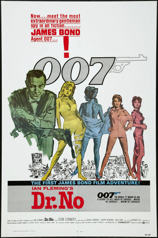
Last Friday was Global James Bond Day, marking the “official” 50th anniversary of the film franchise that began with the premiere of Dr. No on October 5, 1962. So…how about a look back (and forward, since a new movie opens in November) via the posters, including some dandy ones by one-time studio mates Frank McCarthy, Robert McGinnis, and Bob Peak.
Bond. James Bond.
Monday, October 8th, 2012
by Arnie Fenner
And, just for fun, Robert McGinnis’ poster for the James Bond 1967 spoof…


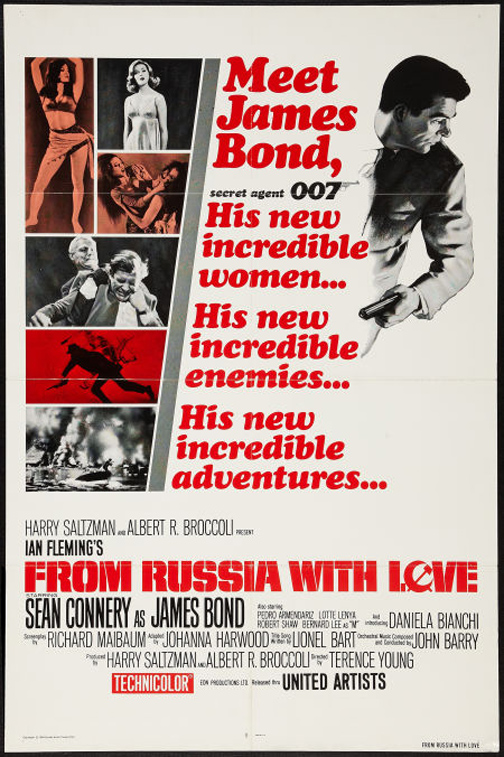
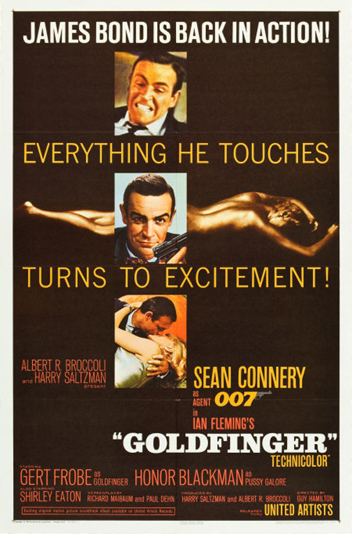
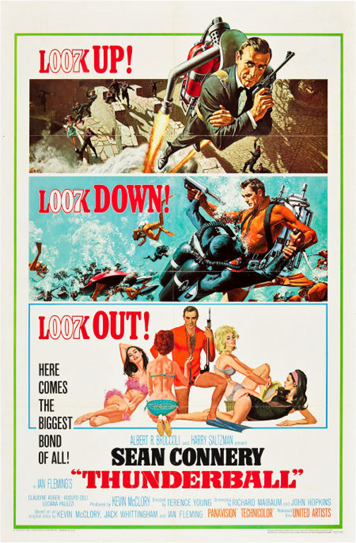
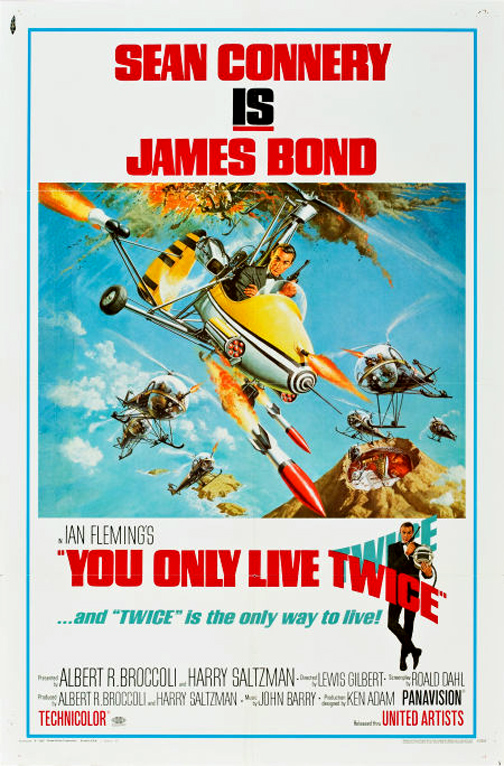
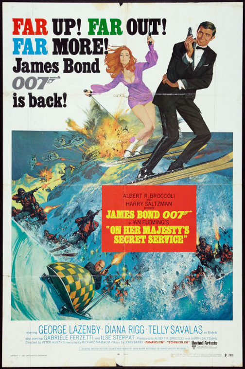
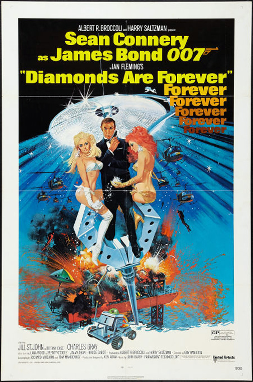
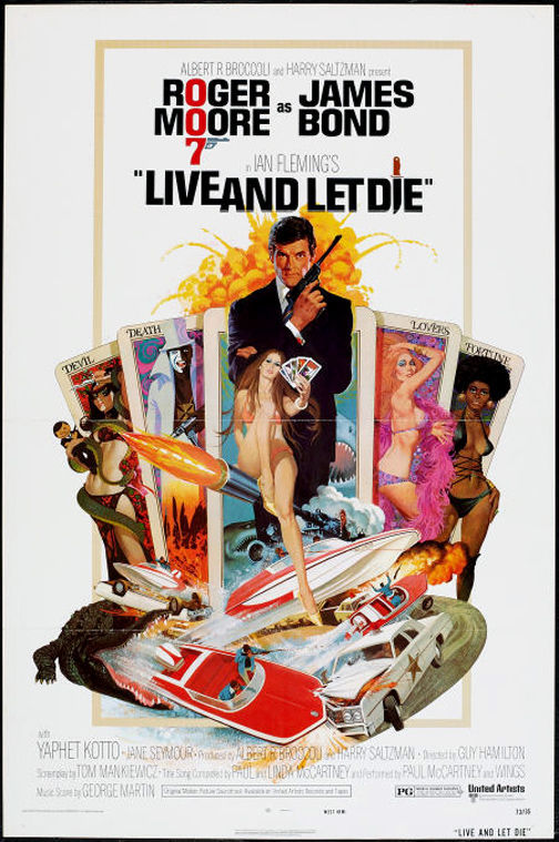
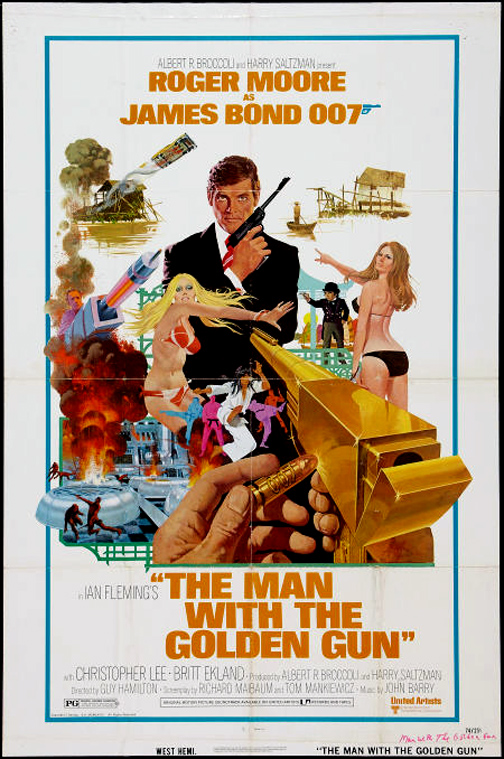
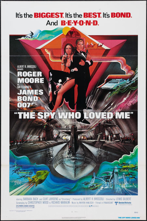
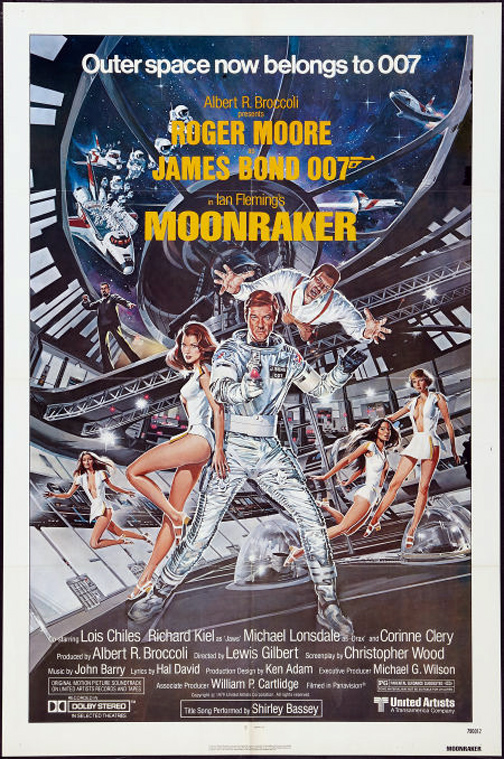
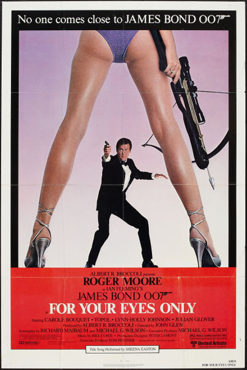
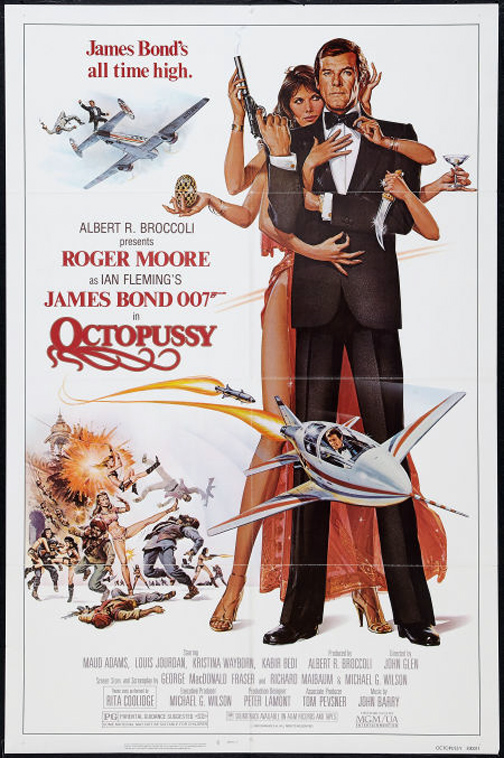
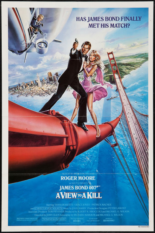
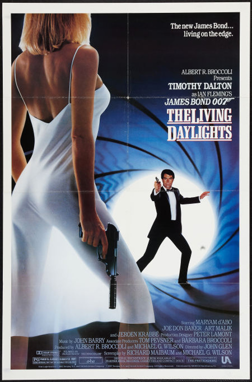
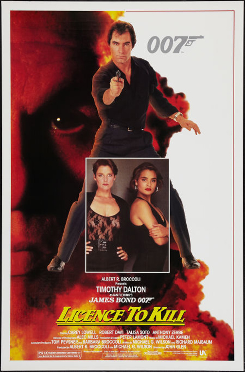
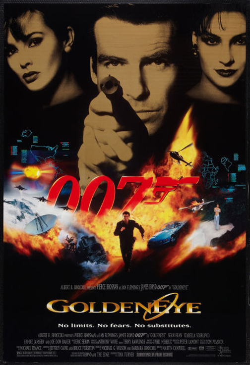
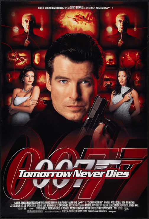

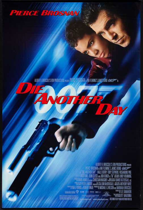
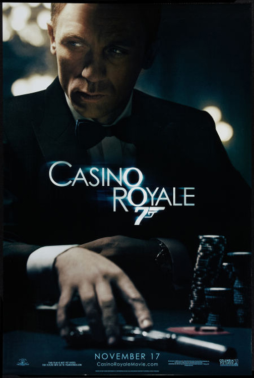
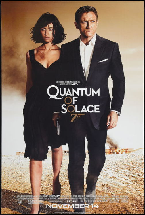
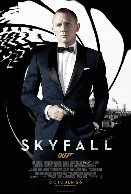
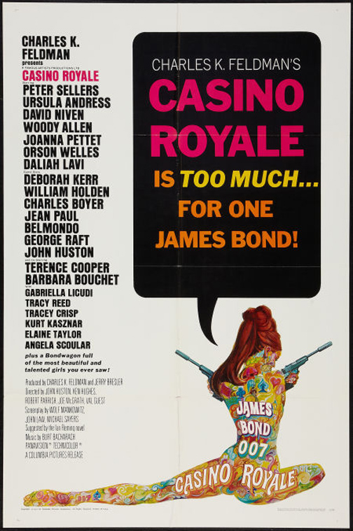




It's interesting to see the evolution from “WORDS EVERYWHERE” and “cram every scene from the movie into one image” to trying to capture one key image with very few words. That being said, the most successful poster to me is “Casino Royale” even though it doesn't even have any art in it. Does this make me a bad person?
yeah i have to admit it too the casino royale is a sweet poster.but i also like the Dr. No poster a lot too. isn't that Mitchell Hooks who did that one?
It's too bad the movie studios have shifted to photos instead of artwork for the posters. The painted posters give you much more of the 'mood' of James Bond. Although the one exception, as David Yanchick notes, is the Casino Royale poster (Daniel Craig). That one looks great.
I agree with you on all counts.
But it's worth noting that many of those early posters were actually compilations of multiple pieces of art. For instance, each of those images in 'Thunderball' were each their own poster as well. And each of -those- posters was often composed of multiple pieces of separate art as well! This particular poster just happens to be a montage of them all.
Personally, I think they are stronger on their own.
Here are some samples:
http://static.driven.urbandaddy.com/wp-content/uploads/2011/05/bondpost1.jpg
http://www.impawards.com/1965/posters/thunderball_ver4_xlg.jpg
http://25.media.tumblr.com/tumblr_m76n56NP2c1qch2c6o1_r1_400.jpg
It looks to me like they tried to recapture the look of those early posters with the one for The World Is Not Enough. What a stinker of a film, though.
These take me back to those glory days when I was first introduced to Mr. Bond. It was a double feature, must have been a rerelease, of Dr. No and Goldfinger. Great fun!
Can't wait for the new movie.
Best,
Aaron
There were a number of different posters generated for each film, particularly for the Connery series. For DIAMONDS ARE FOREVER, Ted Coconnis did several paintings, but I don't know that any were used. For the poster above, Robert McGinnis had to make several alterations: in the original, Connery's head was on the same level as the flanking women's and Bob had to make Bond a bit taller to show that Connery was the star. He also had to raise the woman's hand that was holding the diamonds: originally it was directly in front of Bond's crotch and the art director wanted to avoid the “family jewels” jokes. 🙂
I miss painted movie posters! They're so much more interesting visually and the storytelling is more solid even if they can be over-the-top ridiculous. My eye caught the Casino Royale poster and the reason I liked it is because it tells a story like any good illustration would. Sadly, in that area, most of the other photographed posters are lacking.
The classic one to me is the one for FOR YOUR EYES ONLY. When you mentioned James Bond movie posters, that is the image that I looked for. I was almost shocked that some of the posters were so cluttered. Though now that I think about it, I guess the stories themselves are a bit cluttered: with toys, and bodies, and explosions, and throwaway characters, and more toys… Maybe that was the point of the posters–to show potential viewers that the movies go nonstop from one adrenalin-pumping event to another.
I prefer cleaner images than most of these, but then, as a woman, and a grandmother at that, I am not the potential audience for these films.
The optical illusion in Goldeneye's poster will always get ta me. It looks like Bond's mouth is continuing past the skull to the left.
The FOR YOUR EYES ONLY poster actually turned out to be a little controversial, with some newspapers refusing to run the image in their movie ad listings unless the studio added some more fabric to the woman's swimsuit bottom–which a studio artist did, a bit clumsily.
Iconic spy, suave sophistication, and unmatched charisma. From thrilling missions to unforgettable lines, James Bond remains the epitome of elegance and action. A timeless legend in cinematic history.