 |
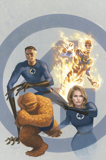
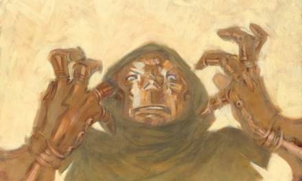
| Mythos: Fantastic Four Cover. 2007. Acryla Gouache on masonite, 16 × 24″. |
After 10 years of drawing no dragons, I actually had to draw several last week, including Lockheed from the X-Men and the “fell beasts” from The Lord of the Rings. Go figure. But now that dragon week(s) is over, I thought I’d get back to the mini-retrospective of my Marvel career.
By 2007, I was pretty set in my ways. Fantastic Four was the penultimate issue of Mythos and I was pretty anxious to finish the gargantuan project. I also started dating my now-fiancee at the time, so I finally had a reason to get out of the house. I still don’t get out much, but at that time I was basically the Mole Man.
 |
|
Mythos: Fantastic Four Title Page. 2007.
Gouache and acrylic on bristol board, 11 × 5″.
|
Starting with Mythos: Hulk, I made cutesy title pages featuring all the major characters in the issue. These weren’t in the budget (i.e. Marvel didn’t ask for it and I didn’t get paid for them) but I felt like they were a nice intro and I could usually sell the original art. When my Mom saw these for the first time, she said it looked like Mitt and Ann Romney. I only listened to NPR, so I had no idea what they looked like back then. I know better now. (You can see my reference for Mr. Fantastic here.)
 |
| Mythos: Fantastic Four, Page 17. 2007.
Gouache and acrylic on bristol board, 11 × 17″.
|
Despite the super-heroic subject matter, much of the imagery in this issue was relatively mundane. As a result, I lavished detail into the few pages that featured fantastic imagery. I always have a grand ol’ time painting fire, so the Human Torch was a delight. (He’s totally naked in this pic, by the way. I’ve always wanted to repaint it for a Marvel Max special edition.) This scene depicts the first time Johnny Storm “flames on” and the nurse behind him is just about to extinguish him. In the foreground, I painted a shocked Reed Richards, whose jaw has literally dropped to the ground. I talk more about making things “glow” in a previous post.
 |
| Digital Color Study |
The secret to painting fire is making everything else darker, so color studies are especially helpful for planning your palette. I had an intern that summer, Orpheus Collar, who still flats my colored pages to this day. He would take my layouts, add a layer of color in Photoshop, and I’d take it from there. It also helps to have great flame reference, which I posted here.
 |
|
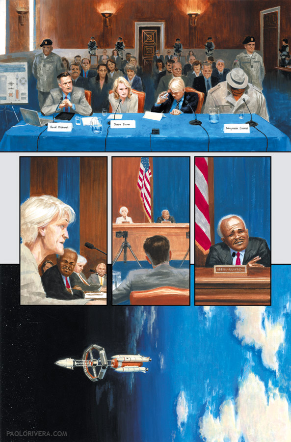
Mythos: Fantastic Four, Page 1. 2007.
Gouache and acrylic on bristol board, 11 × 17″.
|
The narrative was structured around a senate hearing where the Fantastic Four recounted the extraordinary events that gave them their powers. This meant finding a lot of reference for the Dirksen building where they hold inquiries of all sorts. (I only know things like that because I’m a comic book artist.)
 |
|
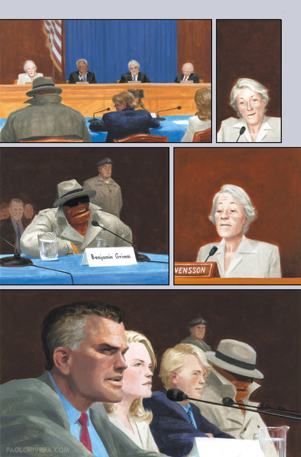
Mythos: Fantastic Four, Page 18. 2007.
Gouache and acrylic on bristol board, 11 × 17″.
|
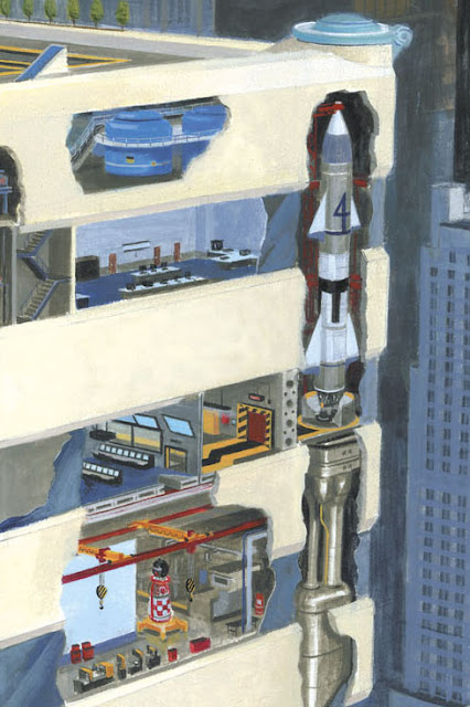
At the time, part of me dreaded the congressional scenes because it was page after page of people sitting in a court room. I think I could have a lot more fun with it now. One thing worked out: it went with the blue and orange color scheme that I mapped out for the book. I also had to design a rocket that could transform into a rotating space station once in orbit. That was hard.
 |
|
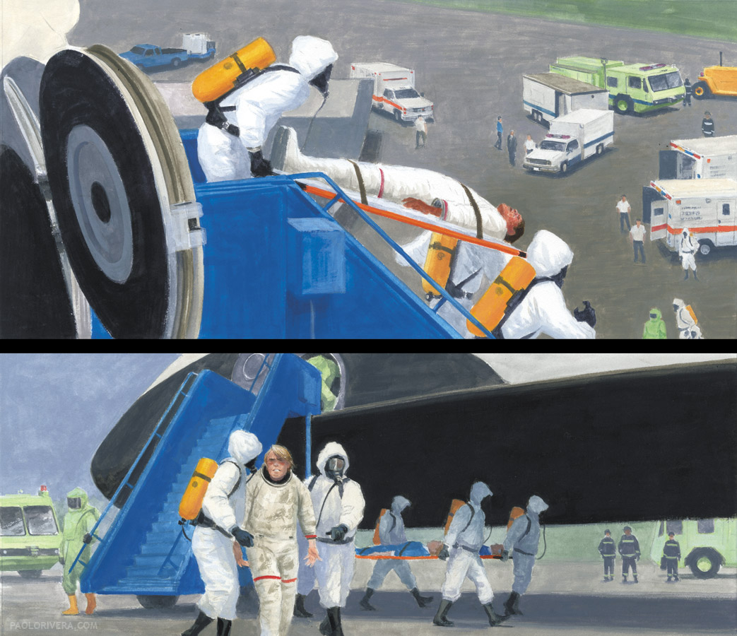
Mythos: Fantastic Four, Page 12, Panels 1-2. 2007.
Gouache and acrylic on bristol board, 11 × 17″.
|
The rocket had to have an escape pod that looked a lot like the Space Shuttle. After getting bombarded by cosmic rays, it lands safely on autopilot, and I got to draw lots of people in colored suits. That’s one reason it’s so fun for me to paint superheroes — it’s one big excuse to use the brightest of pigments.
 |
|
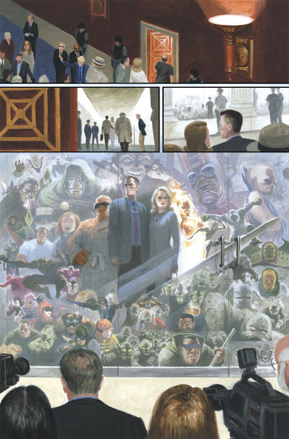
Mythos: Fantastic Four, Page 19. 2007.
Gouache and acrylic on bristol board, 11 × 17″.
|
Every good comics deserves a montage, and this one encompassed all the FF history I could fit (and was familiar with). It’s sort of a confusing image, but the writer, Paul Jenkins, asked a lot of me: the team looking through glass doors at the horde of reporters outside, while their epic future is reflected about them. My favorite part is the 2-parallel-lines-mean-glass turning into the speed lines for the Silver Surfer.
 |
|
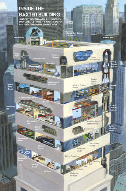
Mythos: Fantastic Four, The Baxter Building. 2007.
Gouache and acrylic on bristol board, 11 × 17″.
|
My one request from Jenkins was that he leave me an extra page in the script where I could paint my version of the Baxter Building, the FF headquarters. It took a hell of a lot of time, but I loved every painstaking minute of it. I also got some pro-bono typographic help from my wife-to-be. You can see the step-by-step process here.


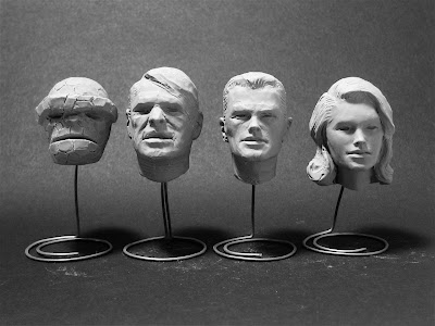

Love this. The Baxter Building is brilliant. I've never considered using sculpey for reference, but that's also very clever. Wow. Do you ever have the urge to go over your paints with hard black lines?
I love how Johny's bed is all messed up while all other three are neat and clean. It shows how much love you've put into this. Great work!
Paolo, fantastic post! What you do with gouache is amazing. How do you handle the color transitions in your backgrounds so well (like your earth from orbit panel, FF pg.1)? My attempts at, say, a sky turn out horrible. I can't seem to get the gouache to have smooth transitions, especially at the horizon where the yellows turn to cyan.
Thanks for the post (and your blog)!
Thanks! In 2008 I made the switch to pencils, inks, and colors — traditional comic book art — and I've been doing mostly that since. When I color ink drawings, however, I use only watercolor, and that's the last step. I'll cover that in a future post.
Thanks! I figured his would be the most messy. Unfortunately, in the version that Marvel printed, the names got mixed up and I think Sue had the messy bed. Oh, well.
Thanks, Michael! That's something that I've struggled with as well. This book was painted in Acryla Gouache, which is just acrylic paint that dries to a matte finish. Nowadays, I would use watercolor or straight gouache, which have a little more leeway in terms of post-application mixing. The trick with acrylic, though, is using plenty of water and keeping it wet until you're happy with the outcome. I'll even use a small spritzer to keep the paint moist. Once, the acrylic is set, it's tough to get those smooth transitions, let alone match the dried color. But give water color a try. Start slowly and build the color up. And you can always wipe away some of it with a damp paper towel or cotton swab.
Thanks, Paolo! It's been years since I've worked in gouache and acrylic so I'd forgotten the trick with the spritzer bottle. I've mostly been working in oils but I need something that dries faster. Your posts here (as well as the other muddies) give me constant inspiration to try different approaches. Again, thank you.
Guernica was painted by Pablo Picasso and still remains one of the best paintings by him. The painting depicts tragedies of a war as well as the sufferings inflicted on people as a result of the war. Pablo Picasso intended to create this with an aim of attracting the attention of the world when Germans bombed the small town of Basque in Guernica. The painting was completed in the year 1937 and remains a legend to date. http://www.wahooart.com