 |
|
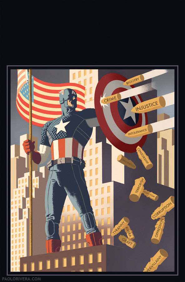
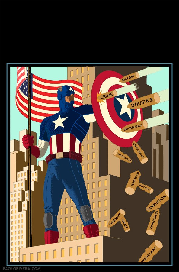
Captain America #1 Cover (Variant). 2012.
Ink(ed by Joe Rivera) on Marvel board, 11 × 17.25″.
|
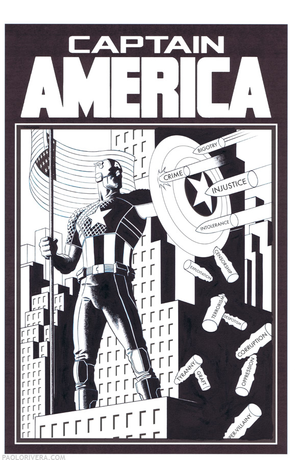
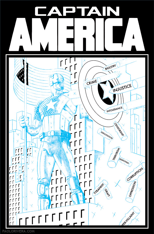
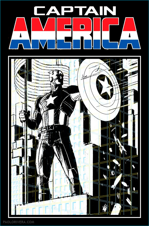
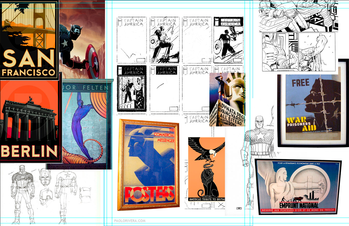
Since we do the pencils and inks separately, I tried to save him some time by doing technical elements — borders, lettering, stars, etc. — all in Photoshop. The image above is what he printed out and inked over. I added the title because it didn’t feel complete without it, but that’s something that Marvel always does in-house. I just swiped the logo from the reference they sent.
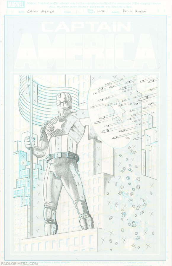
I got hung up on the anachronism of a modern Cap fighting WWII-era Germany and was at a loss for brief spell. Fortunately for me, my editor, Tom Brevoort, suggested the shells-as-metaphor solution which worked perfectly for the tone of the piece (and was a lot easier to draw). Pictured above is the digital composite that I penciled over, complete with perspective grid.
Finally, just a quick note on digital coloring: I have an assistant who “flats” the artwork, meaning all the major shapes are separated into different colors, making them easy to be selected. Once I receive this prepped file, I go through each shape, playing with the color until I strike some kind of harmony. Having established characters like Captain America make some of the choices pretty easy, but subtle shifts can make a world of difference. I find that much of my decision making takes place with the white objects in a composition. Once those are established, everything else seems to fall into place.
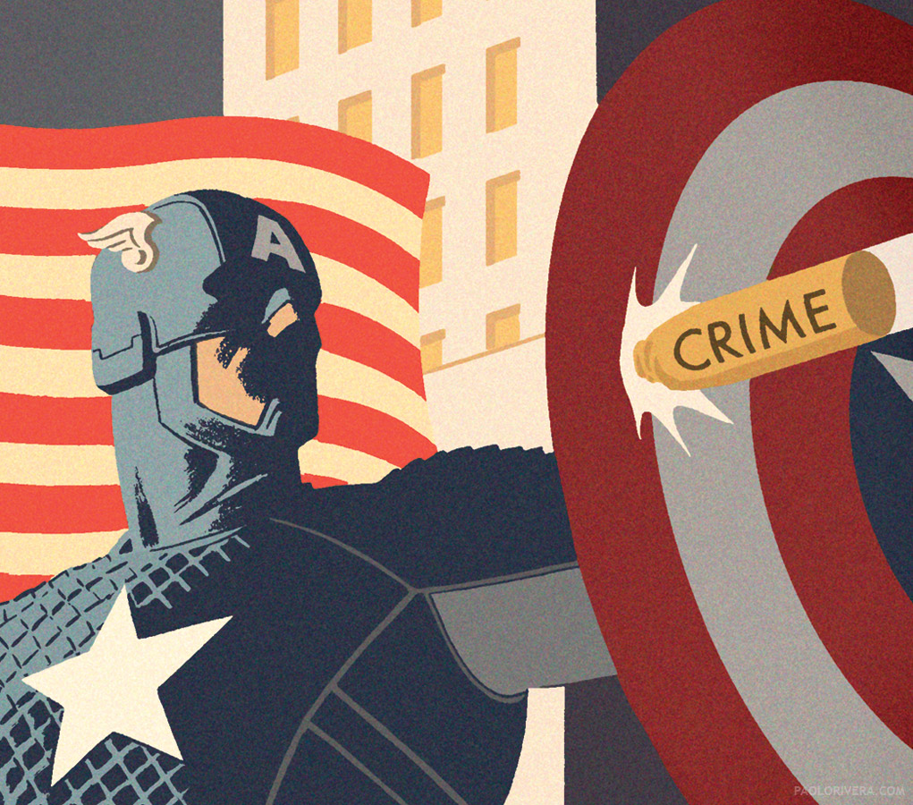
The finishing touch is a filter over the entire image that adds “color noise” to the flat hues. It’s one of the simplest filters (Filter Gallery: Texture: Grain) but I find that it activates the color in the same way that I would layer pigments with real paint.


PLEASE, advertise somewhere else! This is not your personal forum to make money off the backs of people who come here to enjoy, admire and converse about the work posted here.
One of the coolest covers I have ever seen on a Marvel comic!
I expect cap to fight against governments all over the world and against the big industries. Oh wait..
wow …that is just….wow
love it!
I really dig your work and have for a while. But this is super cool and probably one of my favorites.
Thanks, everybody!
Okay, hold on… since when does Cap fight bigotry, intolerance, and censorship? Don't tell me he's gone PC too?
I can see injustice, crime, terrorism, graft, and Rivera… because you know, they're all actual crimes. But bigotry?
It may be deplorable, but being a bigot is not a crime as far as I know.
Intolerance? Listen, isn't being intolerant part of living in a free society? Someone may be an intolerant jerk, but that's his right, isn't it?
Censorship? So Cap is fighting censorship now? By what standard?
I don't know… I miss the days when super heroes actually fought bad guys… not guys you just don't happen to agree with.
By the way, “fascism” ought to be on one of those bullets. …Or perhaps its absence is not a mistake. Hmmm….
Free Bollywood hot News, Bollywood Top Hot Actress and Hot Desi Girls Beautiful hot Pictures.
hotentertainnews.blogspot.com
I rate bigotry just above Rivera in the grand scheme of deplorable acts.
Your idea with the smaller bullets is better. Placing words on the bullets moves the piece from its emotional center and make the viewer evaluate it textually–like literature. For instance, one wonder's if “corruption” is really a spent shell. Furthermore, “Intolerance” is a hollow term and can be used by anyone to silence discussion (which is itself intolerant). It isn't merely that the words make the piece as didactic as a Sunday School lesson, the problem is that the words transition the piece from feeling like a propaganda piece into actually being a propaganda piece. They should have gone with your first idea.
I think they would have let me do it if I felt strongly about it, but in this case, I just liked their idea better.