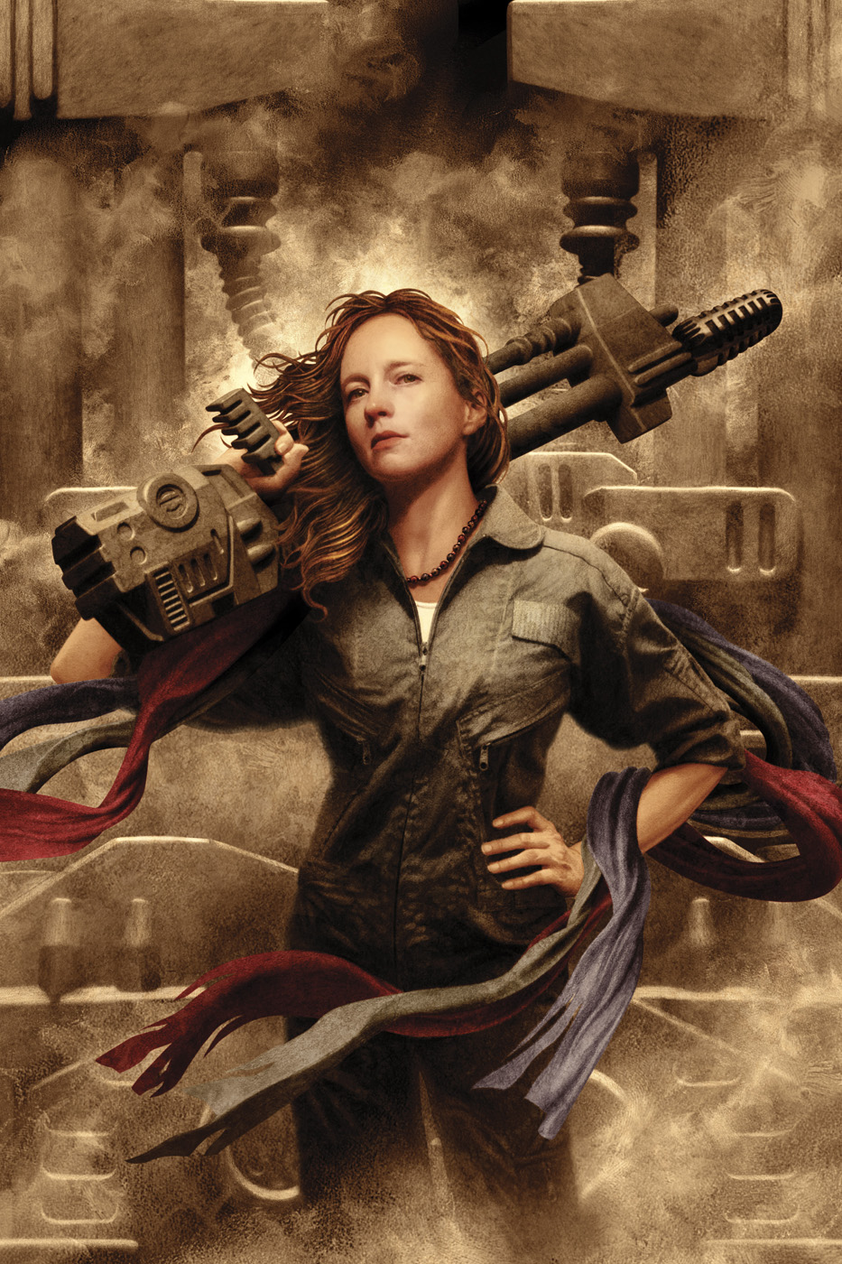
When I brainstormed the cover art for Brenda Cooper’s novel, THE CREATIVE FIRE: BOOK ONE OF RUBY’S SONG, I realized I had an opportunity to do more than a literary character portrait.
The novel was very much a futuristic story about coming-of-age, class warfare, and revolution. Art director Lou Anders wanted me to bring the book’s heroine, Ruby, to life. Some of my favorite cover art often goes beyond just being great product packaging, and somehow also touches the times that it’s created in. And I realized we had an opportunity to possibly do that here.
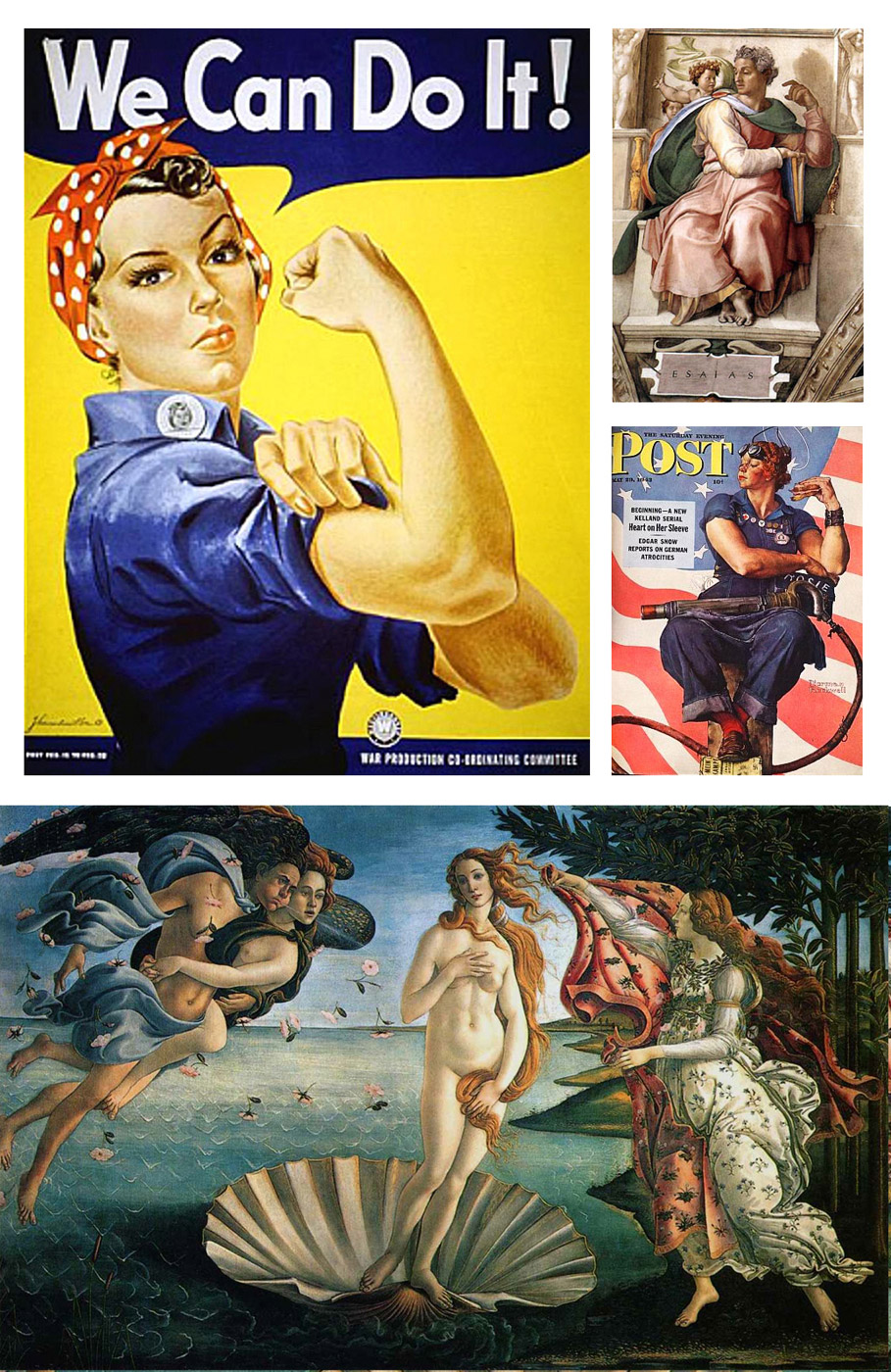
All of us are living in a fragile time for our fundamental rights, at least here in America. It seems our news and social feeds are filled with daily attacks on womens’ rights. Revolutionary posters have always been rallying cries, and Lou and I felt like we might have a chance to evoke those here, as well as serve the novel’s intentions. When I thought about who Ruby was, I thought of the 1940’s image of Rosie the Riveter, as imagined by J. Howard Miller and Norman Rockwell (with genius inspiration from Michelangelo’s Sistine Chapel). I thought of the grace of Sandro Botticelli’s The Birth of Venus, along with Russian revolution posters, and Howard Chandler Christy’s “Fight or Buy Bonds” painting.
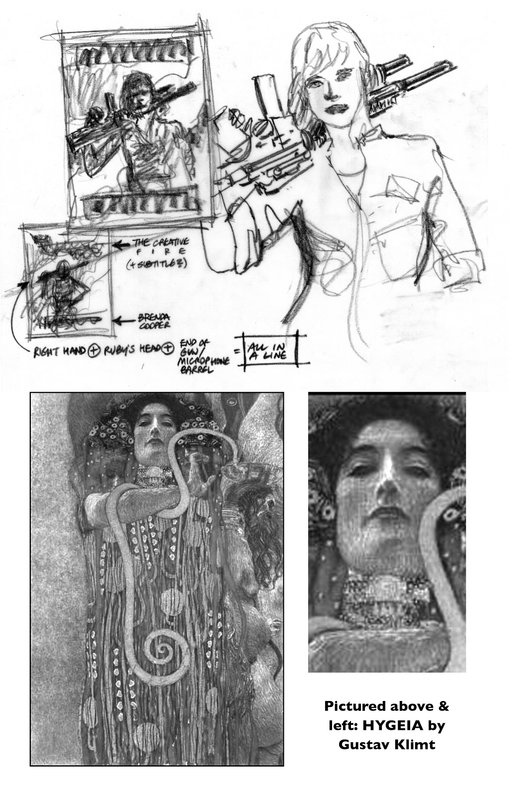
In the novel, Ruby is a singer and Lou and I talked about how her microphone might be a key part of the cover art. I felt that an image of her singing didn’t quite have enough dimension. However, in the right hands, microphones can be more powerful than guns. And that became the defining lightbulb moment that cracked the idea open.
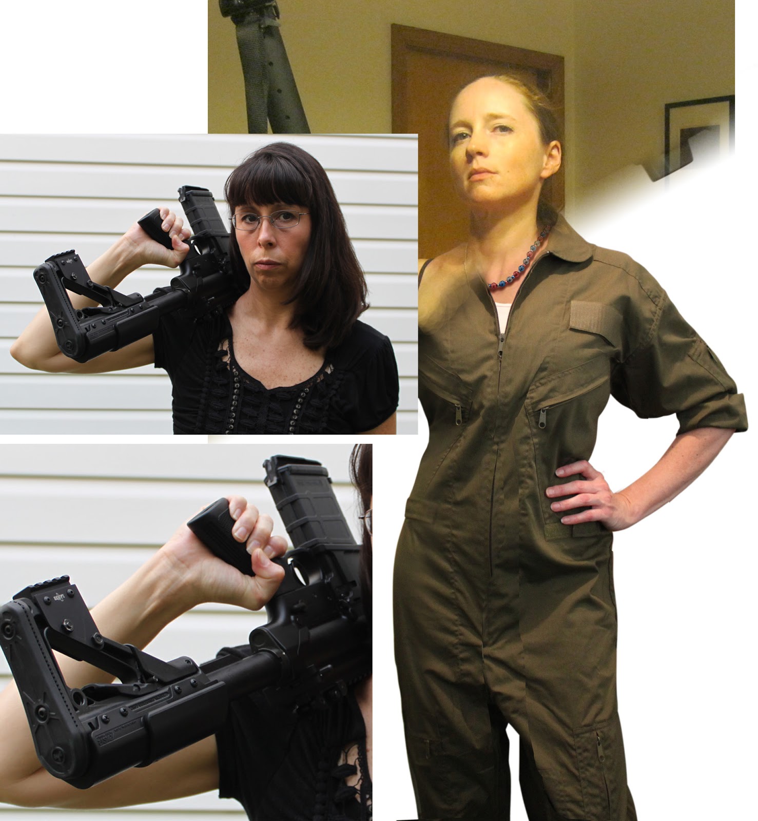
Next, I needed to shoot reference photos for my drawing work. I used two different models — one who lived hundreds of miles away, and one much closer to home. For the long-distance shoot, I sent a few thumbnails, lighting cues, and image inspirations (including Klimt’s “Hygeia”) to a friend and her husband photographed her. I referred to both batches of photos when I was drawing, and pulled cues from several photos.
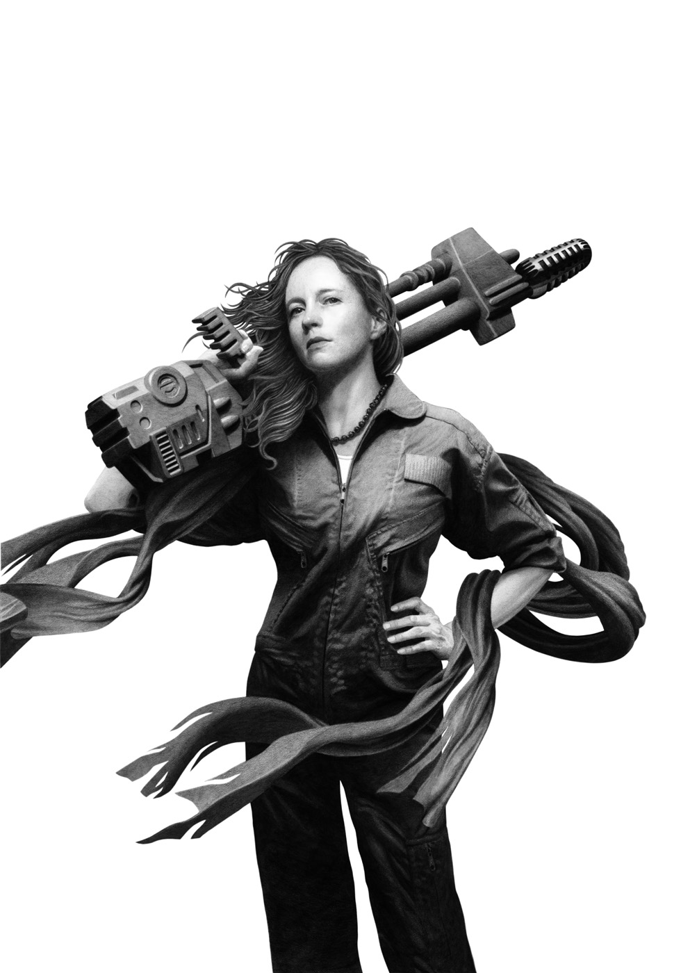
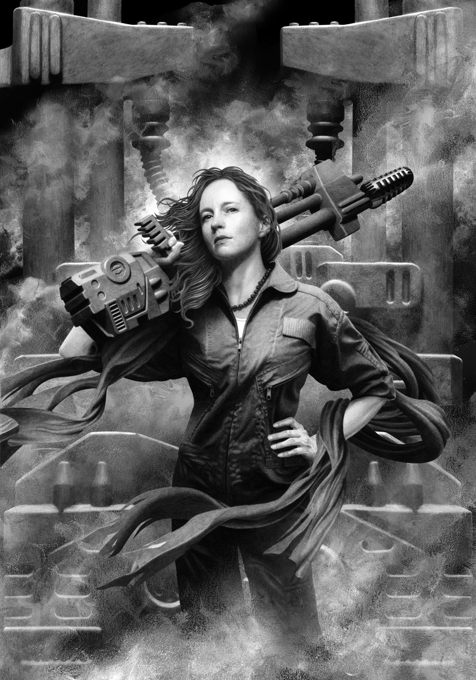
Final drawing study #1 / Pencil on Strathmore 500 illustration board / 17″ x 24″
Composite drawing/painting work with foreground and background merged / Pencil on Strathmore 500 illustration board + oil for the smoke
The first Spectrum Fantastic Art Live happened in Kansas City while I was working on this cover art, and I showed a print to a few friends there for critique. One friend said the microphone was “too Flash Gordon”.
It was helpful feedback, and I went back home to do several improvements including a reworking of the microphone. Here’s the final version.
One of the great things about doing cover art is when the author of the book sees the work you’ve done, and dearly wants to inject some of your vision back into the prose. As far as I remember from my reading, there is no microphone stand in THE CREATIVE FIRE that looks like what I created, but Brenda has told me she now wants one for Ruby for Book 2. That’s good to hear, but in the end, it’s OK whether she does or doesn’t. The most important thing is that the spirit of this image is true to the book’s intentions and strengths, and connects it with an appreciative reading audience. That microphone is very much the spirit of Ruby, and what she means to this book, and hopefully it will be for others who realize that we’re all revolutions waiting to happen.
This art is also featured as the July artwork (only fitting for Independence Day, right?) in the 2013 John Picacio Calendar, which is available for purchase for a few more short days — only until this Wednesday, November 28th at 12noon EST, via Kickstarter.
To see more of John’s award-winning art, be sure to visit his website at: http://www.johnpicacio.com/





I'm sorry – but where is the microphone?
Have a look at the barrel, Mary.
Very nice to see the process for this Creative Fire. It is a very beautiful piece, it has so much finesse and awesome colors. Good luck with the calendar, and your work is fantastic. What an inspiration! 🙂
Why can't I draw as well as this?! I have a strong admiration, for artists who have a flair for digital painting.
I think the microphone on the gun is a great and subtle touch. But the face– showing strength and character without the pretentious caricature often seen in ads and illustration–is genius. Bravo!
Hi, Isis and Cranky — Very appreciated! Thanks for the kind words. 🙂
Hi, Anime — This post dealt more with the idea-making of a piece of cover art. But maybe at some point, I'll try to cover the way I assimilate my greyscales and my colors. It is a digital result, but it's not digital painting in the way that most digital artists paint. It's more like sandwich-making. 😉 Thanks for the kind feedback!
Okay – now I see it! Thanks – great job!
I'm amazed at the values and subltely you get with your drawings, I'd love to see a process post in the future with the more technical side highlighted.
Love the work, great to see you posting here.
-SB
Thanks, Mary!
Hey there, Scott — Yeah, down the road, I'll see if I can pull together a more technical post. 'Appreciated, man. 🙂
Did you traditionally paint over-top that gorgeous drawing? Or did you scan it in and glaze it digitally? Fantastic piece! The drawing itself is a minor wonder. *so envious!*