I love when good Artists revamp their websites! It always brings the promise of new work, and an excuse to enjoy old work yet again.
Two artists I -really- admire both have new sites this week, and I thought it was worth sharing.
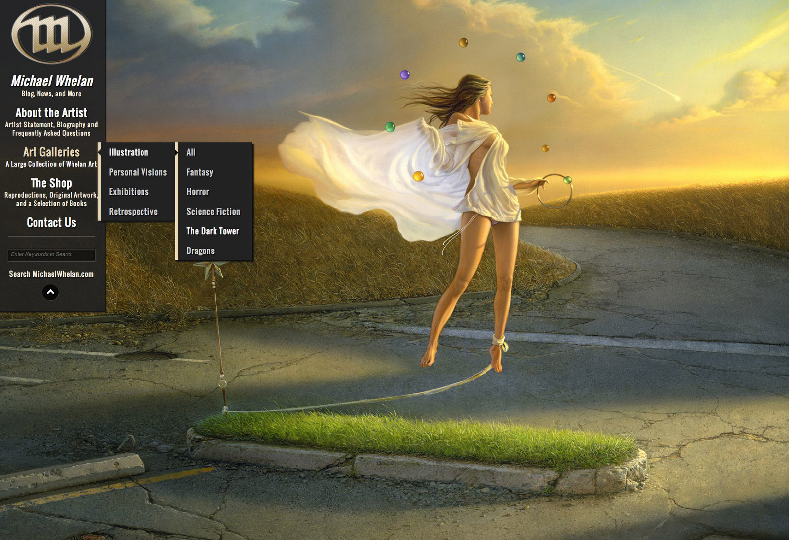
Michael’s revamped site is not only pretty, and really functional… but holy cow it’s extensive! There are literally HUNDREDS of paintings to browse. All of them are well scanned and very well categorized. Michael’s illustration work, and his personal work, are both represented here. If you enjoy realistic fantasy, it’s a must see.
I think this country’s biggest problem is the Paul Pope shortage. Why can I not just have a heaping pile of Paul Pope magazines to maniacally snuggle my face into? I wait years just for scraps I tell you! But today my fellow Pulp Hopers, Paul has decided to get a website. Not a blog like before, but a nice, commercial website with a decent overview of his work… and few new tid-bits I hadn’t seen.
Now if he would just put up a ‘shop’ page, I could make all my Paul Pope dreams come true!


Great art all around, but what I'm totally psyched about is that I finally remember who wrote a series of books I read when I was younger but couldn't remember the name of. Turns out Whelan did the cover art! I can finally stop getting that word on the tip of my tongue feeling every time I remember those books now- Thanks!
Yeah, Whelan's old site was very 90s. Glad he revamped it!