 |
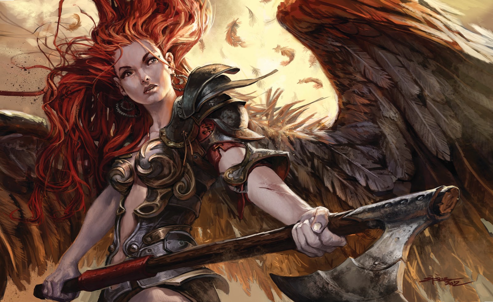
| Play mat Illustration |
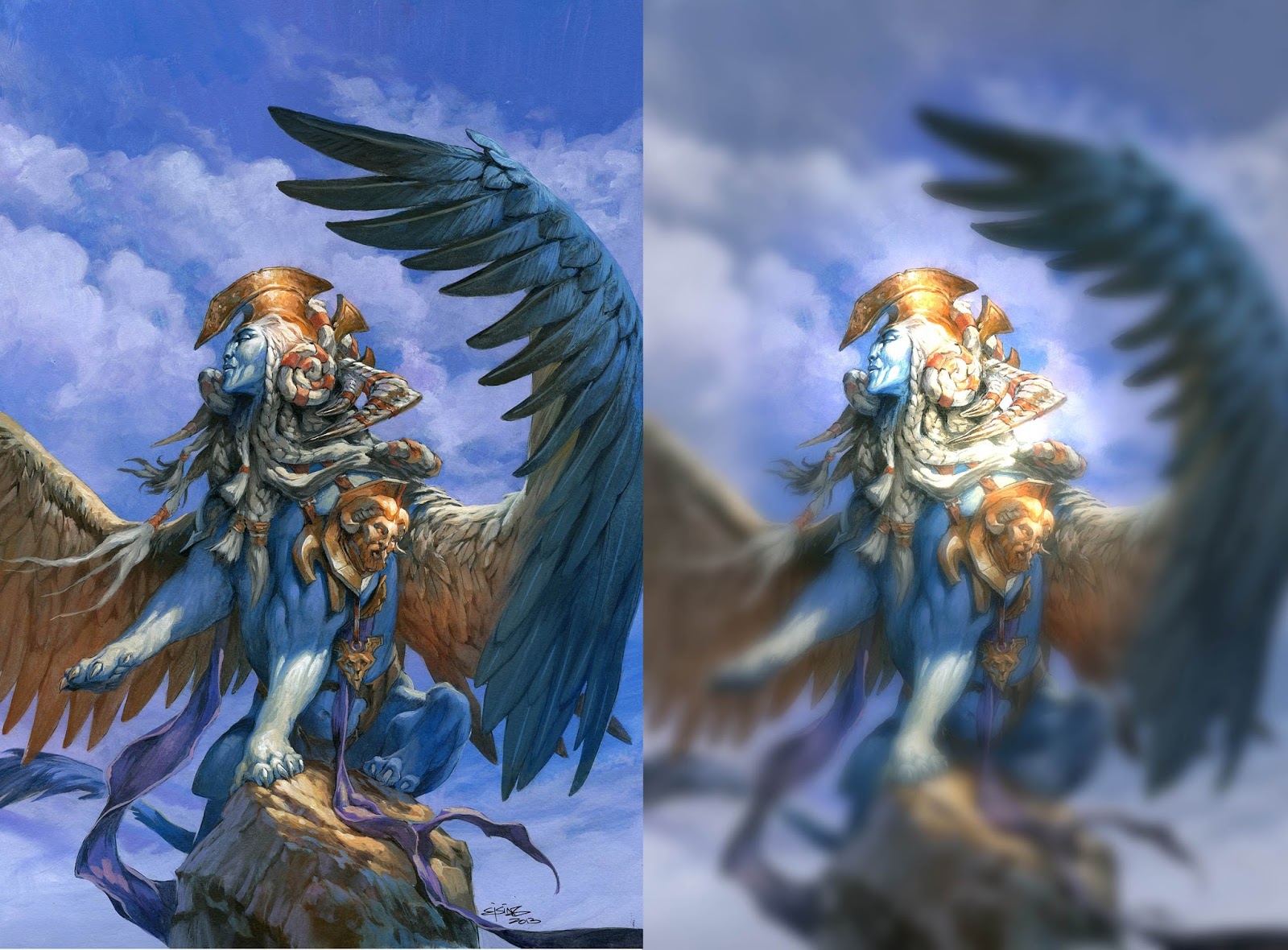
I have been tampering a little with the digital media. I always thought I would never get around to painting digitally, but a month at a game studio changed that. the first 2 weeks I felt like I had gone over to the enemy. I felt like cheating. then came the happy stage where I am at right now. Every thing seems new fresh and spontaneous. “to be perfectly honest I have no clue what I am doing ” I am simply thrilled with doing something new and “Not Acrylic”: the change of media has refreshed my enthusiasm for painting and I am shooting in every direction and testing brushes like my life depended on it.
But when having to do a professional job, like the playmat I am sharing today, I basically did what I usually do: I treated the drawing like it was an acrylic painting.
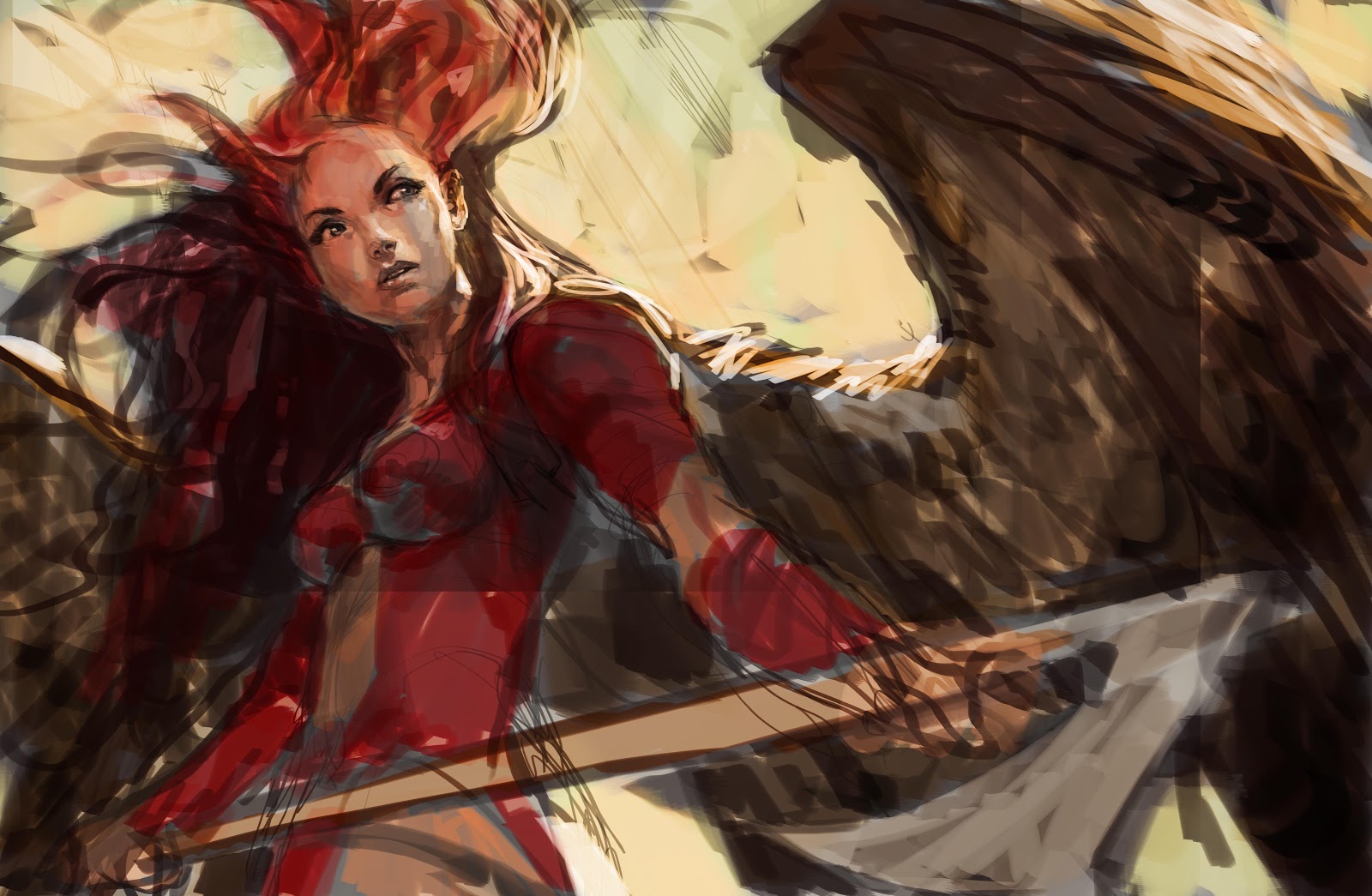
I sketched in black and white. Added most of teh values right away and got the approval, from Glen at Gordian Knot Games.
Then the hard part of figuring out how to actually paint it so it looks finished or less messy began. In my search for brushes I found one, that looks exactly like my “real” brush,. It has a pointy tip and a feathery end. And then I just used that for almost everything.
Last night I became very uncertain if the image was any good. So I sent it to Tyler Jacobsen and asked him for his opinion? As the gallant and polite gentleman he is, he did a quick paint over to show me the small value shifts he would have made. I applied them and whola! the image seemed finished.
In this one painting I feel like I have learned so much about digital painting: First of all: next time I will do a tighter drawing before starting on the colors. I will work looser in the beginning as opposed to going straight to finalize the face. And as in acrylic: I will try to minimize the amount of strokes needed to tell a form, line or area. I will use less layers; no one needs 35 layers. If I have more than 3 I should just flatten, I think. Commit to what I am doing. It is so easy to fix anyway.
This image will be available as a playmat during the Magic the Gathering Grand Prix Bilbao 18th to 20th January 2013.


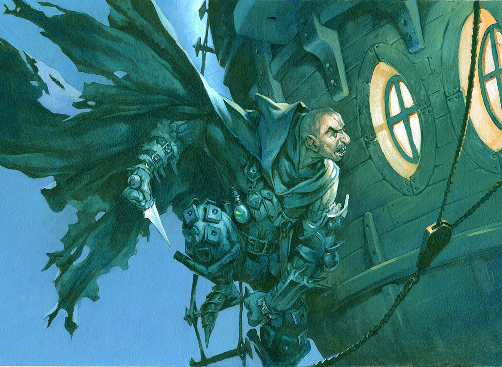
Gah! I'm almost afraid to say it, Jesper… but this is -really- nice!
thanks Dan.
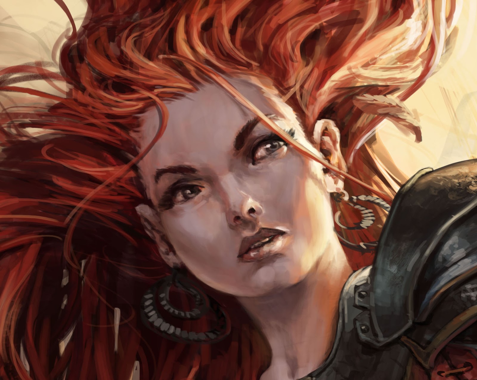
I am really on thin ice here and feel so much out of my comfort zone, so it means a lot to me. I am very aware that the digital stuff should at least be level with my acrylic, but I do not feel quite there yet, but I think there is some other strength to this image that my acrylic is lacking: it is wilder and more spontanious especially in the hair.
I can tell it's done by you, Jesper. That's also what I really like about Tyler Jacobsen's digital art, that he's made the media his own. The same goes for Jim Murray (his concept work on Dota 2 is brilliant!), and of course Justin Gerard 🙂
The hard part about digital, for me, is that I can't put down one brush stroke and have it describe as much as it would in traditional media. I find myself using a mix of normal round brushes, a “real brush” brush and the smudge tool with a “grainy” brush. The smudge tool helps get some of those edges you get when real paint meets paint.
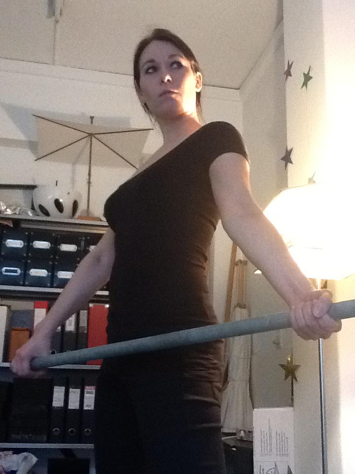
To me, technically, the image is as good as any of your acrylics. The only thing that bothers me is the jaw area. In this angle we would be able to see some of the downside of her chin – you'll know what I'm talking about when you look again at the reference.
Welcome to the dark side, the force is strong with you indeed!! Hehe Fantastic work Jesper! Now I'll have to get used to this style, with the traditional I could tell if it's yours when I see it, but this will challenge me 🙂 It looks great nonetheless 🙂
I love it! I've been a huge fan for quite a while now and I like how your digital work looks at the same time totally recognizably yours but at the same time there's something slightly different about it. I'm looking forward to seeing what comes next and if working digitally will influence your traditional work as well.
Great work, Jesper!
Nice one Jesper! Great to see your work from this side of the media-world and how well you carry your style over.
Hey Jesper,
I realized in the first moment.. “hey, something's wrong” haha
Great approach and it is even more dynamic because of you knowing “I can change that anyway”. The hair especially.
Again your use of warm-cold contrast rocks and I like the paintsy texture on the axe..
Funny enough, I actually try to be more traditional-looking, but even artrage (which you should try out, it simulates paint a lot better, you will be surprised) kind of disappoints me in some ways…
the feeling of the hair of your brush really mattering and all the fine moves you can do in real life are missing.
Argh!
Looks fantastic, Jesper, and still recognizably your work! And here I was, inspired by you at the first workshop to switch from digital back to acrylics – I'm even trying oils now…
As for digital, I definitely recommend working on as few layers as possible, if not simply on one. Commit! 😀
this is utter amazing as a digital painter, ans the fact your my favourite fantasy artist i love how you kept this loose and engergetic but still kept it Jesper Ejsing, beautiful colours, this has to be in your art book. your work always influences me the most. stunning, how long did thistake you compared to your traditional painting
Hey Jesper
Great to see that you finally went digital. It looks like you made that shift without breaking a sweat. When you get the routine I think you will be able to work even faster, than your acryllics.
A thing I find really rewarding, working in photoshop, is the “dual brush”, which you can adjust to look almost like real brush strokes.
hmmm.. Better drop by and perform an exorcism on you one of these days.
Iver; I am slinging good old brushes while writting this. Worry not. It is just that some things, like working in Computer games, feels downright stupid to be doing traditional.
It would be like writting blog post on a typewriter and scan the pages before hitting the “publish” button.
You should make prints….put me down for one if you do!