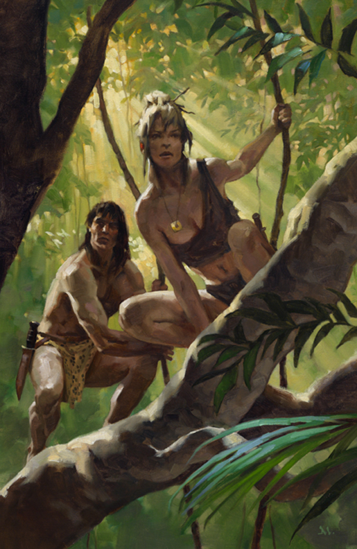
This was one of my favorite jobs from last year. A book cover for a modern update on the Tarzan legend that focuses on Jane, for Tor Books.
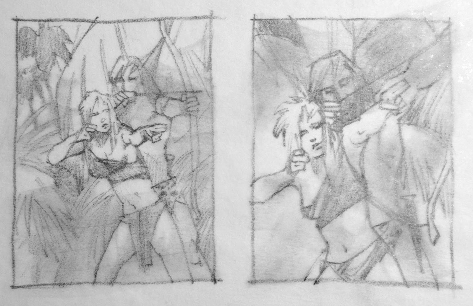
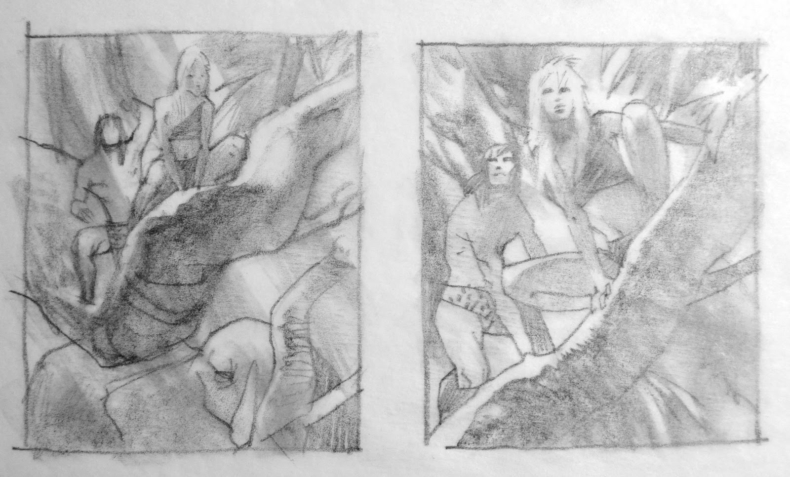
Initially there was some talk about Jane teaching Tarzan how to shoot a bow, so I started with that. On the second set of thumbs, I realized it should be more about Jane, front and center, Tarzan as backup.
Irene Gallo and I discussed it and she was drawn to the last thumbnail. From there, I gathered reference
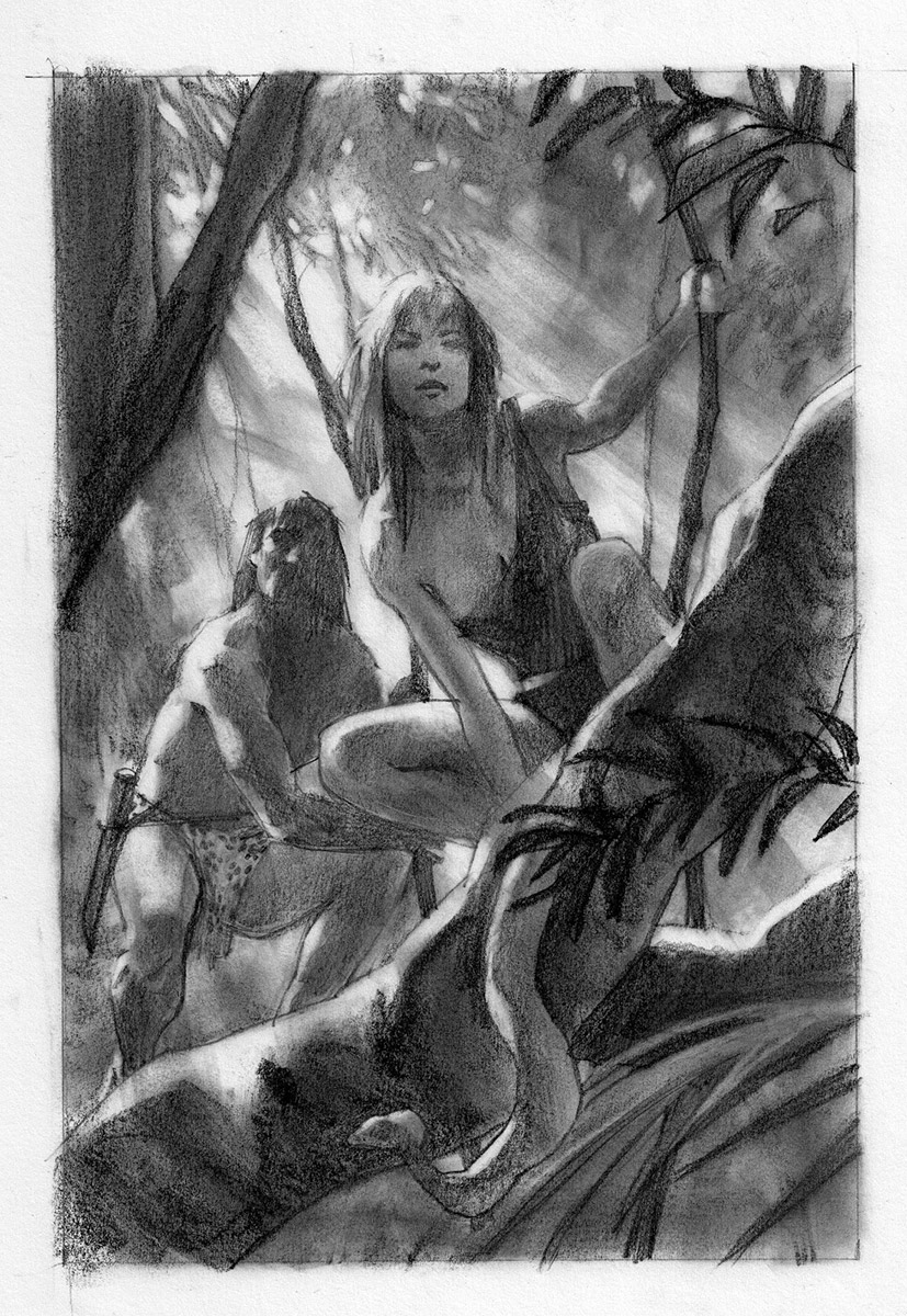
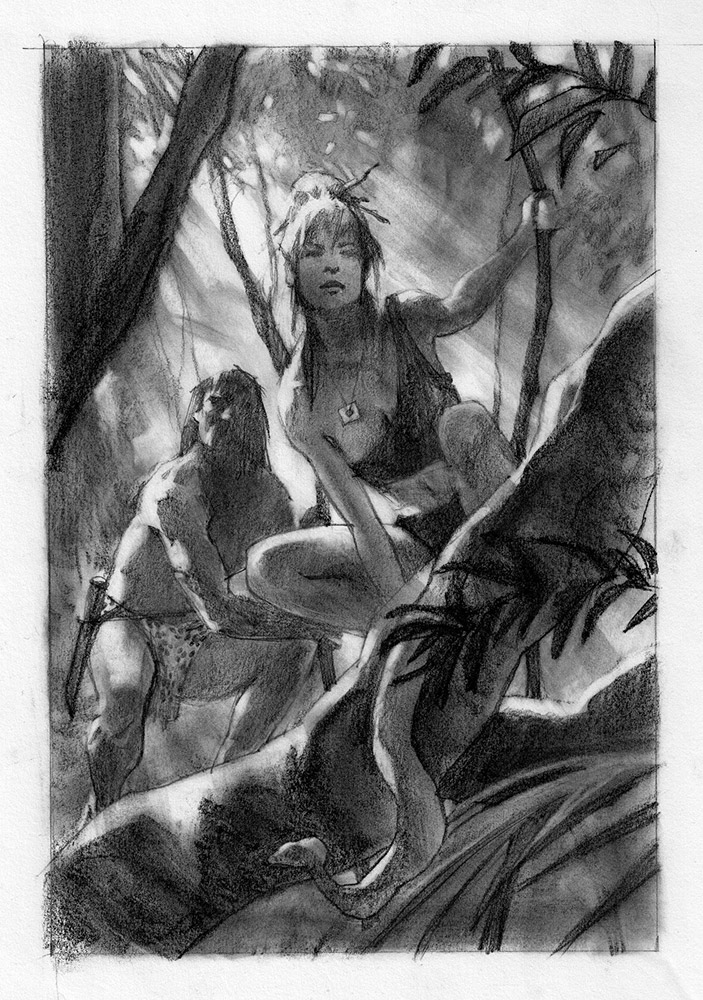
for the jungle and figures, and freehanded this sketch, while studying the reference. I was asked to change the two-piece she’s wearing for a one-piece.
They loved it over at the estate of Edgar Rice Burroughs, but had a few suggestions. Here’s the short list on the sketch:
● crop Jane’s hair for more contemporary feel, or pulled up
● define Tarzan more, but not overly so
● take out snake as Tarzan hates snakes
● add square, gold necklace
● Jane face too Asian, should be more European
● and…please make her clothing a two-piece…..!
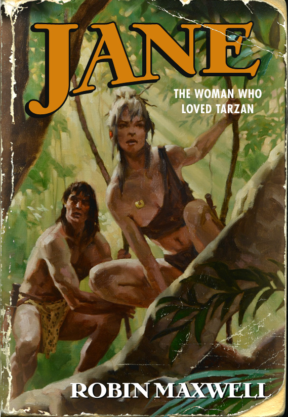
Final sketch. I was quite happy with all of the changes. I took out the snake in the finish.
I painted the final and Irene had it designed to give it a bit of an old look. I loved it…pre-stressed cover!
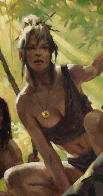
But I noticed a problem: something was wrong with her anatomy now that her hair was off her shoulder. (you can see it above) I thought it was her head, and was about to completely repaint the head all over again, shifting it slightly left, when I showed it to my friend, David Grove.
He looked it over slowly, then said, “wait…wait…it’s not the head. That’s a nice head. It’s the shoulder….something about–” He pulled out a pencil and some tissue and laid it over the painting. In a few seconds he had reshaped the socket. I instantly saw the problem. Back at the studio, I managed to correct it in about a half hour.
Irene loved it. The ERB estate loved it.
Tor Marketing did not.
They wanted a more contemporary feel for the more contemporary attitude of the book. Despite the great time I had working on it, and my desire to see it published, I saw their point. These things happen.
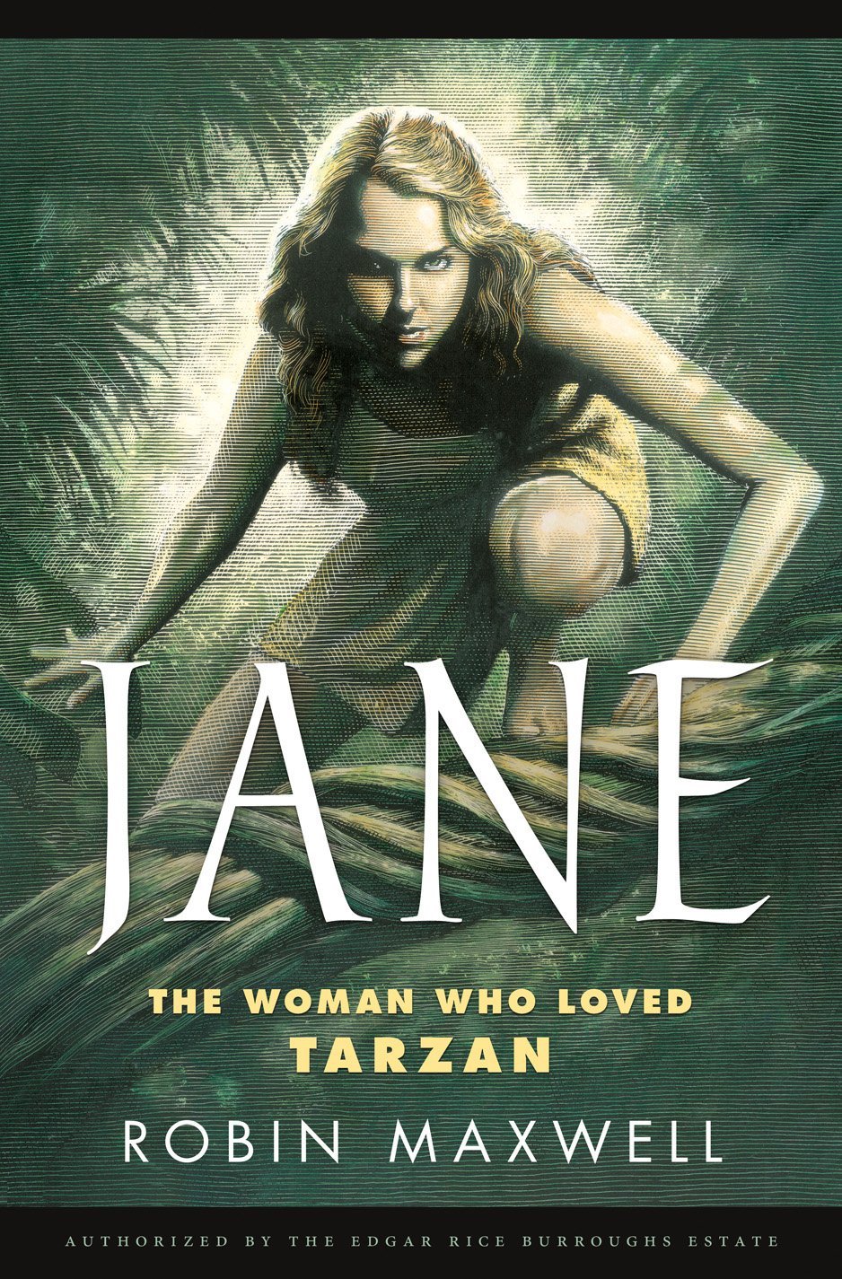
Irene chose my good friend, Mark Summers, to complete the task. Even though we were friends in the middle of competing for the attention, competing in the market at large, and my wanting to drive to Canada to snap all of his scratchboard nibs… he did a superb job.
Ultimately, I was glad a friend and great artist got this one. Sometimes, ya just gotta let stuff go. There will be more opportunities down the road.



Cool! I never had the experience to learn about this stuff.
Awesome. Your work on this is great, very nice sense of being in the jungle, fantastic light, two characters but Jane being the main focus. While the contemporary part may be missing from yours, I still prefer it.
Mark Summers' version is superb as well, same nice suggestion of environment, but … and maybe that's just me … there seems to be some anatomical issues. The arm on the left seems weird and has no muscles on the forearm underside. The arm on the right looks better but reminds me of CG character's arms – quite featureless. Might be 'seeing' it wrong though.
Both versions are amazing. Thanks for sharing the process, ups and downs of working with a group. Superb attitude, a lot to learn there.
Can we see the overpainted version of the shoulder Greg? After reading your post, now I am really curious!
What really struck me was the indecisiveness concerning what was wanted. The final image does basically everything they told you not to do. Her hair is down, she is in a one piece outfit, Tarzan is completely gone…does this sort of thing ever become a bother?
I'm hoping you still got a kill fee. Has this ever happened to you before? I'm just wondering how common the practice is with publishers.
And of course Tarzan hates snakes: Jane is protecting him from it! Great work. Hope you can find another venue for the piece eventually.
Funny, this is also the first thing I thought of as I read the end of the article – “But did Greg get paid?”
blown away. I guess that is why Im not an art director at a publishing company. I really like the piece by Mark Summers. It is an amazing piece. I just don't get the same feeling of adventure from it.
Great work as always, Greg.
Though I'm certain there will be many more good ones to come, this is the best post I've read on Muddy Colors so far this year.
It's not too late to enter the piece in the Spectrum competition!
🙂
I can see why marketing loved the used piece, it's very Hunger Games.
Hey Robert…the mockup of the Jane cover that looks old is the painting before I fixed it. You can see the strange shoulder and deltoid line. Compare that to the closeup I showed, and you'll see the difference.
Keith! I didn't think of that! LOL! That's hilarious to me: they had Mark do everything they'd asked for in the beginning. Crazy.
Paolo! Since I work so closely with Tor and Irene, we were all working on the same level: let's do the best for the book. They understood what was going on, and everyone just seemed levelheaded on this one….even when they decided to pay me the full amount for the painting. I like that! Tor is always fair.
It isn't very common. This hasn't happened much before, but my approach for one of their fantasy covers was rejected for a more contemporary look for a series by Ken Scholes. Again, I understood, and again, they paid me. It still left that feeling that I was Second Best, but that's been the risk I've taken for the past many, many years, working as a painterly guy in the midst of a digital wave.
The scary part for me is trying to grab the few projects out there where they want a loose, brushy look. But….I keep going. And I try to keep the paint relevant by making it compelling, and hard to look away. Whether it's wildly brushy, or more controlled. I know you understand this from your excellent painting chops!
Hey Megan….thanks! and yep, I did. It's in Spectrum 19…..on the left page next to Mark's!! (got it in just in time last January)
Both covers are nice, but I certainly am more of a fan of your painting – I just can't separate Tarzan in my mind with the pulp fiction vibe. But I guess it's a good lesson in knowing that the publisher may want to do something totally different. If you don't mind me asking, in a situation like this, would you normally get paid something like a reduced rate since they didn't use your cover? And what do you do if the project's suddenly off and they decide not to use your art OR pay you? Might be kind of scary…
Keep painting!
-Will
Will…normally the publisher would pay a kill fee of about 50% of the agreed price. (If it's killed in the sketch stage, it might be 25%) Tor Books and especially Irene are quite fair and many times as generous as they can be. Irene has a great love for the genre and also for the artists' work. So she tries to do well by them.
There are horror stories all over illustration of people not getting paid for the work. When that happens it's just awful all around. I tend to think that you should go after the payment unless, or until, it becomes a pain or is taking your time and energy away.
Always best to keep moving. Many get stalled over what's right, or how much they've been wronged. Best to cut your losses at the right times, and the term, “pick your battles” applies well here.
Some guys will eat themselves from the inside out just trying to prove a point. I've been close to that in the past, but learned many lessons from it. It's not worth it.
Again: keep moving, keep going. Physically, mentally, emotionally, CREATIVELY. Try not to be too precious with your work.
Hi Greg, Gotta disagree with Marketing there (old engineer, this is not new). As having read the books back about 1960 – 70 and grown up on Hogarth and Manning maybe I'm biased to the old styles the same as the Burroughs estate, but I think it fails artistically as well, simply because (a) it's a still life: there is no story, no direction in time and (b) that old pyramidal composition format is always weaker than a diagonal. (c) The scratchboard approach also looks like a woodcut…this is modern?
Regards
I too don't agree with marketing at all, with your cover it would have been auto-buy for me.
I wonder at the 'more contemporary feel' they kept mentioning has the Tarzan story been brought forward in time? The book blurb starts with 'Cambridge, England, 1905.'
So the publishers ignored the E. R. B. estate's suggestions completely? That seems very strange as you had to take them into account. My question on seeing the cover they went with (and this has nothing to do with its artistic merits) is what audience were they targeting? Not a male audience that was familiar with Tarzan methinks. The whole atmosphere of exotic adventure is missing. But then maybe that's not what the book is about. On seeing it on a bookshelf I would be left scratching my head. I'll take the Manchess version and I love the weathered paperback art. I'm very glad it made it into Spectrum.
Best,
Aaron
Thanks, guys. It's really just a shift in aesthetics. I knew what marketing wanted and I think for a more contemporary look they could've gone many different ways. I actually spoke about Mark with Irene. It's an odd combination, but even though it has that classic woodcut feel, it seems to work here with the modern type.
I'm not disagreeing as you bring up fine points. Just that they wanted and needed something with a different attitude. Again, I'm sad I didn't make the cover. But that's just 'cause I'm greedy!
Mark's halo focus on her head really drives the piece, and keeps that focus right where a potential reader will be drawn to it.
I disagree with marketing on many things, but when you watch them in action? Often quite savvy. The publishing endeavor is fascinating to watch. They've managed to keep it going decades after the death knell for books has been rung so many times in the past one hundred years. But that's another discussion.
Anon: oh man….woke my inner kid: Manning's Magnus Robot Fighter was where I really learned to draw!
You made a clear study of the reasons that motivated the final choice of the marketing department. They don't think only in terms of aesthetics, but also in terms of efficiency. In my modest opinion, there is much less work on the final picture they chose than on your picture. Excuse my outspokenness, but to me, the final picture chosen by marketing just looks as a copy and paste from Scarlett Johansson's Black Widow in either the Iron Man 2 or Avengers movies. It's striking, the face, the body position make me immediately think about that figure !
Your work is much more creative. Congratulations. All of your works are great.
I have to say I think your piece is FAR superior than the one they chose, nor disrespect intended to your friend. That said, I ended up not liking the book (which was disappointing because I had really been looking forward to it when it was announced). It had been billed as a retelling of the Tarzan story from Jane's point of view, but what we got instead was a completely different story altogether with a few familiar names given to some of the characters. Oh, well…
Hey Gregory,
Robin Maxwell here (author of JANE: The Woman Who Loved Tarzan). I was bowled over by your perspective on your wonderful work on the cover of my novel, and your experience of being taken off the project. Irene Gallo never showed us your other thumbnails (archery) nor the pre-stressed finished cover (fabulous!). Jim Sullos, the president of ERB Inc. and I were the ones giving you those notes. Jim (a very dignified gentleman) and I had some pretty funny conversations about nudity and bellybuttons (I LOVED Jane's sexy bellybutton showing, and that was the reason for asking for it to go back to the two-piece outfit).
We suffered the most shocking moment of the publication process back in March of 2012. We'd been so happy with your work and your willingness to make the little changes we'd asked for (Jim is a stickler for authentic Tarzan lore, and he was the one who insisted on losing the snake). Then suddenly we were told in one fell swoop that 1) we were losing our wonderful acquiring editor, Katharine Critchlow 2) your cover was out and Mark's was in. And the days of ERB's and my input into the creative process on the cover was over. We could not ask for one scratch of a change. Jim was particularly put out that Tarzan was no longer in the picture, and that disturbed me as well.
I did love Mark's cover, different as it was to yours.
The irony is that the change was made, according to Tor marketing, to attract female readers. My previous eight historical novels were, indeed, read mostly by females. Perhaps I shouldn't have been surprised that a huge percentage of men (many of them ERB Tarzan fans) became JANE's readers and fans. I think that your cover would have attracted many more male readers, as well as the women who enjoy seeing a man as sexy and virile as Tarzan. And as it was a love story between equals, your version would have illustrated that aspect brilliantly.
I found your response to the situation remarkably mature (notwithstanding Mark's snapped scratchboard nibs). You are a gentleman and a scholar/artist, and I'd like a chance to talk to you further. You might be interested to hear about my wishes to show your cover in my panel presentation at Comic-Con and two Tarzan Centennial conventions in 2012 (and what Tor instructed me to do). I can be reached through my website at http://www.robinmaxwell.com. I'm going to post a link to this blog post on my Facebook pages.
Thank you so much for sharing this with everybody.
Swinging your way,
Robin
Hey Robin! So nice to hear from you!
Wow….your perspective is fascinating, and so interesting after having gone through the process of developing the cover. Sometimes it's great to be able to talk with the author, and other times, not so much! Things can get confusing, and so I support Tor (and other publishers) keeping all parties at bay…..to get that thousand yard look at what's best for the property and what would be the best for sales.
It's taken me a long time to understand the perspectives involved. Irene has been a tremendous help in allowing me to understand the publisher's side of things and at times, the author's.
Honestly, I think everyone loved your idea so much that they wanted to do it right. Give it the best chance. Everyone was working with all cylinders firing, and I think I had to trust what marketing wanted this time….dangit!
I love what you said here, and hearing your side of things is helpful. I would be honored to have you show the piece in your lecture. If ever there's a time that you're doing a panel and want 'the artist' there and we're in the same town, perhaps that might be fun, too.
If you look at the Muddy page, you'll see I'm doing a panel with some great genre artists on Feb 9th at the Society of Illustrators in NYC. Are you nearby?
Thanks for your response! (And I gotta say, I loved that belly button as well. It was very fun to paint!)
Back to the painting treehouse….
Greg
Hey Greg,
Sadly, I'm on the other coast – California, the high desert near Joshua Tree National Park, a truly amazing part of the world (otherworldly vistas) – so I cannot be part of the Society of Illustrators meeting. Since starting to write JANE, I've become friends with Thomas Yeates and have a warm acquaintance with Joe Jusko. Joe and Thomas, Jim Sullos, Tracy Griffin (who is the author of TARZAN CENTENNIAL, the coffee table book) were all on the Comic Con panel with me, “The Naked Truth About Tarzan and Jane.” I may be doing an event at the L.A. Zoo (which they're calling a “mini-Comic-Con” that focuses on wild animals in art). Let me find out if that's happening. You'd be a natural for that one. But it is all the way on the other coast from you.
As for marketing and what sells and what doesn't in publishing these days, I don't think anyone has a clue. One person's guess is as good as another's. They also don't know what kind of advertising actually sells books. They don't even know what kind of stories are going to become best sellers. When you consider the biggest book of last year was S&M soft porn that sold to middle aged housewives, well….Personally, I'm stumped. Waiting for my next burst of inspiration.
All best,
Robin
Oh man….you know it, Robin. No one…NO ONE has the slightest clue what will sell or not. They can only try their best based on some experience and lots of guessing.
I think now that it's probably for the best. Can you imagine the stuff that would be perpetuated by a formula? Perhaps the mystery is ultimately more fun. Not easy, I know.
I try to get students to realize that if there was a sure-fire method for creating, then that road would've been trampled down long ago.
Btw, I go back and forth from Oregon to NYC. Sometimes I stop through CA if there's an event, etc. Depends on the schedule.
Greg
Man, all those lines on the final cover really cheapen the final product. Honestly, while I can understand why yours wasn't choosen (I believe you went for a more “Stone Age Jane” while the marketing wanted a “Average Girl Lost in Forest Jane”) all those lines on Mark's piece makes it looks like a rushed photoshop paiting with some filters applied to make it look more artistic.
PS: sorry about the anonymous comment, can't find a way to use Disqus on this site.
Beautiful drawings and painting and I Love the stressed cover look.
Cheers
Mike
I'm going to be something of a dissenting voice here, looking at this from the other side of the desk so to speak. So if I upset anyone…well, it's not intentional.
First, speaking as an art director, everybody and their brother has in-put into what I do: editorial, licensors, sales force, major clients, all have an opinion. Change is a matter of routine. Sometimes the changes make sense, sometimes they make you grit your teeth–but the decisions are made by people with bigger offices and larger paychecks than mine. When B&N or Costco or Walmart says to the sales rep, “This cover is green. We don't like green. If you change it to pink we'll order 20,000 copies; if you don't we we won't order any.” Do you argue? Only if you don't want to sell 20,000 copies.
All the risk in publishing rests on the shoulders of the publisher. They're paying the author, they're paying the artist, they're paying their staff, printers, distributors: everything comes out of their pocket. OF COURSE they want to sell books, as many as they can: if a title fails, everybody makes money except…the publisher. When a book isn't successful, authors may be bitter and accuse the publisher of bungling the cover art or promotion: sometimes that's fair, but most of the times it isn't. While everyone likes to Monday Morning Quarterback and believe they can do the other guy's job better…they can't.
In 35+ years of working in publishing, I have never met a writer or licensor who knew what might sell better than the art director and marketing staff. I don't say that in disrespect to Robin; no one is more passionate about a book than the author. But that passion can sometimes make it difficult to see the entire picture. The people putting covers together and the people trying to get the stores to stock the book know what they're doing and are giving it their best shots. Everybody has their “job”: the writer writes, the artist creates, the art director directs, the publisher prints, and marketing tries to sell. If the public likes it, everybody wins. If they don't, everybody shares the blame. Everybody.
A creative director had a saying: “The art makes you pick it up. The words make you put it down.” That always used to piss off the writers when he said it, who misinterpreted his meaning. Which was: the art grabs the reader's attention and makes them curious, but after that it has to be the type of book told in such a way that they actually want to buy and read.
Greg's painting is solid and works well. Love it. It has a nice, soupy, time-lost (pulp-y if you will) quality that sends a lot of messages to possible readers. But from a marketing standpoint…that approach may have actually limited the interest to a small niche rather than give the novel a chance to break out and find a larger audience. Tarzan is over 100 years old and the story has been reprinted and retold in any number of ways in a multitude of medias. In other words, it's familiar. People tend to think at a glance they know what's going on, they already know the story being told. There's no surprise. Long time fans might be happy, but what about everybody else? The goal is to break out and reach new readers, too, but how to do that? Does Greg's nostalgic approach work best? Maybe, maybe not. Whether that feeling is right or wrong is hard to know—but there's usually some sales history to back up many of the decisions that get made.
Regardless of some of the comments here, Mark Summers cover IS excellent and IS more contemporary in feel. It makes the browser (not necessarily a long-time Tarzan fan) wonder what's going on and pick it up. And when that happens, half the sales battle is won.
Don't misunderstand me: I like BOTH covers. It's not like one is superior than the other, but only that the approach sends two different messages. Apples and oranges: whether you prefer one to the other is simply a matter of taste.
Being a Psychologist who works using Psychoanalisys (meaning, I'm on the losing side of the Mental Health theories dispute) I've watched some of my fellow “freudian inspired” co-workers try to adapt some “techniques” from Cognitive & Behaviorist writers into their work. They try to estipulate the “end date” of the treatment, use Psychological Tests, have a more open relationship with the patient and so on.
And what I've seen from time to time is that these professionals simply are less well succeded than any of the two sides they get “inspiration” from. In other words, standing in the middle can be a dangerous road, way more dangerous than simply having a “niche” market.
I do understand what Marketing Directors do, and I respect their positions. But some times you need to be aware that this or that book has no chance of selling millions, and can't be marketed using “techniques that sell more”, because people who are “baited” by these kind of techniques, won't want to read this book, even if the cover is great.
But, on the other hand, people who might be interested into Jane or Tarzan, may find the “Twilight”-esque cover to be a let down.
So, while the original art is less appealing for the general teenage-readers. The theme and the title of the book is simply non-appealing for this kind of audience. Actually, the title of the book makes it sound like a Biography, and the way it's worded its obviously aimed at non-younger readers.
In short, the problem with marketing departments is the same as many others, a hamfisted approach to their job, thinking every book cover should look the same, using the “magical techniques” that sell this or that “book of the moment”.
If I had to bet, I would guess that as it is, with this cover, Robin's book won't sell even what was expected from a niche “Tarzan-Loving” crowd.
PS: Again, sorry for the anonymous, I'm the same guy from some posts up.
I would rephrase what that creative director said (above), “The art makes you pick it up. The words make you keep turning the pages… or not.” And perhaps pick up the next one as well.
I don't want to take this into a whole book-and-its-cover tangent, but I will just say that if you've already in love with what's written between the covers you tend be forgiving of (and sometimes even enjoy) the different takes that artists bring to characters on the cover. There are of course exceptions. “That's NOT the way Bilbo Bagins looks!!!” 🙂
“But some times you need to be aware that this or that book has no chance of selling millions, and can't be marketed using “techniques that sell more”, because people who are “baited” by these kind of techniques, won't want to read this book, even if the cover is great.”
No publisher buys a book and invests piles of cash in it unless they think—hope—it will be successful. Every acquisition is a calculated risk; every decision that the editor, art director, and marketing manager makes is based on experience, knowledge of the marketplace, and sincere desire to give a title at least a good chance of finding an audience. I don't ever believe that saying the readers are being “baited” is fair: again, the cover only gets the customer's attention, but it's up to the content to sell it. I think the time of buying a book strictly for its cover are past. When we were snatching up Tarzan paperbacks strictly for the Frazetta or Krenkel covers, we were only out 40¢ to 75¢ a pop: those days are long gone.
“In short, the problem with marketing departments is the same as many others, a hamfisted approach to their job, thinking every book cover should look the same, using the 'magical techniques' that sell this or that 'book of the moment'.”
But see, this is where your prejudice (and the that of some of the other posters) is showing; you've confused your own personal taste and opinions as being absolute, more authoritative than the knowledge and experience of the people actually doing the job or the constraints placed upon them buy store buyers. No one is perfect and nobody can please everyone all the time, but to dismiss the marketing department with broad statements is misguided. I've never heard anyone in publishing describe a “magical technique” much less a “book of the moment”: I wish they existed.
Oh, and 50 SHADES OF GREY et al (since someone else mentioned it somewhere): they were marketed beautifully. Female-centric softcore romance porn that looks respectable. Women can read it on the subway without the person sitting opposite them arching their eyebrows. If the cover had sported a photo or a painting of a couple engaged in B&D it would not have sold for beans.
“If I had to bet, I would guess that as it is, with this cover, Robin's book won't sell even what was expected from a niche 'Tarzan-Loving' crowd.”
I'm tempted to take that bet, especially since I can call up Bookscan sales figures. 🙂 But…what did the critics say?
“Not only is it wildly entertaining and more swoon-worthy and tastefully erotic than Fifty Shades of Grey or any of its knock-offs, but also, Jane has heart and soul. If you are looking for a stellar historical romance and adventure story, Jane should definitely sit on your bookshelf. It has charming and fascinating characters and sociopath villains who scare the living daylights out of you. Jane: The Woman Who Loved Tarzan has positively reinvented the beloved couple for the modern age.”
—The Huffington Post
“Finally an honest portrayal of the only woman of whom I have been really, really jealous. What a wonderful idea to write this book. Now I am jealous all over again!”
—Jane Goodall PhD, DBE, Founder of the Jane Goodall Institute, UN Messenger of Peace
“With riveting action and suspense, earthy humor, a piquant look at the debate over evolution, and the love between heroic, resourceful, and tender Tarzan and smart, strong, and passionate Jane, this is lush and satisfying entertainment.”
—Booklist, starred review
“Excitement, danger, labyrinths, pyramids, treasure, and volcanoes abound, as Jane and Tarzan learn to trust and love each other.”
—Library Journal
“Jane Goodall and Isak Dinesen would be right at home with Miss Jane Porter. A respectful, exciting and disarming update of one of the last century's most oft-told tales.”
—Kirkus Reviews
Not bad at all.
Whoa…those are fabulous reviews! FABULOUS. Now I want to read it!
It's ok….let's DO get into a discussion about covers.
Everyone has made strong convincing points….and thanks for that. (Hey Anon….next time, just sign your name and we'll know it's you.)
I have to agree with Arnie on so many remarks. One especially: taking the personal pov for one that feels across-the-board. This gets us all stuck. Me as an artist as well. Having a broad objective view is hard to train, and in this regard about selling books with appropriate covers, it's extremely difficult.
And we all trip over it. Again: everyone down the line is guessing. An educated guess to be sure, but a guess after all. Talk to authors about their covers and usually you hear that they (the publisher or marketing) “didn't understand the book at all.”
Get this down and remember: The book cover never EVER explains the book.
The cover IS a bait. The cover IS a tease. The cover suggests. The cover entices. The cover MUST NEVER EXPLAIN.
The cover sets up curiosity so that you, the reader/buyer will want to find out more. It's similar to a Hollywood trailer, except much shorter and far less pain, and definitely NOT the kind of giveaway that ruins the in-theater experience that we've all been disappointed about. (mystery book covers: difficult…..the best part of most of those books is the reveal of the mystery! You put that on a cover and people will beat you in the street. So what do you do as an artist? Put someone on the cover thinking about something? Awful. It's a tricky job.)
Less is more works very well here. Mark's cover gets to that point so fast, you're caught in the moment of THINKING ABOUT Jane….wondering about her…..what will I discover. His cover is an even faster read than mine. Truth be told, I didn't want to put Tarzan on my cover AT ALL. In my head, I wanted my figure of Jane in that tree. The end. Mark got away with it. And we were both right: that's what the book needed.
One last point. My style of painting was and is being looked at here as nostalgic. It is NOT. As soon as you put old type on it, it certainly will be because we're used to that, and that's what they did, and it was ultimately wrong in the beginning.
What did I think would work? A blend of what happened. My painting with a more modern type face and design. I think that would have reached a wider audience.
So you see, once again, we have another method of how to sell Robin's book!
Now I'm REALLY looking forward to reading it!
Greg
“The cover IS a bait. The cover IS a tease. The cover suggests. The cover entices. The cover MUST NEVER EXPLAIN.”
When “bait” is used that way, I agree absolutely. My concern was the way it had been used in Anon's post seemed to imply that there was something of a dishonest bait-and-switch going on sometimes with covers. I've never really seen that occur. “I thought this was a cook book and it turned out to be Honey Boo-boo's autobiography!” If that actually happened…I'd be mad, too! 🙂
Hey Greg,
Your painting style is indeed not nostalgic. But the subject matter is. I think it's the distressed book cover mock up above that has some of us thinking about the Frazetta, Krenkel, and Barr paperbacks on our shelves.
Actually I found Mark Summers' cover had a retro feel. The horizontal lines and halo around the main figure made me think of TV in an Outer Limits “We will control the horizontal. We will control the vertical.” way. Of course I'm thinking of the days when televisions still had tubes.
Anyway you cut it, you say Tarzan, and some of us expect Johnny Weissmuller to come swinging in from a Saturday afternoon movie.
Best,
Aaron
Both are fantastic covers, but for my own artistic 'taste' I prefer Greg's. But putting that aside, I agree with TOR Marketing. Greg's cover is visually true to the Tarzan we all know… but as Arnie has said, this makes readers pass over it, thinking that they know the story already. There's nothing in that cover to suggest the reader might learn something new about Tarzan and Jane.
Mark's cover features a Taylor Swift-like face and a dress that's not at all what we would expect from Jane in a tree. The colors are more subdued and diverge from almost every Tarzan piece out there. Mark's cover says 'You will find something new about Jane in here' and that's what a Tarzan-based book NEEDS to sell today, I think.
Now, there is one part to all of this that I find a bit annoying. Greg did the initial job and everyone involved loved it. Marketing did not. Fine. That's valid. Now why did they at TOR marketing assume Greg COULDN'T do a modern Jane? Why did they feel the need to drop the initial artist and go with another one? Personally, I would have went back to Greg and explained the new parameters of the job and request a few new thumbs. Only if those didn't work out would I look for another artist.
Basically, Greg did everything right, but was never given a chance to correct his cover when Marketing made objections. Not sure that was the right thing to do, but there may be a good reason for it, I dunno.
Just to add another bit of perspective: though Marketing is getting a lot of the blame in this discussion, there's a good chance that the changes were a result of feedback from major clients. Remember my comment early on about a green vs pink cover. I don't work for Tor but I suspect they operate much like the publishing company I work for does: meetings are held with the buyers for the largest accounts and comp covers and content descriptions are given to them for forthcoming titles. The buyers give their feedback as to what they like, what they don't, and what it might take to convince them to stock the books in their stores.
In those instances when they don't like something, their feelings are pretty resolute. I'm not saying they're right when they feel that way—personal tastes almost always enter into business decisions regardless of quality or commerciality—but they tend to be pretty immovable. If it's a title the publisher believes in (and of course they do since they acquired the book in the first place), it's back to the drawing board (figuratively and literally) to try to come up with a solution that the client likes and which will lock down their order.
Greg could have done any number of treatments standing on his head that would have pleased everyone and their mothers. No question whatsoever. Except, maybe, the objecting client. People are people and once they've taken a stance they want to “win.” In those instances the best tack tends to be to go in a different direction with a different artist. I don't know that this is what happened with JANE, but speaking from personal experience I think it's most likely.
I see what you're saying, Arnie. I wasn't actually blaming TOR marketing, or anyone at TOR to be honest, just wondering why some decisions were made.
As a former art director for a graphic design firm, I understand the need for a fresh outlook on a project, but I suppose I'm such a fan of Greg's work that I have faith he could have pulled off what Mark did, given the same parameters! But you're right, people are people and motivations are hard to determine sometimes.
Sorry I missed your remarks Michael!
What Arnie said!
AND what you said, too. I would've loved to do another cover, but I understand the shift in direction. That's the business. If they had come back to me and said, “more modern” that would've been fun, too.
Y'know, I was actually TRYING to make the book about just Jane, just her image. I knew that would carry off the idea that the reader would find something different here. I don't really agree that there was nothing new for the reader in my piece as that Jane is scruffy and dirty and animal. As soon as Tarzan got in there (and I wanted to leave him out) that's when things went average.
Big letters, JANE! and a solitary image of a very physically capable Jane was all that was needed. After many meetings and client talks, they finally got there.
I have to say i saw your cover on the web and it is what made me find the book and buy it. When the book arrived in the mail i was disappointed with the cover. i wanted to see your painting instead it was much less narrative art and much less exciting. Wish I had your cover on this excellent book!
I'm looking,,, and I'm looking,,, and honestly…. i think her shoulder “looks” better the way you originally had it. 😉 Your work is awesome by the way. 😉