This is a very new illustration I did for a fantastic game called Kaijudo from Wizards of the Coast.
The dragon “Infernos The Immolator” is the big Boss from the fire part of the game. It was one of my first digital paintings and it was a real bumpy ride to get there.
I first boldly started sketching in color right away. I was slinging strokes around like a gunslinger with endless ammo, Not thinking anything would be a problem and everything would be fixable. “That´s how it is with computers right?”bAfter an hour or so I realized the anatomy and the bas drawing was shit and it struck me that if it had been an acrylic painting I would have started all over a long time ago. So I started all over, this time in pencil. I sketched the whole dragon scanned it in and started adding colors very very slowly.
In the end it looks like my old paintings.
I regret the sky and the clouds. they are way too smooth and lacks “drawing” or strokes. the image come off as being a cutout figure pasted in on a background. It works very well in card size where you do not really see much background because of cropping. I really like the texture part of the wing it looks very much like how I used to do that same effect with a real brush going smudgy for creating textures.


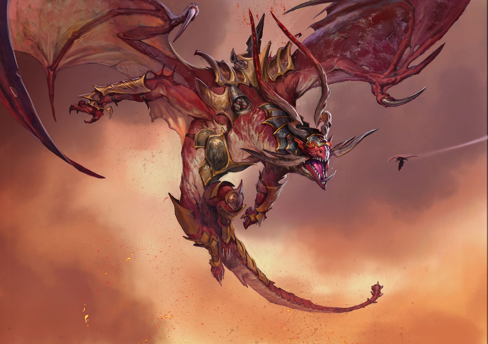
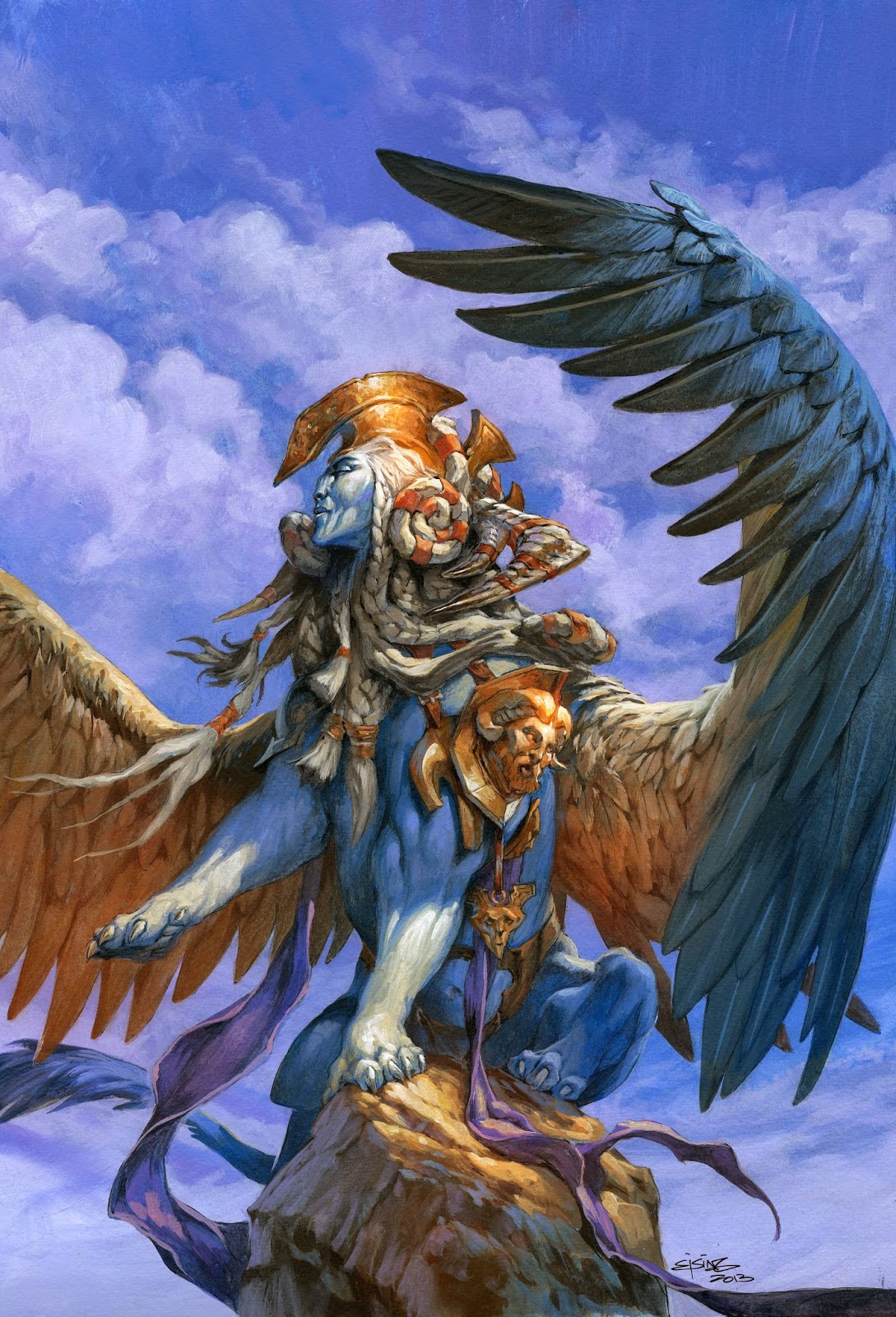
wow. I think it pretty cool. Like it look like a big piece of raw meat, or somebody with the skin ripped off. I very much like this digital painting. The only thing might be to smoothing the soften the edges on the tail, so it blend into the background.
but super cool
I think a lot of commercial artists have to make part of their workflow digital in order to get things done in a timely matter and for their sanity. In addition, mistakes are easier to fix as a digital file. I had an acquaintance redraw an entire full-page piece of art by hand to change a shirt one character was wearing and a hat on another. If he scanned the original into a computer or drew the entire thing digitally, changing pieces of the art would have been done quicker.
Also, the card name that this art appears on is called “Infernus the Immolator” (no letter 'o'). Was this a typo or was that the name Wizards gave to Jesper?
Hey Jesper,
I have a similar query to Alex. Why digital when you've already got a amazing feel for a traditional medium? Is it simply speed – in which case I'd be curious how the time-frame of this piece compares to the time range for one of your traditional pieces.
It seems odd to me – as your originals are amazing, I and (possibly naively) assume that you sell those originals to augment your commission fees. I would have thought that extra revenue would balance out any extra time spent in their creation? It seems especially odd to me when you are obviously going to great lengths to emulate the look of specific strokes and techniques that you would do traditionally.
It makes me think of other artists who paint traditionally and then augment them digitally at the end – for value and colour adjustments, or even for client changes. Like in Don Dos Santos' post yesterday, where he digitally added the flood waters. I would love to hear your reasons.
It saddens me a little every time that commerce succeeds in pushing someone already accomplished with paint towards a tablet.
Oh an also – what a horrible thing they've done with your illustration on the card! Text overlapping his tail – so uncomfortable and difficult to read! I'm sure they know what they're doing, and sales figures probablby show that kids want noisy busy layouts, but to me it really ruins your illustration! I'm glad I got to see it here 🙂
… that´s it, young man, I'll cut your power-supply if you don´t turn of that damn PC of yours immediately !! 😉
just realised you´re a few months older than me. Turn it off anyway, Bones.. 😛
I think that piece looks awesome, Jesper. I actually like the background you put in there — the simplified cloud forms amplify the sense of space to me — plus, sometimes cloud cover is like that 😉 I like the tiny dragon jetting across the cloud space too.
I don't work in the fantasy industry (my professional work has been in children's illustration and graphic design), but as an artist that enjoys both digital and traditional mediums I have to say the biggest advantage to working digitally (for me) is that it does keep things editable (saving out different versions and using smart objects in Photoshop is super-handy, among other things). I can thus safely hammer-out and refine my work without losing previous incarnations.
A few years back at a Photoshop seminar, photographer Jim Divitale taught me a gorgeous creative tenet: design for retreat. Always keeping the rejected or process efforts of a piece (which is far more easily accomplished digitally) can save you a lot of time if a client or employer changes his or her mind about a direction. I think this applies to illustration as well as design.
Lastly, there is vast beauty to traditional, hand-executed art, but I think the computer (when seen clearly) is nothing but a new kind of paintbrush — or maybe an electronic swiss-army knife would be a better analogy. It's all about preference, but I don't believe hand-drawn is better than digital (or vice versa) — if one looks around, he or she can easily see that superb, jaw-dropping beauty comes out of both avenues. Plus, everybody finds a different way to be successful when they stick it out in the art world — no one's process is ultimately superior to another's when the final work is well executed.
I think to answer this question I need a whole block post. Will do that next time it is my turn: For now the short version is:
I Have been adding concept art to my field of work. Lately I have been working as a Concept artist at a Game Studio here in Copenhagen and will be doing concepts for a fantasy game for the next three months.
To me it feels utterly ridiculous to do traditional artwork for a product that will only be digital. It is a matter of doing something as close to the look of the game as I can.
The second reason is that doing some of my artwork digitally means that I can work at home too in my living room with my family around me, compared to spending most of my time in the studio alone.
Thrid: I really do not care much about how you paint and in which medium. My idols differs from oils, to acrylic to digital and pure pencil. the real question is WHAT you paint. The ideas, the design and the story. The how is of less important.
it is a MAC; young man.
“The second reason is that doing some of my artwork digitally means that I can work at home too in my living room with my family around me”
As much as I've been enjoying getting re-acquainted with acrylics and oils this past year, I really do appreciate the aspect of digital that you pointed out here, Jesper.
The iPad, for example, is an incredible tool for responding to inspiration at any time, day or night. Painting with traditional media (which I do love) involves prep, cleanup and also a block of time big enough to make those things worth doing, so it's not always convenient. With digital, you can just jump right in and then jump out again if needed, wherever you are. I've done so much work, sitting in the living room late at night…
Jesper, I really recommend getting the latest model iPad, and then the Procreate app. You can work in HD cinema resolutions at 60 fps, and then export to layered PSD files. The brushes and brush editors are powerful, and you can get pressure sensitivity by using the Jot Touch stylus (if styli are your thing). The new camera in it is great, too, and functions as a perfect quick scanner substitute for analog sketches.
It likely won't replace your MBP + Photoshop (although the potential is there), but it's just so damned useful and convenient that it makes an ideal compliment. Oh, and the Adobe “Nav” app is an excellent use for the iPad when you're on your studio monitor…
Nooo….
I feel the blended smooth background adds space as well as drama to this piece. I have been following your traditional art posts and your digital work is as amazingly good as them. 🙂