By Justin Gerard
Here is a a new piece I am working on and some layout tricks I use when designing a scene:
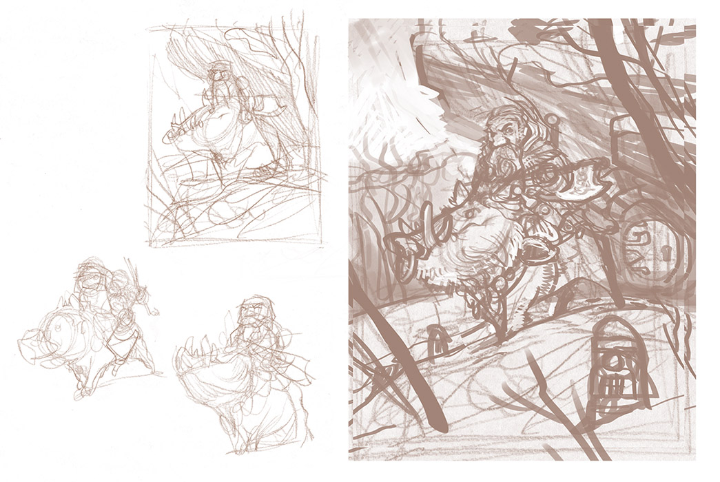
Thumbnails and a digital comp
At the beginning I just draw really sloppy. Sloppiness helps you because…. ok, it’s not really helpful. But nothing is perfect at first. You always have to refine, refine, refine.
What goes here?
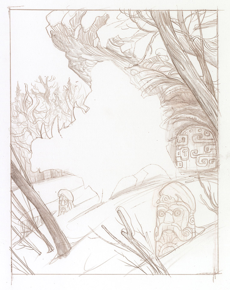
After I have drawn up a comp based on my initial thumbnails I will sometimes draw a background separately from my character. Sometimes I will draw the background behind the character, which allows me to move the character around a bit after dropping them in. This can allow you to experiment with different layout options. In this case I was too cool to experiment with different layout options and left a boar-shaped hole in my scene.
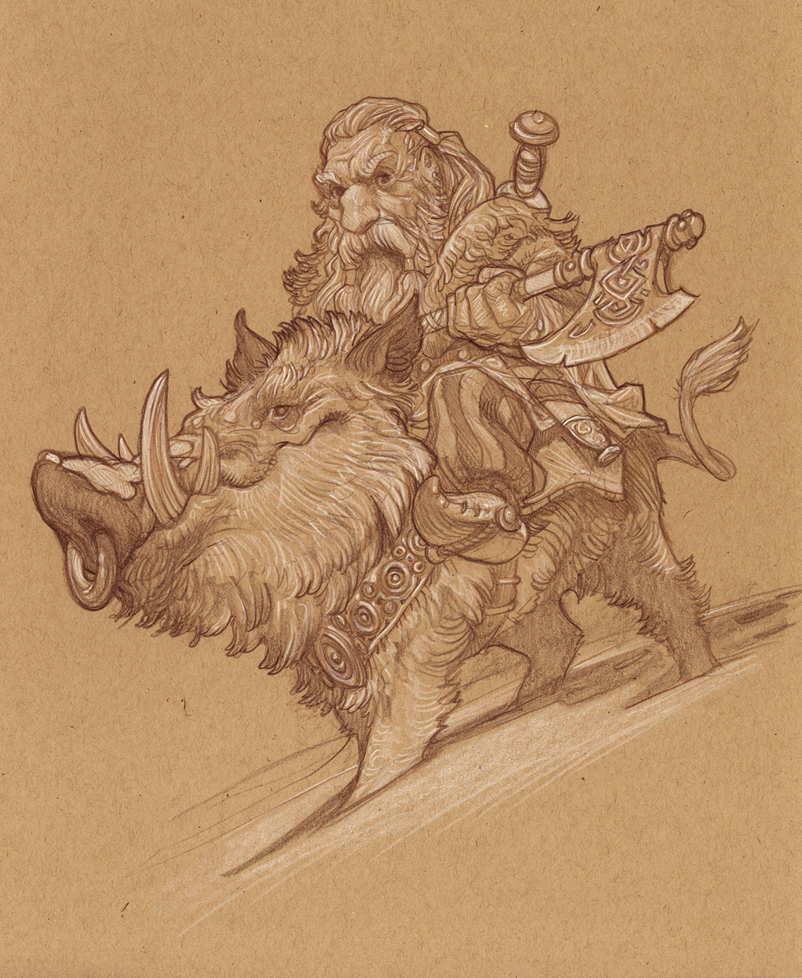
A dwarf riding a boar
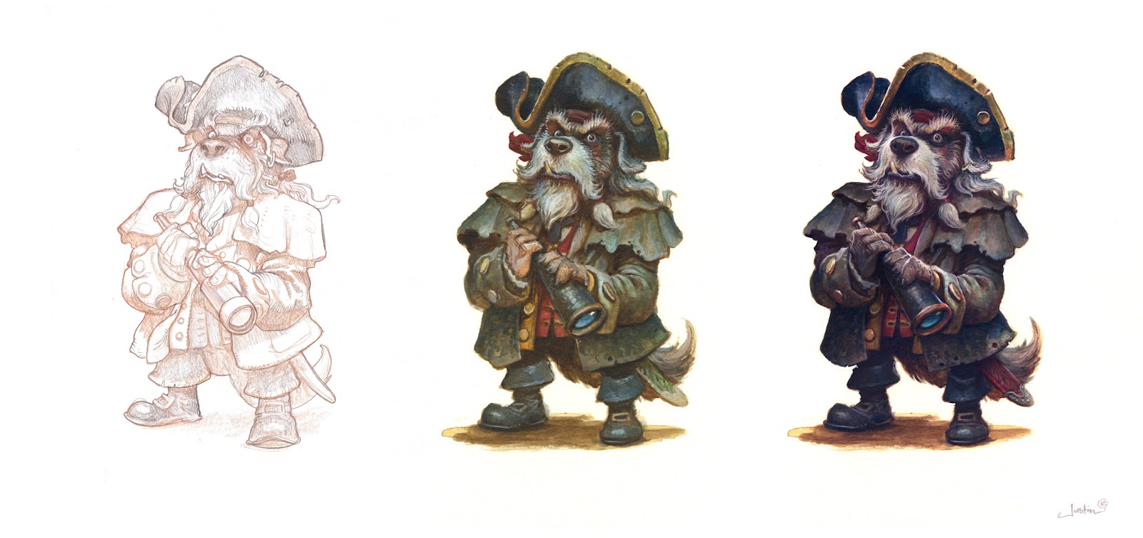
I then draw my character separately. This is especially helpful in scenes with multiple detail figures. Here I have done the drawing on toned paper to also start to get a better feel for how I want to treat the lighting.
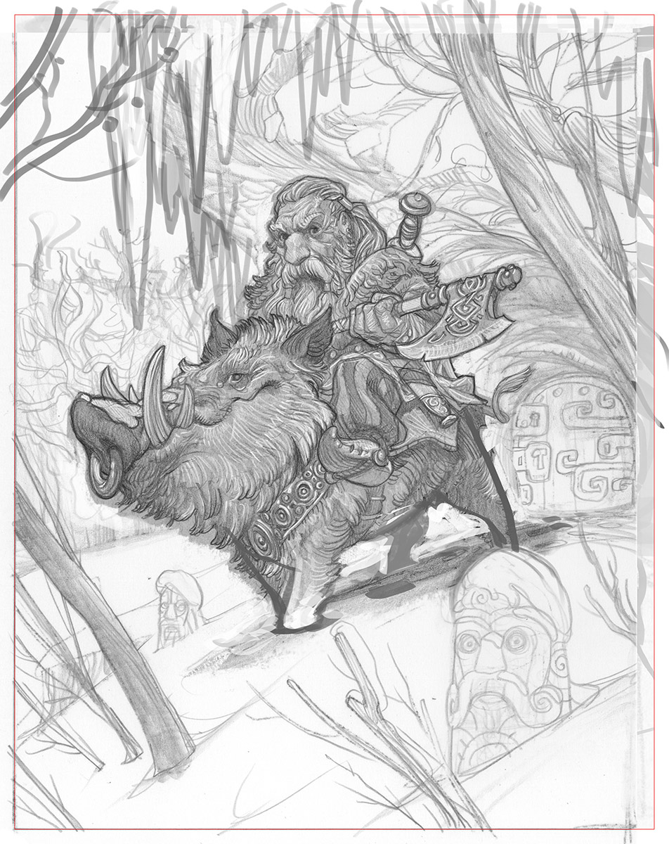
Combined layout
Then, using devilish trickery, I combine everything into a workable layout. Now the layout is ready to be transferred to my final painting surface.
Next Post: Color Comp


Ah, ah. As always, I had hoped things would work out without the devilish trickery. The boar even seems to have lost its legs in the process.
It's coming along nicely nonetheless!!
Ever since I saw the Hobbit my dwarf-mania problem has escalated out of control. You hit a weak spot right now 😀 This drawing is adorable! May I ask what is this pencil on the tonned paper? I cant seem to achieve this effect with mine, even though it seems the same colour at first…maybe yours is pastel based or smth. Thank you
I believe Justin uses Prismacolor coloured pencils and General's Charcoal White, but of course he can confirm or deny these charges. Personally, I've been enjoying using the Cretacolor Primo pencil set from Brevillier's. Their “Artino Basic Drawing Set” is also a nice all-in-one set for this type of work. I'm really interested in trying the General's, but haven't yet found someone who carries them locally.
I'm with you on dwarf mania! As much as I didn't warm to The Hobbit overall, I loved all the general dwarfness of the film… just because… well… dwarves! Also, I was grinning like a fool during the big dwarf battle scene flashback.
I so much want a dwarves vs. orcs MMO designed by Justin and Paul Bonner, and this post does nothing to abate that obsession. I would instantly buy a lifetime subscription, or perhaps two (just in case!).
Hey Justin… Could you give an indication of the scale you do your toned paper drawings at? I love the detail you get into them, and I think I'm starting them too small.
Love the shit-eating grin on the boar's face. looks like he just got a belly full of apples and is now ready for battle!!
I do sometimes use Prismacolor and General's white for these. In this case I used Caran d'ache Pablo pencils for both the brown and white.
Also, I would LOVE to design a MMO or RTS with dwarves and orcs someday. That would be an incredible. Especially if Paul got involved.
Hey Seth,
Most of them are done around the 8 x 10 inches size. I like working at that size, even if I am going to shrink or scale up a character more. I feel like I can get all the details I need in there at that size.
Thank you guys for the quick and vast explanation on the subject! Yes, Dave, this scene and the dwarven kingdom in the begining almost got me a heart attack. Will definately try those pencils you commented on, and as for the MMO- this is the BEST idea ever. On a project like this I would gladly work for free 😀 Dwarves and orcs+ 2 of my idols would bring a whole new era in the fantasy gaming m/
Justin, this may be a trade secret (haha) but do you have a reliable source for finding tone paper of this quality? If I remember correctly, it is Canson Earthtone, or something like that? I would love to get some, unless you sent forth your minions to capture the last shipment of it and scuttled it away on a remote island guarded by rabid apes. In that case, I'll just use some printer paper.
Great Post. I always learn so much from hearing about other illustrators’ processes. The dwarf & boar drawing is incredible and I like how you drew it separately as well as rendered it. Seems like a great way to keep the focus and detail in the main area of the illustration right from the get-go. I will have to experiment with this in the future. Thank you for sharing this with us.
This is so great. I always forget that Photoshop is there to do more than just edit my Facebook pictures, but then I'd also have to drag my ancient scanner out from its hiding place.
Thank you, Justin!
Justin, love that boar! Such a cute couple! Looking at the final comp, the only thing I'm missing is that original expression on the dwarf's face from the large thumbnail. The eyebrow glare. An ill-tempered look off to the right will contrast, and complement, so nicely with the boar's “shit-eating grin” that Viking Myke mentioned. A lovable odd couple.
The dwarf and his boar are so lovely!
and thank's for the usefull tips! can't wait to see it with colors!
I would say that while sloppiness is not helpful in and of itself, a lot of rapid fire editing can happen in that first outpouring on the page. You see what you want, where you want to focus, and sometimes if an idea is worth following up with or not. And sometimes you get to decide if you want to widen your perspective, or if you have bitten off more than you can chew, narrow it down to a small pinpoint of your large aspirations.
Best,
Aaron