In 2010 I finished the first draft of a novel called Cold Cereal. It’s the first of a trilogy about a kid who discovers that a breakfast cereal company is stealing glamour from leprechauns and fairies and magical beasts, and slipping this stolen glamour into their magically delicious cereals, and using these cereals to raise an army of sugar zombies and conquer mankind.
It’s meant to be funny. Whether you find it funny will have a lot to do with your tolerance for this sort of thing.
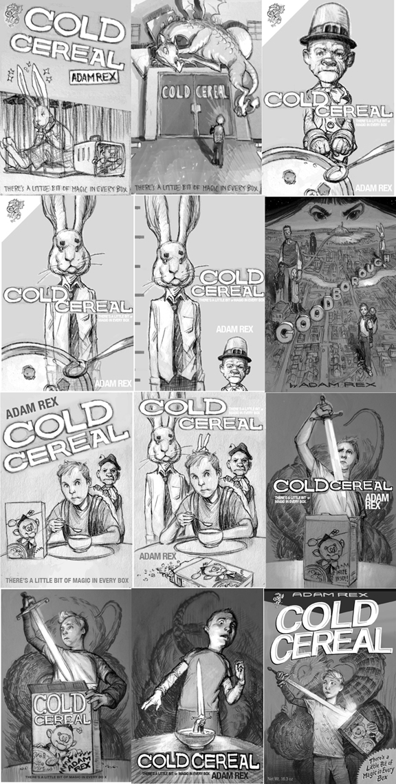
I went through the usual battery of sketches for the cover of this novel:
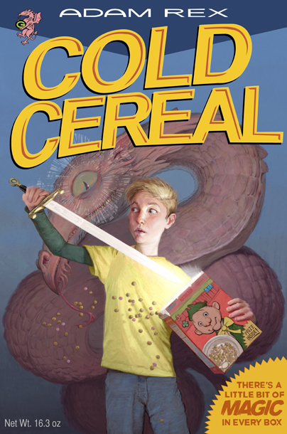
Many of them eventually focused on my main kid (Scott) drawing a sword Excalibur-style out of a box of cereal, as if it were the prize inside. This was an idea that my editor kept pushing, and which she kept insisting was mine. I think I probably had originated it during some spitballing phone conversation, but the truth was that it made me uncomfortable–Scott doesn’t have a sword at any point in the book, and it’s exactly the sort of conceptual image that we accept as adults but which would have struck me as dishonest as a kid. I’d be waiting the whole book for the sword scene.
Well, it did make for an okay cover image. Painted in Photoshop, type design mine.
I ended up liking it. My wife liked it. My agent liked it. My editor liked it. She showed it to the Sales department, and they didn’t like it.
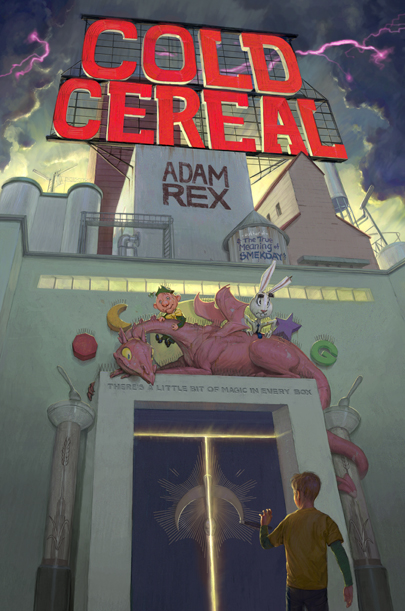
So we reeled back to an older idea: that of Scott approaching the cereal factory at night, seen only by the plaster eyes of mascots that overlook the entrance.
Now everybody was happy but me. I was on the faculty of the Illustration Master Class in Amherst that summer (2011), so at the end of my keynote I put this cover up on screen. I suggested that the students might enjoy critiquing one of my pieces after several grueling days of listening to the faculty critique theirs. I remember being concerned that no one would feel comfortable digging in. Instead, several students may have dislocated their shoulders from so much vigorous hand-raising.
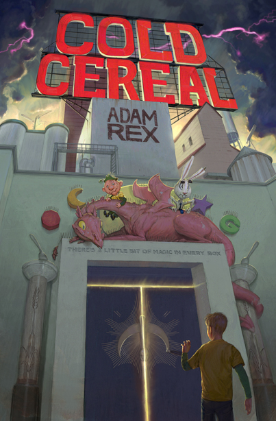
They had, in fact, much better ideas than I could execute before the book went to print. But I took as much as I could to heart and turned in this revision.
Then I got to work on the 40-some pages of interior B&W illustrations, and started writing the sequel.
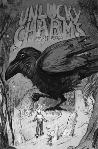
The sequel, Unlucky Charms, had its own cover struggles. I thought I’d knocked it out of the park right away with a dreamy image of two of my heroes approaching a giant raven
Turns out someone at HarperCollins is afraid of birds? Or something? Anyway, they said it was “too scary.”
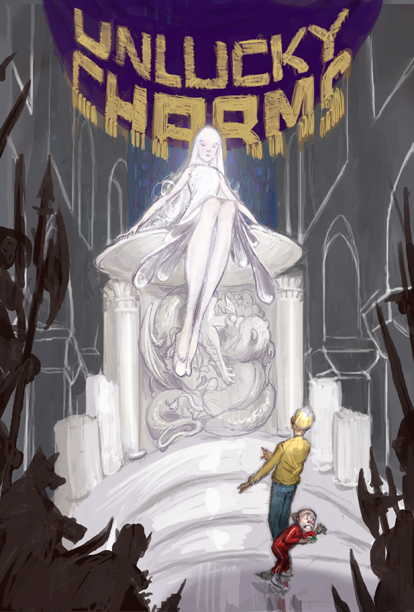
The next was “too sexy.”
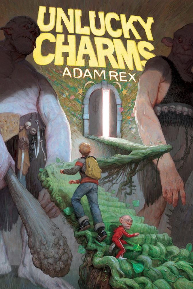
The third idea turned into one of my favorite digital paintings.
Everything just kind of came together–or at least, it did after I made a 3D staircase model in SketchUp to help me draw the vines.
I REALLY like this painting, which is why it pains me a little to tell you that it isn’t the cover of Unlucky Charms.
I believe Cold Cereal has been selling only modestly (I’m not sure because I only get sales figures twice a year, and it hasn’t been in stores all that long). When a book isn’t performing to expectations the only thing you can really change about it is the cover. So may I present the cover of the paperback edition of Cold Cereal:
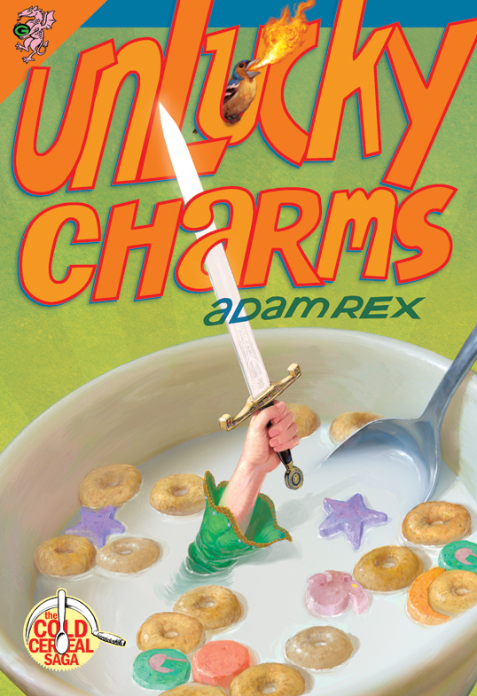
And the redesigned Unlucky Charms, out this week:
I like them. Again–Photoshop, dodgy type design mine.
I’m writing the third book, Champions of Breakfast, as you read this. I already have an approved cover sketch. They went along with the first idea I pitched. It’s TERRIFYING.






It's fantastic artwork for a great IP, you should be well proud. Never mind the type design (actually quite like it) the use of colour is awesome!
Thanks for writing about this whole process. I'm new to illustrating and this has been great to read! The illustrations are wonderful. All it takes now is having that book in the right place at the right time… I hope it sells. It looks like one that kids would love!
Heh, is that a “The Court Jester” reference? Love the cover with the giants, but maybe simpler covers sell better, I don't know. So is there a sword in this one?
Adam, can we get a peek at some of those 40 interior b&w illustrations?
Welcome here. Truly enjoy your work. Now if you only had a sense of humor.
That all sounds fabulous. I admire your patience. I'd have pulled all of my hair out after the second or third cover. Thanks for the insight into your process.
I love all of the covers, but I really do like the ones with the boy swimming in the bowl. (And I agree, I hated that kind of let down where you see an image on the cover and never find it in the book.)
I was at the IMC where someone suggested “Rice Creepies”. That has to be used somewhere (too good I thought). Can't wait to get this book… These look amazing as always.
Wellcome! It's an honor!
Thanks, everyone!
Yes, a tortured “Court Jester” reference.
Scott, you can see a handful of those interiors from both books if you follow these links to my personal blog:
http://www.adamrex.blogspot.com/search/label/cold%20cereal
http://www.adamrex.blogspot.com/search/label/unlucky%20charms
Welcome!
As a kid I was a stickler about comparing the covers to the story. Especially the physical characteristics of the characters, so I understand what you mean. Loved the sketch with the raven!
Welcome Adam. I've been a fan of your work since I stumbled across 'Tree Ring Circus' in a Borders store some 5 or 6 years ago. I bought it instantly due to the rad art, without knowing a thing about you. I've just read 'Fat Vampire' too and had many a chuckle.
Great insightful post – I love the cover with the giants. I do like the sword concept too though – couldn't you just write a sword into the story? 😛
I'm sure you will be a great addition to the Muddy Colors roster, with your unique insights on straddling illustration and writing, and all the difficulties and triumphs of birthing your own properties out into the world. With the sheer volume noise of artists exploding on the internet in recent years, it's something more and more artists are talking about. Of course you're more than a few steps past talk on that front, so I'm sure you have plenty to share about how you got to here 🙂 I'm very much looking forward to it (no pressure).
Welcome, Mr. Rex.
I love the cover with the giant ogres. But the sword rising from the cereal bowl with the fire-breathing finch cover is also a hoot. Personally the raven drawing did put me in mind of Edgar Allan Poe, but had it been a colorful cover painting it might have been less scary. And the truth is young readers scare less easily than I did at that age, I believe.
I can't wait to see more from you here.
Will you be coming to Spectrum Live! 2?
Best Wishes,
Aaron
No, no Spectrum Live for me I'm afraid.
Oh, wow–Muddy Colors AND Adam Rex? Excellent! Smekday and Cold Cereal are favorites at our house. 🙂