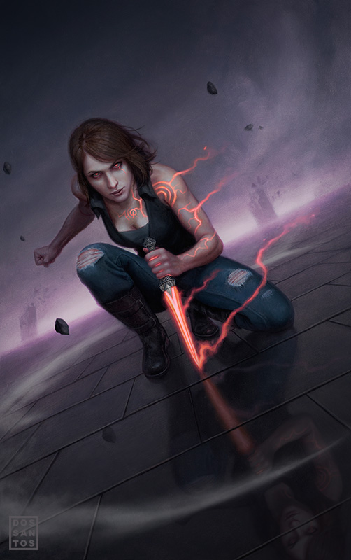
Here’s a piece I did a short while back for the novel ‘Touch of the Demon’, by Diana Rowland.
The original painting is 16 x 24 inches, oils on board, and was a really enjoyable piece to work on.
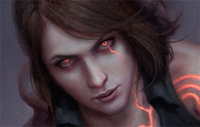
The heroine can enter an alternate reality where demons roam. Trying to capture that eerie feeling of an expansive, yet desolate environment was a lot of fun. I also tried to imply that something was a bit ‘wrong’ with the picture by shifting the woman’s flesh tones to a slightly purple, and unnatural, hue.
Over all, it an exceptionally simply composition. There is not a lot to look at, but I think that’s why I enjoy it so much. It’s just easy to look at. Plus, all that empty space usually makes for extra nice cover designs.
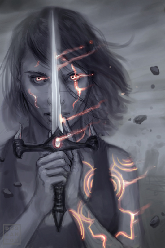
Here is an alternate sketch I was hoping to paint (done digitally in Photoshop). Unfortunately, the dagger was well described in the story, and mine wasn’t even close. Once I started to revise it, it just didn’t look as good.
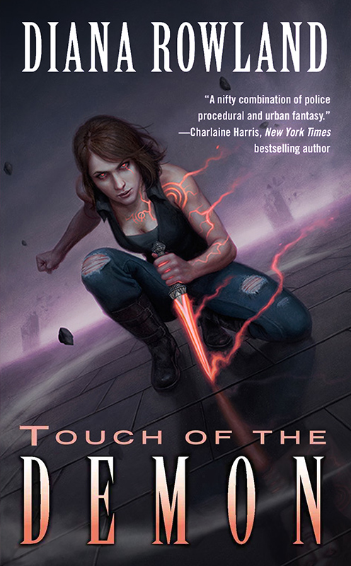
And finally, here is the finished image with type treatment.




Great painting, the glowing effect is great and mirroring on the cobbelstones. Just curious though did you paint this like you are looking at it or did you tilt it on the side at a 45° angle. Either way, excellent.
Hey Dan, after seeing some of Adam Rex's post and this post, i was wondering if it is the job of the illustrator to design the type treatment as 1 whole product or is the type handled by another party?
I painted it at the tilt. That's the way the original looks.
Usually the Art Director, or an on staff designer handles the type. Very rarely does the artist get to do it.
In my case, I've done it maybe 5 times in all my career.
Nice painting! Love the Illidan style enchanted tatoos!Also the head shot kind of reminds me of Scarlett Johansson.Lucky you 😛
the glow behind the fingers is my favorite part. the reflection is super nice as well! Always a joy to see you post new paintings.
It's a beautiful design, and fits the story perfectly. I'm still waiting to hear when I can buy a print 🙂
That image is ssooo stinkin' cool I CAN'T STAND IT!!!!
Very nice!
People shouldn't be allowed to be as good as this!! LOL
It's fantastic, Dan.
awesomeness 🙂
Very nice piece Dan. You should have an instructional DVD on this one. Would love to see how the reflection and that circular wisp of gas was created!